1 / 8
|
How it works? In all, there are 7 major milestones to complete this visualization dashboard for sales & market analysis. To learn more about the details for each of the milestones, you may either
|
|---|
2 / 8
|
Stakeholders in Company A Hover over the cartoon to view the details of each of his/her role in the company.
|
|---|
3 / 8
|
Business Questions From Stakeholders
|
|---|
4 / 8
|
Wireframe Based on Business Questions Hover over the different parts of the wireframe to view the business questions.
|
|---|
5 / 8
|
Graphics Selection Based on Wireframe Click on the button to view the graphic selected.
|
1: Button Selection for Users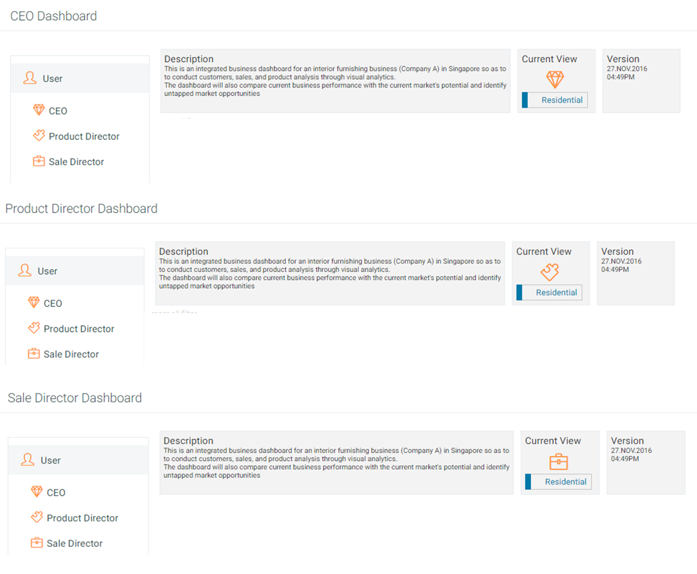
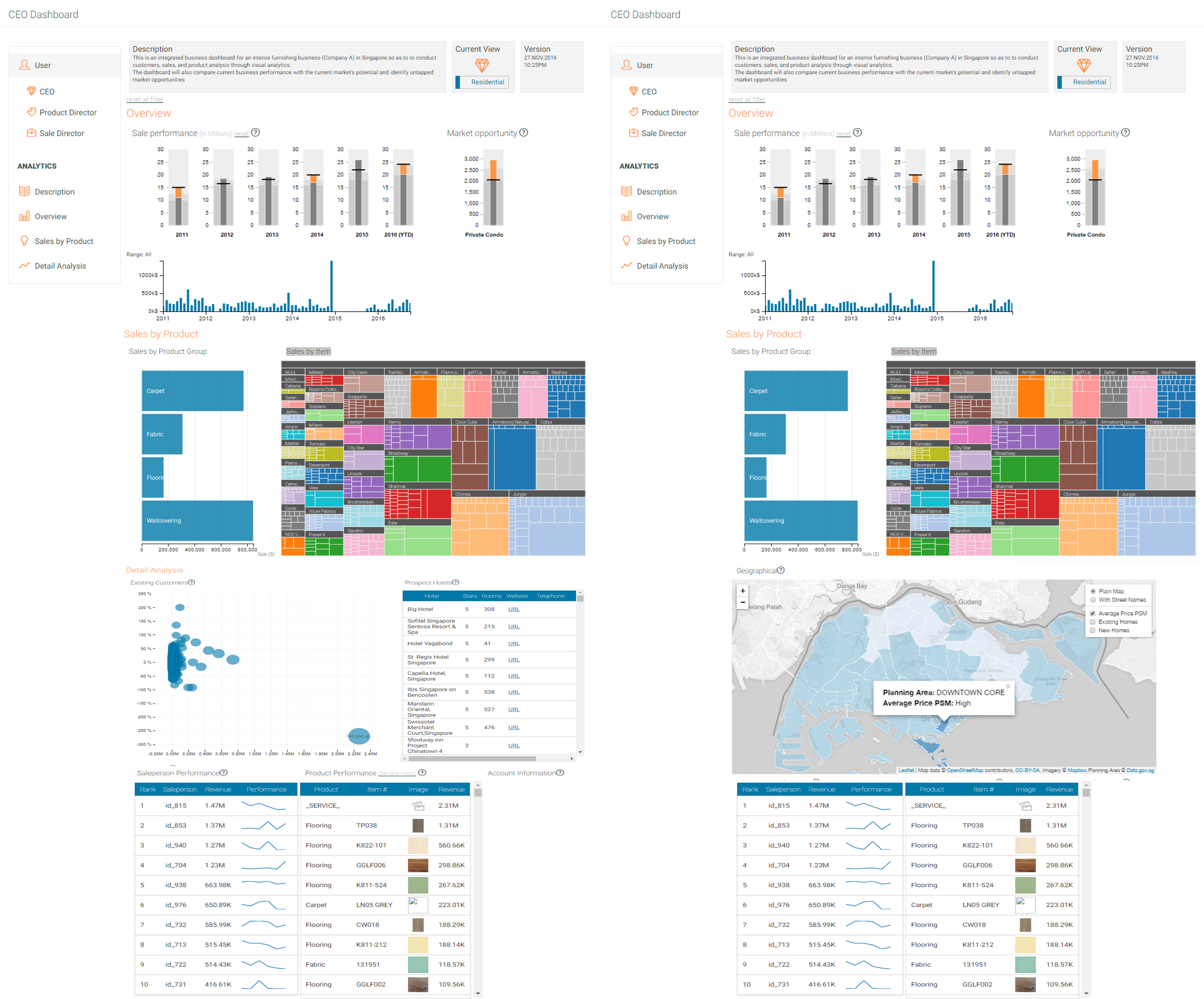
ObjectiveThis acts as a master filter to determine the user of the dashboard.There are 3 key users for analysis : (1) CEO (2) Product Director (3) Sales DirectorInteractivityall the other graphics or element in the dashboard will be updated with the related data.2: A Toggle Switch for Market SectorObjectiveThis acts as a master filter to determine the objective of the dashboard.There are 2 key sectors for analysis : (1) Hospitality Sector (2) Residential SectorInteractivityall the other graphics or element in the dashboard will be updated with the related data.3: Annual Sales Charts (Bullet & Bar)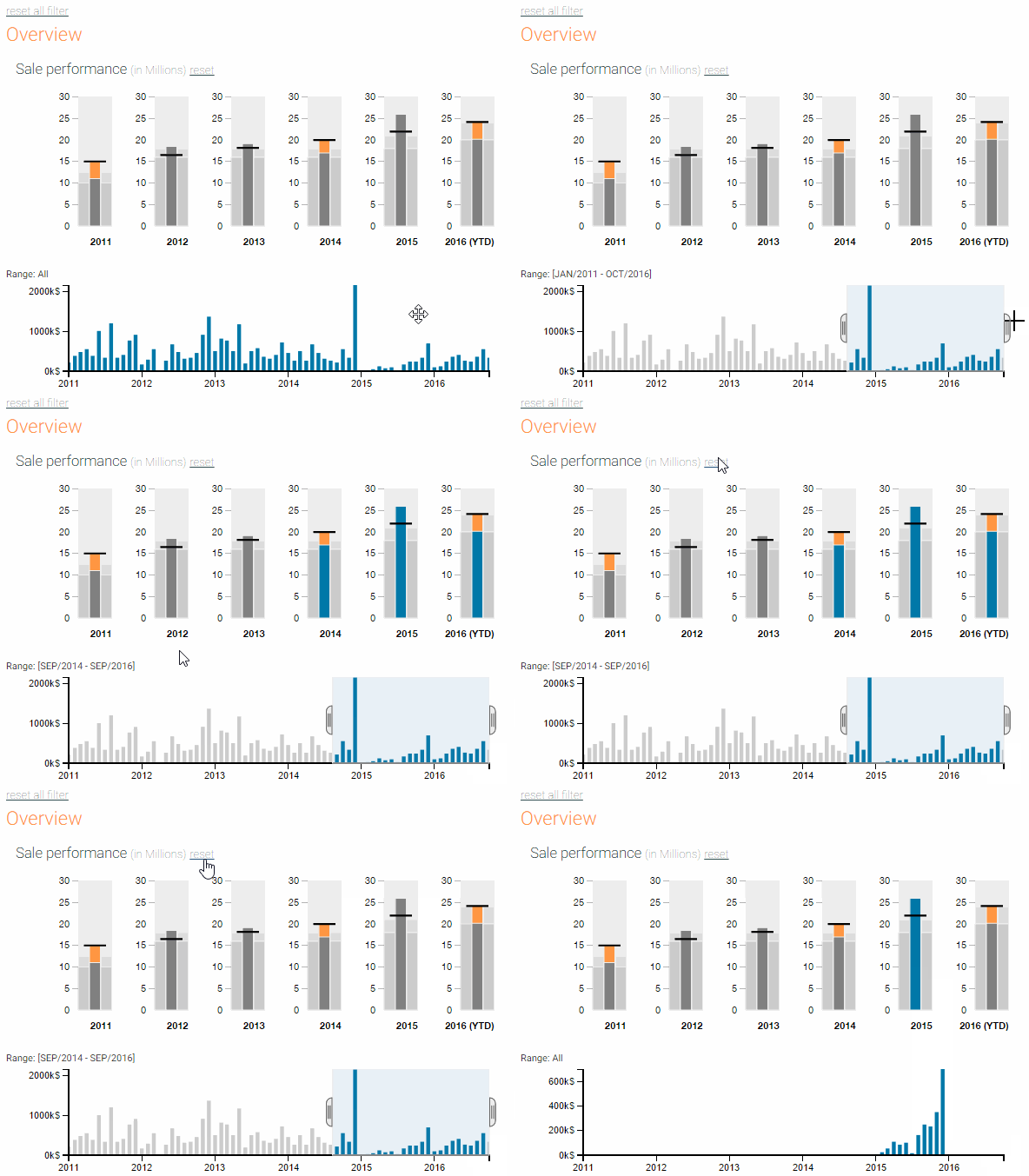
ObjectiveBullet & Bar Chart- Display annual sales indicators & Performance & monthly sales respectively.InteractivityUpon a click on the bullet chart OR adjustment on the scaler on the bar chart, all graphics will be updated with related data.4: Bullet Charts - Market Opportunities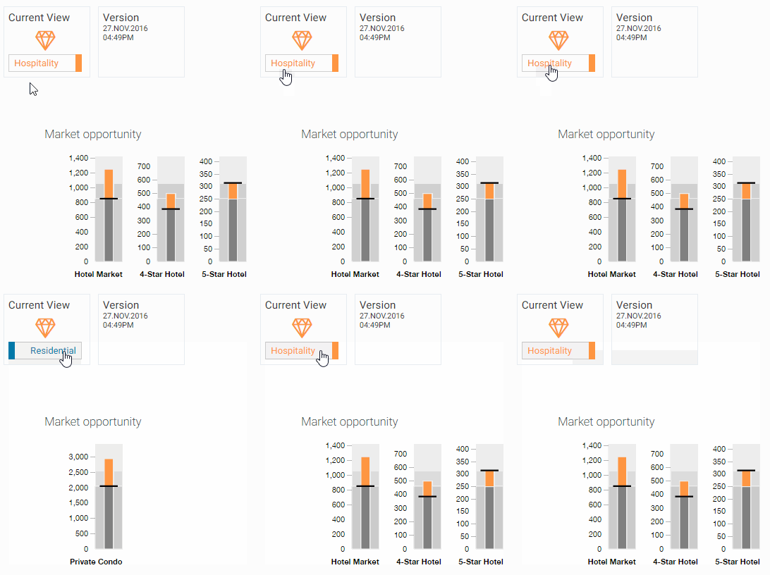
ObjectiveBullet & Bar Chart- Compare the total possible projects/prospects in the sector (the target), and how many of them are existing customers. The shortfall will highlight the possible market growth.InteractivityThe indicator will change with according to the market sector.5: Bar Charts - Sales by Product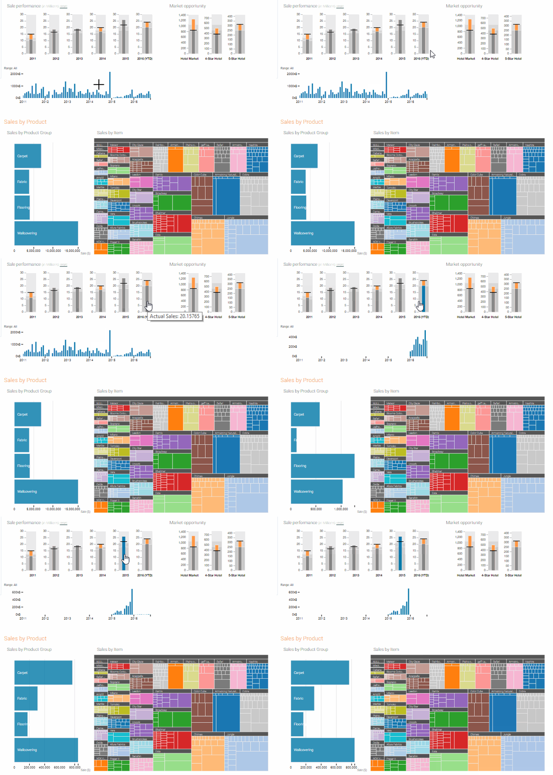
ObjectiveBar Chart- Display annual sales indicators and performanceInteractivityUpon clicking on the bar chart, all graphics will be updated with related product information.6: Tree Map - Sales by Item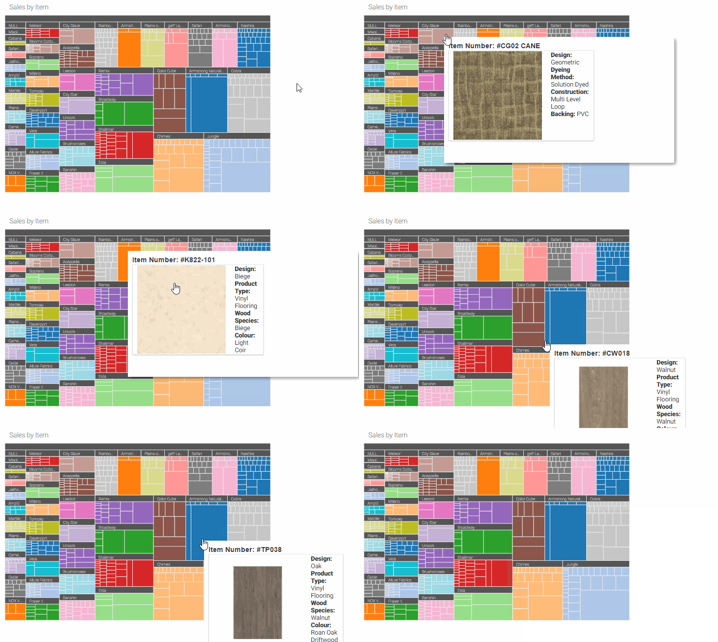
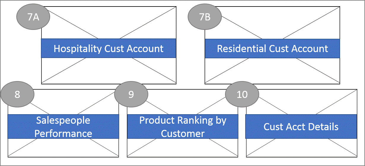
ObjectiveBar Chart- Display annual sales indicators and performanceInteractivityUpon clicking on the bar chart, all graphics will be updated with related product information.Technical ChallengesAlthough there were examples of treemaps implemented in D3 available on the internet, there were numerous technical challenges in developing treemaps using D3 library. First of all was the requirement to feed in a hierarchical JSON file to build the treemap data structure. A flat JSON file or CSV file will need to be converted into a hierarchical JSON file first. After some research and testing, a function was adopted to generate the hierarchical JSON file required. A combination of D3 treemap examples were used to construct the final fit-for-use treemap. A core treemap template was used, while the tooltips was adopted from another example Extensions on the toolips was created to allow display of additional information of each product. (refer to credits for more information).7A: Existing Account's Details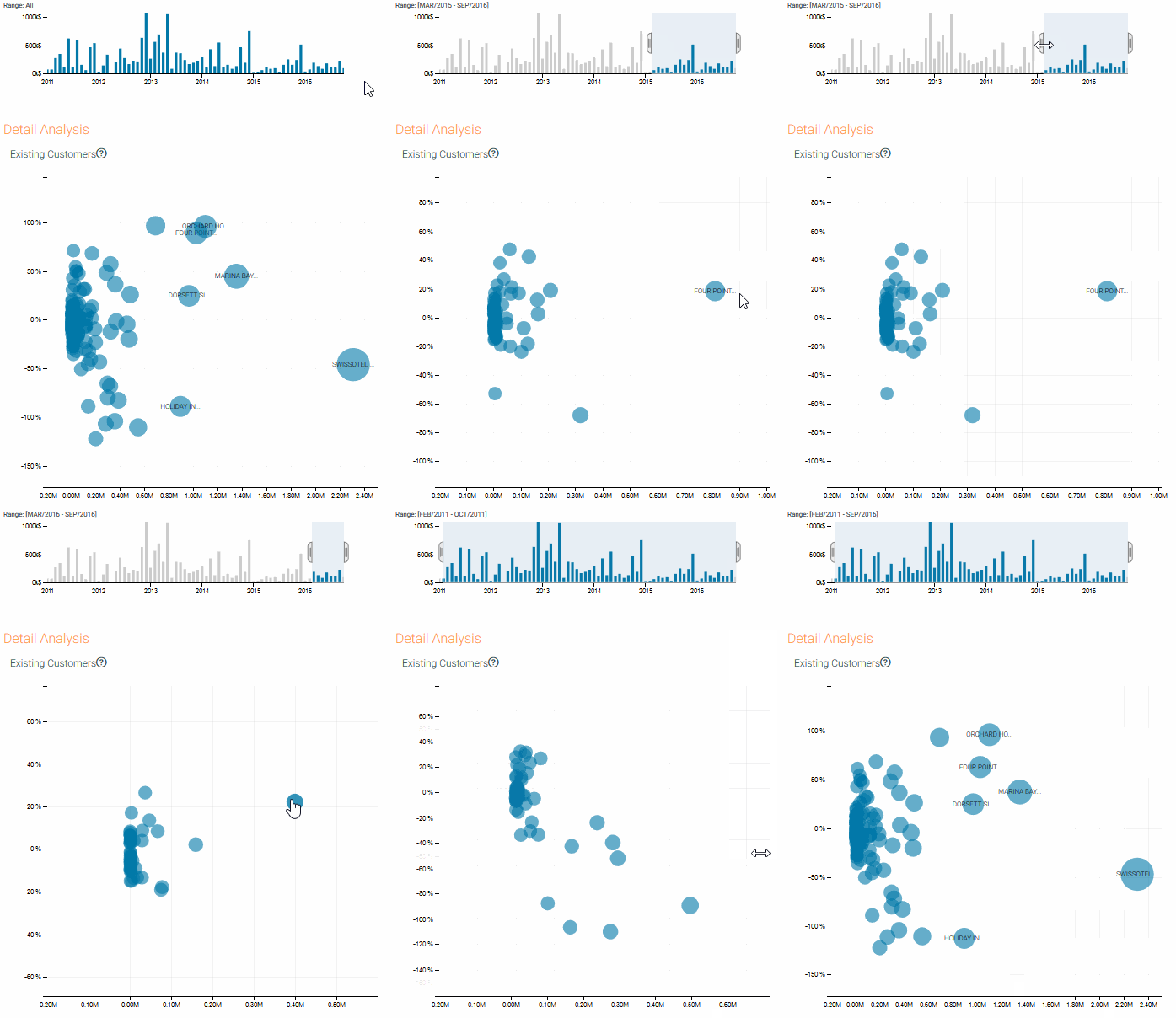
ObjectiveDisplay and arrange hospitality�s customer accounts by its growth rate & revenue generated over the years.InteractivityLinked to the timeline, and we can analyze the growth (rolling period) of each existing account with the timeline chart.7B: Geographical by Residential Projects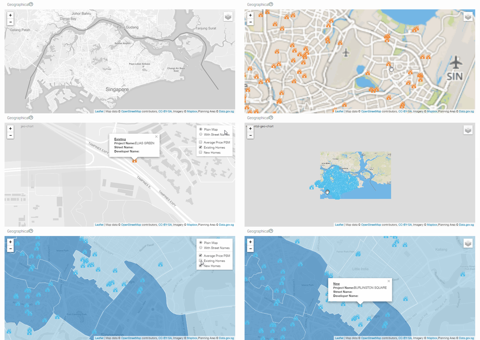
ObjectiveDisplay and group residential�s customer accounts by location.InteractivityFilters availableat the top right hand corner, to shortlist projects for further analysis.Technical ChallengesWe apply the Leaflet JS library to implement the map. The first challenge was to produce a geoJSON file that will map out the planning areas of Singapore. After some trial and error, a KML file was used from data.gov.sg and converted into a geoJSON file using the utility from http://2geojson.com/index.php. For the private residential projects coordinates, a batch geocode utility was used. Manual data cleaning was then done to adjust any coordinates that was incorrect from the utility. ` For the Leaflet implementation, an extension of the Leaflet JS library, DC Leaflet, was used to produce the Maps with DC cross filter functionalities.8: Sparkline - Salespeople's Performance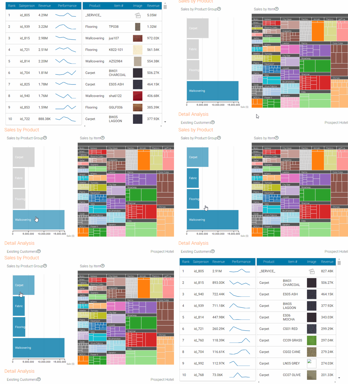
ObjectiveDisplay the trend of the performance of each of the salesperson.InteractivityLinked to the Product Group's Selection such that we can view the trend of the salesperson's performance by product too.9: Table - Product Item By Ranking
ObjectiveDisplay the top 10 items (with product images) of the selection/filter.InteractivityLinked to the Product Group's Selection and Year's Chart such that we can view the trend of the product's performance by product too.10: Existing Account's Details
ObjectiveDisplay the details of the existing account selected.InteractivityLinked to the customers' account such that details will be display for further actions. |
|---|
7 / 8
|
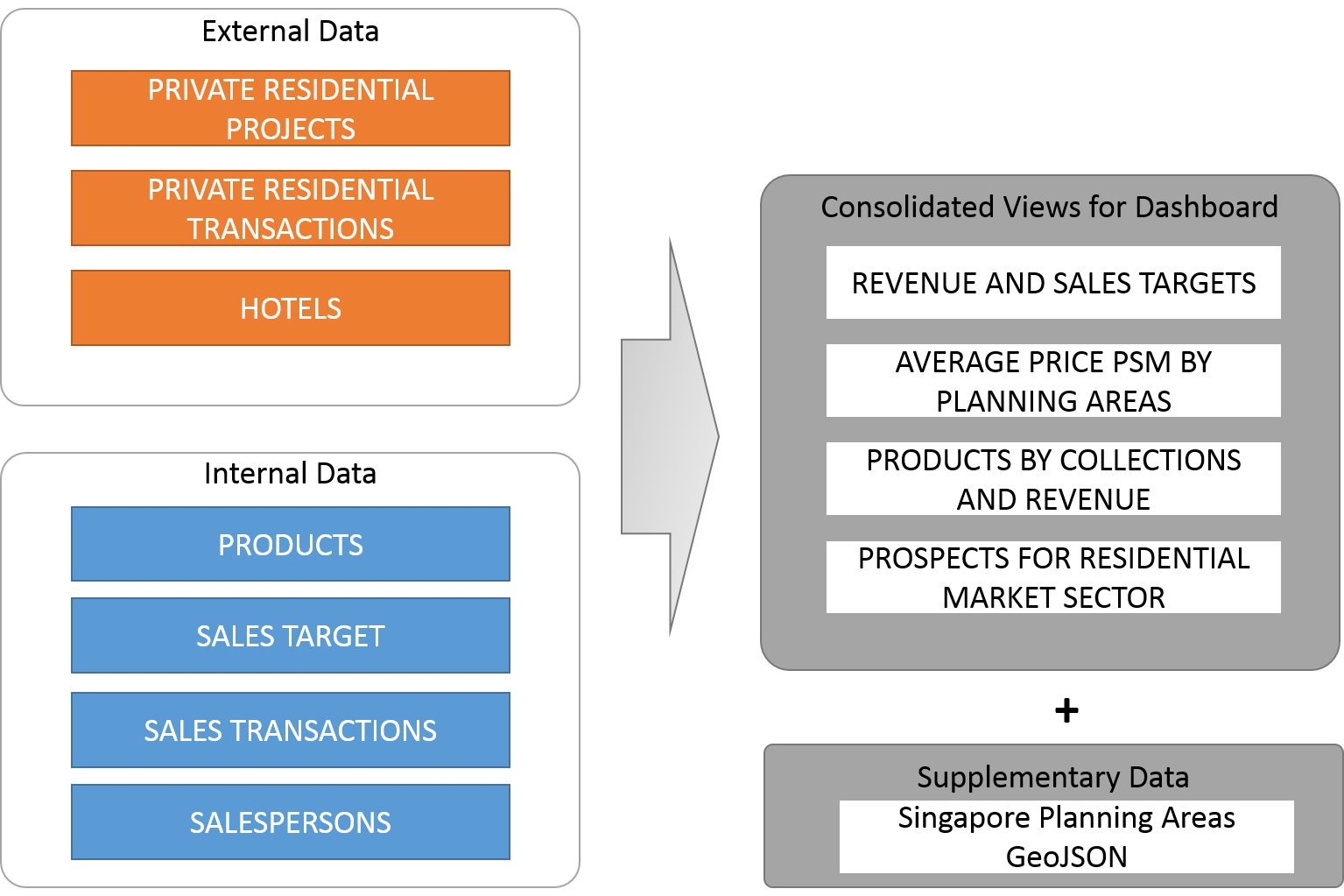
System Architecture for Dashboard 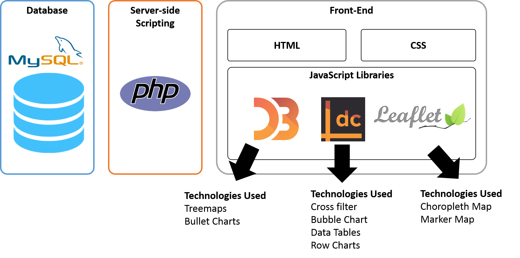 Overall Technical Challenge Integration among different platforms: Naive D3, DC.js and native javascript is challenging since not all external library is well supported and documented. This need long journey of experiments to test out functionalities, work on replacement and extend the original library to support customised requirements from user. A bug in DataTable API in DC.js at current official release v1.7.x disabled the dataset to be sorted accordingly, we ended up to adopt v2.x.x beta for our development |
|---|


