1 / 4
2 / 4
|
From World Wide Web |
||
|---|---|---|
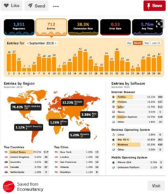
Feature: Sales Dashboard with geographical analysisLearning Points:
|
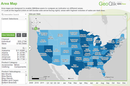
Feature: Geographical Dashboard on SalesLearning Points:
|
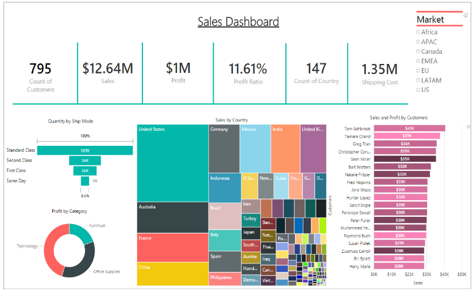
Feature: Sales DashboardLearning Points:
|

Feature: Qlikmap's feature of MapLearning Points:
|
Feature: Geographical Map on DistributionLearning Points:
|
3 / 4
|
Past SMU Students' Work |
||
|---|---|---|
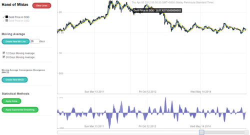
Feature: Demand Forecasting ApplicationLearning Points:
|
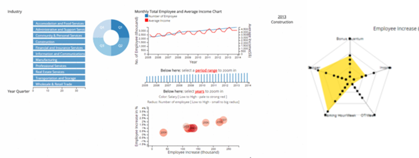
Feature: Job AnalysisLearning Points:
|
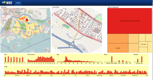
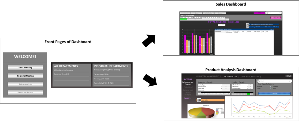
Feature: Comphrensive DashboardLearning Points:
|
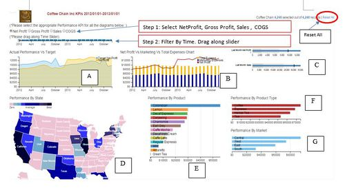
Feature: Comphrensive Dashboard- Coffee Chain Inc ApplicationLearning Points:
|
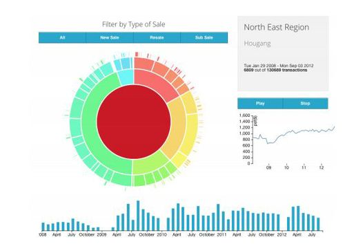
Feature: Sunburst DiagramLearning Points:
|
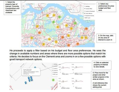
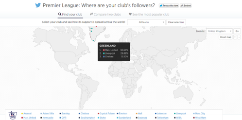
Feature: Geographical DiagramLearning Points:
|
4 / 4
|
From Company A |
|---|
Feature: Current PracticeStrength:
|