Creating your first Opera widget
24th April 2012: Please note
Starting with Opera 12, Opera Widgets will be turned off for new users and completely removed in a later release. If you're interested in building addons for Opera, we recommend going with our extensions platform — check out our extensions documentation to get started.
Table of contents:
Creating an Opera widget is quick and painless, with just a few pointers in the right direction. This article details what a widget is and what you need to create one, and also takes you through creating, running and packaging a widget step by step. The basic techniques discussed here also apply to widgets intended to run on mobiles, set-top-boxes or within the Opera browser on the Nintendo Wii Internet Channel.
Before you get started
OK, we know you can’t wait to get started, but bear with us for just a moment while we run through a few essential basics.
What are widgets?
Widgets are Web applications running on your desktop. They are implemented using client-side Web technologies, and creating one is very much like creating a Web page, except that it is run in a slightly different context.
Opera browsers can install and open these widgets, showing them directly on the user’s desktop (or equivalent in other devices). Widgets are native applications created with web standards, which can integrate nicely with your computer or device. When run on a desktop computer, widgets look something like the eBook widget shown in Figure 1.
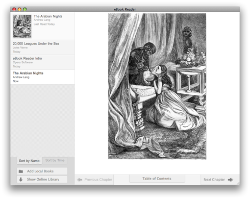
Figure 1: The eBook Reader Widget, running on Mac OSX.
Packaging widgets
Opera Widgets are packaged as regular zip files, renamed to use the extension .wgt. All the files related to your widget should be stored inside the widget file. A typical widget contains the following elements:
- A widget configuration file —
config.xml. This is an XML file in the root of the widget structure that holds information about your widget including its size, name, author, and security information. - An index document —
index.html. Like on a Web page, this document contains the basic skeleton/content of the widget. Widgets content can be created using any markup that Opera handles natively, for example HTML, SVG, or XML files. This file also lives in the root of the widget structure. - Images. These are contained in a single images folder.
- JavaScript files. These are contained in a single script folder.
- Style sheets. These are contained in a single style folder.
When a user running the Opera desktop browser clicks on a link to a .wgt file, Opera will download the widget, start it, and ask the user if the widget should be kept on his/her computer. Note that behavior on different platforms supporting widgets may differ slightly.
The next time the user wants to run the widget, it can be started from the Widgets menu inside Opera, double-clicking the Widget icon at the install location (eg the Applications folder in Mac OSX), the Windows start menu, the Widget manager on their phone, or whatever other native mechanism they have available.
What do you need to create and deploy an Opera Widget?
In order to be able to create an Opera Widget, you will need the same as you need for regular Web development:
- A basic understanding of Web technologies.
- A text editor or IDE that allows creation of JavaScript, HTML, and CSS files.
- A tool for creating
.ziparchives. - Somewhere to publish the widget. The Opera Widgets web site offers the perfect place to host your widgets, and is visited by tens of thousands of people every day looking for widgets to run.
How are widgets related to Web pages?
We keep saying widgets are very similar to regular Web pages, but there are a few differences:
- The security restrictions of a widget are different from regular Web pages — you can create a widget that will simultaneously interface with different Web services living on different Web servers.
- Widgets have a
widgetobject available via JavaScript that allows you to access widget-specific functionality. - Widgets have access to a permanent storage facility for its settings and downloaded data. This mechanism is similar to cookies, but the storage capacity is larger than for cookies, and does not automatically expire after a given time.
- Widgets typically have several views available in the same document. Typically there will be one or more views used to access the widget’s normal functionality, and a separate view wherein you provide the user with configuration options. Switching between these views is done by performing transitions on the views using regular JavaScript/CSS methods.
- By default, widgets are draggable, so you can move them around on the screen simply by clicking and dragging. If this behavior is not desired for a widget (or parts of it) you need to specify control regions where the widget does not respond to dragging.
- By default, the widget background color is transparent. The transparent area of a widget does not respond to mouse events but instead passes them through to any underlying application.
The widget workshop: hello world!
OK, with the background out of the way, let’s start coding! Our first widget will be as simple as possible — a “Hello World!” widget. Earlier on we talked about widgets containing CSS, images and JavaScript files. Many do, but at the very least, a widget requires two files:
- The main document.
- The widget configuration file.
We will start this tutorial by creating a minimal widget, and then expand the widget into a complete widget with style, and a configuration view.
Creating the main document
First, create an HTML document inside a new directory and call it index.html. This document will be what your users will see when they first load the widget. Add the following code to it, and save the document.
<!DOCTYPE html>
<html>
  <head>
    <title>Hello World!</title>
  </head>
  <body>
    <p>Hello World!</p>
  </body>
</html>
Creating the widget configuration file
Next, we’ll show you how to create the widget configuration file, which is needed in order to run your widget. It is always named config.xml, and holds information on certain properties of the widget. The following are some properties the file can contain:
- The widget’s name. This is required.
- The widget’s dimensions. This is the initial viewable area for a widget.
- Author information. Feel free to brag.
- A unique ID for the widget. This ID is made up of three parts: A hostname, a path and a revision date on the
YYYY-MMformat (you can also useYYYY-MM-DDDDif you plan on revising the widget more than once a month). - Security information that provides the widget user with information about which domains the widget will be contacting. Even if this security information is optional, any widget that contacts a third-party service is highly encouraged to include this, since this will establish a trust relationship between you, the widget author, and the widget user.
Create the config.xml file in the same directory as your index.html. Add the following code to it, and save it.
<?xml version='1.0' encoding='UTF-8'?>
<widget>
  <widgetname>Hello World!</widgetname>
  <description>Demo widget from the Hello World tutorial.</description>
  <width>440</width>
  <height>200</height>
  <author>
    <name>John Doe</name>
    <email>john.doe@example.com</email>
    <link>http://acme-widget.example.com</link>
    <organization>Acme Examples, Inc.</organization>
  </author>
  <id>
    <host>example.com</host>
    <name>HelloWorld</name>
    <revised>2008-01</revised>
  </id>
</widget>
Running your widget for the first time
Let’s test what we have so far.
- Select both the files you have so far, and compress them into a
.zipfile - Rename the file, giving it a memorable name and an extension of
.wgt - Run your widget by dragging and dropping the
.wgtfile into your browser window - Select Install
you should see something like that shown in Figure 2.

Figure 2: Running an unstyled Opera widget.
Adding style
In its current form, the widget’s default background color is transparent, and uses regular browser defaults for styling. Let’s spice it up with a little CSS and additional markup.
First, you need to add a stylesheet reference to the HTML document, and add some hooks for styling. Replace what you currently have inside index.html with the following, and save the changes.
<!DOCTYPE html>
<html>
  <head>
    <title>Hello World!</title>
    <link rel="stylesheet" type="text/css" href="style/helloworld.css">
  </head>
  <body>
    <div id="container">
      <div id="header">
        <h1>Hello World!</h1>
      </div>
      <div id="content">
        <div id="front" class="view">
          <h2 id="hellotext">Welcome to the world of Opera Widgets!</h2>
        </div>
      </div>
      <div id="footer">Powered by Opera</div>
    </div>
  </body>
</html>
The easiest way to make changes to a Widget you have already installed and test it is as follows:
- Find where the Widget is installed on your development machine. For example, in Mac OSX it will be in the Applications folder; in Windows it will be in Program Files or C:\Users\[username]\AppData\Local\; in Linux it will be in ~/.opera-widgets/usr/share. In the case of this example, you are looking for
Hello World!
. - Access the files inside the Widget. This is done in different ways depending on your operating system. For example on Mac OS X, Cmd + Click on the Widget icon and select Show Package Contents. You will be given a finder window containing the package contents: Hello World! > Contents > Resources > Widget > index.html.
- Open the HTML file you wish to edit (e.g. index.html) in your favourite text editor, make the desired changes, and save the file.
- Close the widget and restart it to see the effect your changes have had.
Next it’s time to create a style sheet to style your widget. Create a new folder called style in the same directory as your other files, and create a new file inside it called helloworld.css. Add the following code inside this file and save it.
/** Basic styles **/

body {
  font-family: Verdana, Helvetica, sans-serif;
  font-size: 16px;
}

h1 {
  margin: 0;
  font-size: 1.1em;
  padding: 7px 0 0 10px;
  font-weight: normal;
}

h2{
    font-weight: normal;
    font-size: 1.1em;
    margin: 0px;
}

/** Structure **/

#container {
  width: 429px;
}

#header {
  background-image: url(../images/back_top.png);
  padding: 4px 10px 0px 10px;
  height: 35px;
}

#content {
  background-image: url(../images/back_center.png);
  color: #333;
}

.view{
    padding: 10px 10px 10px 20px;
    height: 60px;
    max-height: 60px;
    max-width: 393px;
    overflow: auto;
    -apple-dashboard-region:dashboard-region(control rectangle 0px 0px 0px 0px);
}

#footer {
  background-image: url(../images/back_bottom.png);
  height: 23px;
  padding: 2px 0 0 20px;
  font-size: 0.6em;
  text-decoration: underline;
  color: #dd2222;
}
You’ll notice that there are several background images referenced inside this style sheet; now you need to add these to our widget folder. The images you need can be found in the /docs/examples/firstwidget directory in the SDK package — unzip the archive, then grab the images folder contained within it and put it in the same directory as the index.html file.
The styling is now all in place, so try running your widget again, in the same manner as before — it should now look like Figure 3. After this styling is applied, the widget no longer looks bland and unstyled. It now has a background that makes it stand out from the rest of the desktop. The control regions make the center of the widget and any scrollbars clickable without causing the widget to be dragged.

Figure 3: The widget is now styled - much better!
Adding interactivity
You will now have a fully working widget, but there is much farther you can go with it – it does not yet offer any interactivity, and there is no way to configure the widget. Next we will take you through adding a configuration button, which “flips” the widget over.
Open index.html again, replace the contents with the following code, and save it.
<!DOCTYPE html>
<html>
  <head>
    <title>Hello World!</title>
    <link rel="stylesheet" type="text/css" href="style/helloworld.css">
    <script type="text/javascript" src="script/helloworld.js"></script>
  </head>
  <body>
    <div id="container">
      <div id="header">
        <div id="controlbuttons">
          <button id="flipbutton" class="controlbutton" type="button"></button>
          <button id="closebutton" class="controlbutton" type="button"></button>
        </div>
        <h1>Hello World!</h1>
      </div>
      <div id="content">
        <div id="front" class="view">
          <h2 id="hellotext">Welcome to the world of Opera Widgets!</h2>
        </div>
        <div id="config" class="view">
          <h2>Hello World! Configuration</h2>
          <p>
             <label for="frontlabel">Text to display</label>
             <input id="frontlabel" type="text" size="25">
             <button id="updatebutton" type="button">Update</button>
          </p>
        </div>
      </div>
      <div id="footer">Powered by Opera</div>
    </div>
  </body>
</html>
The major additions here are:
- A reference to the script that controls the view flipping, from the main view to the configuration view.
- A button for flipping between the front and back of the widget.
- A configuration view.
Now you need to update the style sheet, and add the JavaScript.
Styling the configuration and buttons
Add the following style rules to the helloworld.css file below the existing rules, and save the file. These rules hide the configuration view by default and control the look of the buttons.
#config {
  display: none;
}

/** Button styles **/

#controlbuttons {
  float: right;
}

.controlbutton {
  opacity: 0.0;
  overflow: hidden;
  height: 30px;
  width: 30px;
  background-position: left top;
  border: 0;
}

#flipbutton {
  background: transparent url(../images/btn_config.png) scroll no-repeat 0 0;
}

#closebutton {
  background: transparent url(../images/btn_close.png) scroll no-repeat 0 0;
}

/** Button effects **/

#container:hover .controlbutton {
  opacity: 1;
}

#container .controlbutton:hover {
  background-position: 0 50%;
}

#container .controlbutton:active {
  background-position: 0 100%;
}
Now it’s time to test the widget again, to check out the new functionality. Run your widget again as before — it should look like Figure 4.
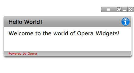
Figure 4: The initial state of the widget when moused over.
Adding behavior to the buttons
The next step is to add behavior to the flip button, so that the widget shows its other side when the flip button is clicked or activated. This behavior is controlled by some simple JavaScript, and all you need to do is put it in the right place. Look to the resource zip file you unpacked earlier to find a script folder containing a helloworld.js file. Copy this folder into the same directory as your index.html file.
The contents of the file is as follows:
// define a namespace to hold our widget specific functions,
// avoid polluting the global namespace
var helloWorld = helloWorld || {};

// function for flipping between different sides of the widget
helloWorld.flip = function ( e )
{
    var display = document.getElementById('front').style.display;
    if ( display == 'block' || display == '' )
    {
        document.getElementById('front').style.display = "none";
        document.getElementById('config').style.display = "block";
    }
    else
    {
        document.getElementById('config').style.display = "none";
        document.getElementById('front').style.display = "block";
    }
}

// initialize the widget

window.addEventListener( 'load' , function(ev)
{
    // add behavior to the flip button
    document.getElementById('flipbutton').addEventListener('click',function(ev){
        helloWorld.flip();
    }, false);

    // add behavior to the close button
    document.getElementById('closebutton').addEventListener('click',function(ev){
        window.close();
    }, false);

    // add a change handler so that the widget shows whatever we input into the
    // widget front, flip back to the front when done
    document.getElementById('updatebutton').addEventListener('click',function(ev){
        document.getElementById('hellotext').textContent =
            document.getElementById('frontlabel').value;
        helloWorld.flip();
    },false);

    // set the contents of the text field to the initial value
    document.getElementById('frontlabel').setAttribute( 'value',
        document.getElementById('hellotext').textContent );
},false);
In this code, we’ve encapsulated the functions specific to the widget in their own object, or namespace. This way the functions are not overriden if they have already been defined. We recommend you stay away from the global namespace as much as possible. The second half of the code is a function that runs when the widget is loaded and sets up the behavior of the buttons and the text field.
Now try running the widget and clicking the configuration button. The widget is flipped so that the reverse side of the widget is visable. This reverse side shows a text input field, which you use to alter the text on the main view of the widget, as shown in Figure 5.

Figure 5: The widget configuration view.
Distributing your widget
At this point in the article, your widget should be complete. The final step you’ll want to take is to package it up, and make it available for others to download and use. There are instructions available on how to deploy your own widgets here.
Summary
Congratulations! You have now finished your first Opera Widget. Now you can move on to personalize this widget, or create and deploy your own widgets on widgets.opera.com.
If you would like to examine a complete copy of the widget created in this article, you can view the source code in the /docs/examples/firstwidget directory in the SDK package, or download the Hello World!. Click the Launch-button on the download page to run the widget. If you want to save the widget zip-file on your hard drive, right click on the Launch-button and select Save Link As….
This article is licensed under a Creative Commons Attribution-Noncommercial-Share Alike 3.0 Unported license.
Comments
The forum archive of this article is still available on My Opera.
No new comments accepted.