Components
NativeBase is made from effective building blocks referred to as components. The Components are constructed in pure React Native platform along with some JavaScript functionality with rich set of customisable properties. These components allow you to quickly build the perfect interface.
NativeBase includes components such as anatomy of your app screens, header, textbox, buttons, badge, icon, inputgroup, form, checkbox, radio-button, list, card, thumbnail, progress bar, spinner, layout, search bar etc.
- Anatomy
- ActionSheet
- Badge
- Button
- Card
- Check Box
- Deck Swiper
- FABs
- Muliple Fabs
- Footer Tabs
- Form
- Header
- Icon
- Layout
- List
- Picker
- Segment
- Radio Button
- Search Bar
- Spinner
- Tabs
- Advanced Tabs
- Thumbnail
- Toast
- Typography
- Drawer
- Ref
1. anatomy-headref
2. Anatomy
Automatically animates views to their new positions.
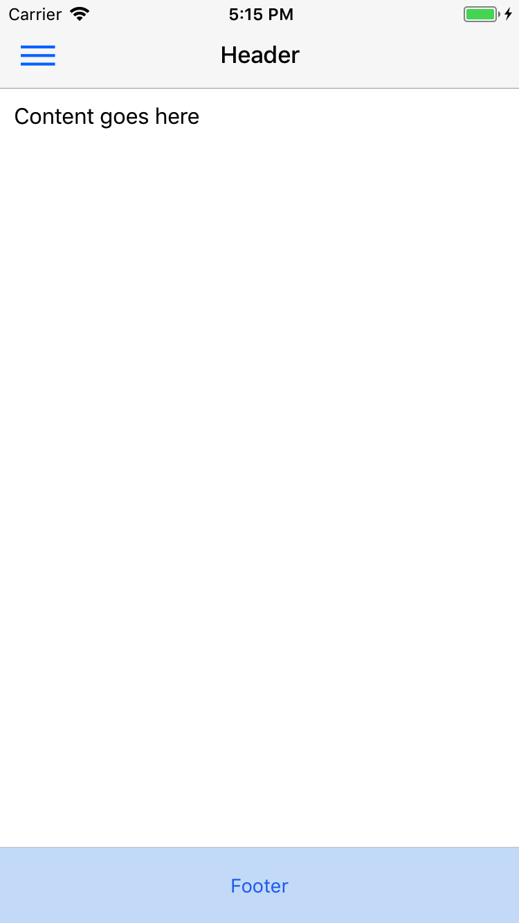
A common way to use NativeBase screen structure is to have all the components within <Container>

General Syntax
import React, { Component } from 'react';
import { Container, Header, Title, Content, Footer, FooterTab, Button, Left, Right, Body, Icon } from 'native-base';
export default class AnatomyExample extends Component {
render() {
return (
<Container>
<Header>
<Left>
<Button transparent>
<Icon name='menu' />
</Button>
</Left>
<Body>
<Title>Header</Title>
</Body>
<Right />
</Header>
<Content>
// Your main content goes here
</Content>
<Footer>
<FooterTab>
<Button full>
<Text>Footer</Text>
</Button>
</FooterTab>
</Footer>
</Container>
);
}
}- NativeBase provides its own frame component, named after
<Container>. - All the components should be included within the Container.
- Container takes mainly three components:
<Header>,<Content>and<Footer>. - Container comes with its predefined stylesheet, with an added advantage of accepting user-defined styles.
- Usage of Container's
Headercomponent is very similar to your HTML <head>. So is withFooter. - The
Contentcomponent of Container is nothing but the body section of your screen.
Configuration
| Property | Default | Option | Description |
|---|---|---|---|
| Header | - | - | Renders as Header (navbar) of your screen. Input values: Button, Title (Text). |
| Content | - | - | Represents the main content of your screen. There can be only one <Content> component in a screen.
|
| Footer | - | - | Renders as Footer of your screen. Input values: FooterTab |
3. Header Anatomy
import React, { Component } from 'react';
import { Container, Header, Title, Button, Left, Right, Body, Icon } from 'native-base';
export default class HeaderExample extends Component {
render() {
return (
<Container>
<Header>
<Left>
<Button transparent>
<Icon name='menu' />
</Button>
</Left>
<Body>
<Title>Header</Title>
</Body>
<Right />
</Header>
</Container>
);
}
}4. Content Anatomy
- This is a NativeBase component which renders as body element of your screen.
- Each screen can have only one
Contentcomponent and can be defined anywhere within the Container. - Content takes in the whole collection of React Native and NativeBase components.
- Content provides you with stylesheet.
- User can add custom styles while defining
Contentwithin their app. - Replacing Component: ScrollView of react-native.
import React, { Component } from 'react';
import { Container, Content } from 'native-base';
export default class ContentExample extends Component {
    render() {
        return (
            <Container>
                <Content>
                    // Your main content goes here
                </Content>
            </Container>
        );
    }
}| Property | Default | Option | Description |
|---|---|---|---|
| padder | true | true, false | Applies margin at all sides to Content section. Can be used with NativeBase View as well. |
| disableKBDismissScroll | false | true, false | Disables automatic scroll on focus. |
5. Footer Anatomy
- NativeBase component that renders as footer that includes your favourite apps for your screen.
- There can be only a single Footer component into your Container.
- To have Footer for your screen, include
Footercomponent withinContainer. - NativeBase gives you flexibility to define your Footer component anywhere in the bounds of Container.
- Footer takes input as: Left, Body, Right and FooterTab as well.
- The components those are defined within
Footerwill be rendered in the same order that you define them. - Footer provides you with stylesheet.
- User can add custom styles while defining
Footerwithin their app. - Replacing Component: React Native
View.
import React, { Component } from 'react';
import { Container, Footer, Left, Body, Right, Button, Icon, Title } from 'native-base';
export default class FooterExample extends Component {
render() {
return (
<Container>
<Footer>
<FooterTab>
<Button full>
<Text>Footer</Text>
</Button>
</FooterTab>
</Footer>
</Container>
);
}
}6. ActionSheet
NativeBase ActionSheet is a wrapper around the react-native ActionSheetIOS component.


General Syntax
import React, { Component } from 'react';
import { Container, Content, ActionSheet, Button, Text, Header, Left, Right, Body, Title } from 'native-base';
var BUTTONS = [
'Option 0',
'Option 1',
'Option 2',
'Delete',
'Cancel',
];
var DESTRUCTIVE_INDEX = 3;
var CANCEL_INDEX = 4;
export default class ActionSheet extends Component {
constructor(props) {
super(props);
this.state = {}
}
render() {
return (
<Container>
<Header>
<Left>
<Button transparent>
<Icon name="heart" size={20} color='red' />
</Button>
</Left>
<Body>
<Title>Hello</Title>
</Body>
<Right />
</Header>
<Content padder>
<Button onPress={()=> ActionSheet.show(
{
options: BUTTONS,
cancelButtonIndex: CANCEL_INDEX,
destructiveButtonIndex: DESTRUCTIVE_INDEX,
title: 'Testing ActionSheet'
},
(buttonIndex) => {
this.setState({ clicked: BUTTONS[buttonIndex] });
}
)}><Text>Actionsheet</Text></Button>
</Content>
</Container>
);
}
}Note: The use cases similar to RN's ActionSheetIOS.
7. Badge
Syntax
import React, { Component } from 'react';
import { Container, Content, Badge, Text } from 'native-base';
export default class BadgeExample extends Component {
    render() {
        return (
            <Container>
                <Content>
                    <Badge>
                        <Text>2</Text>
                    </Badge>
                    <Badge primary>
                        <Text>2</Text>
                    </Badge>
                    <Badge success>
                        <Text>2</Text>
                    </Badge>
                    <Badge info>
                        <Text>2</Text>
                    </Badge>
                    <Badge warning>
                        <Text>2</Text>
                    </Badge>
                    <Badge danger>
                        <Text>2</Text>
                    </Badge>
                    <Badge primary>
                      <Icon name="star" />
                  </Badge>
                    <Badge
                      style={{ backgroundColor: 'black' }}>
                        <Text style={{ color: 'white' }}>1866</Text>
                    </Badge>
                </Content>
            </Container>
        );
    }
}- NativeBase spectrum of colors are compatible with Badge.
Replacing Component: React Native
<View>Configuration
Property Default Option Description primary - true,false Add a blue background color to your component success - true,false Add a green background color to your component info - true,false Add a light blue background color to your component as shown warning - true,false Add a yellow warning background color to your component danger - true,false Add a red background color to your component
8. button-def-headref
9. Button
Button is a pure NativeBase component.
Buttons are the integral part of an application. They are used for various purposes like, submit or reset a form, navigate, performing interactive actions such as showing or hiding something in an app on click of the button, etc.
Contents:
- Button Theme
- Block Button
- Full Button
- Rounded Button
- Icon Button
- Outline Button
- Transparent Button
- Button Size
- Disabled Button
Syntax
import React, { Component } from 'react';
import { Container, Content, Button } from 'native-base';
export default class ButtonExample extends Component {
    render() {
        return (
            <Container>
                <Content>
                    // NativeBase default style
                    <Button>
                        <Text>Click Me! </Text>
                    </Button>
                </Content>
            </Container>
        );
    }
}
import React, { Component } from 'react';
import { Container, Content, Button, Text } from 'native-base';
export default class ButtonExample extends Component {
render() {
return (
<Container>
<Content>
// NativeBase default style
<Button>
<Text> Click Me! </Text>
</Button>
</Content>
</Container>
);
}
}- NativeBase provides
Buttoncomponent which is readily not available in React Native. - Supports React Native app on both iOS and Android devices.
- Button component takes input such as: Text, Icon, Text with Icon.
- NativeBase gives you privilege to customize the props of this component.
Example: To have custom style for button, include them instyleprop of button. - Intakes user-defined styles.
- NativeBase has provided its users with enormous list of
propsthat can be used with Button. - Replacing Component: React Native
<TouchableOpacity>
Configuration
| Property | Default | Option | Description |
|---|---|---|---|
| style | - | - | Defines button style |
| active | - | true | Boolean value to describe state of Button |
| block | - | - | Block level button |
| bordered | - | - | Applies outline button style. |
| disabled | true | true false | Disables click option for button |
| large | - | - | For large size button |
| rounded | - | - | Renders button with slightly round shaped edges. |
| small | - | - | For small size button |
| full | - | - | full width button |
| iconRight | - | - | Right Padding for the icon |
| iconLeft | - | - | Left Padding for the icon. |
| primary | - | true,false | Add a blue background color to your component |
| success | - | true,false | Add a green background color to your component |
| light | - | true,false | Add a light white background color to your component. |
| info | - | true,false | Add a light blue background color to your component as shown |
| warning | - | true,false | Add a yellow warning background color to your component |
| danger | - | true,false | Add a red background color to your component |
| dark | - | true,false | Add a black background color to your component |
10. button-theme-headref
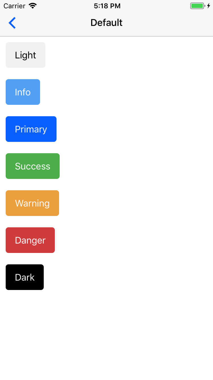
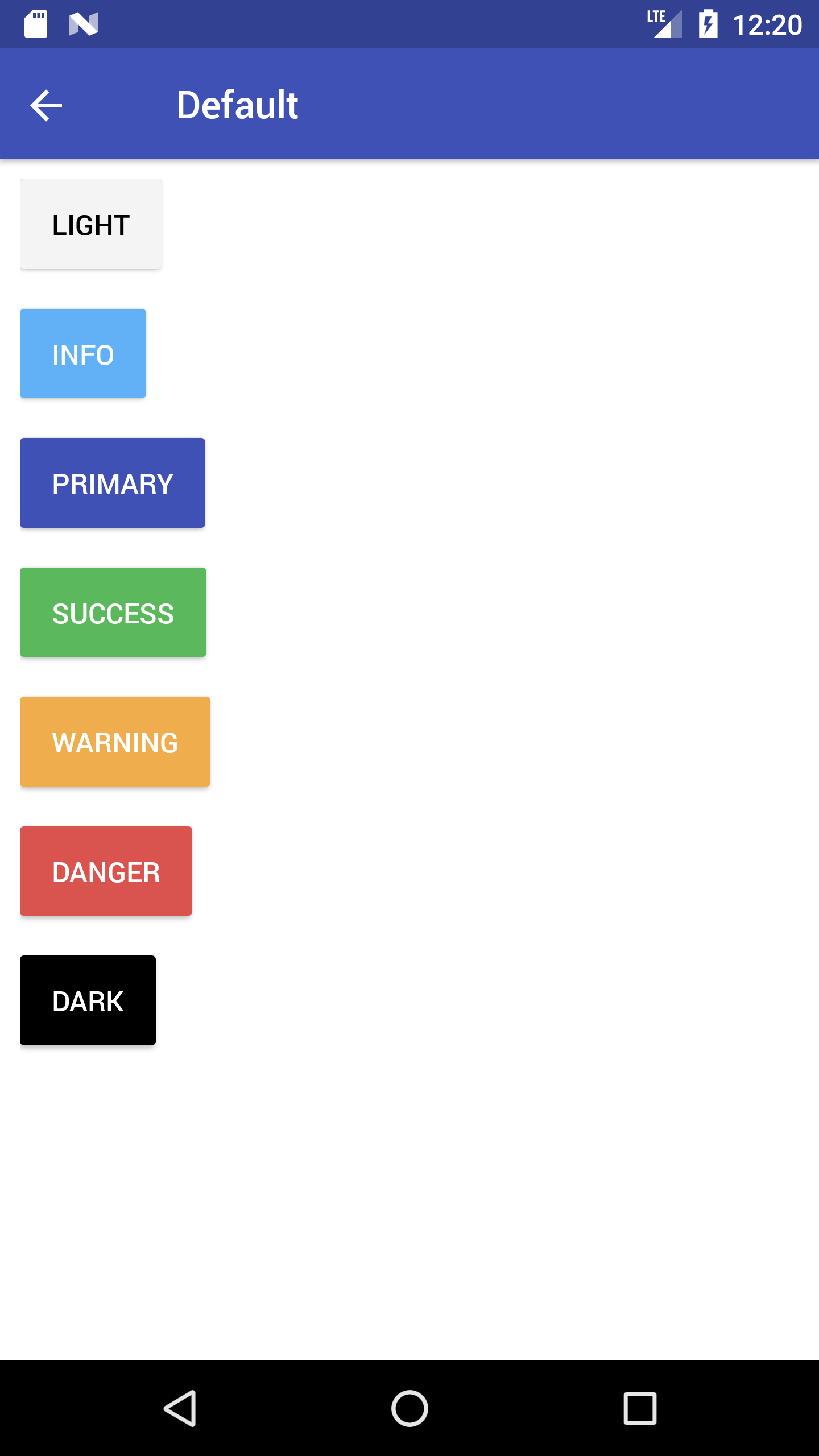
10.0.1. Button Theme
NativeBase provides buttons with wide range of colors, size and variuos other props.
NativeBase provides following color themes:
- Primary (default)
- Success
- Info
- Warning
- Danger
- Dark
Syntax
import React, { Component } from 'react';
import { Container, Content, Button, Text } from 'native-base';
export default class ButtonThemeExample extends Component {
    render() {
        return (
            <Container>
                <Content>
                    <Button light><Text> Light </Text></Button>
                    <Button primary><Text> Primary </Text></Button>
                    <Button success><Text> Success </Text></Button>
                    <Button info><Text> Info </Text></Button>
                    <Button warning><Text> Warning </Text></Button>
                    <Button danger><Text> Danger </Text></Button>
                    <Button dark><Text> Dark </Text></Button>
                </Content>
            </Container>
        );
    }
}
11. button-block-headref
11.0.1. Block Button
A block level button spans the entire width of the parent element.
Create block level buttons by adding block prop with the Button


Syntax
import React, { Component } from 'react';
import { Container, Content, Button, Text } from 'native-base';
export default class BlockButtonExample extends Component {
    render() {
        return (
            <Container>
                <Content>
                    <Button light block>
                        <Text>Light</Text>
                    </Button>
                    <Button block>
                        <Text>Primary</Text>
                    </Button>
                    <Button block success>
                        <Text>Success</Text>
                    </Button>
                    <Button block info>
                        <Text>Info</Text>
                    </Button>
                    <Button block warning>
                        <Text>Warning</Text>
                    </Button>
                    <Button block danger>
                        <Text>Danger</Text>
                    </Button>
                    <Button dark block>
                        <Text>Dark</Text>
                    </Button>
                </Content>
            </Container>
        );
    }
}
12. button-full-headref
12.0.1. Full Button
Adding full to a button will make the button take 100% of its parent’s width. However, it will also remove the button’s left and right borders. This style is useful when the button should stretch across the entire width of the display.


Syntax
import React, { Component } from 'react';
import { Container, Content, Button, Text } from 'native-base';
export default class FullButtonExample extends Component {
    render() {
        return (
            <Container>
                <Content>
                <Button light full>
                    <Text>Light</Text>
                </Button>
                <Button full>
                    <Text>Primary</Text>
                </Button>
                <Button full success>
                    <Text>Success</Text>
                </Button>
                <Button full info>
                    <Text>Info</Text>
                </Button>
                <Button full warning>
                    <Text>Warning</Text>
                </Button>
                <Button full danger>
                    <Text>Danger</Text>
                </Button>
                <Button dark full>
                    <Text>Dark</Text>
                </Button>
                </Content>
            </Container>
        );
    }
}
13. button-rounded-headref
13.0.1. Rounded Button
Include rounded prop with Button to easily style your buttons.


Syntax
import React, { Component } from 'react';
import { Container, Content, Button, Text } from 'native-base';
export default class RoundedButtonExample extends Component {
    render() {
        return (
            <Container>
                <Content>
                    <Button light rounded>
                        <Text>Light</Text>
                    </Button>
                    <Button rounded>
                        <Text>Primary</Text>
                    </Button>
                    <Button rounded success>
                        <Text>Success</Text>
                    </Button>
                    <Button rounded info>
                        <Text>Info</Text>
                    </Button>
                    <Button rounded warning>
                        <Text>Warning</Text>
                    </Button>
                    <Button rounded danger>
                        <Text>Danger</Text>
                    </Button>
                    <Button dark rounded>
                        <Text>Dark</Text>
                    </Button>
                </Content>
            </Container>
        );
    }
}
14. button-icon-headref
14.0.1. Icon Button
The Icon Buttons, can take text and/or icon as child elements inside the Button.
This goes as simple as this: include your choice of icon using Icon component within the Button component.


Syntax
import React, { Component } from 'react';
import { Container, Content, Button, Icon, Text } from 'native-base';
export default class IconButtonExample extends Component {
    render() {
        return (
          <Container>
              <Content>
                  <Button iconLeft light>
                      <Icon name='arrow-back' />
                      <Text>Back</Text>
                  </Button>
                  <Button iconRight light>
                      <Text>Next</Text>
                      <Icon name='arrow-forward' />
                  </Button>
                  <Button iconLeft>
                      <Icon name='home' />
                      <Text>Home</Text>
                  </Button>
                  <Button transparent primary iconLeft>
                      <Icon name='beer' />
                      <Text>Pub</Text>
                  </Button>
                  <Button dark iconLeft>
                      <Icon name='cog' />
                      <Text>Settings</Text>
                  </Button>
              </Content>
          </Container>
      );
  }
}
15. button-outline-headref
15.0.1. Outline Button
Include bordered prop with Button to apply outline button style.


Syntax
import React, { Component } from 'react';
import { Container, Content, Button, Text } from 'native-base';
export default class OutlineButtonExample extends Component {
    render() {
        return (
          <Container>
             <Content>
                 <Button outline light bordered>
                     <Text>Light</Text>
                 </Button>
                 <Button bordered>
                     <Text>Primary</Text>
                 </Button>
                 <Button bordered success>
                     <Text>Success</Text>
                 </Button>
                 <Button bordered info>
                     <Text>Info</Text>
                 </Button>
                 <Button bordered warning>
                     <Text>Warning</Text>
                 </Button>
                 <Button bordered danger>
                     <Text>Danger</Text>
                 </Button>
                 <Button dark bordered danger>
                     <Text>Dark</Text>
                 </Button>
             </Content>
         </Container>
        );
    }
}
16. button-transparent-headref
16.0.1. Transparent Button
Include transparent prop with Button. This will render button without border and background color.

 Syntax
import React, { Component } from 'react';
import { Container, Content, Button, Text } from 'native-base';
export default class TransparentButtonExample extends Component {
    render() {
        return (
            <Container>
                <Content>
                <Button light transparent>
                    <Text>Light</Text>
                </Button>
                <Button transparent>
                    <Text>Primary</Text>
                </Button>
                <Button transparent success>
                    <Text>Success</Text>
                </Button>
                <Button transparent info>
                    <Text>Info</Text>
                </Button>
                <Button transparent warning>
                    <Text>Warning</Text>
                </Button>
                <Button transparent danger>
                    <Text>Danger</Text>
                </Button>
                <Button dark transparent>
                    <Text>Dark</Text>
                </Button>
                </Content>
            </Container>
        );
    }
}
17. button-size-headref
17.0.1. Button Size
Want to have buttons of fancy size?
Include the following props with your Button.
small: for small size button.large: for large size button.


Syntax
import React, { Component } from 'react';
import { Container, Content, Button, Text } from 'native-base';
export default class ButtonSizeExample extends Component {
    render() {
        return (
            <Container>
                <Content>
                    //Small size button
                    <Button small primary>
                        <Text>Default Small</Text>
                    </Button>
                    //Regular size button
                    <Button success>
                        <Text>Success Default</Text>
                    </Button>
                    //Large size button
                    <Button large info>
                        <Text>Dark Large</Text>
                    </Button>
                </Content>
            </Container>
        );
    }
}
18. button-disabled-headref
18.0.1. Disabled Button
A disabled button is unusable and un-clickable.
The disabled prop of NativeBase Button is of type boolean. When present, it specifies that the button should be disabled. The disabled prop can be set to keep a user from clicking on the button until some other condition has been met (like selecting a checkbox, etc.). Then, a conditional code could remove the disabled value, and make the button usable.

 Syntax
import React, { Component } from 'react';
import { Container, Content, Button, Text } from 'native-base';
export default class DisabledButtonExample extends Component {
    render() {
        return (
          <Container>
              <Content>
              <Button disabled><Text>Solid</Text></Button>
              <Button bordered disabled><Text>Bordered</Text></Button>
              <Button rounded disabled><Text>rounded</Text></Button>
              <Button large disabled><Text>Custom</Text></Button>
              <Button disabled iconRight>
                  <Text>Icon Button</Text>
                  <Icon name="home" />
              </Button>
              <Button block disabled style={styles.mb15}><Text>Block</Text></Button>
              <Button full disabled style={styles.mb15}><Text>Block</Text></Button>
              </Content>
          </Container>
        );
    }
}
19. card-def-headref
Card
Card is a pure NativeBase component.
Card is a flexible and extensible content container. It includes options for headers and footers, a wide variety of content, contextual background colors, and powerful display options.
NativeBase Cards support a wide variety of content, including images, text, list groups, links, and more. Mix and match multiple content types to create the card you need.


Contents:
Genertal Syntax
import React, { Component } from 'react';
import { Container, Content, Card, CardItem, Text, Body } from 'native-base';
export default class CardExample extends Component {
    render() {
        return (
            <Container>
                <Content>
                    <Card>
                        <CardItem>
                          <Body>
                            <Text>
                                //Your text here
                            </Text>
                          </Body>
                        </CardItem>
                    </Card>
                </Content>
            </Container>
        );
    }
}Card: This component adds a box-shadow by default. Also provides default spacing and alignment between cards.CardItem: This is the child component ofCard. Works very similar to the list items of list. Card takes any number of CardItem.- CardItem component takes input such as: Text, Button, Image, Thumbnail, Icon.
- Replacing Component for Card: React Native
<View> - Replacing Component for CardItem: React Native
<TouchableOpacity>
Configuration
| Property | Default | Option | Description |
|---|---|---|---|
| button | - | - | To navigate on click of a card item. |
| cardBody | - | - | Defines section for body of card. The child components are rendered with proper spacing and alignment. |
| footer | - | - | Displays text as footer for cards |
| header | - | - | Displays text as header for cards |
| transparent | - | - | Removes card shadow from iOS and elevation from android |
| bordered | false | true false | To add border to the cardItems |
20. card-headfoot-headref
20.0.1. Card Header and Footer
To add an optional header and/or footer within a card, include header prop with the CardItem.
- Card Header: Include
headerprop with first instance of CardItem within Card. - Card Footer: Include
headerprop with last instance of CardItem within Card.


Syntax
import React, { Component } from 'react';
import { Container, Content, Card, CardItem, Text, Body } from 'native-base';
export default class CardHeaderFooterExample extends Component {
    render() {
        return (
            <Container>
                <Content>
                    <Card>
                        <CardItem header>
                            <Text>NativeBase</Text>
                        </CardItem>
                        <CardItem>
                            <Body>
                                <Text>
                                    //Your text here
                                </Text>
                            </Body>
                        </CardItem>
                        <CardItem header>
                            <Text>GeekyAnts</Text>
                        </CardItem>
                   </Card>
                </Content>
            </Container>
        );
    }
}
21. card-list-headref
21.0.1. Card List
Include CardItem subsequently within Card to create a card with lists.


Syntax
import React, { Component } from 'react';
import { Container, Content, Card, CardItem, Text, Icon, Right } from 'native-base';
export default class CardListExample extends Component {
    render() {
        return (
            <Container>
                <Content>
                    <Card>
                    <CardItem>
                       <Icon active name="logo-googleplus" />
                       <Text>Google Plus</Text>
                       <Right>
                          <Icon name="arrow-forward" />
                       </Right>
                     </CardItem>
                   </Card>
                </Content>
            </Container>
        );
    }
}
22. card-image-headref
22.0.1. Card Image
Want to have something more with Card Lists?
Include image with CardItem within Card along with some text before and after image to create a card with lists.
Here is your Card Image ready !


Syntax
import React, { Component } from 'react';
import { Image } from 'react-native';
import { Container, Content, Card, CardItem, Thumbnail, Text, Button, Icon, Left, Body } from 'native-base';
export default class CardImageExample extends Component {
    render() {
        return (
            <Container>
                <Content>
                    <Card >
                        <CardItem>
                            <Left>
                                <Thumbnail source={logo} />
                                <Body>
                                    <Text>NativeBase</Text>
                                    <Text note>GeekyAnts</Text>
                                </Body>
                            </Left>
                          </CardItem>
                          <CardItem cardBody>
                              <Image/>
                          </CardItem>
                          <CardItem>
                              <Button transparent>
                                  <Icon active name="thumbs-up" />
                                  <Text>12 Likes</Text>
                              </Button>
                              <Button transparent>
                                  <Icon active name="chatbubbles" />
                                  <Text>4 Comments</Text>
                              </Button>
                              <Text>11h ago</Text>
                        </CardItem>
                   </Card>
                </Content>
            </Container>
        );
    }
}
23. card-showcase-headref
23.0.1. Card Showcase
Card Showcase is further customization of Card Image. It uses several different items.
- Begins with the Card List component, which is similar to out List Avatar.
- Make use of Left, Body and Right components to align the content of your Card header.
- To mixup Image with other NativeBase components in a single CardItem, include the content within Body component.


Syntax
import React, { Component } from 'react';
import { Image } from 'react-native';
import { Container, Content, Card, CardItem, Thumbnail, Text, Button, Icon, Left, Body } from 'native-base';
export default class CardShowcaseExample extends Component {
    render() {
        return (
            <Container>
                <Content>
                    <Card style={{ flex: 0 }}>
                        <CardItem>
                            <Left>
                                <Thumbnail source={require('./img/NB-logo.png')} />
                                <Body>
                                    <Text>NativeBase</Text>
                                    <Text note>April 15, 2016</Text>
                                </Body>
                            </Left>
                        </CardItem>
                        <CardItem>
                            <Body>
                                <Image style={{ resizeMode: 'cover' }} source={require('./img/card-showcase.png')} />
                                <Text>
                                    //Your text here
                                </Text>
                                <Button transparent textStyle={{color: '#87838B'}}>
                                    <Icon name="logo-github" />
                                    <Text>1,926 stars</Text>
                                </Button>
                            </Body>
                        </CardItem>
                   </Card>
                </Content>
            </Container>
        );
    }
}
24. checkbox-headref
Check Box
Check Box allows the user to select a number of items from a set of choices.
Replacing Component: React Native <TouchableOpacity>


Syntax
import React, { Component } from 'react';
import { Container, Content, ListItem, Text, CheckBox } from 'native-base';
export default class CheckBoxExample extends Component {
    render() {
        return (
            <Container>
                <Content>
                    <ListItem>
                        <CheckBox checked={true} />
                        <Text>Daily Stand Up</Text>
                    </ListItem>
                    <ListItem>
                        <CheckBox checked={false} />
                        <Text>Discussion with Client</Text>
                    </ListItem>
                </Content>
            </Container>
        );
    }
}
Configuration
| Property | Default | Option | Description |
|---|---|---|---|
| checked | false |
true false |
Represents the state value of an item from set of choices. |
25. deckswiper-headref
Deck Swiper
Looking at data one piece at a time is more efficient when you consider people you might want to date, restaurants, streaming music, or local events you might want to check out.
NativeBase Deck Swiper helps you evaluate one option at a time, instead of selecting from a set of options.
Replacing Component: React Native <View>


Syntax
import React, { Component } from 'react';
import { Image } from 'react-native';
import { Container, Icon, View, DeckSwiper, Card, CardItem, Thumbnail, Text, Left, Body } from 'native-base';
const cards = [
    {
        text: 'Card One',
        name: 'One',
        image: require('./img/swiper-1.png'),
    },
    .  .  .
];
export default class DeckSwiperExample extends Component {
  render() {
        return (
            <Container>
                <View>
                    <DeckSwiper
                        dataSource={cards}
                        renderItem={item =>
                            <Card style={{ elevation: 3 }}>
                                <CardItem>
                                    <Left>
                                        <Thumbnail source={item.image} />
                                        <Body>
                                            <Text>{item.text}</Text>
                                            <Text note>NativeBase</Text>
                                        </Body>
                                    </Left>
                                </CardItem>
                                <CardItem cardBody>
                                    <Image style={{ resizeMode: 'cover', width: null }} source={item.image} />
                                </CardItem>
                                <CardItem>
                                    <Icon name="heart" style={{ color: '#ED4A6A' }} />
                                    <Text>{item.name}</Text>
                                </CardItem>
                            </Card>
                        }
                    />
                </View>
            </Container>
        );
    }
}
Configuration
| Property | Default | Option | Description |
|---|---|---|---|
| onSwipeRight | Function | - | Callback that is called when the Card is Swipe Right |
| onSwipeLeft | Function | - | Callback that is called when the Card is Swipe Left |
| looping | true | true, false | Enable or disable looping of DeckSwiper on end reached. |
26. fabs-def-headref
FABs
FABs (Floating Action Buttons) are used for a special type of promoted action. They are distinguished by a circled icon floating above the UI in a fixed position and have special motion behaviors. When clicked, it may contain more related actions.
Replacing Component: React Native <Animated>


Syntax
import React, { Component } from 'react';
import { Container, Content, Button, Icon, Fab } from 'native-base';
export default class FABExample extends Component {
    constructor() {
        this.state = {
            active: 'true'
        };
    }
      render() {
        return (
                      <Container>
                <Content>
                    <Fab
                        active={this.state.active}
                        direction="right"
                        containerStyle={{ marginLeft: 10 }}
                        style={{ backgroundColor: '#5067FF' }}
                        position="topLeft"
                        onPress={() => this.setState({ active: !this.state.active })}>
                        <Icon name="share" />
                        <Button style={{ backgroundColor: '#34A34F' }}>
                            <Icon name="logo-whatsapp" />
                        </Button>
                        <Button style={{ backgroundColor: '#3B5998' }}>
                            <Icon name="logo-facebook" />
                        </Button>
                        <Button disabled style={{ backgroundColor: '#DD5144' }}>
                            <Icon name="mail" />
                        </Button>
                    </Fab>
                </Content>
            </Container>
        );
    }
}
Configuration
| Property | Default | Option | Description |
|---|---|---|---|
| active | - |
true false |
Toggle status of FAB (initial status) |
| direction | up | up, down, left, right | Direction of Buttons that popup on click of FAB. |
| containerStyle | - | user-defined | Padding options to render FAB. |
| style | - | user-defined | User defined styles. |
| position | bottomRight |
topLeft, topRight bottomLeft, bottomRight |
Position of FAB on screen. |
| onPress | - | user-defined | Toggle status of FAB (negated value of initial status) |
27. fabs-multiple-headref
Multiple FABs


Syntax
import React, { Component } from 'react';
import { Container, Content, Button, Icon, Fab, Text, View } from 'native-base';
export default class FABExample extends Component {
constructor() {
this.state = {
active: 'true'
};
}
render() {
return (
<Container>
<View>
<Fab
active={this.state.active}
direction="up"
containerStyle={ marginLeft: 10 }
position="bottomRight"
onPress={() => this.setState({ active: !this.state.active })}>
....
</Fab>
<Fab direction="left" position="topRight">
....
</Fab>
<Fab direction="down" position="topLeft">
....
</Fab>
<Fab direction="right" position="bottomLeft">
....
</Fab>
</View>
</Container>
);
}
}28. footer-tabs-headref
Footer Tabs
Tabs are a horizontal region of buttons or links that allow for a consistent navigation experience between screens. It can contain any combination of text and icons, and is a popular method for enabling mobile navigation.
Replacing Component: React Native <View>
Contents


Syntax
import React, { Component } from 'react';
import { Container, Content, Footer, FooterTab, Button, Icon, Badge, Text } from 'native-base';
export default class FooterTabsExample extends Component {
    render() {
        return (
            <Container>
                <Content />
                <Footer >
                    <FooterTab>
                        <Button>
                            <Text>Apps</Text>
                        </Button>
                        <Button>
                            <Text>Camera</Text>
                        </Button>
                        <Button active>
                            <Text>Navigate</Text>
                        </Button>
                        <Button>
                            <Text>Contact</Text>
                        </Button>
                    </FooterTab>
                </Footer>
            </Container>
        );
    }
}
Configuration
| Property | Default | Option | Description |
|---|---|---|---|
| active | - | true, false | This is Button prop (applicable with FooterTab only). Sets a Footer Button active. |
| badge | - | true, false | This is Button prop (applicable with FooterTab only). Set to true if using Badges. |
| vertical | - | true, false | This is Button prop (applicable with FooterTab only). Use this prop to vertically align footer elements like icons and text. Necessary when using Badge in Footer Tabs. |
29. footer-icon-headref
30. Icon Footer


Syntax
import React, { Component } from 'react';
import { Container, Content, Footer, FooterTab, Button, Icon, Text } from 'native-base';
export default class FooterTabsExample extends Component {
render() {
return (
<Container>
<Content />
<Footer >
<FooterTab>
<Button>
<Icon name="apps" />
</Button>
<Button>
<Icon name="camera" />
</Button>
<Button active>
<Icon active name="navigate" />
</Button>
<Button>
<Icon name="person" />
</Button>
</FooterTab>
</Footer>
</Container>
);
}
}31. footer-text-headref
32. Icon Footer with Text


Syntax
import React, { Component } from 'react';
import { Container, Content, Footer, FooterTab, Button, Icon, Text } from 'native-base';
export default class FooterTabsExample extends Component {
render() {
return (
<Container>
<Content />
<Footer >
<FooterTab>
<Button vertical>
<Icon name="apps" />
<Text>Apps</Text>
</Button>
<Button vertical>
<Icon name="camera" />
<Text>Camera</Text>
</Button>
<Button active vertical>
<Icon active name="navigate" />
<Text>Navigate</Text>
</Button>
<Button vertical>
<Icon name="person" />
<Text>Contact</Text>
</Button>
</FooterTab>
</Footer>
</Container>
);
}
}33. footer-badge-headref
34. Footer with badge


Syntax
import React, { Component } from 'react';
import { Container, Content, Footer, FooterTab, Button, Icon, Text } from 'native-base';
export default class FooterTabsExample extends Component {
render() {
return (
<Container>
<Content />
<Footer >
<FooterTab>
<Button badge vertical>
<Badge><Text>2</Text></Badge>
<Icon name="apps" />
<Text>Apps</Text>
</Button>
<Button>
<Icon name="camera" />
<Text>Camera</Text>
</Button>
<Button active badge vertical>
<Badge ><Text>51</Text></Badge>
<Icon active name="navigate" />
<Text>Navigate</Text>
</Button>
<Button>
<Icon name="person" />
<Text>Contact</Text>
</Button>
</FooterTab>
</Footer>
</Container>
);
}
}Form
NativeBase makes use of List to design Forms that include group of related input components. Include any combination of NativeBase components to make up your form.
Input is a NativeBase component built on top of React Native's
Note: Form in native base is just a wrapper around the inputs and hence has no onSubmit function.
Contents:
- Fixed Label
- Inline Label
- Floating Label
- Stacked Label
- Regular Textbox
- Underlined Textbox
- Rounded Textbox
- Icon Textbox
- Success Input Textbox
- Error Input Textbox
- Disabled Textbox


Syntax
import React, { Component } from 'react';
import { Container, Content, Form, Item, Input } from 'native-base';
export default class FormExample extends Component {
    render() {
        return (
            <Container>
                <Content>
                    <Form>
                        <Item>
                            <Input placeholder="Username" />
                        </Item>
                        <Item last>
                            <Input placeholder="Password" />
                        </Item>
                    </Form>
                </Content>
            </Container>
        );
    }
}
Configuration
| Property | Default | Option | Description |
|---|---|---|---|
| fixedLabel | - | - | Label is Fixed to the left of the Input and does not hide when text is entered. |
| floatingLabel | - | - | Label that animates upwards when the input is selected and animates downward when input is erased. |
| inlineLabel | - | - | Label placed to the left of the input element. When the user enters text, the label does not hide. This can also be used along with placeholder. |
| stackedLabel | - | - | Places the label on top of the input element which appears like a stack. This can also be used along with placeholder. |
| bordered | - | - | Includes border with the textbox. |
| rounded | - | - | Includes rounded border with the textbox. |
| underline | true | - | Includes and underline border with the textbox. |
| disabled | - | - | Disables inputting data. |
| error | - | - | The border color of textbox for invalid input. |
| placeholder | - | - | The string that will be rendered before text input has been entered. Optional user-defined placeholder for textbox. |
| secureTextEntry | false | true false | If true, the text input obscures the text entered so that sensitive text like passwords stay secure. This prop can be passed to Input. |
| success | - | - | The border color of textbox for valid input. |
| last | - | - | Style the Form Item for the last Item of the Form. |
35. fixed-label-headref
35.0.1. Fixed Label
The fixedLabel property creates a Input component, whose Label is fixed at the left of the Input, which does not hide when text is entered. The input aligns on the same position, regardless of the length of the label. It can be used with placeholder as well.


Syntax
import React, { Component } from 'react';
import { Container, Content, Form, Item, Input,Label} from 'native-base';
export default class FormExample extends Component {
    render() {
        return (
            <Container>
                    <Content>
                        <Form>
                            <Item fixedLabel>
                                <Label>Username</Label>
                                <Input />
                            </Item>
                            <Item fixedLabel last>
                                <Label>Password</Label>
                                <Input />
                            </Item>
                        </Form>
                    </Content>
                </Container>
        );
    }
}
36. inline-label-headref
36.0.1. Inline Label
The inlineLabel property creates a Input component, whose Label is in-line with Input, which does not hide when text is entered. It can be used with placeholder as well.


Syntax
import React, { Component } from 'react';
import { Container, Content, Form, Item, Input,Label} from 'native-base';
export default class FormExample extends Component {
    render() {
        return (
            <Container>
                    <Content>
                        <Form>
                            <Item inlineLabel>
                                <Label>Username</Label>
                                <Input />
                            </Item>
                            <Item inlineLabel last>
                                <Label>Password</Label>
                                <Input />
                            </Item>
                        </Form>
                    </Content>
                </Container>
        );
    }
}
37. floating-label-headref
37.0.1. Floating Label
The inlineLabel property creates a Input component, whose Label is in-line with Input, which does not hide when text is entered. It can be used with placeholder as well.


Syntax
import React, { Component } from 'react';
import { Container, Content, Form, Item, Input,Label} from 'native-base';
export default class FormExample extends Component {
    render() {
        return (
            <Container>
                    <Content>
                        <Form>
                            <Item floatingLabel>
                                <Label>Username</Label>
                                <Input />
                            </Item>
                            <Item floatingLabel last>
                                <Label>Password</Label>
                                <Input />
                            </Item>
                        </Form>
                    </Content>
                </Container>
        );
    }
}
38. stacked-label-headref
38.0.1. Stacked Label
The inlineLabel property creates a Input component, whose Label is in-line with Input, which does not hide when text is entered. It can be used with placeholder as well.


Syntax
import React, { Component } from 'react';
import { Container, Content, Form, Item, Input,Label} from 'native-base';
export default class FormExample extends Component {
    render() {
        return (
            <Container>
                    <Content>
                        <Form>
                            <Item stackedLabel>
                                <Label>Username</Label>
                                <Input />
                            </Item>
                            <Item stackedLabel last>
                                <Label>Password</Label>
                                <Input />
                            </Item>
                        </Form>
                    </Content>
                </Container>
        );
    }
}
39. regular-textbox-headref
39.0.1. Regular Textbox
To use the regular textbox which is rectangular in shape, include the borderType property and assign it with value as regular.


Syntax
import React, { Component } from 'react';
import { Container, Content, InputGroup, Input } from 'native-base';
export default class RegularTextboxExample extends Component {
render() {
return (
<Container>
<Content>
// Simple rectangular text input box
<Item regular>
<Input placeholder='Regular Textbox'/>
</Item>
</Content>
</Container>
);
}
}40. underlined-textbox-headref
40.0.1. Underlined Textbox
To use the underlined textbox, include the borderType property and assign it with value as underline.


Syntax
import React, { Component } from 'react';
import { Container, Content, InputGroup, Input, Icon } from 'native-base';
export default class UnderlinedTextboxExample extends Component {
render() {
return (
<Container>
<Content>
// Underlined text input box with placeholder text
<Item underline>
<Input placeholder='Underlined Textbox' />
</Item>
</Content>
</Container>
);
}
}41. rounded-textbox-headref
41.0.1. Rounded Textbox
To have a textbox with round type border, include the borderType property and assign it with value as rounded.


Syntax
import React, { Component } from 'react';
import { Container, Content, InputGroup, Input, Icon } from 'native-base';
export default class RoundedTextboxExample extends Component {
    render() {
        return (
            <Container>
                <Content>
                    // Rounded text input box
                    <Item rounded>
                        <Input placeholder='Rounded Textbox'/>
                    </Item>
                </Content>
            </Container>
        );
    }
}
42. icon-textbox-headref
42.0.1. Icon Textbox
Icons can be easily added to the NativeBase Textbox. To do so, include an icon within the <InputGroup>.
By default the icon will be aligned to the left in the textbox.
However, you can also render icon to the right. To display icon at the end of textbox, include iconRight prop with the <InputGroup>.


Syntax
import React, { Component } from 'react';
import { Container, Content, InputGroup, Input, Icon } from 'native-base';
export default class IconTextboxExample extends Component {
    render() {
        return (
            <Container>
                <Content>
                    // Text input box with icon aligned to the left
                    <Item>
                        <Icon active name='home' />
                        <Input placeholder='Icon Textbox'/>
                    </Item>
                    // Text input box with icon aligned to the right
                    <Item>
                        <Input placeholder='Icon Alignment in Textbox'/>
                        <Icon active name='swap' />
                    </Item>
                </Content>
            </Container>
        );
    }
}
43. success-textbox-headref
43.0.1. Success Input Textbox
To display textbox with valid data, include the success prop with <InputGroup>.


Syntax
import React, { Component } from 'react';
import { Container, Content, InputGroup, Input, Icon } from 'native-base';
export default class SuccessInputTextboxExample extends Component {
    render() {
        return (
            <Container>
                <Content>
                    <Item success>
                        <Input placeholder='Textbox with Success Input'/>
                        <Icon name='checkmark-circle' />
                    </Item>
                </Content>
            </Container>
        );
    }
}
44. error-textbox-headref
44.0.1. Error Input Textbox
To display textbox with invalid data, include the error prop with <InputGroup>.


Syntax
import React, { Component } from 'react';
import { Container, Content, InputGroup, Input, Icon } from 'native-base';
export default class ErrorInputTextboxExample extends Component {
    render() {
        return (
            <Container>
                <Content>
                    <Item error>
                        <Input placeholder='Textbox with Error Input'/>
                        <Icon name='close-circle' />
                    </Item>
                </Content>
            </Container>
        );
    }
}
45. disabled-textbox-headref
45.0.1. Disabled Textbox
To restrict inputting data into textbox, include the disabled prop with <InputGroup>.


Syntax
import React, { Component } from 'react';
import { Container, Content, InputGroup, Input, Icon } from 'native-base';
export default class DisabledTextboxExample extends Component {
    render() {
        return (
            <Container>
                <Content>
                    <Item disabled>
                        <Input disabled placeholder='Disabled Textbox'/>
                        <Icon name='information-circle' />
                    </Item>
                </Content>
            </Container>
        );
    }
}
46. header-def-headref
Header
- NativeBase component that renders as Header (navbar) for your screen.
- There can be a single Header component into your Container.
- To have Header for your screen, include
<Header>component within<Container>. - Header takes input as: Button and Title (Text)
- The components those are defined within
<Header>will be rendered in the same order that you define them. - Header provides you with stylesheet.
- User can add custom styles while defining
<Header>within their app. - Replacing Component:
React Native
<View>


Syntax
import React, { Component } from 'react';
import { Container, Content, ListItem, Text, CheckBox, Header } from 'native-base';
export default class CheckBoxExample extends Component {
    render() {
        return (
            <Container>
                <Header>
                    <Left>
                        <Button transparent>
                            <Icon name='arrow-back' />
                        </Button>
                    </Left>
                    <Body>
                        <Title>Header</Title>
                    </Body>
                    <Right>
                        <Button transparent>
                            <Icon name='menu' />
                        </Button>
                    </Right>
                </Header>
            </Container>
        );
    }
}
Configuration
| Property | Default | Option | Description |
|---|---|---|---|
| Left | - | - | Components render to the left in Header |
| Body | - | - | Components render at the center of Header |
| Right | - | - | Components render to the right in Header |
| iosBarStyle | - | 'light-content', 'dark-content' or 'default' | Set iOS barStyle |
| androidStatusBarColor | - | - | Set bakground color for status bar in android |
| span | - | true,false | Set header size to half the screen size |
| hasSubtitle | - | true,false | Add subtitle to the Header Component |
| noShadow | - | true,false | Removes shadow from iOS and elevation from android |
| searchBar | - | true,false | Add searchBar to header or not |
| rounded | - | true,false | Make Header searchBar Rounded |
| hasSegment | - | true,false | Add Segments to Header Component |
| hasTabs | - | true,false | Add Tabs to Header Component |
| backgroundColor | - | string | Set background color |
46.0.1. Header with only title
import React, { Component } from 'react';
import { Container, Content, ListItem, Text, CheckBox,Header } from 'native-base';
export default class HeaderTitle extends Component {
    render() {
        return (
            <Container>
                <Header>
                    <Left/>
                    <Body>
                        <Title>Header</Title>
                    </Body>
                    <Right />
                </Header>
            </Container>
        );
    }
}
46.0.2. Header with Icon and Text Buttons
import React, { Component } from 'react';
import { Container, Content, ListItem, Text, CheckBox,Header } from 'native-base';
export default class HeaderIconText extends Component {
    render() {
        return (
            <Container>
            <Header>
                <Left>
                    <Button transparent>
                        <Icon name='arrow-back' />
                    </Button>
                </Left>
                <Body>
                    <Title>Header</Title>
                </Body>
                <Right>
                    <Text>Cancel</Text>
                </Right>
            </Header>
        </Container>
        );
    }
}
46.0.3. Header with title and Subtitle
import React, { Component } from 'react';
import { Container, Content, ListItem, Text, CheckBox, Header } from 'native-base';
export default class HeaderTitle extends Component {
    render() {
        return (
            <Container>
            <Header>
                <Left>
                    <Button transparent>
                        <Icon name='arrow-back' />
                    </Button>
                </Left>
                <Body>
                    <Title>Title</Title>
                    <Subtitle>Subtitle</Subtitle>
                </Body>
                <Right />
            </Header>
        </Container>
        );
    }
}
47. icon-def-headref
Icon
Perfect, crisp, high definition icons and pixel ideal fonts powered by NativeBase to preserve matters very high first-rate. You will continually have pixel perfect icons on your initiatives.
Uses Ionicons from React Native Vector Icons
Syntax
import React, { Component } from 'react';
import { Container, Content, Icon } from 'native-base';
export default class IconExample extends Component {
    render() {
        return (
            <Container>
                <Content>
                    <Icon name='home' />
                    <Icon ios='ios-menu' android="md-menu" style={{fontSize: 20, color: 'red'}}/>
                </Content>
            </Container>
        );
    }
}Iconcan take any two of the following attributes: name, ios, android.- In case if you want to include icon with custom color, size etc then that should go into
style. - All the icons in the icon libraries of NativeBase, are scalable vector icons that can be customized size, color, etc.
Configuration
| Property | Default | Option | Description |
|---|---|---|---|
| name | - | - | Name of the icon. |
| ios | - | - | Name of the icon for IOS devices. |
| android | - | - | Name of the icon for Android devices. |
| active | default | true fasle | Renders filled Icons. Note: By default it renders outline Icons. |
| color | black | user-defined |
Renders icon with defined color. Note: Include this prop within style
|
| fontSize | 27 | user-defined |
Renders icon with defined icon-size. Note: Include this prop within style
|
Layout
The layout system is an essential concept that needs to be mastered in order to create great layouts and UIs. React Native uses Flexbox to create the layouts, which is great when we need to accommodate our components and views in different screen sizes or even different devices. Flexbox is awesome but it could be tiresome for newbies.
Not being very good at Flexbox?
Here comes the Easy Grid of NativeBase, a wrapper of Flexbox.
The layout system in NativeBase is very powerful and flexible. No more worries about props of Flexbox such as alignItems, flexDirection, justifyContent, margin, padding, position, width etc. You can create any layout with all the available options that we have. In order to build custom layouts and components, understanding how layout works in NativeBase is not as hard as Flexbox. Flexbox makes it look like percentages, however what actually is happening is just ratios. On the easier part, ratios are easier to represent than percentage/decimals. For this reason, the Easy Grid takes in ratios in place of percentage.
Performance wise, Easy Grid is noteworthy and works as fine as Flexbox, not much of calculation.


Syntax
import React, { Component } from 'react';
import { Container, Content } from 'native-base';
import { Col, Row, Grid } from 'react-native-easy-grid';
export default class LayoutExample extends Component {
    render() {
        return (
            <Container>
                <Content>
                    <Grid>
                        <Col style={{ backgroundColor: '#D954D7', height: 200 }}></Col>
                        <Col style={{ backgroundColor: '#D93735', height: 200  }}></Col>
                    </Grid>
                </Content>
            </Container>
        );
    }
}
NOTE: <Content> component uses <ScrollView>. This is required by <Col> and <Row> elements of Easy-Grid to have a defined height.
- Replacing Component for Grid: React Native
<View> - Replacing Component for Col: React Native
<View> - Replacing Component for Row: React Native
<View>
48. list-def-headref
List
This component is completely built by NativeBase.
A base component for specifying lists of information. List must contain one or more list elements. Props provide configurability for several features. Provides a number of attributes that follows styling and interaction guidelines for each platform, so that they are intuitive for users to interact with.


Contents:
Syntax
import React, { Component } from 'react';
import { Container, Content, List, ListItem, Text } from 'native-base';
export default class ListExample extends Component {
    render() {
        return (
            <Container>
                <Content>
                    <List>
                        <ListItem >
                            <Text>Simon Mignolet</Text>
                        </ListItem>
                        <ListItem>
                            <Text>Nathaniel Clyne</Text>
                        </ListItem>
                        <ListItem>
                            <Text>Dejan Lovren</Text>
                        </ListItem>
                    </List>
                </Content>
            </Container>
        );
    }
}
List: This component defines a section to include your list items.ListItem:- This is the child component of
List. - Defines a list item.
- Adds border at bottom of each ListItem.
- List takes any number of ListItem.
- This is the child component of
- ListItem component takes input such as: Text, Badge, Thumbnail, Icon.
- Replacing Component for List: React Native
<View> - Replacing Component for ListItem: React Native
<TouchableOpacity>
Configuration
| Property | Default | Option | Description |
|---|---|---|---|
| button | - | - | To navigate on click of a list item. |
| dataArray | Array | user-defined array | Array of data chunks to render iteratively. |
| itemDivider | - | - | Helps to organize and group the list items. |
| itemHeader | - | - | Style the item as the header for the ListItems. |
| first | - | - | Render as the first Item in the List. |
| icon | - | - | To have list styling of icons . |
| avatar | - | - | Style the list to have Avatars. |
| thumbnail | - | - | Style the list to have Thumbnails. |
| renderRow | Function | - | Callback which takes a chunk of data from dataArray and returns as a component. |
49. list-divider-headref
49.0.1. List Divider
The List Divider component creates a list separator, which can be used for grouping list items. To create a divider for any child element of the list, include itemDivider prop with ListItem component.
The List Divider of NativeBase comes with default style which is easily customisable.


Syntax
import React, { Component } from 'react';
import { Container, Content, List, ListItem, Text } from 'native-base';
export default class ListDividerExample extends Component {
    render() {
        return (
            <Container>
                <Content>
                    <List>
                        <ListItem itemDivider>
                            <Text>A</Text>
                        </ListItem>
                        <ListItem >
                            <Text>Aaron Bennet</Text>
                        </ListItem>
                        <ListItem>
                            <Text>Ali Connors</Text>
                        </ListItem>
                        <ListItem itemDivider>
                            <Text>B</Text>
                        </ListItem>
                        <ListItem>
                            <Text>Bradley Horowitz</Text>
                        </ListItem>
                    </List>
                </Content>
            </Container>
        );
    }
}
50. list-header-headref
50.0.1. List Header
The List Header component creates a list header, which can be used for grouping list items. To create a header for any child element of the list, include itemHeader prop with ListItem component. The List Header of NativeBase comes with default style which is easily customisable.


Syntax
import React, { Component } from 'react';
import { Container, Content, ListItem, Text } from 'native-base';
export default class ListHeaderExample extends Component {
render() {
return (
<Container>
<Content>
<ListItem itemHeader first>
<Text>COMEDY</Text>
</ListItem>
<ListItem >
<Text>Hangover</Text>
</ListItem>
<ListItem>
<Text>Horrible Bosses</Text>
</ListItem>
<ListItem last>
<Text>Conjuring</Text>
</ListItem>
<ListItem itemHeader>
<Text>ACTION</Text>
</ListItem>
<ListItem>
<Text>Terminator Genesis</Text>
</ListItem>
</Content>
</Container>
);
}
}51. list-icon-headref
51.0.1. List Icon
Lists can have icons assigned either to the left and/or right side of each list item.
Along with icons, list item can also have badges assigned.
To have note kind of text for list item, include note prop with Text component of ListItem.


Syntax
import React, { Component } from 'react-native';
import { Container, Content, List, ListItem, Text, Icon, Badge, Left, Body, Right, Switch } from 'native-base';
export default class ListIconExample extends Component {
    render() {
        return (
            <Container>
                <Content>
                    <ListItem icon>
                        <Left>
                            <Icon name="plane" />
                        </Left>
                        <Body>
                          <Text>Airplane Mode</Text>
                        </Body>
                        <Right>
                            <Switch value={false} />
                        </Right>
                    </ListItem>
                    <ListItem icon>
                        <Left>
                            <Icon name="wifi" />
                        </Left>
                        <Body>
                          <Text>Wi-Fi</Text>
                        </Body>
                        <Right>
                            <Text>GeekyAnts</Text>
                            <Icon name="arrow-forward" />
                        </Right>
                    </ListItem>
                    <ListItem icon>
                        <Left>
                            <Icon name="bluetooth" />
                        </Left>
                        <Body>
                          <Text>Bluetooth</Text>
                        </Body>
                        <Right>
                            <Text>On</Text>
                            <Icon name="arrow-forward" />
                        </Right>
                    </ListItem>
                </Content>
            </Container>
        );
    }
}
52. list-avatar-headref
52.0.1. List Avatar
List Avatars are medium to showcase an image with your list item whose dimension lays between icon and dimension. To create a avatar list, nest <Thumbnail> component within <ListItem> component.

Syntax
import React, { Component } from 'react-native';
import { Container, Content, List, ListItem, Thumbnail, Text, Body } from 'native-base';
export default class ListAvatarExample extends Component {
    render() {
        return (
            <Container>
                <Content>
                    <ListItem avatar>
                        <Left>
                            <Thumbnail source={require('./img/one.png')} />
                        </Left>
                        <Body>
                            <Text>Kumar Pratik</Text>
                            <Text note>Doing what you like will always keep you happy . .</Text>
                        </Body>
                        <Right>
                            <Text note>3:43 pm</Text>
                        </Right>
                    </ListItem>
                </Content>
            </Container>
        );
    }
}
53. list-thumbnail-headref
53.0.1. List Thumbnail
List Thumbnails are medium to exhibit an image with your list item. To create a thumbnail list, nest <Thumbnail> component within <ListItem> component with few props and style.
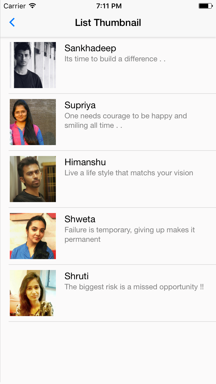
Syntax
import React, { Component } from 'react-native';
import { Container, Content, List, ListItem, Thumbnail, Text, Body } from 'native-base';
export default class ListThumbnailExample extends Component {
    render() {
        return (
            <Container>
                <Content>
                    <List>
                        <ListItem>
                            <Thumbnail square size={80} source={require('./img/one.png')} />
                            <Body>
                                <Text>Sankhadeep</Text>
                                <Text note>Its time to build a difference . .</Text>
                            </Body>
                        </ListItem>
                    </List>
                </Content>
            </Container>
        );
    }
}
54. dynamic-list-headref
54.0.1. Dynamic List
A center aspect designed for efficient representation of vertically scrolling lists of changing data. The simplest way is to create a List dataArray, populate it with an easy array of data chunks, and instantiate a ListItem component with that chunk of data and a renderRow callback which takes a chunk from the whole data array and returns a renderable component.


Syntax
import React, { Component } from 'react';
import { Container, Content, List, ListItem, Text } from 'native-base';
export default class DynamicListExample extends Component {
    render() {
        var items = ['Simon Mignolet','Nathaniel Clyne','Dejan Lovren','Mama Sakho','Emre Can'];
        return (
            <Container>
                <Content>
                    <List dataArray={items}
                        renderRow={(item) =>
                            <ListItem>
                                <Text>{item}</Text>
                            </ListItem>
                        }>
                    </List>
                </Content>
            </Container>
        );
    }
}
For more advanced implementation of rendering list dynamically, take a look at nativebase-tutorial.
55. list-seperator-headref
55.0.1. List Separator
Seperator component is a separator usually used in list, which can be used for grouping list items. To create a seperator between list of items. Though it is used with List, You can use it anywhere in your app.


Syntax
import React, { Component } from 'react';
import { Container, Content, ListItem, Text, Separator } from 'native-base';
export default class SeperatorExample extends Component {
    render() {
        return (
            <Container>
                <Content>
                    <Separator bordered>
                        <Text>FORWARD</Text>
                    </Separator>
                    <ListItem >
                        <Text>Aaron Bennet</Text>
                    </ListItem>
                    <ListItem>
                        <Text>Claire Barclay</Text>
                    </ListItem>
                    <ListItem last>
                        <Text>Kelso Brittany</Text>
                    </ListItem>
                    <Separator bordered>
                        <Text>MIDFIELD</Text>
                    </Separator>
                    <ListItem>
                        <Text>Caroline Aaron</Text>
                    </ListItem>
                </Content>
            </Container>
        );
    }
}
Configuration
| Property | Default | Option | Description |
|---|---|---|---|
| bordered | - | - | adds border to the bottom and top of the separator |
Picker
Renders the native picker component on iOS and Android.
Replacing Component: React Native <Picker>
For Android use this React Native Picker.


Syntax
import React, { Component } from 'react';
import { Container, Content, Picker } from 'native-base';
const Item = Picker.Item;
export default class PickerExample extends Component {
    constructor(props) {
        super(props);
        this.state = {
            selectedItem: undefined,
            selected1: 'key1',
            results: {
                items: []
            }
        }
    }
    onValueChange (value: string) {
        this.setState({
            selected1 : value
        });
    }
    render() {
        return (
            <Container>
                <Content>
                    <Picker
                        supportedOrientations={['portrait','landscape']}
                        iosHeader="Select one"
                        mode="dropdown"
                        selectedValue={this.state.selected1}
                        onValueChange={this.onValueChange.bind(this)}>
                        <Item label="Wallet" value="key0" />
                        <Item label="ATM Card" value="key1" />
                        <Item label="Credit Card" value="key2" />
                        <Item label="Debit Card" value="key3" />
                   </Picker>
                </Content>
            </Container>
        );
    }
}
Configuration
| Property | Default | Option | Description |
|---|---|---|---|
| renderHeader (iOS only) | - | - | Takes component that appears as header of the Picker, comes with a backAction prop to close the picker. Like renderHeader={(backAction) =>{ // BODY } |
| textStyle (iOS only) | - | - | Text style of header. |
| itemStyle (iOS only) | - | - | Style of items in the Picker |
| itemTextStyle (iOS only) | - | - | Text style of item component |
| supportedOrientations | - | Potrait, Landscape, Landscape-left, Landscape-right | Allows the modal to be rotated to any of the specified orientations |
Segment
Segments are best used as an alternative for tabs. Mainly used in iOS.


Syntax(simple)
import React, { Component } from 'react';
import { Container, Content, Segment, Left, Right, Segment, Button, Icon } from 'native-base';
export default class ProgressBarExample extends Component {
render() {
return (
<Container>
<Header>
<Left>
<Button transparent>
<Icon name="arrow-back" />
</Button>
</Left>
<Body>
<Segment>
<Button first><Text>Puppies</Text></Button>
<Button last active><Text>Cubs</Text></Button>
</Segment>
</Body>
<Right>
<Button transparent>
<Icon name="search" />
</Button>
</Right>
</Header>
<Content padder>
<Text>Awesome segment</Text>
</Content>
</Container>
);
}
}Segment takes Button as children. The active Button shoud be given an active prop (implementation is totally up to you). Also the first and last buttons should be given props first and last respectively. Pro tip: It is advisable to use hasSegment prop with Header if you're using Segment below the header.
Syntax(outside header)
import React, { Component } from 'react';
import { Container, Content, Segment, Left, Right, Title, Segment, Button, Icon } from 'native-base';
export default class ProgressBarExample extends Component {
render() {
return (
<Container>
<Header hasTabs>
<Left>
<Button transparent>
<Icon name="arrow-back" />
</Button>
</Left>
<Body>
<Title>Hello</Title>
</Body>
<Right>
<Button transparent>
<Icon name="search" />
</Button>
</Right>
</Header>
<Segment>
<Button first><Text>Puppies</Text></Button>
<Button><Text>Kittens</Text></Button>
<Button last active><Text>Cubs</Text></Button>
</Segment>
<Content padder>
<Text>Awesome segment</Text>
</Content>
</Container>
);
}
}56. radio-button-headref
Radio Button
Radio buttons let the user select any one from a set of options.
Replacing Component: React Native <TouchableOpacity>


Syntax
import React, { Component } from 'react';
import { Container, Content, ListItem, Text, Radio } from 'native-base';
export default class RadioButtonExample extends Component {
    render() {
        return (
            <Container>
                <Content>
                        <ListItem>
                            <Radio selected={false} />
                            <Text>Daily Stand Up</Text>
                        </ListItem>
                        <ListItem>
                            <Radio selected={true} />
                            <Text>Discussion with Client</Text>
                        </ListItem>
                </Content>
            </Container>
        );
    }
}
Configuration
| Property | Default | Option | Description |
|---|---|---|---|
| selected | false |
true false |
Represents the state value of an item from set of choices. |
57. search-bar-headref
Search Bar
It’s kind of common on the Internet where – if we fail to get what we are looking for on a website, we resort to searching. Search box has always been an essential part of any application. We provide you with the one, which filters the list based on your search input.


Syntax
import React, { Component } from 'react';
import { Container, Header, Item, Input, Icon, Button } from 'native-base';
export default class SearchBarExample extends Component {
    render() {
        return (
            <Container>
                <Header searchBar rounded>
                    <Item>
                        <Icon name="ios-search" />
                        <Input placeholder="Search" />
                        <Icon name="ios-people" />
                    </Item>
                    <Button transparent>
                        <Text>Search</Text>
                    </Button>
                </Header>
            </Container>
        );
    }
}searchBar: Prop to be used with<Header>component to have Search bar onto the Header section of your screen.- Replacing Component: React Native
<View>
Configuration
| Property | Default | Option | Description |
|---|---|---|---|
| rounded | regular | - | Wraps the search bar with predefined border options. |
Spinner
If you have certain screens of your app that take some time to load, you may want to consider a page loader. A page loader is any kind of animation that visually communicates to a visitor that the page is loading and to just sit tight for a few seconds. Without a page loader, user might think that the app is being unresponsive and just click away in frustration. A page loader also provides a small distraction which can actually makes the wait seem much shorter.
Replacing Component: React Native <ActivityIndicator>


Syntax
import React, { Component } from 'react';
import { Container, Content, Spinner } from 'native-base';
export default class SpinnerExample extends Component {
    render() {
        return (
            <Container>
                <Content>
                    <Spinner />
                    <Spinner color='red' />
                    <Spinner color='green' />
                    <Spinner color='blue' />
                </Content>
            </Container>
        );
    }
}
Configuration
| Property | Default | Option | Description |
|---|---|---|---|
| color | #45D56E | user-defined | Color of Spinner. |
58. tabs-def-headref
Tabs
Tabs are a horizontal region of buttons or links that allow for a consistent navigation experience between screens. It can contain any combination of text and icons, and is a popular method for enabling mobile navigation.
Replacing Component: react-native-scrollable-tab-view <ScrollableTabView>


Syntax(simple)
import React, { Component } from 'react';
import { Container, Content, Tab, Tabs } from 'native-base';
import Tab1 from './tabOne';
import Tab2 from './tabTwo';
export default class TabsExample extends Component {
render() {
return (
<Container>
<Header hasTabs />
<Tabs>
<Tab heading="Tab1">
<Tab1 />
</Tab>
<Tab heading="Tab2">
<Tab2 />
</Tab>
<Tab heading="Tab3">
<Tab3 />
</Tab>
</Tabs>
</Container>
);
}
}Configuration
| Property | Default | Option | Description |
|---|---|---|---|
| locked | false | true false | Disable swipe |
| initialPage | - | integer | Set default active tab |
| tabBarPosition | top | top, bottom, overlayTop, overlayBottom | Set position of Tabs |
| renderTabBar | - | - | Accept 1 argument props and should return a component to use as the tab bar |
| onChangeTab | - | - | Function to call when tab changes |
| onScroll | - | - | Function to call when the pages are sliding, should accept 1 argument which is an Float number representing the page position in the slide frame |
| children | - | - | Each top-level child component should have a tabLabel prop that can be used by the tab bar component to render out the labels |
| tabBarUnderlineStyle | - | - | Style of the default tab bar's underline |
| tabBarBackgroundColor | white | - | Color of the default tab bar's background |
| tabBarActiveTextColor | navy | - | Color of the default tab bar's text when active |
| tabBarInactiveTextColor | black | - | Color of the default tab bar's text when not active. |
| scrollWithoutAnimation | false | true, false | On tab press change tab without animation. |
| prerenderingSiblingsNumber | 0 | - | pre-render nearby # sibling, Infinity === render all the siblings, default to 0 === render current page |
Known Issues : Custom tabHeading is not yet supported for
ScrollableTab heading only accepts a string. Pro-Tip : It is advisable to use hasTabs prop with Header while using Tabs.
59. advanced-tabs-headref
Advanced Tabs
Syntax(advanced)
import React, { Component } from 'react';
import { Container, Content, Tab, Tabs } from 'native-base';
import Tab1 from './tabOne';
import Tab2 from './tabTwo';
export default class TabsExample extends Component {
render() {
return (
<Container>
<Header hasTabs/>
<Tabs>
<Tab heading={ <TabHeading><Icon name="camera" /><Text>Camera</Text></TabHeading>}>
<Tab1 />
</Tab>
<Tab heading={ <TabHeading><Text>No Icon</Text></TabHeading>}>
<Tab2 />
</Tab>
<Tab heading={ <TabHeading><Icon name="apps" /></TabHeading>}>
<Tab3 />
</Tab>
</Tabs>
</Container>
);
}
}Syntax(scrollable)
import React, { Component } from 'react';
import { Container, Content, Tab, Tabs } from 'native-base';
import Tab1 from './tabOne';
import Tab2 from './tabTwo';
export default class TabsExample extends Component {
render() {
return (
<Container>
<Header hasTabs/>
<Tabs renderTabBar={()=> <ScrollableTab />}>
<Tab heading="Tab1">
<Tab1 />
</Tab>
<Tab heading="Tab2">
<Tab2 />
</Tab>
<Tab heading="Tab3">
<Tab3 />
</Tab>
<Tab heading="Tab4">
<Tab4 />
</Tab>
<Tab heading="Tab5">
<Tab5 />
</Tab>
</Tabs>
</Container>
);
}
}| Property | Default | Option | Description |
|---|---|---|---|
| heading | - | string, |
Label String, or Component |
| tabStyle | - | style object | Style for tabbar |
| activeTabStyle | - | style object | Style for active tabbar |
| textStyle | - | style object | Style for text |
| activeTextStyle | - | style object | Style for active text |
Pro tip: It is advisable to use hasTabs prop with Header while using Tabs.
Thumbnail
Thumbnail component works very similar to Image. It helps you to showcase an image with variuos dimensions and shapes. By default, Thumbnail renders an image in circular shape.
Replacing Component: React Native <Image>


Syntax
import React, { Component } from 'react';
import { Container, Content, Thumbnail, Text } from 'native-base';
export default class ThumbnailExample extends Component {
    render() {
        return (
            <Container>
                <Content>
                    <Text>Square Thumbnail</Text>
                    <Thumbnail square source={require('./img/one.png')} />
                    <Thumbnail square source={require('./img/one.png')} />
                    <Text>Circular Thumbnail</Text>
                    <Thumbnail source={require('./img/two.png')} />
                    <Thumbnail source={require('./img/two.png')} />
                </Content>
            </Container>
        );
    }
}
Configuration
| Property | Default | Option | Description |
|---|---|---|---|
| source | - | - | Image path for thumbnail. |
| square | - | - |
Represents shape of thumbnail. By default thumbnail is circle in shape. |
| small | - | - | Small thumbnail with width and height of 40px. |
| large | - | - | Large thumbnail with width and height of 80px. |
60. Toast
NativeBase Toast can be used to display quick warning or error messages.


Syntax
import React, { Component } from 'react';
import { Container, Content, Toast, Button, Text, Header, Left, Right, Body, Title, Icon } from 'native-base';
export default class Toast extends Component {
  constructor(props) {
  super(props);
  this.state = {
    showToast: false
  }
}
render() {
  return (
      <Container>
        <Header>
          <Left>
            <Button transparent>
              <Icon name="arrow-back" />
            </Button>
          </Left>
          <Body>
            <Title>Hello</Title>
          </Body>
          <Right />
        </Header>
        <Content padder>
          <Button onPress={()=> Toast.show({
              supportedOrientations: ['portrait','landscape'],
              text: 'Wrong password!',
              position: 'bottom',
              buttonText: 'Okay'
            })}>
            <Text>Toast</Text>
          </Button>
        </Content>
      </Container>
  );
}
}
Configuration
| Key | Value | Option | Description |
|---|---|---|---|
| text | - | string | The text content to be shown in the toast. |
| buttonText | - | string | The text to be displayed inside the button. |
| position | bottom | top,bottom,center | Sets position for the toast. |
| type | - | danger,success,warning | Sets context to the Toast. |
| duration | - | integer | Milliseconds after which Toast disappers |
| supportedOrientations | - | Portrait, Landscape, Landscape-left, Landscape-right | Allows the modal to be rotated to any of the specified orientations |
| style | - | - | Attach any style to toast component. |
| buttonTextStyle | - | - | Attach any style to toast Button Text. |
| buttonStyle | - | - | Attach any style to toast Button. |
| textStyle | - | - | Attach any style to toast Text component. |
Note: For Toast to work, it has to be called inside Container.
Typography
NativeBase provides you with the Heading Tags, namely H1, H2 and H3 components. These Heading tags helps you prioritize the content of your screen.
Replacing Component for H1, H2, H3, Text: React Native


Syntax
import React, { Component } from 'react';
import { Container, Content, H1, H2, H3, Text } from 'native-base';
export default class TypographyExample extends Component {
    render() {
        return (
            <Container>
                <Content>
                    <H1>Header One</H1>
                    <H2>Header Two</H2>
                    <H3>Header Three</H3>
                    <Text>Default</Text>
                </Content>
            </Container>
        );
    }
}
Configuration
| Property | Default | Option | Description |
|---|---|---|---|
| H1 | font-size: 27 | user-defined | Heading tag <H1> |
| H2 | font-size: 24 | user-defined | Heading tag <H2> |
| H3 | font-size: 21 | user-defined | Heading tag <H3> |
Drawer
Drawer for both iOS and Android.
Drawer can be the perfect option to provide navigation options.


Syntax
import React, { Component } from 'react';
import { Drawer } from 'native-base';
import SideBar from './yourPathToSideBar';
export default class DrawerExample extends Component {
    render() {
      closeDrawer = () => {
        this.drawer._root.close()
      };
      openDrawer = () => {
        this.drawer._root.open()
      };
        return (
            <Drawer
              ref={(ref) => { this.drawer = ref; }}
              content={<SideBar navigator={this.navigator} />}
              onClose={() => this.closeDrawer()} >
            // Main View
          </Drawer>
        );
    }
}
Note: You need to create your own SideBar component and import it.
61. ref-components-headref
Ref to Components
- NativeBase is built on top of React Native. Hence, the components of NativeBase have respective replacing React Native elements.
- NativeBase has now made it easy for developers, to access the any of its components using ref, along with its associated React Native elements.
- After building your component, you may find yourself wanting to reach out and invoke methods on component instances returned from render().
- This can be achieved from refs. Refs are a great way to send a message to a particular child instance.
- The ref attribute takes a callback function, and the callback will be executed immediately after the component is mounted or unmounted.
Syntax
import React, { Component } from 'react';
import { Container, Content, Button } from 'native-base';
export default class RefExample extends Component {
    render() {
        return (
            <Container>
                <Content>
                    <Button ref={ (c) => this._button = c }>
                        Click Me
                    </Button>
                </Content>
            </Container>
        );
    }
}this._buttongets you the reference of NativeBase Button.this._button._rootgets you the reference of NativeBase Button's replacing React Native element i.e., TouchableOpacity.- This feature is accessible with all of NativeBase components.