Анимации
Кувалдин Артем
Разработчик интерфейсов
Сначала был GIF
JS анимации
var foo = null; // object

function doMove() {
foo.style.left = parseInt(foo.style.left) + 1 + 'px';
setTimeout(doMove, 20); // call doMove in 20msec
}
function init() {
foo = document.getElementById('superman'); // get the "foo" object
foo.style.left = '0px'; // set its initial position to 0px
doMove(); // start animating
}
window.onload = init;
CSS-анимации
Преобразования
На текущий момент нам доступны:
Перемещение
Масштабирование
Вращение
Наклон
Свойство transform
.box {
    transform: тип_трансформации(значение);
}
не влияет на окружение
Бокс 1
Бокс 2
Бокс 3
Бокс 4
Перемещение
.box {
    width: 300px;
    height: 100px;
  /*transform: translate(X    , Y    );*/
    transform: translate(100px, 100px);
}
300x100
translate(300px, 100px)
translate(-300px, -100px)
translate(0, 100px)
translate(300px, 0)
Перемещение в %
.box {
    transform: translate(100%, 100%);
}
200x100
translate(100%, 100%)
translate(-100%, -100%)
translate(0, 100%)
translate(100%, 0)
.box-blue {
    transform: translateX(100%);
}
.box-red {
    transform: translateY(100%);
}
200x100
translateX(100%)
translateY(100%)
Масштабирование
.blue {
    /*Размер элемента = 150%*/
    transform: scale(1.5);
}
.red {
    /*Размер элемента = 50%*/
    transform: scale(0.5);
}
scale(1)
scale(1.5)
scale(.5)
Масштабирование
.blue {
    /*         scale(X, Y  )*/
    transform: scale(1, 1.5);
}
.green {
    /*Размер элемента по оси X = 50%*/
    transform: scaleX(0.5);
}
.red {
    /*Размер элемента по оси Y = 50%*/
    transform: scaleY(0.5);
}
scale(1, 1)
scale(1, 1.5)
scaleX(.5)
scaleY(.5)
Отрицательные значения
.blue {
    transform: scale(1, -1);
}
.green {
    transform: scale(-1, 1);
}
.red {
    transform: scale(-2);
}
scale(1, -1)
scale(-1, 1)
scale(-2)
Вращение
.like {
    /*Поворот элемента вокруг оси на 180°*/
    transform: rotate(180deg);
}
.like {
transform: rotate(-180deg);
}Другие единицы измерения
.like {
    /*Полтора оборота по часовой стрелке*/
    transform: rotate(1.5turn);
    /*1.5turn = 540deg = 600grad ≈ 9,42478rad*/
}
Наклон
.red {
    transform: skew(45deg, 0); /*skewX(45deg)*/
}
.green {
    transform: skew(0, 45deg); /*skewY(45deg)*/
}
.blue {
    transform: skew(25deg, 25deg);
}
Множественные преобразования
.box {
    transform: scale(2) translateX(100px) rotate(45deg);
}
Box
Что будет?
.box {
    transform: rotate(45deg) translateX(100px) scale(2);
}
Box
rotate(45deg)
translateX(100px)
scale(2)
translateX(100px)
scale(2)
translateX(100px)
skew(45deg)
translateY(100px)
skew(45deg)
translateY(100px)
Исходная точка
.box {
    transform: rotate(45deg);
    transform-origin: left top;
    /*transform-origin: 0;*/
    /*transform-origin: 0 0;*/
    /*transform-origin: 0% 0%;*/
}
box 1
rotate(45deg)
transform-origin: 50% 100%;
transform-origin: right bottom;
transform-origin: 50px;
transform-origin: 0 100%;
3D
rotateX(360deg)
rotateY(360deg)
rotateZ(360deg)
translateX(100%)
translateY(100%)
translateZ(200px)
scale(2)
Перспектива
создает иллюзию глубины и позволяет перемещать в двумерном пространстве экрана точку вдоль и вокруг оси Z (как бы вглубь экрана и из него).
Перспектива
.3d_perspective {
    perspective: 200px;
}
Расположение точки
.3d_perspective {
    /* по-умолчанию: perspective-origin: 50% 50%; */
}
.3d_perspective_lt {
    perspective-origin: 0 0;
}
.3d_perspective_ct {
    perspective-origin: 50% 0%;
}
.3d_perspective_rt {
    perspective-origin: right top;
}transform-style
Сообщает о том что дочерние элементы позиционируются в 3D-пространстве.
.wrapper {
    /*по умолчанию flat*/
    transform-style: preserve-3d;
}backface-visibility
Определяет видимость задней стороны объекта.
backface-visibility: visible;
backface-visibility: hidden;
Свойства transform
| 2D | 3D |
|---|---|
| translate(x,y) | translate3d(x,y,z) |
| scale(x,y) | scale3d(x,y,z) |
| rotate(angle) | rotate3d(x,y,z,angle) |
| matrix(a, b, c, d, e, f) | matrix3d(a,b,c,d,e,f,g,h,i,j,k,l,m,n,o,p) |
rotate3d(1, 1, 1, 180deg)
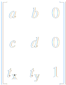
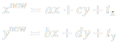
Матрица преобразований
.matrix {
    /*         matrix(a, c, b, d, tx, ty);*/
    transform: matrix(2, 0, 0, 1, 0, 0);;
}
.matrix {
    /*         matrix(a, c, b, d, tx, ty);*/
    transform: matrix(2, 0, 0, 1, 0, 0);
}| Коэффициент | Преобразование | Аналог |
|---|---|---|
| a | Изменение размера по горизонтали | scaleX() |
| b | Наклон по горизонтали | skewX() |
| c | Наклон по вертикали | skewY() |
| d | Изменение размера по вертикали | scaleY() |
| tx | Смещение по горизонтали в пикселах | translateX() |
| ty | Смещение по вертикали в пикселах | translateY() |
| Коэффициент | Преобразование | Аналог |
|---|---|---|
| a | Изменение размера по горизонтали | scaleX() |
| b | Наклон по горизонтали | skewX() |
| c | Наклон по вертикали | skewY() |
| d | Изменение размера по вертикали | scaleY() |
| tx | Смещение по горизонтали в пикселах | translateX() |
| ty | Смещение по вертикали в пикселах | translateY() |
Переходы
Переходы – это анимация от одного набора CSS свойств к другому. Для перехода необходимо:
- Два набора свойств:
- начальный набор свойств(color: #f00;)
- конечный набор свойств(color: #00f;)
- Свойство transition – описание свойств и характеристик анимации перехода
- Инициатор – действие, которое вызывает изменение от одного набора свойств к другому(:hover, :target, :focus, :active)
.button {
    /*Свойство перехода*/
    transition-property: transform;
    /*Длительность перехода*/
    transition-duration: .3s;
}
.button:hover {
    transform: scale(1.2);
}Несколько свойств
.button {
    transition-property: transform, background-color;
    transition-duration: 0.3s, 300ms;
    /*                    .3s, .3s  ; */
    background-color: #ccc;
}
.button:hover {
    transform: scale(1.2);
    background-color: #f00;
}Задержка перехода
.button {
    transition-property: transform, background-color;
    transition-duration: 0.3s, 500ms;
    transition-delay: 0s, 0.5s;
    background-color: #ccc;
}
.button:hover {
    transform: scale(1.2);
    background-color: #f00;
}Тип перехода
.button {
    transition-property: transform;
    /*функция положения объекта от времени.*/
    transition-timing-function: linear;
    transition-duration: 0.3s;
}
.button:hover {
    transform: translateX(800px);
    background-color: #f00;
}
transition-timing-function:
linear
ease
ease-in
ease-out
ease-in-out
step-start
step-end
steps(10)
steps(10, start)
Кривая Безье
P = (1−t)2P1 + 2(1−t)tP2 + t2P3
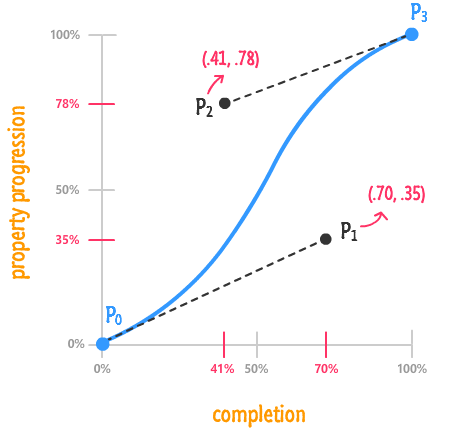
Пример
Шпаргалка
.rocket {
transition-property: transform;
/*                                      (x1, y1, x2, y2);*/
transition-timing-function: cubic-bezier(.98, 0, 1, .28);
transition-duration: 3s;
}Краткая запись
.long {
   transition-property: transform;
   transition-duration: .5s;
   transition-delay: 1s;
   transition-timing-function: ease-in;
}
.short {
/* property duration [timing-function] [delay]*/
transition: transform 1s ease-in .5s;
}.multi-short {
transition: transform .5s ease-in,
background-color .5s ease-in 1s;
}.super-short {
transition: all .5s;
}Анимации
Свойство animation
Позволяет анимировать переходы между ключевыми кадрами.
Для создания анимации необходимо:
- Определить ключевые кадры - содержат свойства, которые применяются в определенный момент времени при анимации.
- Применение анимации к элементу.
Ключевые кадры
@keyframes animationName {
    from {
        /*css свойства для первого кадра*/
    }
    to {
        /*css свойства для второго кадра*/
    }
}
.box.visible {
animation-name: show;
animation-duration: 2s;
}
@keyframes show {
from {
opacity: 0;
}
to {
opacity: 1;
}
}box visible
.box {
    opacity: 0;
}
.box.visible {
    animation-name: show;
    animation-duration: 2s;
}
@keyframes show {
    to {
        opacity: 1
    }
}
box visible
.box1:hover { animation-name: blink;
   animation-duration: 1s;
}
.box2:hover { animation-name: blink;
   animation-duration: 5s;
}
@keyframes blink {
    from {
        background-color: blue;
    }
    to {
        background-color: green;
    }
}
box 1 visible
box 2 visible
.box:hover { animation-name: blink;
   animation-duration: 2s;
}
@keyframes blink {
    from {
        background-color: blue;
    }
    50% {
        background-color: red;
    }
    to {
        background-color: green;
    }
}
box visible
.box:hover { animation-name: blink;
    animation-duration: 3s;
}
@keyframes blink {
    0% { background-color: blue; }
    25% { background-color: green; }
    50% { background-color: red; }
    75% { background-color: yellow; }
    100% { background-color: grey; }
}
box visible
.box:hover { animation-name: blink;
    animation-duration: 10s;
}
@keyframes blink {
    0%, 50% {
        background-color: blue;
    }
    25%, 75% {
        background-color: green;
    }
    100% {
        background-color: grey;
    }
}
box visible
.box:hover { animation-name: blink;
    animation-duration: 4s;
}
@keyframes blink {
    0% {
        background-color: blue;
    }
    25%, 75% {
        background-color: green;
    }
    100% {
        background-color: grey;
    }
}
box visible
.box.visible { animation-name: show;
    animation-duration: 2s;
}
@keyframes show {
    0% {
        opacity: 0;
        background-color: blue;
    }
    50% { background-color: green; }
    100% {
        opacity: 1;
        background-color: red;
    }
}
box visible
Задержка анимации
.box.move {
    animation-name: move;
    animation-duration: 2s;
    animation-delay: 1s;
}
@keyframes move {
    25%, 75% {
        transform: translateX(100%);
    }
    100% {
        transform: translateX(200%);
    }
}
box visible
Тип анимации
.box.move {
    animation-name: move;
    animation-duration: 8s;
    animation-timing-function: cubic-bezier(...);
}
@keyframes move {
    0% { transform: translate(0, 0); }
    25% {
        transform: translate(100%, 0);
        animation-timing-function: linear;
    }
    50% { transform: translate(100%, 200%); }
    75% {
        transform: translate(0, 200%);
        animation-timing-function: linear;
    }
    100% { transform: translate(0, 0); }
}
box visible
Повторение анимации
.circle:hover {
    animation-name: zoom;
    animation-duration: 1s;
    animation-iteration-count: 3;
}
@keyframes zoom {
    0% {
        transform: scale(1);
    }
    100% {
        transform: scale(2);
    }
}
hover me
Повторение анимации
.seconds {
    animation-name: seconds;
    animation-duration: 60s;
    animation-iteration-count: infinite;
}Скачки между повторениями
.circle {
    animation-name: seconds;
    animation-duration: 1s;
    animation-iteration-count: 3;
    animation-direction: alternate;
}
hover me
Скачки после завершения
.circle {
    animation-name: seconds;
    animation-duration: 1s;
    animation-iteration-count: 3;
    animation-direction: alternate;
    animation-fill-mode: forwards;
}
hover me
Краткая запись
.long {
    animation-name: scale;
    animation-duration: 2s;
    animation-timing-function: ease-in-out;
    animation-iteration-count: 3;
    animation-direction: alternate;
    animation-delay: 5s;
    animation-fill-mode: forwards;
}
.short {
animation: scale 2s ease-in-out 3 alternate 5s forwards;
}.multi-short {
animation: scale 2s ease-in, move 2s ease-out;
}Управление анимацией
.b-heart {
    ...
    animation: heartBeat 1s ease infinite;
}
    .b-heart:hover {
    animation-play-state: paused;
}
Эффект печати
css is awesome
typing {
    width: 0;
    white-space: nowrap;
    overflow: hidden;
    border-right: .05em solid !important;
}
.typing.visible {
    animation: typing 4s steps(15) forwards,
               caret 1s steps(1) infinite;
}
@keyframes typing { to { width: 15ch; } }
@keyframes caret { 50% { border-color: transparent; } }
Движение по кругу


.circle.run { animation: spin 4s linear infinite; }
@keyframes spin { to { translate: rotate(1turn); } }
Движение по кругу
Движение по кругу
.circle.run img {
    animation: spin 4s linear infinite;
}

@keyframes spin {
    0% {
        transform: rotate(0turn)
                   translateY(-150px)
                   rotate(1turn);
    }
    100% {
        transform: rotate(1turn)
                   translateY(-150px)
                   rotate(0turn);
    }
}
Движение по кругу
Блокировка свойств
.box:hover {
    animation: break-style 1s infinite;
}
box
Заключение
Creative Link EffectsDay night
Solar System
Pure css
Спасибо