1. Introduction
When scale of contents is changed by UA's zoom function or CSS3 Transforms, media query with zoom media features can provide the responsible contents concerning zooming. In addition to control of a style sheet, the application to elements which can have media attributes such as source element etc. is also taken into consideration.
2. Use case
This section is non-normative.
Interactive zooming function is essential for applications such as Mapping and High-Resolution Photos which have interactive zooming functions.
The zoom functionality is implemented using a zoom function that is provided by UA natively-level or by application level. There are two types of UA-level zoom functions: 1) page zoom which takes into account the size of initial viewport, and 2) pinch zoom which acts like a magnifying glass that doesn't affect the viewport. On the other hand, application-level zoom function controls a scale of coordinates for contents.
Moreover, contents provider may want to provide the most appropriate contents or styling according to zoom ratio changed by the user's zooming operation. Such functions are called 'Level of Detail' (LoD) and conventionally popular. LoD is effective functionarity not only to provide information interactively from overview to detail but also to control the distribution of the detailed large size data. It is convenient for content providers that UA has a function that realizes LoD without massive JS apps.
The function which controls styles and resources according to various environments surrounding contents is offered using css media query and picture element etc. It is considered that zoom shown here is also a kind of such environment. So, this specification prescribes a feature that control dynamic expression of content according to zoom by extending Media Queries.
@media (zoom >= 2.0)
@media (min-zoom: 2.0) { ... }
    <html>
      <head>
        <style type="text/css">
          @media (min-zoom: 1.0) {
            .content {
              display: inline;
            }
          }
          @media (min-zoom: 2.0) {
            .content {
              display: none;
            }
          }
        </style>
      </head>
      <body>
        <img class="content" src="sample.jpg"/>
      </body>
    </html>
<picture>
  <source
    media="(min-zoom: 4.0)"
    srcset="images/ultra-high-res-image.png">
  <source
    media="(min-zoom: 2.0)"
    srcset="images/high-res-image.png">
  <img
    src="images/normal-image.png"
    alt="a zoomable image">
</picture>
3. Difference between existing features and zoom features
This section is non-normative.
-
resolutionmedia features - resolution media feature takes into account the page zoom, but regards the pinch zoom as 1.0.
-
zoomas viewport property - This specifies only layout of content at initial status rather than expression according to interaction. And also, there are only mobile browsers supporting this, but no desktop browsers.
-
     This meta element:

     <meta name="viewport" content="initial-scale=1.0">

     Translate into:

     @viewport {
       zoom: 1.0;
       width: auto;
     }
4. Possible zooming types
This section is non normative.
This chapter organizes possible zooming patterns provided by UA and web contents. UA may have a native function for zooming such as page zoom and pinch zoom. Also, CSS pixel size may not be same as the size of device pixel (dot), as it may appear as devicePixelRatio. Additionally, web contents may be sometimes nested with iframe element. The CSS pixel unit size in child document may differ from the CSS pixel unit size in parent document when CSS Transforms is applied to the contents in the documents. These parameters to change the size of contents are able to fall into the concept of "zoom". The formula including these all parameters regarding zoom is indicated as below. This formula indicates relation between the dot size of device and the pixel size in the user coordinate of root element in the most descendant document.
deviceDotSize = resolution[dppx] * PinchZoom * DocumentScale(root's child) * .... * DocumentScale(this) * contentSizeresolution[dppx] = nativeResolution * PageZoomThis picture shows the configuration of UA and its contents which the above-mentioned formula assumes.
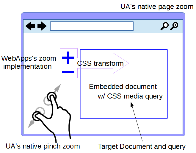
Each variable number is described as below. The variables are defined as scalar value.
- resolution
- This is a value of resolution with "dppx" prescribed in [CSS3-VALUES]. This value is same as devicePixelRatio defined in [CSSOM-VIEW].
- PageZoom
- This is a value of page zoom prescribed in [CSSOM-VIEW]
- PinchZoom
- This is a value of pinch zoom prescribed in [CSSOM-VIEW].
- DocumentScale
- This is a value of scale given by transform to child's content nested by an element for embedded content such as iframe (HTMLEmbedded Content, SVG Embedded Content), if contents targeted by media queries are nested with an embedded content element. Whole scale value is calculated by multiplying each scale in each nest. Let DocumentScale(root's child) be a scale given by transform from a root document to a child document. Let DocumentScale(this) be a scale given by transform from a parent of the most descendant document (called this) to the most descendant document.
- nativeResolution
- This is a value of resolution in a condition in PageZoom of 1.0.
- deviceDotSize
- This is a value of size of device native pixel in 'dot' unit system.
- contentSize
- This is a value of size of CSS pixel in a content's coordinate system. This value is able to be scaled with transform function.
4.1 Scale of Embedded Content
Transform matrix ([CSS-TRANSFORMS]) from parent's coorditnate system to child's coordinate system is given by CTM of an embedded content element in parent content and implicit transformation in viewport establishment process in [SVG2]. The value of scale ([CSS-TRANSFORMS-2]) is given by the transform matrix.
Transform property can be given to child elements of document's root element in HTML and SVG. However, DocumentScale is absolutely a value given by transform to parent document's root element. Because media qureies takes into account only external condition of the document, but not internal condition of the document.
The following parent iframe is displayed, even though min-zoom media feature of 2.0 is set and scale transform of 2.0 is applied to the parent iframe. On the other hand, the following child iframe is not displayed since the scale transform of 2.0 at the parent document affects to the zoom condition at the child document.- parent.html
<html> <head> <style type="text/css"> @media (min-zoom: 2.0) { .content { display: none; } } .content { transform: scale(2.0); } </style> </head> <body> <iframe id="parent" class="content" src="child.html" /> </body> </html>- child.html
    <html>
      <head>
        <style type="text/css">
          @media (min-zoom: 2.0) {
            .content {
              display: none;
            }
          }
        </style>
      </head>
      <body>
        <iframe id="child" class="content" src="sample.jpg" />
      </body>
    </html>
4.2 Possible zoom listings
Device's dot size = resolution * PinchZoom * DocumentScale(root's child) * .... * DocumentScale(this) * contentSize Window's native CSS pxel size = 'zoom' * Root document's css pixel size Device's dot size = 'zoom-dot' * Root document's css pixel size Window's native CSS pxel size = 'document-zoom' * contentSize Device's dot size = 'document-zoom-dot' * contentSize Windows's CSS pixel size = 'window-scale' * contentSize Parent's CSS pixel size = 'document-scale' * contentSize Use cases of each zoom type
- 'zoom'
- The case that styles and contents are provided according to pinch zoom gesture using UA native functionality.
- 'zoom-dot'
- The case that styles and contents are provided with reflecting the devicePixelRatio of the device with such as Retina display in addition to 'zoom'.
- 'document-zoom'
- The case that styles and contents are provided according to both scale of CSS Transforms on contents and pinch zoom provided by UA native functionality. However, resolution is not considered. Accordingly, this realizes the contents responded to both pinch zoom of UA, and transforms of web apps except for resolution.
Note: stakagi: From the viewpoint of mapping use case, I think this "document-zoom" is better rather than "window-scale" because LoD works even by UA native pinch zoom.
- 'document-zoom-dot'
- The case which responds also to resolution in addition to the above. It may be useful in order to realize the contents even responded to the resolution of a device and page zoom.
- 'window-scale'
- The case that styles and contents are provided according to total scale of CSS Transforms on nested documents imported by iframe and img elements, but independing on pinch zoom provided by UA native functionalities. In conventional zoomable Web Apps, such a function is implemented mostly.
- 'document-scale'
- Differ from the above, it is the case that styles and contents are provided according to the scale on the single hierarchy.
5. Zoom media features
Zoom media features are prescribed as below based on the formula in a previous section. These features are specified by a single term or the combination of terms in the above formula.
5.1 document-zoom
Value: <percentage>,<number>
Applies to: visual and tactile media types
Accepts min/max prefixes: yes
The 'document-zoom' media feature corresponds to
(PinchZoom * DocumentScale(root's child) * .... * DocumentScale(this)). This means zooming to window of UA in CSS Pixel coordinates of document targetted by media queries.UA native pinch zooming is reflected to this features.For example, this media query expresses that a style sheet is usable when the zoom ratio based ondocument-zoomis greater than 2.0:@media (min-document-zoom: 2.0) { ... }
Acknowledgments
This specification is the product of the W3C Working Group on Cascading Style Sheets.
We would like to sincerely thank Tomoaki Konno and Brian Birtles to acknowledge their contributions to this work.
References
Normative References
- [CSSOM-VIEW]
- CSSOM View Module 1 URL: http://www.w3.org/TR/cssom-view/
- [CSS-DEVICE-ADAPT]
- CSS Device Adaptation URL: http://www.w3.org/TR/css-device-adapt/
- [MEDIA-QUERIES]
- Media Queries URL: http://www.w3.org/TR/css3-mediaqueries/
- [CSS-VALUES]
- CSS Values and Units Module Level 3 URL: http://www.w3.org/TR/css3-values/
- [CSS-TRANSFORMS]
- CSS Transforms Module Level 1 URL: http://www.w3.org/TR/css3-transforms/
- [SVG2]
- Scalable Vector Graphics (SVG) 2 URL: http://www.w3.org/TR/SVG2/
- [CSS-TRANSFORMS-2]
- CSS Transforms Module Level 2 URL: http://svg2.mbsrv.net/devinfo/devstd/CSS_Transforms_Diff/css3Transforms_tmp/css-transforms-2_tmp/
Issues Index
Isn't there any feature more than needed?The translation into English from Japanese is required.The review for checking errors of terminological definitions and interpretation of concepts is required.Is it nice as devicePixelRatio to take the smaller value of the values of height and width? It may also be appropriate to use sqrt (w * h).It seems that the term is not unified within [CSS-DEVOCE-ADAPT] and [CSSOM VIEW]. 'zoom' in [CSS-DEVOCE-ADAPT] corresponds to 'pinch zoom' in [CSSOM VIEW].Is resolution in dppx devicePixelRatio? If so, shoud be link them in appropriate specs.