Evolving the Internet on your phone: Designing web sites with Opera Mini 4 in mind
14th December 2011: This article is obsolete
This article is obsolete/out of date, so should no longer be treated as a current or reliable source of information. Please consult the Opera Mini: web content authoring guidelines for more up-to-date information:
Opera Mini overview
Opera Mini 4 is a cutting edge web browser for mobile phones - it is the consumer version of Opera Mobile, the most widely-deployed advanced mobile web browser. Unlike many phone-based browsers, it works on most modern phones, from the top of the range smart phones to fashion phones and low end models. All that is required to run Opera Mini is a Java Virtual Machine (JVM). Due to Opera's lean and efficient code-base, and Opera Mini's server based pre-formatting, it can display web pages that were built using regular web technologies designed for desktop based browsers (other mobile browsers that work on low end handsets require special WAP content or the mobile profiles of HTML and CSS, which isn't an ideal solution.)
Web pages are rendered on the Opera Mini servers, which compile the web page into a compressed binary that is sent to the Opera Mini client. This reduces the data traffic sent to the phone, reducing users' data bills (many users still pay by the KB,) and reducing the time taken to display the page. Pages can be displayed either using a regular desktop view, or the traditional Opera Mini single column view. Pages can be customised for mobile using handheld stylesheets and CSS3 media queries.
Get the code examples that accompany this article.
Visit our Opera Mini & Opera Mobile page for details and download instructions.
In coming weeks and months, we'll follow this up with further articles, including more detailed web standards support, how to articles, and advanced techniques. JavaScript/DOM support in Opera 4 Mini will be the subject of a whole separate article.
Opera Mini technical specifications
Opera Mini 4 is built on the same rendering engine, Core-2, that is going into our all of our next generation browsers. This code-base was first made available on the Nintedo Wii's Internet Channel, and will be included in a modified form in the next version of the desktop browser, Opera Kestrel.
Opera Mini 4 includes the same (X)HTML, CSS, XSLT and XPath support as found in its desktop cousin, excepting Web Forms 2 support, which is currently disabled. The file input element is disabled in the beta release, but will enabled in the final release for taking images from the phone's camera. A subset of Core-2's JavaScript engine is also included. The majority of JavaScript functions are available, except those that require asynchronous operations or user interaction once the page has been loaded. As such XMLHttpRequest (used in Ajax) is not available when used asynchronously. SVG and plug-ins are not available.
Identifying Opera Mini 4
A browser can be identified by checking the user agent string. Opera Mini 4 identifies as Opera 9.5, with Opera Mini included in the parentheses. This corresponds with the branch of Opera that the rendering engine was taken from. The default user agent string is as follows:
Opera/9.50 (J2ME/MIDP; Opera Mini/4.0.8462/8; U; en)It is important to bear in mind that phone manufacturers and mobile carriers often customise browser user agent strings, so testing the user agent string isn't always fool proof. In general the Opera Mini/4.x portion of the string should always be included, where x is the minor version number.
Opera in general can be identified by using JavaScript to test for window.opera. This will identify any version of Opera, including the desktop browser.
While it is possible to identify Opera Mini by these methods, it is best to avoid this kind of detection where possible, and instead use object detection to test for feature support (unless you are serving content specifically for Opera Mini, which isn't advised.) This way, if Opera Mini is currently lacking a specific feature, it will just bypass that code safely without failing; if it is added in a later version, it will get the code for that feature without requiring any changes to your script.
Rendering modes
As mentioned above, Opera Mini 4 includes two rendering modes. In this section, we'll discuss them in more detail.
The default rendering mode on devices with screens over 128 pixels wide is Desktop rendering. In this mode the web page is rendered as if it was on a desktop computer, and scaled to fit the screen width. This works in much the same way as The Internet Channel on Nintendo Wii, except Mini returns the real screen dimensions when tested via JavaScript (for example using window.innerWidth.) If the web page is wider than the device screen, a virtual mouse pointer is shown that the user can use to scroll around, and if it is greater than twice the display size, a magnifying thumbnail will be shown that the user can use to zoom into various parts of the page (as illustrated in Figure 1.)
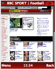
Figure 1 - the BBC web site, with magnifying thumbnail (left,) and then zoomed in on (right.)
On devices with screens less than or equal to 128 pixels the default rendering is Fit to width. In this mode the page is reformatted into a single column mode using CSSR - this avoids the need to scroll horizontally. The user can also enable this option from the browser's menu (Menu > Tools > Settings > Fit to width, then refresh the page.)
This mode is the same as CSSR mode on both Opera Mobile and Opera for desktop, except that floats are disabled. You can test small screen rendering in the desktop browser using the View > Small Screen option (See Figure 2; Floats are not disabled in the desktop version like they are on Mini.) An Opera Mini simulator is also available.
Figure 2 - Small screen rendering in the Opera desktop browser.
In either mode, if a Handheld Stylesheet is defined it is used to define the layout of the page instead of the screen stylesheet.
As a developer, this gives you full control over how your site will be displayed on the phone. As scaling and fit to width are turned off in this mode, it is important to bear in mind that on some devices it is difficult or impossible to horizontally scroll. Care should be taken that your layout takes this into account - use a single column layout if possible. CSS3 Media Queries are also supported, allowing the designer to send different style rules depending on the resolution of the screen - small screen sizes can be given a stylesheet optimised for a single column layout. You'll see an example of a media query in use later on in the article.
What follows is a summary of things to be aware of about the two different rendering modes.
Desktop rendering
When in desktop rendering mode, the page will be displayed the same way as it is on the desktop version of Opera, except for some differences, which include:
- Scaling the page to fit the width of the screen
- Reformatting text so that a row or column of text is not wider than the screen width
- Scaling and compressing images to a lower resolution to save bandwidth. In the standard low quality mode, images are rescaled to have a maximum size of 95% of the screen size in either direction
- Zero support is available for plug-ins, SVG and Web Forms 2
- Some differences to CSS support, as hi-lighted below
- Only a small subset of JavaScript is supported
- Due to client limitations, frames should be avoided where possible, as they are flattened in Mini. They shouldn't really be used anyway, but we are including this just for completeness
- Automatically converting phone numbers to links when detected
Small Screen/Fit to width rendering
When in small screen rendering/Fit to width mode, the page is reformatted to fit the screen. This includes:
- Reformatting the layout to display as one continuous column
- Ignoring floats
- Reformatting text to wrap at the screen width instead of the width of the containing block
- Rescaling images to have a maximum size of 70% of the screen size in either direction
- Zero support is available for plug-ins, SVG and Web Forms 2
- Only a small subset of JavaScript is supported
- Due to client limitations, frames should be avoided where possible
- Automatically converting phone numbers to links when detected
HTML and CSS support
The HTML and CSS support in Opera Mini 4 is vastly improved over previous versions. The support is equivalent to that of Opera Kestrel, including its support of CSS3 features such as selectors and text-shadow. Important differences are highlighed in the following sections.
Optimising your CSS for mobile devices using handheld stylesheets and media queries
The default media type for Opera Mini 4 is handheld, if it is available, otherwise the screen media type is used. Unlike Opera Mini 3, Mini 4 fully interprets handheld stylesheets without any reformatting. When using a handheld stylesheet, the standard stylesheet is ignored. Full support for media queries has been added, except in the case of media that is not applicable to mobile browsing, such as print.
Handheld stylesheet example
Handheld stylesheets can be defined to replace the screen stylesheet when the web page is viewed on a mobile phone or handheld device, giving an efficient way to optimise for mobiles. Unfortunately, some modern mobile browsers ignore the handheld media type. See an example that uses handheld stylesheets. In this example there are two stylesheets. The screen stylesheet is ignored by any browsers that support handheld stylesheets correctly (such as Opera Mini 4 and Opera Mobile) and instead the handheld stylesheet is used to style the page. A 'skip to content' link is shown, and the menu is displayed above the main content, so that no horizontal scrolling is required to reach the different options. If there are any images in the page, it sets their maximum width to 95% of the screen width.
Media queries
Media queries are expressions that allow us to more accurately specify under what user agent conditions a stylesheet should be applied, in HTML using media attribute of the link element, the @import statement inside a CSS document, or whatever. You can also specify media queries for specific CSS rules using the @media rule. For example, you could specify that you wanted a stylesheet applied only when the viewing device is a handheld device with a maximum screen width of 480 pixels. We'll see how to do this below.
Media queries are part of the CSS3 specification and supported by modern standards-compliant browsers, including but not limited to Opera, Opera Mobile, Opera Mini 4, Safari 3 and the Nokia S60 browser. Wide support for media queries amongst mobile browsers that support regular web technologies make them an ideal solution for optimising the layout of a page for devices with small screens. In Opera Mobile and Opera Mini these can be used in conjunction with the handheld media type to give you finer control of the layout.
Media queries can be defined in a stylesheet using syntax such as the following:
@media handheld and (max-device-width: 480px), screen and (max-device-width: 480px) { }@media defines the media that the media query is applied to and max-device-width defines the maximum screen width that the query will include. In this case it will apply the rules contained within the curly braces to both screen and handheld media if the device's screen is 480px or lower.
max-device-width isn't the only query that can be used. For testing on a desktop screen it is best to use max-width so it applies when the browser window is the required size and not just the physical size of the display. a list of the available queries can be found in the Media Query Specification; we will also look at media queries in more detail in a future article.
It is important to include both screen and handheld media types as currently some mobile browsers support media queries but not handheld media. Including screen will pickup those browsers.
See an example using Media Queries.
Another way to specify a Media Query is to include it in the link element itself, similar to the handheld example above. The syntax for this is as follows:
<link rel="stylesheet" href="style/handheldexample.css" type="text/css" media="handheld, only screen and (max-device-width: 480px)" />This can be seen in this second example using Media Queries. For ease of testing on desktop there's also an example using max-width instead of max-device-width.
The advantage of this approach is that in the previous example the media query overrides the screen styles, while this only specifies the styles needed for mobile. The disadvantage is that two stylesheets have to maintained instead of one. You need to use the only keyword in the screen media query to make sure browsers that do not understand media queries (such as Firefox and IE) ignore the statement, otherwise they get to the link element, see the screen keyword, which they also understand, but then ignore the media query and end up applying the stylesheet just like a regular screen stylesheet.
This is not an issue in the first example, as those browsers do not understand the @Media construct and thus the whole statement is ignored. However, WebKit makes it more difficult by not supporting the handheld media type. As screen is used, it will pick up the regular screen stylesheet too. For this reason a media query has to be added to the regular screen stylesheet link element. Instead of using:
<link rel="stylesheet" href="style/screen.css" type="text/css" media="screen" />As would normally be used, you should use the following:
<link rel="stylesheet" href="style/screen.css" type="text/css" media="screen and (min-device-width: 481px)" />As the only keyword is not specified, browsers that do not support media queries will also apply the stylesheet.
In the first example I included the media query for both the handheld and screen media types, therefore the mobile optimised stylesheet wouldn't apply to devices with screens wider than 480px, even if the browser supports handheld media. In the second and third examples I only specified the media query on the screen media type, so the stylesheet would apply to all devices where the browsers support handheld, no matter what size the screen is. The media query specified for the screen media type would be used by browsers that support media queries but not handheld media, such as Safari and the S60 browser.
Borders and backgrounds
Borders and background images are now supported in Opera Mini 4, as seen in Figure 3. However, dotted and dashed borders display as a solid border - this is a design decision due to bandwidth and memory issues.
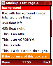
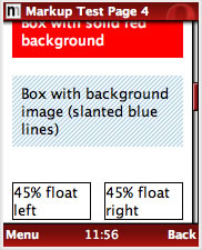
Figure 3 - Opera Mini 4 (right) also supports borders and background images.
HTML support
Now I will go through the significant improvements in HTML support that Opera Mini 4 has, over previous versions.
Text and font support
(Ok, so this bit involves some CSS as well!) Opera Mini supports one font in various sizes, so specifying font-family has no effect, except for a special case with monospace fonts. The font included is called "San Serif"/Generic and all fonts map to this.
The font can be displayed as normal and bold, with italic to be supported in the final version of Opera Mini 4. While there is only one font supported, a monospace font is emulated, which makes every character appear to be an even width inside pre and code elements, and when courier or the generic monospace font-family value is specified. The good news with Opera Mini 4 is that now proper heading levels (h1 - h6) are now supported, as seen in Figure 4.
del, abbr and acronym are also now supported.

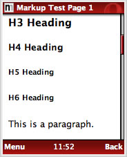
Figure 4 - As you can see from this side by side comparison of Opera Mini 3 (left) and 4 (right,) Opera Mini now supports proper rendering of full HTML heading levels.
Lists and tables
Support for lists and tables have been added to Opera Mini 4. List support includes ordered, unordered and definition lists.
While tables are supported, when using handheld stylesheets or media queries to reformat the layout, it is recommended to display any data tables in one or two columns or so that horizontal scrolling is not required, with the required headings clearly shown using the th element (see Figure 5.) Using tables for layout should be avoided, as always. If your existing mark-up uses tables for layout, I'd recommend avoiding defining a handheld stylesheet, and allowing Opera Mini to reformat the page automatically, unless the layout is relatively trivial to adapt using CSS.
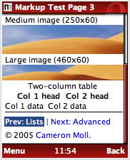
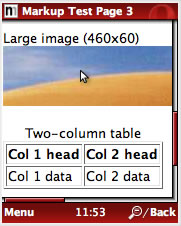
Figure 5 - Opera Mini 4 (right) properly renders HTML tables too...
Image formats
All image formats supported by Core-2 are supported by Opera Mini 4. This includes PNG, JPEG, GIF (animated GIFs not supported in Mini,) BMP, ICO, TGA and WBMP. Opera Mini has two image settings - the default is low quality, which reduces the image quality to save bandwidth, but the user can change this to high quality in the settings menu for when bandwidth isn't an issue. Due to this image compression, and for accessibility reasons, it is recommended to avoid including text in images, but if you absolutely must use an image for text, such as for displaying a particular font on the regular desktop layout, include the image using CSS and optimise the size and clarity for best results on the mobile version. A good solution if you are using handheld stylesheets or media queries is to only include the image in the screen stylesheet and not include it at all in the handheld stylesheet. Always make sure the original text is available for screen readers to access.
Summary
This has been a brief, but we hope, helpful introduction to optimizing your web page designs so that they will work better when accessed by mobile browsers. As mentioned earlier on in the article, we will be publishing more content to help you with mobile site development/troubleshooting in the very near future. Watch this space! We will round off with some brief tips on getting the best out of your your web sites on multiple devices.
- Separate mark-up (XHTML), presentation (CSS) and behaviour (JavaScript)
- Write concise and semantic (X)HTML, without tables for layout
- Validate your CSS and (X)HTML and avoid vendor specific JavaScript and DOM extensions
- Provide fallbacks for Ajax, JavaScript behaviour, and plug-ins where possible
- Use media queries or handheld stylesheets to optimise the layout and images if appropriate
- Place decorative images in your CSS files instead of mark-up
- Avoid frames
- Use
alttext as users often turn off images to save bandwidth - Reduce margins and padding when using handheld stylesheets
- Test in multiple full HTML browsers
Resources List
- Mobile test by Cameron Moll: http://www.cameronmoll.com/articles/mobile/mkp/
- Mini 4 Simulator: http://www.operamini.com/beta/simulator/ (URL no longer active)
- Mini 3 Simulator: http://www.operamini.com/demo/ (URL no longer active)
- Media Query Spec: http://www.w3.org/TR/css3-mediaqueries/
- CSS Media types: http://www.w3.org/TR/REC-CSS2/media.html
David Storey

David Storey heads up the Open the Web initiative at Opera. This small global team is tasked with improving the compatibility of web sites across Opera's wide range of browsers, as well as promoting web standards, accessibility and best practices, so that the Web will work for all standards-aware browsers, platforms, devices and users. He is a member of the W3C Mobile Web Best Practices Working Group.
On his blog, Slightly Ajar, he discusses this work, as well as random topics, from travel to music.
David previously worked for CERN, home of the World Wide Web, before taking up his post at Opera Software.
This article is licensed under a Creative Commons Attribution, Non Commercial - Share Alike 2.5 license.
Comments
The forum archive of this article is still available on My Opera.
No new comments accepted.