Data Analyst Nanodegree
Project 1: Investigate a dataset
Titanic Survival Exploration
1. Introduction
In 1912, the ship RMS Titanic struck an iceberg on its maiden voyage and sank, resulting in the deaths of most of its passengers and crew. In this introductory project, we will explore a subset of the RMS Titanic passenger manifest to determine which features best predict whether someone survived or did not survive.
Part of this work comes from previous work for the Machine Learning Nanodegree titled: Project 0 - Titanic Survival Exploration
1.1. Questions
The aim of this project is to analyze the dependance of the survival outcome of Titanic passenger of different factors. Hence, the dependent variable will be the survival of the passenger and the others will be remain as independent variables.
In this case, the efect on the survival of three independent features will be analyzed: class, sex and age. It is logical to believe that higher class will result in higher possibility of survivals, as with females and younger people are more likely to survive.
The questions to ask is, then:
- How does class influence survival?
- How does gender influence survival?
- How does age influence survival?
1.2. Loading dataset
#ignore warnings
import warnings
warnings.filterwarnings('ignore')

import numpy as np
import pandas as pd
import random
import matplotlib.pyplot as plt
from scipy import stats
import ipy_table as tbl

# RMS Titanic data visualization code
#from titanic_visualizations import survival_stats
from IPython.display import display
%matplotlib inline

# Load the dataset
in_file = 'titanic-data.csv'
full_data = pd.read_csv(in_file)

# Print the first few entries of the RMS Titanic data
display(full_data.head(3))
1.3. Feature description
From a sample of the RMS Titanic data, we can see the various features present for each passenger on the ship:
- Survived: Outcome of survival (0 = No; 1 = Yes)
- Pclass: Socio-economic class (1 = Upper class; 2 = Middle class; 3 = Lower class)
- Name: Name of passenger
- Sex: Sex of the passenger
- Age: Age of the passenger (Some entries contain
NaN) - SibSp: Number of siblings and spouses of the passenger aboard
- Parch: Number of parents and children of the passenger aboard
- Ticket: Ticket number of the passenger
- Fare: Fare paid by the passenger
- Cabin Cabin number of the passenger (Some entries contain
NaN) - Embarked: Port of embarkation of the passenger (C = Cherbourg; Q = Queenstown; S = Southampton)
Since we're interested in the outcome of survival for each passenger or crew member, we can remove the Survived feature from this dataset and store it as its own separate variable outcomes. We will use these outcomes as our prediction targets.
Run the code block cell to remove Survived as a feature of the dataset and store it in outcomes.
# Store the 'Survived' feature in a new variable and remove it from the dataset
outcomes = full_data['Survived']

# Select columns to keep
columns_to_keep= ['Pclass', 'Sex', 'Age']
titanic_df = full_data[columns_to_keep]

# Show the new dataset with 'Survived' removed
display(titanic_df.head(3))
The very same sample of the RMS Titanic data now shows the Survived feature removed from the DataFrame. Note that data (the passenger data) and outcomes (the outcomes of survival) are now paired. That means for any passenger data.loc[i], they have the survival outcome outcome[i].
Think: Out of the first five passengers, if we predict that all of them survived, what would you expect the accuracy of our predictions to be?
# print out information about the data
titanic_df.info()
There are missing 177 missing ages.
2.2. Insert missing ages
The missing ages will be replaced by random numbers in the [0.05,.0.95] quantile range, so that the data distribution will not change it characteristics significantly. It will be taking into account Pclass and Sex for this substitution.
missing_ages = titanic_df[titanic_df['Age'].isnull()]
# determine maximum and minimum age based on Sex and Pclass
quantiles_ages = titanic_df[titanic_df['Age'].notnull()].groupby(['Sex','Pclass'])['Age'].quantile([0.05,0.95])
print quantiles_ages


def remove_na_ages(row):
    '''
    function to check if the age is null and replace with the a random value int te 0.1-0.9 quantile range
    for the class and sex
    '''
    #print quantiles_ages[row['Sex'],row['Pclass'],0.05],quantiles_ages[row['Sex'],row['Pclass'],0.95]
    if pd.isnull(row['Age']):
        return round(random.uniform(quantiles_ages[row['Sex'],row['Pclass'],0.05],
                                       quantiles_ages[row['Sex'],row['Pclass'],0.95]),3)# round element to 3 decimals
    else:
        return round(row['Age'],3) # convert to 3 decimals

#Create a copy of the data
df = titanic_df.copy(deep = True)
df['Age'] = titanic_df.apply(remove_na_ages, axis=1)

##------- Divide age by ranges--------------

#Calculate the quantiles
quartiles = df['Age'].quantile([.0,.25,.5,.75, 1.])
print "-------------------------------------------"
print "Quartiles"
print [.0,.25,.5,.75, 1.]
print quartiles.values

df['Age_group'] = pd.cut(df['Age'], quartiles.values, labels=[1,2,3,4], precision= 3, include_lowest= True)

# transform categorical data into integer

df['Sex_label'] =pd.Categorical.from_array(df['Sex'])

        #Is a Factor, as in R. To access labels: f.labels
        # To access levels: f.levels
2.2.1. Age distribution
def place_legend_outside(ax):

    # Shrink current axis by 20%
    box = ax.get_position()
    #ax.set_position([box.x0, box.y0, box.width * 0.8, box.height])

    # Put a legend to the right of the current axis
    ax.legend(loc='lower left', bbox_to_anchor=(1, 0.6), fontsize= 14)


fig = plt.figure(figsize=[11,3])
ax = fig.add_subplot(131)

age_labels=['0','%d'%(quartiles[.25]), '%d'%(quartiles[.5]), '%d'%(quartiles[.75]),'%d'%(quartiles[1.])]

limits= [0,120]


#First class, ages,gender
plt.subplot(131)
plt.hist([df['Age_group'][(df['Pclass']==1) & (df['Sex']== 'female')].values.labels,
          df['Age_group'][(df['Pclass']==1) & (df['Sex']== 'male')].values.labels],
         color=['red', 'blue'], bins=[0, 1, 2, 3, 4], histtype='bar')
plt.title('1st class', fontsize = 16)
plt.xticks(range(5), age_labels)
plt.ylabel('Number of people')
plt.xlabel('Age (years)')
plt.ylim(limits)


#Second class, ages,gender
plt.subplot(132)
plt.hist([df['Age_group'][(df['Pclass']==2) & (df['Sex']== 'female')].values.labels,
          df['Age_group'][(df['Pclass']==2) & (df['Sex']== 'male')].values.labels],
         color=['red', 'blue'], bins=[0, 1, 2, 3, 4], histtype='bar')

plt.title('2nd class', fontsize = 16)
plt.ylabel('Number of people')
plt.xlabel('Age (years)')
#plt.title('female')
plt.xticks(range(5), age_labels)
plt.ylim(limits)


#Third class, ages,gender
ax3= plt.subplot(133)
plt.hist([df['Age_group'][(df['Pclass']==3) & (df['Sex']== 'female')].values.labels,
          df['Age_group'][(df['Pclass']==3) & (df['Sex']== 'male')].values.labels],
         color=['red', 'blue'], bins=[0, 1, 2, 3, 4], histtype='bar', label = ['female', 'male'] )

plt.title('3rd class', fontsize = 16)
plt.xticks(range(5), age_labels)
plt.ylabel('Number of people')
plt.ylim(limits)
plt.xlabel('Age (years)')

plt.legend()

plt.tight_layout(pad=0.25, w_pad=0.25, h_pad=1.)


place_legend_outside(ax3)

This plot shows the age distribution for female and male passengers for each of the classes. Age range represent the 4 quartiles in which the overall age population can be divided into.
Clearly, the most populated class is '3rd class'. With respect to other clases, the amount of members per age range can be up to 3 times greater (females 0-20 years) or 10 times greater (males 0-20 years) with respect to the same range in '1st class'.
2.3. Survival rate
In this section it will be calculated the survival rate for different groups determined by age, gender and class.
The survival rate will be defined : $\frac{N_{survivors}}{N_{total}}$
# Plot survival rate by feature
fig = plt.figure(figsize=[12,4])
ax = fig.add_subplot(131)
fig.suptitle('Figure 1: Survival rate', fontsize = 18)
limits= [0,1.1]

def survival_ratio(df):
    '''This function returns the survival ratio from from the dataframe introduced df'''
    return np.round(np.sum(df==1)/float(df.size),3)

print 'Overal survival rate: %.3f' %survival_ratio(outcomes)

#SURVIVAL

#1.Class

# Create a table
table_class = pd.crosstab([outcomes], [df['Pclass']])
survival_rate_class= table_class.iloc[1]/table_class.sum(axis=0) # iloc[1] to pick the survivors, 0: dead

ax1 = plt.subplot(131)

plt.bar(survival_rate_class.index,survival_rate_class.values)
plt.xticks(survival_rate_class.index.values, ['1st', '2nd', '3rd'])
plt.xlabel('Class')
plt.ylabel('Survival rate')
plt.ylim(limits)

plt.title('1.a.', fontsize= 14)

#Sex

table_sex = pd.crosstab([outcomes], [df['Sex_label']])
survival_rate_sex= table_sex.iloc[1]/table_sex.sum(axis=0)

ax2 = plt.subplot(132)

plt.bar(survival_rate_sex.index.values.labels,survival_rate_sex.values)
plt.xticks(survival_rate_sex.index.values.labels, survival_rate_sex.index.values) #Acess the indexes, which are categorical
                                                                                # label: 0,1 and value: male, female
plt.xlabel('Sex')
#plt.ylabel('')

plt.ylabel('Survival rate')
plt.ylim(limits)

plt.title('1.b.', fontsize= 14)

#Ages
table_ages = pd.crosstab([outcomes], [df['Age_group']])
survival_rate_ages= table_ages.iloc[1]/table_ages.sum(axis=0)

ax3 = plt.subplot(133)

plt.bar(survival_rate_ages.index.values.labels,survival_rate_ages.values)
plt.xticks(survival_rate_ages.index.values.labels,
           ['[0-%d]'%quartiles[.25],'(%d-%d]'%(quartiles[.25],quartiles[.5]),
            '(%d-%d]'%(quartiles[.5],quartiles[.75]), '[%d,80]'%(quartiles[.75])])
plt.xlabel('Age (years)')
plt.ylabel('Survival rate')
#plt.ylabel('')
plt.ylim(limits)
plt.title('1.c.', fontsize= 14)
#HORIZONTAL LINE for the overal survival rate

ax1.axhline(y=survival_ratio(outcomes), xmin=0,xmax=3, color = 'grey', linestyle="--",linewidth=0.5,zorder=0)
ax2.axhline(y=survival_ratio(outcomes), xmin=0,xmax=3, color = 'grey', linestyle="--",linewidth=0.5,zorder=0)
ax3.axhline(y=survival_ratio(outcomes), xmin=0,xmax=3, color = 'grey', linestyle="--",linewidth=0.5,zorder=0, label = '$\mu_0$')
plt.legend()

plt.subplots_adjust(top=0.8)
fig.savefig('survival_rate_per_feature.png', bbox_inches='tight')

From this plot it can be observed that class and gender influence the survival. On the contrary, age does not seem to influence the survival.
$\mu_0= 0.384 $ is the overal survival rate.
# Create a table
table = pd.crosstab([outcomes], [df['Pclass'], df['Sex'],df['Age_group']])
display(table)

# Calculate the survival rate for each age group, sex and class
survival_rate= (table.iloc[1]/table.sum(axis=0))
display(survival_rate)
#PLOT SURVIVAL RATE

fig = plt.figure(figsize=[12,4])
fig.suptitle('Figure 2: Survival rate', fontsize = 18)

age_labels=['0','%d'%(quartiles[.25]), '%d'%(quartiles[.5]), '%d'%(quartiles[.75]),'%d'%(quartiles[1.])]

limits= [0,1.1]
x_values = np.arange(start= .5, stop= 4.5, step=1)

#First class, ages,gender
plt.subplot(131)
plt.plot(x_values,survival_rate[1]['female'].values, 'r-^')
plt.plot(x_values, survival_rate[1]['male'].values, 'b-o')


plt.title('1st class', fontsize = 16)
plt.ylabel('survival rate')
plt.xticks(range(5), age_labels)
plt.ylim(limits)

plt.xlabel('Age (years)')

plt.title('2.a.', fontsize= 14)
#Second class, ages,gender
plt.subplot(132)

plt.plot(x_values,survival_rate[2]['female'].values, 'r-^')
plt.plot(x_values, survival_rate[2]['male'].values, 'b-o')


plt.title('2nd class', fontsize = 16)
#plt.title('female')
plt.xticks(range(5), age_labels)
plt.ylim(limits)
plt.ylabel('survival rate')
plt.xlabel('Age (years)')

plt.title('2.b.', fontsize= 14)

#Third class, ages,gender
ax3= plt.subplot(133)

plt.plot(x_values,survival_rate[3]['female'].values, 'r-^', label= 'female')
plt.plot(x_values, survival_rate[3]['male'].values, 'b-o', label= 'male')

plt.title('3rd class', fontsize = 16)

plt.xticks(range(5), age_labels)
plt.ylim(limits)
plt.legend()
plt.ylabel('survival rate')

plt.xlabel('Age (years)')

place_legend_outside(ax3)

plt.subplots_adjust(top=0.8)

plt.title('2.c.', fontsize= 14)

fig.savefig('survival_rate.png', bbox_inches='tight')

From this plot it can be observed that class is determinant in the survival rate as it is gender. Females tend to survive in a higher amount than males do, and also higher class gives higher chances of survival.
3. Chi-squared tests
In this section it will be performed a chi-squared test per independent feature in order to check the 'a priori' hypotheses.
3.1. Class
Hipotheses
- The null Hypothesis ($H_0$) will be that Class does not affect the variable Survived
- The alternative Hypothesis ($H_A$) will be Class affects the variable Survived
After performing a Chi-squared test for independence it is obtained $\chi^2= 102.889$ and a $p-value=0.000$
p < 0.01 and hence the null hipothesis is rejected as it is shown that Class has an effect in the survival for a Confidence Interval of 99%
table = pd.crosstab([outcomes], df['Pclass'])
#table = pd.crosstab([outcomes[df[df['Pclass']==1].index],outcomes[df[df['Pclass']==2].index], outcomes[df[df['Pclass']==3].index]])
print table
chi2, p, dof, expected = stats.chi2_contingency(table.values)
results = [
    ['Item','Value'],
    ['Chi-Square Test',chi2],
    ['P-Value', p]

]
tbl.make_table(results)
3.2. Sex
Hipotheses
- The null Hypothesis ($H_0$) will be that Sex does not affect the variable Survived
The alternative Hypothesis ($H_A$) will be Sex affects the variable Survived
After performing a Chi-squared test for independence it is obtained $\chi^2= 260.717$ and a $p-value=0.000$
p < 0.01 and hence the null hipothesis is rejected as it is shown that Sex has an effect in the survival for a Confidence Interval of 99%
table = pd.crosstab([outcomes], df['Sex_label'])
#table = pd.crosstab([outcomes[df[df['Pclass']==1].index],outcomes[df[df['Pclass']==2].index], outcomes[df[df['Pclass']==3].index]])
print table
chi2, p, dof, expected = stats.chi2_contingency(table.values)
print expected
results = [
    ['Item','Value'],
    ['Chi-Square Test',chi2],
    ['P-Value', p]

]
tbl.make_table(results)
3.3. Age
Hipotheses
- The null Hypothesis ($H_0$) will be that Age does not affect the variable Survived
- The alternative Hypothesis ($H_A$) will be Age affects the variable Survived
After performing a Chi-squared test for independence it is obtained $\chi^2= 3.7 $ and a $p-value=0.3$
p > 0.05 and hence the we fait at rejecting the as is shown that Class has no effect in the survival for a Confidence Interval of 95%
table = pd.crosstab([outcomes], df['Age_group'])
print table
chi2, p, dof, expected = stats.chi2_contingency(table.values)
print expected
results = [
    ['Item','Value'],
    ['Chi-Square Test',chi2],
    ['P-Value', p]

]
tbl.make_table(results)
4. Conclusions
In this project I performed a tentative analysis of the Titanic dataset. When approaching this dataset, I found a lot of features characterizing each passenger. In order to perform a simple analysis for this report, I had to pick those that I thought would be more relevant to survival, these are: class, sex, gender. It seems to me pretty straight forward that maybe higher class passenger would be more likely to survive. The gender of the passenger and the age are factors that classify the passenger and I wanted to know how they influenced the survival, for which I had no 'a priori' hypothesis. One could think that women are more likely to survive just because in that time they were entitled to the care of the children almost exclusively (fortunately this is a becoming a shared responsability). Age could influence making younger (remember, they are with their mothers) or even the older to survive (again the weak are guaranteed a place in the lifeboats).
The number of passangers available on this dataset is 891. However, there were 2224 passengers and crew aboard, with an amount of 1502 casualties. This lack of information may lead to biased conclusions, not accurate to reality.
4.1. Questions
The next plot (fig.1) was used in order to draw first impressions on the features. It shows survival rate for each class, for each sex and for certain ranges of ages. The value $\mu_0$ is the overal survival rate, where $\mu_0=0.384$.
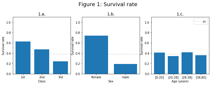
This plot shows how class and gender influence the survival, while age does not seem to influence the survival (for each age the survival rate is more or less the same as the overal survival rate).
- How does class influence survival?
'A priori': higher class may lead to more chance of survival.
Figure 1.a. shows that the lower the class the less the chance to survive.

Figure 2, shows the survival rate vs age ranges for each gender. It can be seen that, generally, for both sexs, higher class results in higher survival rate.
This was confirmed with chi-squared test, with a confidence of 99% (p-value = 0).
Conclusion: Class affects survival, and higher class tend to be related to higher chance of survival.
- How does gender influence survival?
'A priori': it is not clear which gender is more likely to survive.
The plot of survival rate vs gender (fig. 1.b.), shows a higher survival chance for women. Also, in Figure 2 it can be seen that females tend to survive more than males do.
This was confirmed with chi-squared test, with a confidence of 99% (p-value = 0).
Conclusion: Gender affects survival, and females are more likely to survive than males.
- How does age influence survival?
'A priori': maybe the younger and older people are more likely to survive.
In the plot of survival for different age ranges (fig 1.c), there is no clear conclusion and the survival seems to be the same for each age range.
The plot of survival rate vs age ranges for each gender (fig.2) shows that, generally, older people have the lower survival chance in each class and sex. However, it is not clear how age affects survival.
This was confirmed with chi-squared test, with a confidence of 95% (p-value = 0.3), where the test failed to reject the null hypothesis which was that age has no influence in survival.
Conclusion: Age does not seem to affect survival.