## The basic files and libraries needed for most presentations
# creates the libraries and common-functions sections
read_chunk("../common/utility_functions.R")require(ggplot2) #for plots
require(lattice) # nicer scatter plots
require(plyr) # for processing data.frames
library(dplyr)
require(grid) # contains the arrow function
require(jpeg)
require(doMC) # for parallel code
require(png) # for reading png images
require(gridExtra)
require(reshape2) # for the melt function
#if (!require("biOps")) {
# # for basic image processing
# devtools::install_github("cran/biOps")
# library("biOps")
#}
## To install EBImage
if (!require("EBImage")) { # for more image processing
source("http://bioconductor.org/biocLite.R")
biocLite("EBImage")
}
used.libraries<-c("ggplot2","lattice","plyr","reshape2","grid","gridExtra","biOps","png","EBImage")# start parallel environment
registerDoMC()
# functions for converting images back and forth
im.to.df<-function(in.img,out.col="val") {
out.im<-expand.grid(x=1:nrow(in.img),y=1:ncol(in.img))
out.im[,out.col]<-as.vector(in.img)
out.im
}
df.to.im<-function(in.df,val.col="val",inv=F) {
in.vals<-in.df[[val.col]]
if(class(in.vals[1])=="logical") in.vals<-as.integer(in.vals*255)
if(inv) in.vals<-255-in.vals
out.mat<-matrix(in.vals,nrow=length(unique(in.df$x)),byrow=F)
attr(out.mat,"type")<-"grey"
out.mat
}
ddply.cutcols<-function(...,cols=1) {
# run standard ddply command
cur.table<-ddply(...)
cutlabel.fixer<-function(oVal) {
sapply(oVal,function(x) {
cnv<-as.character(x)
mean(as.numeric(strsplit(substr(cnv,2,nchar(cnv)-1),",")[[1]]))
})
}
cutname.fixer<-function(c.str) {
s.str<-strsplit(c.str,"(",fixed=T)[[1]]
t.str<-strsplit(paste(s.str[c(2:length(s.str))],collapse="("),",")[[1]]
paste(t.str[c(1:length(t.str)-1)],collapse=",")
}
for(i in c(1:cols)) {
cur.table[,i]<-cutlabel.fixer(cur.table[,i])
names(cur.table)[i]<-cutname.fixer(names(cur.table)[i])
}
cur.table
}
# since biOps isn't available use a EBImage based version
imgSobel<-function(img) {
kern<-makeBrush(3)*(-1)
kern[2,2]<-8
filter2(img,kern)
}
show.pngs.as.grid<-function(file.list,title.fun,zoom=1) {
preparePng<-function(x) rasterGrob(readPNG(x,native=T,info=T),width=unit(zoom,"npc"),interp=F)
labelPng<-function(x,title="junk") (qplot(1:300, 1:300, geom="blank",xlab=NULL,ylab=NULL,asp=1)+
annotation_custom(preparePng(x))+
labs(title=title)+theme_bw(24)+
theme(axis.text.x = element_blank(),
axis.text.y = element_blank()))
imgList<-llply(file.list,function(x) labelPng(x,title.fun(x)) )
do.call(grid.arrange,imgList)
}
## Standard image processing tools which I use for visualizing the examples in the script
commean.fun<-function(in.df) {
ddply(in.df,.(val), function(c.cell) {
weight.sum<-sum(c.cell$weight)
data.frame(xv=mean(c.cell$x),
yv=mean(c.cell$y),
xm=with(c.cell,sum(x*weight)/weight.sum),
ym=with(c.cell,sum(y*weight)/weight.sum)
)
})
}
colMeans.df<-function(x,...) as.data.frame(t(colMeans(x,...)))
pca.fun<-function(in.df) {
ddply(in.df,.(val), function(c.cell) {
c.cell.cov<-cov(c.cell[,c("x","y")])
c.cell.eigen<-eigen(c.cell.cov)
c.cell.mean<-colMeans.df(c.cell[,c("x","y")])
out.df<-cbind(c.cell.mean,
data.frame(vx=c.cell.eigen$vectors[1,],
vy=c.cell.eigen$vectors[2,],
vw=sqrt(c.cell.eigen$values),
th.off=atan2(c.cell.eigen$vectors[2,],c.cell.eigen$vectors[1,]))
)
})
}
vec.to.ellipse<-function(pca.df) {
ddply(pca.df,.(val),function(cur.pca) {
# assume there are two vectors now
create.ellipse.points(x.off=cur.pca[1,"x"],y.off=cur.pca[1,"y"],
b=sqrt(5)*cur.pca[1,"vw"],a=sqrt(5)*cur.pca[2,"vw"],
th.off=pi/2-atan2(cur.pca[1,"vy"],cur.pca[1,"vx"]),
x.cent=cur.pca[1,"x"],y.cent=cur.pca[1,"y"])
})
}
# test function for ellipse generation
# ggplot(ldply(seq(-pi,pi,length.out=100),function(th) create.ellipse.points(a=1,b=2,th.off=th,th.val=th)),aes(x=x,y=y))+geom_path()+facet_wrap(~th.val)+coord_equal()
create.ellipse.points<-function(x.off=0,y.off=0,a=1,b=NULL,th.off=0,th.max=2*pi,pts=36,...) {
if (is.null(b)) b<-a
th<-seq(0,th.max,length.out=pts)
data.frame(x=a*cos(th.off)*cos(th)+b*sin(th.off)*sin(th)+x.off,
y=-1*a*sin(th.off)*cos(th)+b*cos(th.off)*sin(th)+y.off,
id=as.factor(paste(x.off,y.off,a,b,th.off,pts,sep=":")),...)
}
deform.ellipse.draw<-function(c.box) {
create.ellipse.points(x.off=c.box$x[1],
y.off=c.box$y[1],
a=c.box$a[1],
b=c.box$b[1],
th.off=c.box$th[1],
col=c.box$col[1])
}
bbox.fun<-function(in.df) {
ddply(in.df,.(val), function(c.cell) {
c.cell.mean<-colMeans.df(c.cell[,c("x","y")])
xmn<-emin(c.cell$x)
xmx<-emax(c.cell$x)
ymn<-emin(c.cell$y)
ymx<-emax(c.cell$y)
out.df<-cbind(c.cell.mean,
data.frame(xi=c(xmn,xmn,xmx,xmx,xmn),
yi=c(ymn,ymx,ymx,ymn,ymn),
xw=xmx-xmn,
yw=ymx-ymn
))
})
}
# since the edge of the pixel is 0.5 away from the middle of the pixel
emin<-function(...) min(...)-0.5
emax<-function(...) max(...)+0.5
extents.fun<-function(in.df) {
ddply(in.df,.(val), function(c.cell) {
c.cell.mean<-colMeans.df(c.cell[,c("x","y")])
out.df<-cbind(c.cell.mean,data.frame(xmin=c(c.cell.mean$x,emin(c.cell$x)),
xmax=c(c.cell.mean$x,emax(c.cell$x)),
ymin=c(emin(c.cell$y),c.cell.mean$y),
ymax=c(emax(c.cell$y),c.cell.mean$y)))
})
}
common.image.path<-"../common"
qbi.file<-function(file.name) file.path(common.image.path,"figures",file.name)
qbi.data<-function(file.name) file.path(common.image.path,"data",file.name)
th_fillmap.fn<-function(max.val) scale_fill_gradientn(colours=rainbow(10),limits=c(0,max.val))Quantitative Big Imaging
author: Kevin Mader date: 07 April 2016 width: 1440 height: 900 css: ../template.css transition: rotate
ETHZ: 227-0966-00L
Analysis of Complex Objects
Course Outline
source('../common/schedule.R')- 25th February - Introduction and Workflows
- 3rd March - Image Enhancement (A. Kaestner)
- 10th March - Basic Segmentation, Discrete Binary Structures
- 17th March - Advanced Segmentation
- 24th March - Analyzing Single Objects
- 7th April - Analyzing Complex Objects
- 14th April - Spatial Distribution
- 21st April - Statistics and Reproducibility
- 28th April - Dynamic Experiments
- 12th May - Scaling Up / Big Data
- 19th May - Guest Lecture - High Content Screening
- 26th May - Guest Lecture - Machine Learning / Deep Learning and More Advanced Approaches
- 2nd June - Project Presentations
Literature / Useful References
Books
- Jean Claude, Morphometry with R
- Online through ETHZ
- Buy it
- John C. Russ, “The Image Processing Handbook”,(Boca Raton, CRC Press)
- Available online within domain ethz.ch (or proxy.ethz.ch / public VPN)
Papers / Sites
- Thickness
- [1] Hildebrand, T., & Ruegsegger, P. (1997). A new method for the model-independent assessment of thickness in three-dimensional images. Journal of Microscopy, 185(1), 67–75. doi:10.1046/j.1365-2818.1997.1340694.x
- Curvature
- http://mathworld.wolfram.com/MeanCurvature.html
- [2] “Computation of Surface Curvature from Range Images Using Geometrically Intrinsic Weights”*, T. Kurita and P. Boulanger, 1992.
Previously on QBI …
- Image Enhancment
- Highlighting the contrast of interest in images
- Minimizing Noise
- Segmentation
- Understanding value histograms
- Dealing with multi-valued data
- Automatic Methods
- Hysteresis Method, K-Means Analysis
- Regions of Interest
- Contouring
- Component Labeling
- Single Shape Analysis
Outline
- Motivation (Why and How?)
- What are Distance Maps?
- Skeletons
- Tortuosity
- What are thickness maps?
- Thickness with Skeletons
- Watershed Segmentation
- Connected Objects
- Curvature
- Characteristic Shapes
Learning Objectives
Motivation (Why and How?)
- How do we measure distances between many objects?
How can we extract topology of a structure?
- How can we measure sizes in complicated objects?
How do we measure sizes relavant for diffusion or other local processes?
- How do we identify seperate objects when they are connected?
- How do we investigate surfaces in more detail and their shape?
- How can we compare shape of complex objects when they grow?
Are there characteristic shape metrics?
What did we want in the first place
To simplify our data, but an ellipse model is too simple for many shapes
So while bounding box and ellipse-based models are useful for many object and cells, they do a very poor job with the sample below.
cell.im<-jpeg::readJPEG("ext-figures/Cell_Colony.jpg")
cell.lab.df<-im.to.df(bwlabel(cell.im<.6))
size.histogram<-ddply(subset(cell.lab.df,val>0),.(val),function(c.label) data.frame(count=nrow(c.label)))
keep.vals<-subset(size.histogram,count>25)


cur.cell.df<-subset(cell.lab.df,val==155)
cell.pca<-pca.fun(cur.cell.df)
cell.ellipse<-vec.to.ellipse(cell.pca)
ggplot(cur.cell.df,aes(x=x,y=y))+
  geom_tile(color="black",fill="grey")+
  geom_path(data=bbox.fun(cur.cell.df),aes(x=xi,y=yi,color="Bounding\nBox"))+
  geom_path(data=cell.ellipse,aes(color="Ellipse"))+
  labs(title="Single Cell",color="Shape\nAnalysis\nMethod")+
  theme_bw(20)+coord_equal()+guides(fill=F)
Why
- We assume an entity consists of connected pixels (wrong)
- We assume the objects are well modeled by an ellipse (also wrong)
What to do?
- Is it 3 connected objects which should all be analzed seperately?
- If we could divide it, we could then analyze each spart as an ellipse
- Is it one network of objects and we want to know about the constrictions?
- Is it a cell or organelle with docking sites for cell?
- Neither extents nor anisotropy are very meaningful, we need a more specific metric
Distance Maps: What are they
# Distance map code
# Fill Image code
# ... is for extra columns in the data set
fill.img.fn<-function(in.img,step.size=1,...) {
  xr<-range(in.img$x)
  yr<-range(in.img$y)
  ddply(expand.grid(x=seq(xr[1],xr[2],step.size),
                  y=seq(yr[1],yr[2],step.size)),
        .(x,y),
      function(c.pos) {
        ix<-c.pos$x[1]
        iy<-c.pos$y[1]
        nset<-subset(in.img,x==ix & y==iy)
        if(nrow(nset)<1) nset<-data.frame(x=ix,y=iy,val=0,...)
        nset
        })
}
fill.img<-fill.img.fn(cur.cell.df)
euclid.dist<-function(x,x0,y,y0) sqrt((x-x0)^2+(y-y0)^2)
man.dist<-function(x,x0,y,y0) abs(x-x0)+abs(y-y0)
dist.map<-function(in.df,fg.ph=155,bg.ph=0,dist.fn=euclid.dist) {
  foreground.df<-subset(in.df,val==fg.ph)
  background.df<-subset(in.df,val==bg.ph)
  ddply(foreground.df,.(x,y),function(c.pos) {
    ix<-c.pos$x[1]
    iy<-c.pos$y[1]
    # calculate the minimum distance to a background voxel
    data.frame(dist=min(
      with(background.df,dist.fn(x,ix,y,iy))
      ))
  })
}


# grid used for all datasets
x.grid<-seq(-10,10,length.out=81)
# function to make a test circle image
make.sph.img<-function(sph.list,in.grid=x.grid) {

  test.sph.img<-expand.grid(x=in.grid,y=in.grid)
  test.sph.img$val<-0

  for(i in 1:nrow(sph.list)) {
    test.sph.img$val<-with(sph.list[i,], # use the namespace for the current cirlce
                           with(test.sph.img, # use the grid namespace as well
                                ifelse(val,1,ifelse(((x-xi)^2+(y-yi)^2)
A map (or image) of distances. Each point in the map is the distance that point is from a given feature of interest (surface of an object, ROI, center of object, etc)
test.sph.list<-data.frame(xi=c(-3,-3, 5, 5),
                    yi=c(-5, 5,-3, 5),
                    ri=c( 2, 3, 5, 2))
test.img<-make.sph.img(test.sph.list,seq(-2,8))

ggplot(test.img,aes(x=x,y=y,fill=ifelse(val,"FG","BG")))+
  geom_tile(color="black")+
  geom_text(aes(label=ifelse(val,"FG","BG")))+
  labs(title="Object Distance Map",fill="Phase")+
  theme_bw(20)+coord_equal()
Definition
If we start with an image as a collection of points divided into two categories
- Im(x, y)= {Foreground, Background}
- We can define a distance map operator (dist) that transforms the image into a distance map
$$ dist(\vec{x}) = \textrm{min}(||\vec{x}-\vec{y}|| \forall \vec{y} \in \textrm{Background}) $$
We will use Euclidean distance $||\vec{x}-\vec{y}||$ for this class but there are other metrics which make sense when dealing with other types of data like Manhattan/City-block or weighted metrics.
Distance Maps: Types
Using this rule a distance map can be made for the euclidean metricggplot(fill.img.fn(dist.map(test.img,fg.ph=1,bg.ph=0),dist=0),aes(x=x,y=y,fill=dist))+
geom_tile(color="black")+
geom_text(aes(label=ifelse(dist>0,round(dist*10)/10,"Obj")))+
th_fillmap.fn(4)+
labs(title="Euclidean Distance",fill="Distance\nFrom\nObject")+
theme_bw(20)+coord_equal()
Similarly the Manhattan or city block distance metric can be used where the distance is defined as
$$ \sum_{i} |\vec{x}-\vec{y}|_i $$
ggplot(fill.img.fn(dist.map(test.img,fg.ph=1,bg.ph=0,dist.fn=man.dist),dist=0),aes(x=x,y=y,fill=dist))+
  geom_tile(color="black")+
  geom_text(aes(label=ifelse(dist>0,round(dist*10)/10,"Obj")))+
  th_fillmap.fn(4)+
  labs(title="Manhattan / City Block Distance",fill="Distance\nFrom\nObject")+
  theme_bw(20)+coord_equal()
Distance Maps: Precaution
The distance map is one of the crictical points where the resolution of the imaging system is important.
- We measure distances computationally in pixels or voxels
- but for them to have a meaning physically they must be converted
- Isotropic imaging (1 μ m x 1μ m x 1 μ m) is fine
Anisotropic
Ideally
- as part of filtering, resample and convert to an isotropic scale.
If that is not possible
- custom distance map algorithms which use the side-lengths of the voxels to calculate distance rather than assuming 1x1x1
Distance Maps
test.sph.list<-data.frame(xi=c(-3,-3, 5, 5),
                    yi=c(-5, 5,-3, 5),
                    ri=c( 2, 3, 5, 2))
test.img<-make.sph.img(test.sph.list)
ggplot(cbind(test.img,label=ifelse(test.img$val,"FG","BG")),aes(x=x,y=y,fill=label))+
  geom_tile(color="black")+
  labs(title="Foreground and Background",fill="Label")+
  theme_bw(20)+coord_equal()
We can create 2 distance maps
- Foreground → Background
- Information about the objects size and interior
- Background → Foreground
- Information about the distance / space between objects
ggplot(dist.map(test.img,fg.ph=1,bg.ph=0),aes(x=x,y=y,fill=dist))+
  geom_tile(color="black")+
  labs(title="Object Distance Map",fill="Distance\nFrom\nSurface")+
  th_fillmap.fn(6)+
  theme_bw(20)+coord_equal()
ggplot(dist.map(test.img,fg.ph=0,bg.ph=1),aes(x=x,y=y,fill=dist))+
  geom_tile(color="black")+
  labs(title="Background Distance Map",fill="Distance\nFrom\nSurface")+
  th_fillmap.fn(6)+
  theme_bw(20)+coord_equal()
Distance Map
One of the most useful components of the distance map is that it is relatively insensitive to small changes in connectivity.
- Component Labeling would find radically different results for these two images
- One has 4 small circles
- One has 1 big blob
test.sph.list<-data.frame(xi=c(-4,-3, 5, 5),
                    yi=c(-4, 5,-3, 5),
                    ri=c( 4, 5, 5, 3)+0)
ggplot(dist.map(make.sph.img(test.sph.list),fg.ph=1,bg.ph=0),aes(x=x,y=y,fill=dist))+
  geom_tile(color="black")+
  labs(title="Circle Distance Map",fill="Distance\nFrom\nSurface")+
  theme_bw(20)+coord_equal()
test.sph.list.big<-test.sph.list
# bring everything closer

test.sph.list.big$xi<-0.95*test.sph.list.big$xi
test.sph.list.big$yi<-0.95*test.sph.list.big$yi
ggplot(dist.map(make.sph.img(test.sph.list.big),fg.ph=1,bg.ph=0),aes(x=x,y=y,fill=dist))+
  geom_tile(color="black")+
  labs(title="Same Circles, a bit closer",fill="Distance\nFrom\nSurface")+
  theme_bw(20)+coord_equal()
ggplot(rbind(
  cbind(dist.map(make.sph.img(test.sph.list),fg.ph=1,bg.ph=0),type="Circles"),
  cbind(dist.map(make.sph.img(test.sph.list.big),fg.ph=1,bg.ph=0),type="Closer Circles")),
  aes(x=dist,color=type))+
  geom_density(aes(y=..count..))+
  labs(x="Distance from Surface",y="Voxel Count",color="Image")+
  theme_bw(20)
Distance Map of Cell
Foreground
ggplot(dist.map(fill.img,fg.ph=155,bg.ph=0),aes(x=x,y=y,fill=dist))+
  geom_tile(color="black")+
  labs(title="Single Cell",fill="Distance\nFrom\nSurface")+
  theme_bw(20)+coord_equal()
Background
ggplot(dist.map(fill.img,fg.ph=0,bg.ph=155),aes(x=x,y=y,fill=dist))+
  geom_tile(color="black")+
  labs(title="Single Cell",fill="Distance\nFrom\nSurface")+
  theme_bw(20)+coord_equal()
Skeletonization / Networks
For some structures like cellular materials and trabecular bone, we want a more detailed analysis than just thickness. We want to know
- which structures are connected
- how they are connected
- express the network in a simple manner
- quantify tortuosity
- branching
test.mesh<-expand.grid(xi=seq(-10,10,length.out=5),yi=seq(-10,10,length.out=4))
test.mesh$ri<-runif(nrow(test.mesh),min=0.5,max=2)
test.mesh.im<-make.sph.img(test.mesh)
ggplot(subset(test.mesh.im,val==0),aes(x=x,y=y))+
  geom_tile(color="black",fill="grey")+
  labs(title="Object Mask")+
  theme_bw(20)+coord_equal()
Skeletonization
The first step is to take the distance transform the structure
Id(x, y)=dist(I(x, y))
We can see in this image there are already local maxima that form a sort of backbone which closely maps to what we are interested in.
test.mesh.dist<-dist.map(test.mesh.im,fg.ph=0,bg.ph=1)
ggplot(test.mesh.dist,aes(x=x,y=y,fill=dist))+
  geom_tile(color="black")+
  labs(title="Circle Distance Map",fill="Distance\nFrom\nSurface")+
  theme_bw(20)+coord_equal()
By using the laplacian filter as an approximate for the derivative operator which finds the values which high local gradients.
$$ \nabla I_{d}(x,y) = (\frac{\delta^2}{\delta x^2}+\frac{\delta^2}{\delta y^2})I_d \approx \underbrace{\begin{bmatrix}
-1 & -1 & -1 \\
-1 & 8 & -1 \\
-1 & -1 & -1
\end{bmatrix}}_{\textrm{Laplacian Kernel}} \otimes I_d(x,y) $$
# use a laplacian kernel
lap.kernel<-data.frame(xi=c(-1, 0, 1,-1, 0, 1,-1, 0, 1),
                       yi=c(-1,-1,-1, 0, 0, 0, 1, 1, 1),
                       wi=c(-1,-1,-1,-1, 8,-1,-1,-1,-1))
test.mesh.dif<-data.frame(x=c(),y=c(),val=c())
for(i in 1:nrow(lap.kernel)) {
  temp.df<-test.mesh.dist[,c("x","y")]
  temp.df$val<-with(lap.kernel[i,],test.mesh.dist$dist*wi)
  temp.df$x<-with(lap.kernel[i,],temp.df$x+diff(x.grid)[1]*xi)
  temp.df$y<-with(lap.kernel[i,],temp.df$y+diff(x.grid)[1]*yi)
  test.mesh.dif<-rbind(test.mesh.dif,temp.df)
}
test.mesh.dif<-ddply(test.mesh.dif,.(x,y),function(all.vals) {
  data.frame(val=sum(all.vals$val))
})
ggplot(test.mesh.dif,aes(x=x,y=y,fill=val))+
  geom_tile(color="black")+
  labs(title="Laplacian Image",fill="Laplacian/\nGradient")+
  theme_bw(20)+coord_equal()+scale_fill_gradient2()
Creating the skeleton
We can locate the local maxima of the structure by setting a minimum surface distance
Id(x, y)>MINDIST
and combining it with a minimum slope value
∇Id(x, y)>MINSLOPE
Thresholds
Harking back to our earlier lectures, this can be seen as a threshold on a feature vector representation of the entire dataset.
- We first make the dataset into a tuple
$$ \textrm{cImg}(x,y) = \langle \underbrace{I_d(x,y)}_1, \underbrace{\nabla I_d(x,y)}_2 \rangle $$
skelImage(x, y)=
$$ \begin{cases}
1, & \textrm{cImg}_1(x,y)\geq MIN-DIST \\
& \& \textrm{ cImg}_2(x,y)\geq MIN-SLOPE \\
0, & \textrm{otherwise}
\end{cases}$$
Skeleton: Different Thresholds
merge.mesh.dif<-rbind(
  cbind(subset(test.mesh.dist,dist>2),type="Non-surface\nPoints",val=0),
  cbind(subset(test.mesh.dif,val>1),type="Slope\nPoints",dist=0)
  )

ggplot(merge.mesh.dif,aes(x=x,y=y,fill=type))+
  geom_tile(color="black",alpha=0.75)+
  labs(title="Min Slope=1, Min Dist=2",fill="Source")+
  theme_bw(20)+coord_equal()
merge.mesh.dif<-rbind(
  cbind(subset(test.mesh.dist,dist>1),type="Non-surface\nPoints",val=0),
  cbind(subset(test.mesh.dif,val>0),type="Slope\nPoints",dist=0)
  )
ggplot(merge.mesh.dif,aes(x=x,y=y,fill=type))+
  geom_tile(color="black",alpha=0.5)+
  labs(title="Min Slope=0, Min Dist=1",fill="Source")+
  theme_bw(20)+coord_equal()
Skeleton: Pruning
overlap.im<-ddply(merge.mesh.dif,.(x,y),function(c.pts) {
  data.frame(cnt=nrow(c.pts), # points from how many images are present
             dist=max(c.pts$dist))
})

ggplot(subset(overlap.im,cnt==2),aes(x=x,y=y))+
  geom_tile(color="black",alpha=0.9,fill="red")+
  labs(title="Min Slope=0, Min Dist=1.5",fill="Source")+
  theme_bw(20)+coord_equal()
The structure is a overgrown
- Stricter ‘thresholds’
- Sensitive to ‘threshold’ selection
- Resolution dependent
- Dedicated pruning algorithms
- Ideally model-based
- Minimum branch length
- Minimum branch width
Skeleton: Junctions
With the skeleton which is ideally one voxel thick, we can characterize the junctions in the system by looking at the neighborhood of each voxel.
make.junc<-function(in.skel,step.size=1,max.dist=1) {
  t.neighbors<-subset(
    expand.grid(xv=step.size*c(-1:1),yv=step.size*c(-1:1)),
    sqrt(xv^2+yv^2)<=(max.dist*step.size))
  spread.skel<-ddply(t.neighbors,.(xv,yv),function(c.off) {
    data.frame(x=in.skel$x+c.off[1,"xv"],
              y=in.skel$y+c.off[1,"yv"])
  })
  f.skel<-subset(
    ddply(spread.skel,.(x,y),function(in.pt) data.frame(cnt=nrow(in.pt))),
    cnt>1)
  f.skel$label<-with(f.skel,ifelse(cnt==2,"Terminal",ifelse(cnt==3,"Segment",ifelse(cnt>3,"Junction",""))))
  f.skel
}

pruned.skeleton<-subset(overlap.im,cnt==2)

junc.skel1<-make.junc(pruned.skeleton,step.size=0.25,max.dist=1)

ggplot(junc.skel1,aes(x=x,y=y,fill=label))+
  geom_tile(color="black",alpha=0.9)+
  labs(title="Cross Neighborhood",fill="Type")+
  theme_bw(20)+coord_equal()
As with nearly every operation, the neighborhood we define is important and we can see that if we use a box neighborhood vs a cross neighborhood (4 vs 8 adjacent) we count diagonal connections differently
junc.skel2<-make.junc(pruned.skeleton,step.size=0.25,max.dist=2)

ggplot(junc.skel2,aes(x=x,y=y,fill=label))+
  geom_tile(color="black",alpha=0.9)+
  labs(title="Box Neighborhood",fill="Type")+
  theme_bw(20)+coord_equal()
Skeleton: Network Assessment
Once we have classified the skeleton into terminals, segments, and junctions we can analyze the various components and assess metrics like connectivity, branching, and many other.
The easist way is to further process the image by
- component labeling the different segments and joints
- determining the average length of each segment
- number of incoming segments at a given joint
Most of the other metrics can be simply counted
Cross Neighborhood
kable(aggregate(x~label,data=junc.skel1,FUN=length))| label | x |
|---|---|
| Junction | 755 |
| Segment | 309 |
| Terminal | 586 |
Box Neighborhood
kable(aggregate(x~label,data=junc.skel2,FUN=length))| label | x |
|---|---|
| Junction | 1362 |
| Segment | 735 |
| Terminal | 403 |
Skeleton: Tortuosity
One of the more interesting ones in material science is called tortuosity and it is defined as the ratio between the arc-length of a segment and the distance between its starting and ending points.
$$ \tau = \frac{L}{C} $$
A high degree of tortuosity indicates that the network is convoluted and is important when estimating or predicting flow rates. Specifically
- in geology it is an indication that diffusion and fluid transport will occur more slowly
- in analytical chemistry it is utilized to perform size exclusion chromatography
- in vascular tissue it can be a sign of pathology.
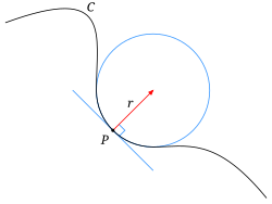
Thickness Map: What is it?
Thickness is a metric for assessing the size and structure of objects in a very generic manner. For every point $\vec{x}$ in the image you find the largest sphere which:
- contains that point
- is entirely contained within the object
 Taken from [1]
- The image shows a typical object
- The sphere centered at point p with a radius r is the largest that fits
Application
- Ideal for spherical and cylindrical objects since it shows their radius
- Also relevant for flow and diffusion since it can highlight bottlenecks in structure
Thickness Map
thick.map<-function(dist.df,min.dist=0.25) {
  obj.vox<-subset(dist.df,dist>=0)
  full.thick.map<-ddply(subset(dist.df,dist>=min.dist),.(x,y),function(c.pos) {
    ix<-c.pos$x[1]
    iy<-c.pos$y[1]
    ir<-c.pos$dist[1]
    # spread the distance out to all points within the sphere
    # save the images inside the sphere
    cbind(
subset(obj.vox,((x-ix)^2+(y-iy)^2)dmap.fg<-dist.map(fill.img,fg.ph=155,bg.ph=0)
ggplot(dmap.fg,aes(x=x,y=y,fill=dist))+
geom_tile(color="black")+
labs(title="Single Cell",fill="Distance\nFrom\nSurface")+
th_fillmap.fn(max(dmap.fg$dist))+
theme_bw(20)+coord_equal()
ggplot(thick.map(dmap.fg),aes(x=x,y=y,fill=sph.rad))+
  geom_tile(color="black")+
  labs(title="Single Cell",fill="Sphere\nRadius")+
  th_fillmap.fn(max(dmap.fg$dist))+
  theme_bw(20)+coord_equal()
Thickness Map
dmap.bg<-dist.map(fill.img,fg.ph=0,bg.ph=155)
ggplot(dmap.bg,aes(x=x,y=y,fill=dist))+
  geom_tile(color="black")+
  labs(title="Single Cell",fill="Distance\nFrom\nSurface")+
  th_fillmap.fn(max(dmap.bg$dist))+
  theme_bw(20)+coord_equal()
ggplot(thick.map(dmap.bg),aes(x=x,y=y,fill=sph.rad))+
  geom_tile(color="black")+
  labs(title="Single Cell",fill="Sphere\nRadius")+
  th_fillmap.fn(max(dmap.bg$dist))+
  theme_bw(20)+coord_equal()
Thickness Map From Skeleton
Calculating the distance map by drawing a sphere at each point is very time consuming (O(n3)).
- The skeleton (last section) is very closely related to the thickness.
- We found the local maxima in the image using the Laplace
- We can thus grow the Spheres from these points instead of all
- Start by instead of thresholding transforming the image to the distance at each point
thSkelImage(x, y)=
$$ \begin{cases}
\textrm{cImg}_1(x,y) , & \textrm{cImg}_1(x,y)\geq MIN-DIST \\
& \& \textrm{ cImg}_2(x,y)\geq MIN-SLOPE \\
0, & \textrm{otherwise}
\end{cases}$$
merge.mesh.dif<-rbind(
  cbind(subset(test.mesh.dist,dist>=sqrt(3)),type="Non-surface\nPoints",val=0),
  cbind(subset(test.mesh.dif,val>.5),type="Slope\nPoints",dist=0)
  )
overlap.im<-ddply(merge.mesh.dif,.(x,y),function(c.pts) {
  data.frame(cnt=nrow(c.pts), # points from how many images are present
             dist=max(c.pts$dist))
})

th_fillmap<-scale_fill_gradientn(colours=rainbow(10),limits=c(0,max(test.mesh.dist$dist)))
ggplot(subset(overlap.im,cnt==2),aes(x=x,y=y,fill=dist))+
  geom_tile(color="black",alpha=1)+
  labs(title="Value Skeleton",fill="Source")+
  th_fillmap+
  theme_bw(20)+coord_equal()
From Skeleton vs All Points
filled.skel<-fill.img.fn(subset(overlap.im,cnt==2),step.size=0.25,dist=0,cnt=0)
system.time(skthmap<-thick.map(filled.skel))## user system elapsed
## 3.369 0.073 3.901
ggplot(skthmap,aes(x=x,y=y,fill=sph.rad))+
  geom_tile(color="black")+
   th_fillmap+
  labs(title="Thickness From Skeleton",fill="Sphere\nRadius")+
  theme_bw(20)+coord_equal()
system.time(thmap<-thick.map(test.mesh.dist))## user system elapsed
## 8.724 0.215 9.233
ggplot(thmap,aes(x=x,y=y,fill=sph.rad))+
  geom_tile(color="black")+
  labs(title="Full Thickness Map",fill="Sphere\nRadius")+
  th_fillmap+
  theme_bw(20)+coord_equal()
Statistically Does it Matter
hist.sum<-ddply.cutcols(rbind(
  cbind(thmap,type="Full Map"),
  cbind(skthmap,type="Skeleton Map")
  ),
  .(cut_interval(sph.rad,12),type),
  function(c.block) data.frame(count=nrow(c.block))
  )
ggplot(hist.sum,aes(x=sph.rad,color=type,y=count))+
  geom_line()+geom_point()+
  labs(x="Sphere Radius",y="Voxel Count",color="Algorithm")+
  theme_bw(20)+scale_y_sqrt()
It depends
- Small structures are lost
- They might not have been very important or noisy anyways
- Higher values are very similar
comp.table<-data.frame(cbind(summary(thmap$sph.rad),summary(skthmap$sph.rad)))
names(comp.table)<-c("Full Map","Skeleton Map")
kable(comp.table)| Full Map | Skeleton Map | |
|---|---|---|
| Min. | 0.750 | 1.750 |
| 1st Qu. | 2.475 | 2.500 |
| Median | 2.658 | 2.693 |
| Mean | 2.637 | 2.708 |
| 3rd Qu. | 2.926 | 2.926 |
| Max. | 3.182 | 3.182 |
How much can we cut down
merge.mesh.dif<-rbind(
  cbind(subset(test.mesh.dist,dist>2),type="Non-surface\nPoints",val=0),
  cbind(subset(test.mesh.dif,val>1.25),type="Slope\nPoints",dist=0)
  )
overlap.im<-ddply(merge.mesh.dif,.(x,y),function(c.pts) {
  data.frame(cnt=nrow(c.pts), # points from how many images are present
             dist=max(c.pts$dist))
})
tfilled.skel<-fill.img.fn(subset(overlap.im,cnt==2),step.size=0.25,dist=0,cnt=0)
system.time(tskthmap<-thick.map(tfilled.skel))## user system elapsed
## 2.095 0.046 2.315
ggplot(tskthmap,aes(x=x,y=y,fill=sph.rad))+
  geom_tile(color="black")+
   th_fillmap+
  labs(title="Thickness from Skeleton\n Slope>1.25 & Dist>1.7",fill="Sphere\nRadius")+
  theme_bw(20)+coord_equal()
hist.sum<-ddply.cutcols(rbind(
    cbind(thmap,type="Full Map"),
    cbind(skthmap,type="Skeleton Map"),
    cbind(tskthmap,type="Tiny Skeleton Map")),
  .(cut_interval(sph.rad,12),type),
  function(c.block) data.frame(count=nrow(c.block))
  )
ggplot(hist.sum,aes(x=sph.rad,color=type,y=count))+
  geom_line()+geom_point()+
  labs(x="Sphere Radius",y="Voxel Count",color="Algorithm")+
  theme_bw(20)+scale_y_sqrt()
comp.table<-data.frame(cbind(summary(thmap$sph.rad),summary(skthmap$sph.rad),summary(tskthmap$sph.rad)))
names(comp.table)<-c("Full Map","Skeleton Map","Tiny Skeleton Map")
kable(comp.table)| Full Map | Skeleton Map | Tiny Skeleton Map | |
|---|---|---|---|
| Min. | 0.750 | 1.750 | 2.136 |
| 1st Qu. | 2.475 | 2.500 | 2.658 |
| Median | 2.658 | 2.693 | 2.658 |
| Mean | 2.637 | 2.708 | 2.754 |
| 3rd Qu. | 2.926 | 2.926 | 3.010 |
| Max. | 3.182 | 3.182 | 3.182 |
Thickness in 3D Images
While the examples and demonstrations so far have been shown in 2D, the same exact technique can be applied to 3D data as well. For example for this liquid foam structure

The thickness can be calculated of the background (air) voxels in the same manner.
With care, this can be used as a proxy for bubble size distribution in systems where all the bubbles are connected to it is difficult to identify single ones.

Watershed
Watershed is a method for segmenting objects without using component labeling.
- It utilizes the shape of structures to find objects
- From the distance map we can make out substructures with our eyes
- But how to we find them?!
test.sph.list.big<-test.sph.list
# bring everything closer
test.sph.list.big$xi<-0.95*test.sph.list.big$xi
test.sph.list.big$yi<-0.95*test.sph.list.big$yi

ws.distmap<-dist.map(make.sph.img(test.sph.list.big,seq(-10,10)),fg.ph=1,bg.ph=0)

ggplot(ws.distmap,aes(x=x,y=y,fill=dist))+
  geom_tile(color="black")+
  labs(title="Original Distance Map",fill="Distance\nFrom\nSurface")+
  theme_bw(20)+coord_equal()
Watershed: Flowing Downhill
So we start by distributing pixels all across the imagews.distmap$count<-1 # evenly distributed
ws.distmap$orig.x<-ws.distmap$x
ws.distmap$orig.y<-ws.distmap$y
ggplot(ws.distmap,aes(x=x,y=y,fill=dist))+
geom_tile(color="black")+
geom_tile(aes(color=as.factor(count)),fill="red",alpha=0.5,size=.2)+
labs(title="Initial Distribution of Water",fill="Distance\nFrom\nSurface",
color="Water\nCount")+
theme_bw(20)+coord_equal()
If any of the neighbors have a higher distance (more downhill) then move to that position
single.watershed<-function(ws.dmap,s.dist=1) {
  ws.fun<-function(in.pos) {
    c.pos<-in.pos[1,]
    # all the points within range of the current voxel with a greater distance
    # since everything flows uphill
    jump.pts<-subset(ws.dmap,
           (sqrt( (x-c.pos$x)^2 + (y-c.pos$y)^2 )<=s.dist) & dist>=c.pos$dist)
    jump.pts<-jump.pts[order(-jump.pts$dist),]
    # find the furtherst point and
    # save the old positions
    best.pts<-cbind(jump.pts[1,c("x","y","dist")],
                    orig.x=in.pos$orig.x,
                    orig.y=in.pos$orig.y,
                    count=in.pos$count)

    # leave an empty copy of the voxel behind (c.pos)
    c.pos$count<-0
    rbind(best.pts,
          c.pos)

  }
  rbind(
    ddply(subset(ws.dmap,count>0),.(x,y),ws.fun),
    subset(ws.dmap,count==0)
    )
}

prop.watershed<-function(...,iters=1) {
  if(iters>1) prop.watershed(single.watershed(...),iters=iters-1)
  else single.watershed(...)
}
show.watershed<-function(ju.tab)
ddply(ju.tab,.(x,y),function(c.pos) data.frame(dist=c.pos[1,"dist"],count=sum(c.pos[,"count"])))ws.onestep<-prop.watershed(ws.distmap,sqrt(2),iters=1)
ggplot(show.watershed(ws.onestep),aes(x=x,y=y,fill=dist))+
geom_tile(aes(fill=as.factor(count),color=dist),size=.2)+
labs(title="After one step",color="Distance\nFrom\nSurface",
fill="Water\nCount")+
theme_bw(20)+coord_equal()
Watershed: More flowing
ws.fewstep<-prop.watershed(ws.onestep,sqrt(2),iters=1)
ggplot(show.watershed(ws.fewstep),aes(x=x,y=y,fill=dist))+
  geom_tile(aes(fill=(count),color=dist),size=1)+
  labs(title="After 2 steps",color="Distance\nFrom\nSurface",
       fill="Water\nCount")+
   scale_fill_gradientn(colours=rainbow(10))+
  theme_bw(20)+coord_equal()
ws.manysteps<-prop.watershed(ws.fewstep,sqrt(2),iters=4)
ggplot(show.watershed(ws.manysteps),aes(x=x,y=y,fill=dist))+
  geom_tile(aes(fill=as.factor(count),color=dist),size=.3)+
  labs(title="After 6 steps",color="Distance\nFrom\nSurface",
       fill="Water\nCount")+
  theme_bw(20)+coord_equal()
Watershed: Regrowing
We can then take the points from these basins and regrow them back to their original size and these represent the watershed regions of our image
ws.manysteps$label<-with(ws.manysteps,paste("Cent:",x,",",y,sep=""))
ggplot(subset(ws.manysteps,count>0),aes(x=orig.x,y=orig.y))+
  geom_tile(aes(fill=label),color="black")+
  labs(title="After 6 steps",
       fill="Watershed")+
  theme_bw(20)+coord_equal()
Curvature
Curvature is a metric related to the surface or interface between phases or objects.
- It is most easily understood in its 1D sense or being the radius of the circle that matchs the local shape of a curve
- Mathematically it is defined as
$$ \kappa = \frac{1}{R} $$
- Thus a low curvature means the value means a very large radius and high curvature means a very small radius
Curvature: Surface Normal
In order to meaningfully talk about curvatures of surfaces, we first need to define a consistent frame of reference for examining the surface of an object. We thus define a surface normal vector as a vector oriented orthogonally to the surface away from the interior of the object $\rightarrow \vec{N}$


Curvature: 3D
With the notion of surface normal defined ($\vec{N}$), we can define many curvatures at point $\vec{x}$ on the surface.
- This is because there are infinitely many planes which contain both point $\vec{x}$ and $\vec{N}$
- More generally we can define an angle θ about which a single plane containing both can be freely rotated
- We can then define two principal curvatures by taking the maximum and minimum of this curve
κ1 = max(κ(θ))
κ2 = min(κ(θ))
Mean Curvature
The mean of the two principal curvatures
$$ H = \frac{1}{2}(\kappa_1+\kappa_2) $$
Gaussian Curvature
The mean of the two principal curvatures
K = κ1κ2
- positive for spheres (or spherical inclusions)
- curvatures agree in sign
- negative for saddles (hyperboloid surfaces)
- curvatures disgree in sign
- 0 for planes
Curvature: 3D Examples
Examining a complex structure with no meaningful ellipsoidal or watershed model. The images themselves show the type of substructures and shapes which are present in the sample.

- gaussian curvature: the comparative amount of surface at, above, and below 0
- from spherical particles into annealed mesh of balls

Characteristic Shape
Characteristic shape can be calculated by measuring principal curvatures and normalizing them by scaling to the structure size. A distribution of these curvatures then provides shape information on a structure indepedent of the size.
For example a structure transitioning from a collection of perfectly spherical particles to a annealed solid will go from having many round spherical faces with positive gaussian curvature to many saddles and more complicated structures with 0 or negative curvature.
Curvature: Take Home Message
It provides another metric for characterizing complex shapes
- Particularly useful for examining interfaces
- Folds, saddles, and many other types of points are not characterized well be ellipsoids or thickness maps
- Provides a scale-free metric for assessing structures
- Can provide visual indications of structural changes
Other Techniques
There are hundreds of other techniques which can be applied to these complicated structures, but they go beyond the scope of this course. Many of them are model-based which means they work well but only for particular types of samples or images. Of the more general techniques several which are easily testable inside of FIJI are
- Directional Analysis = Looking at the orientation of different components using Fourier analysis (Analyze → Directionality)
- Tubeness / Surfaceness (Plugins → Analyze →) characterize binary images and the shape at each point similar to curvature but with a different underlying model
- Fractal Dimensionality = A metric for assessing the structure as you scale up and down by examining various spatial relationships
- Ma, D., Stoica, A. D., & Wang, X.-L. (2009). Power-law scaling and fractal nature of medium-range order in metallic glasses. Nature Materials, 8(1), 30–4. doi:10.1038/nmat2340
- Two (or more) point correlation functions = Used in theoretical material science and physics to describe random materials and can be used to characterize distances, orientations, and organization in complex samples
- Jiao, Y., Stillinger, F., & Torquato, S. (2007). Modeling heterogeneous materials via two-point correlation functions: Basic principles. Physical Review E, 76(3). doi:10.1103/PhysRevE.76.031110
- Andrey, P., Kiêu, K., Kress, C., Lehmann, G., Tirichine, L., Liu, Z., … Debey, P. (2010). Statistical analysis of 3D images detects regular spatial distributions of centromeres and chromocenters in animal and plant nuclei. PLoS Computational Biology, 6(7), e1000853. doi:10.1371/journal.pcbi.1000853
- Haghpanahi, M., & Miramini, S. (2008). Extraction of morphological parameters of tissue engineering scaffolds using two-point correlation function, 463–466. Retrieved from http://portal.acm.org/citation.cfm?id=1713360.1713456