## The basic files and libraries needed for most presentations
# creates the libraries and common-functions sections
read_chunk("../common/utility_functions.R")require(ggplot2) #for plots
require(lattice) # nicer scatter plots
require(plyr) # for processing data.frames
library(dplyr)
require(grid) # contains the arrow function
require(jpeg)
require(doMC) # for parallel code
require(png) # for reading png images
require(gridExtra)
require(reshape2) # for the melt function
#if (!require("biOps")) {
# # for basic image processing
# devtools::install_github("cran/biOps")
# library("biOps")
#}
## To install EBImage
if (!require("EBImage")) { # for more image processing
source("http://bioconductor.org/biocLite.R")
biocLite("EBImage")
}
used.libraries<-c("ggplot2","lattice","plyr","reshape2","grid","gridExtra","biOps","png","EBImage")# start parallel environment
registerDoMC()
# functions for converting images back and forth
im.to.df<-function(in.img,out.col="val") {
out.im<-expand.grid(x=1:nrow(in.img),y=1:ncol(in.img))
out.im[,out.col]<-as.vector(in.img)
out.im
}
df.to.im<-function(in.df,val.col="val",inv=F) {
in.vals<-in.df[[val.col]]
if(class(in.vals[1])=="logical") in.vals<-as.integer(in.vals*255)
if(inv) in.vals<-255-in.vals
out.mat<-matrix(in.vals,nrow=length(unique(in.df$x)),byrow=F)
attr(out.mat,"type")<-"grey"
out.mat
}
ddply.cutcols<-function(...,cols=1) {
# run standard ddply command
cur.table<-ddply(...)
cutlabel.fixer<-function(oVal) {
sapply(oVal,function(x) {
cnv<-as.character(x)
mean(as.numeric(strsplit(substr(cnv,2,nchar(cnv)-1),",")[[1]]))
})
}
cutname.fixer<-function(c.str) {
s.str<-strsplit(c.str,"(",fixed=T)[[1]]
t.str<-strsplit(paste(s.str[c(2:length(s.str))],collapse="("),",")[[1]]
paste(t.str[c(1:length(t.str)-1)],collapse=",")
}
for(i in c(1:cols)) {
cur.table[,i]<-cutlabel.fixer(cur.table[,i])
names(cur.table)[i]<-cutname.fixer(names(cur.table)[i])
}
cur.table
}
# since biOps isn't available use a EBImage based version
imgSobel<-function(img) {
kern<-makeBrush(3)*(-1)
kern[2,2]<-8
filter2(img,kern)
}
show.pngs.as.grid<-function(file.list,title.fun,zoom=1) {
preparePng<-function(x) rasterGrob(readPNG(x,native=T,info=T),width=unit(zoom,"npc"),interp=F)
labelPng<-function(x,title="junk") (qplot(1:300, 1:300, geom="blank",xlab=NULL,ylab=NULL,asp=1)+
annotation_custom(preparePng(x))+
labs(title=title)+theme_bw(24)+
theme(axis.text.x = element_blank(),
axis.text.y = element_blank()))
imgList<-llply(file.list,function(x) labelPng(x,title.fun(x)) )
do.call(grid.arrange,imgList)
}
## Standard image processing tools which I use for visualizing the examples in the script
commean.fun<-function(in.df) {
ddply(in.df,.(val), function(c.cell) {
weight.sum<-sum(c.cell$weight)
data.frame(xv=mean(c.cell$x),
yv=mean(c.cell$y),
xm=with(c.cell,sum(x*weight)/weight.sum),
ym=with(c.cell,sum(y*weight)/weight.sum)
)
})
}
colMeans.df<-function(x,...) as.data.frame(t(colMeans(x,...)))
pca.fun<-function(in.df) {
ddply(in.df,.(val), function(c.cell) {
c.cell.cov<-cov(c.cell[,c("x","y")])
c.cell.eigen<-eigen(c.cell.cov)
c.cell.mean<-colMeans.df(c.cell[,c("x","y")])
out.df<-cbind(c.cell.mean,
data.frame(vx=c.cell.eigen$vectors[1,],
vy=c.cell.eigen$vectors[2,],
vw=sqrt(c.cell.eigen$values),
th.off=atan2(c.cell.eigen$vectors[2,],c.cell.eigen$vectors[1,]))
)
})
}
vec.to.ellipse<-function(pca.df) {
ddply(pca.df,.(val),function(cur.pca) {
# assume there are two vectors now
create.ellipse.points(x.off=cur.pca[1,"x"],y.off=cur.pca[1,"y"],
b=sqrt(5)*cur.pca[1,"vw"],a=sqrt(5)*cur.pca[2,"vw"],
th.off=pi/2-atan2(cur.pca[1,"vy"],cur.pca[1,"vx"]),
x.cent=cur.pca[1,"x"],y.cent=cur.pca[1,"y"])
})
}
# test function for ellipse generation
# ggplot(ldply(seq(-pi,pi,length.out=100),function(th) create.ellipse.points(a=1,b=2,th.off=th,th.val=th)),aes(x=x,y=y))+geom_path()+facet_wrap(~th.val)+coord_equal()
create.ellipse.points<-function(x.off=0,y.off=0,a=1,b=NULL,th.off=0,th.max=2*pi,pts=36,...) {
if (is.null(b)) b<-a
th<-seq(0,th.max,length.out=pts)
data.frame(x=a*cos(th.off)*cos(th)+b*sin(th.off)*sin(th)+x.off,
y=-1*a*sin(th.off)*cos(th)+b*cos(th.off)*sin(th)+y.off,
id=as.factor(paste(x.off,y.off,a,b,th.off,pts,sep=":")),...)
}
deform.ellipse.draw<-function(c.box) {
create.ellipse.points(x.off=c.box$x[1],
y.off=c.box$y[1],
a=c.box$a[1],
b=c.box$b[1],
th.off=c.box$th[1],
col=c.box$col[1])
}
bbox.fun<-function(in.df) {
ddply(in.df,.(val), function(c.cell) {
c.cell.mean<-colMeans.df(c.cell[,c("x","y")])
xmn<-emin(c.cell$x)
xmx<-emax(c.cell$x)
ymn<-emin(c.cell$y)
ymx<-emax(c.cell$y)
out.df<-cbind(c.cell.mean,
data.frame(xi=c(xmn,xmn,xmx,xmx,xmn),
yi=c(ymn,ymx,ymx,ymn,ymn),
xw=xmx-xmn,
yw=ymx-ymn
))
})
}
# since the edge of the pixel is 0.5 away from the middle of the pixel
emin<-function(...) min(...)-0.5
emax<-function(...) max(...)+0.5
extents.fun<-function(in.df) {
ddply(in.df,.(val), function(c.cell) {
c.cell.mean<-colMeans.df(c.cell[,c("x","y")])
out.df<-cbind(c.cell.mean,data.frame(xmin=c(c.cell.mean$x,emin(c.cell$x)),
xmax=c(c.cell.mean$x,emax(c.cell$x)),
ymin=c(emin(c.cell$y),c.cell.mean$y),
ymax=c(emax(c.cell$y),c.cell.mean$y)))
})
}
common.image.path<-"../common"
qbi.file<-function(file.name) file.path(common.image.path,"figures",file.name)
qbi.data<-function(file.name) file.path(common.image.path,"data",file.name)
th_fillmap.fn<-function(max.val) scale_fill_gradientn(colours=rainbow(10),limits=c(0,max.val))Quantitative Big Imaging
author: Kevin Mader date: 17 March 2016 width: 1440 height: 900 css: ../common/template.css transition: rotate
ETHZ: 227-0966-00L
Analysis of Single Objects
Course Outline
source('../common/schedule.R')- 25th February - Introduction and Workflows
- 3rd March - Image Enhancement (A. Kaestner)
- 10th March - Basic Segmentation, Discrete Binary Structures
- 17th March - Advanced Segmentation
- 24th March - Analyzing Single Objects
- 7th April - Analyzing Complex Objects
- 14th April - Spatial Distribution
- 21st April - Statistics and Reproducibility
- 28th April - Dynamic Experiments
- 12th May - Scaling Up / Big Data
- 19th May - Guest Lecture - High Content Screening
- 26th May - Guest Lecture - Machine Learning / Deep Learning and More Advanced Approaches
- 2nd June - Project Presentations
Literature / Useful References
- Jean Claude, Morphometry with R
- Online through ETHZ
- Buy it
- John C. Russ, “The Image Processing Handbook”,(Boca Raton, CRC Press)
- Available online within domain ethz.ch (or proxy.ethz.ch / public VPN)
- Principal Component Analysis
- Venables, W. N. and B. D. Ripley (2002). Modern Applied Statistics with S, Springer-Verlag
- Shape Tensors
- http://www.cs.utah.edu/~gk/papers/vissym04/
- Doube, M.,et al. (2010). BoneJ: Free and extensible bone image analysis in ImageJ. Bone, 47, 1076–9. doi:10.1016/j.bone.2010.08.023
- Mader, K. , et al. (2013). A quantitative framework for the 3D characterization of the osteocyte lacunar system. Bone, 57(1), 142–154. doi:10.1016/j.bone.2013.06.026
Models / ROC Curves
Previously on QBI …
- Image Enhancment
- Highlighting the contrast of interest in images
- Minimizing Noise
- Segmentation
- Understanding value histograms
- Dealing with multi-valued data
- Automatic Methods
- Hysteresis Method, K-Means Analysis
- Regions of Interest
- Contouring
- Machine Learning
Review of ROC
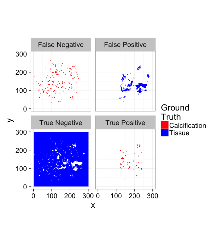
- True Positive values in the ring that are classified as Foreground
- True Negative values outside the ring that are classified as Background
- False Positive values outside the ring that are classified as Foreground
- False Negative values in the ring that are classified as Background
ROC Curve
mk.th.img<-function(in.img,steps,smin=0.3,smax=0.7) ldply(seq(smin,smax,length.out=steps),function(c.thresh) {
  mutate(in.img,
         Segmented = ifelse(
                         Intensity>c.thresh*255,
                         "Foreground","Background"),
         Thresh = c.thresh
        )
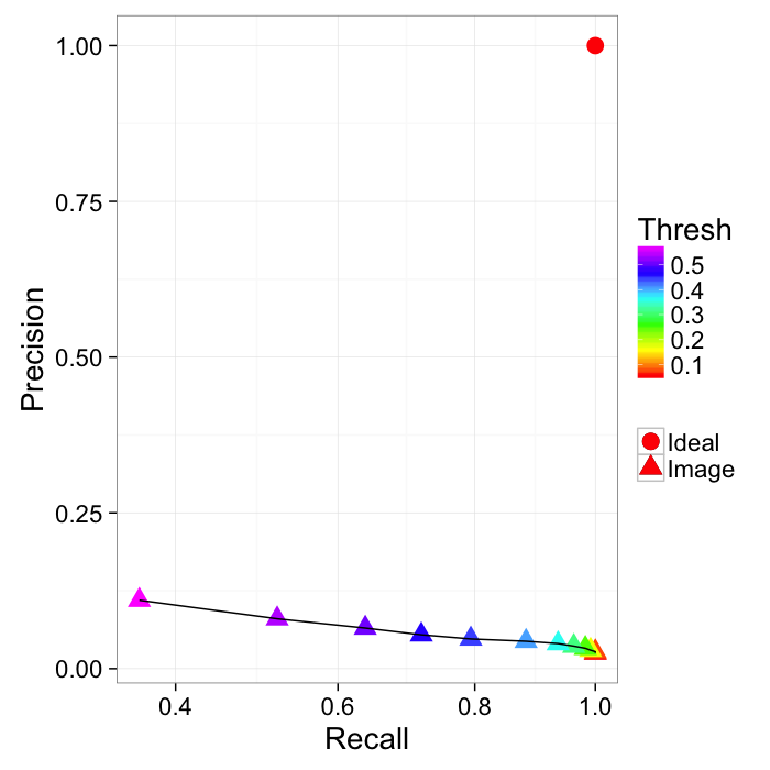
})- Recall (sensitivity)= TP/(TP + FN)
- Precision = TP/(TP + FP)
Reciever Operating Characteristic (first developed for WW2 soldiers detecting objects in battlefields using radar). The ideal is the top-right (identify everything and miss nothing)
Evaluating Models
- https://github.com/jvns/talks/blob/master/pydatanyc2014/slides.md
- http://mathbabe.org/2012/03/06/the-value-added-teacher-model-sucks/
Practical Example: Calcifications in Breast Tissue
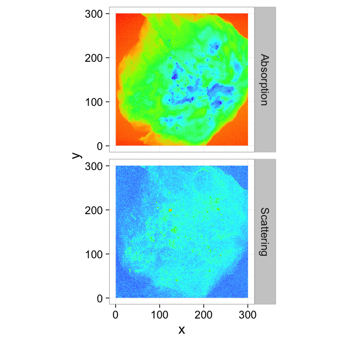
While finding a ring might be didactic, it is not really a relevant problem and these terms are much more meaningful when applied to medical images where every False Positives and False Negative can be mean life-threatening surgery or the lack thereof. (Data courtesy of Zhentian Wang)
# image data
breast.abs<-im.to.df(readPNG(qbi.data("breastabs_0.png")))
breast.dci<-im.to.df(readPNG(qbi.data("breastdci_0.png")))
breast.img<-cbind(breast.abs[,c("x","y")],
                  abs=breast.abs[,c("val")],
                  dci=breast.dci[,c("val")])
# ground truth
breast.cal<-
  mutate(
    im.to.df(readPNG(qbi.data("breastcal_0.png"))),
    Segmented=ifelse(val>0.25,"Calcification","Tissue")
)scale.f<-3
ggplot(rbind(cbind(breast.abs,type="Absorption"),
cbind(mutate(breast.dci,
sval=scale.f*val,
val=ifelse(sval>1,1,sval))[,c("x","y","val")],
type="Scattering")),
aes(x,y,fill=val))+
geom_raster()+
coord_equal()+
facet_grid(type~.)+
scale_fill_gradientn(colours=rainbow(8))+
guides(fill=F)+
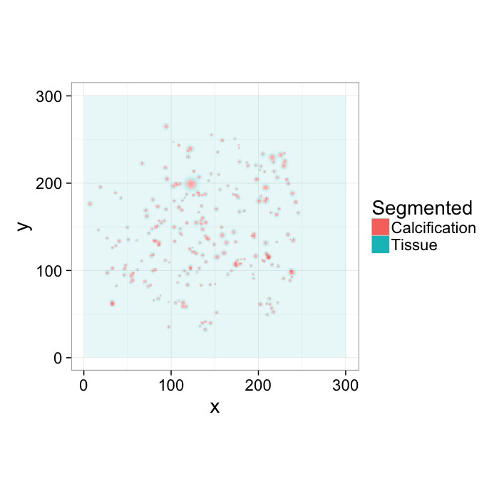
theme_bw(20)From these images, an expert labeled the calcifications by hand, so we have ground truth data on where they are:
ggplot(breast.cal,aes(x,y,fill=Segmented,alpha=val))+
  geom_raster()+
  coord_equal()+
  guides(alpha=F)+
  theme_bw(20)
Applying a threshold
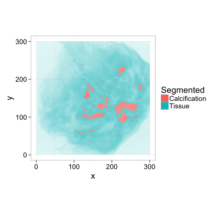
We can perform the same analysis on an image like this one, again using a simple threshold to evalulate how accurately we identify the calcifications
tr.breast<-mutate(breast.abs,
                 Segmented=ifelse(val>0.6,"Calcification","Tissue")
                 )
ggplot(tr.breast,aes(x,y,fill=Segmented,alpha=val))+
  geom_raster()+
  coord_equal()+
  guides(alpha=F)+
theme_bw(20)score.img<-mutate(
merge(tr.breast[,c("x","y","Segmented")]
,
breast.cal[,c("x","y","Segmented")],
by=c("x","y"),suffixes=c("C","GT")),
Match=(SegmentedC==SegmentedGT),
Category=
ifelse(Match,
ifelse(SegmentedC=="Calcification","True Positive","True Negative"),
ifelse(SegmentedC=="Calcification","False Positive","False Negative")
)
)
ggplot(score.img,
aes(x,y,fill=SegmentedGT))+
geom_tile()+
facet_wrap(~Category)+
coord_equal()+
scale_colour_manual(values=c("green","black"))+
scale_fill_manual(values=c("red","blue"))+
labs(fill="Ground\nTruth")+
theme_bw(20)Examining the ROC Curve
mk.th.img<-function(in.img,stepseq) ldply(stepseq,function(c.thresh) {
  mutate(in.img,
         Segmented = ifelse(
                         val>c.thresh,
                         "Calcification","Tissue"),
         Thresh = c.thresh
        )
})

mk.stat.table<-function(in.img,stepseq)
  ddply(mk.th.img(in.img,stepseq),.(Thresh),function(c.img) {
  in.df<-merge(c.img[,c("x","y","Segmented")],
               breast.cal[,c("x","y","Segmented")],
               by=c("x","y"),suffixes=c("C","GT"))
  in.df<-mutate(in.df,Match=(SegmentedC==SegmentedGT))
  data.frame(TP=nrow(subset(in.df,SegmentedGT=="Calcification" & Match)),
             TN=nrow(subset(in.df,SegmentedGT=="Tissue" & Match)),
             FP=nrow(subset(in.df,SegmentedC=="Calcification" & !Match)),
             FN=nrow(subset(in.df,SegmentedC=="Tissue" & !Match))
             )
})
step.fcn<-function(vals,n) quantile(vals,seq(0,1,length.out=n+2)[-c(1,n+2)])
abs.steps<-step.fcn(breast.abs$val,6)
tp.table<-mk.stat.table(breast.abs,abs.steps)prec.table<-mutate(tp.table,
Thresh=round(100*Thresh),
Recall=round(100*TP/(TP+FN)),
Precision=round(100*TP/(TP+FP))
)
kable(prec.table)| Thresh | TP | TN | FP | FN | Recall | Precision |
|---|---|---|---|---|---|---|
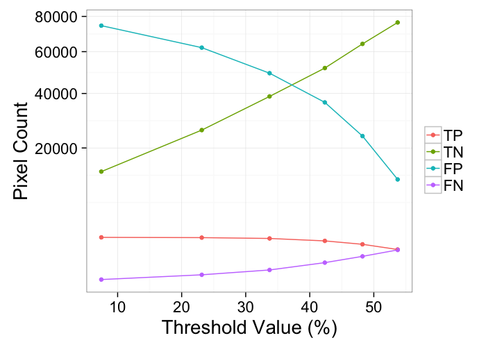
| 7 | 2056 | 13461 | 74483 | 0 | 100 | 3 |
| 23 | 2030 | 25806 | 62138 | 26 | 99 | 3 |
| 34 | 1950 | 38744 | 49200 | 106 | 95 | 4 |
| 42 | 1726 | 51676 | 36268 | 330 | 84 | 5 |
| 48 | 1435 | 64161 | 23783 | 621 | 70 | 6 |
| 54 | 1043 | 76363 | 11581 | 1013 | 51 | 8 |
ggplot(melt(tp.table,id.vars=c("Thresh")),
       aes(x=Thresh*100,y=value,color=variable))+
  geom_point()+
  geom_path()+
  labs(color="",y="Pixel Count",x="Threshold Value (%)")+
  scale_y_sqrt()+
theme_bw(20)abs.steps<-step.fcn(breast.abs$val,12)
tp.table<-mk.stat.table(breast.abs,abs.steps)
prec.table<-mutate(tp.table,
Recall=TP/(TP+FN),
Precision=TP/(TP+FP)
)
ggplot(prec.table,aes(x=Recall,y=Precision))+
geom_point(aes(color=Thresh,shape="Image"),size=5)+
geom_point(data=data.frame(Recall=1,Precision=1),
aes(shape="Ideal"),size=5,color="red")+
geom_path()+
#coord_equal()+
scale_color_gradientn(colours=rainbow(6))+
scale_x_sqrt()+
labs(shape="")+
theme_bw(20)Comparing Absorption and Scattering Channels
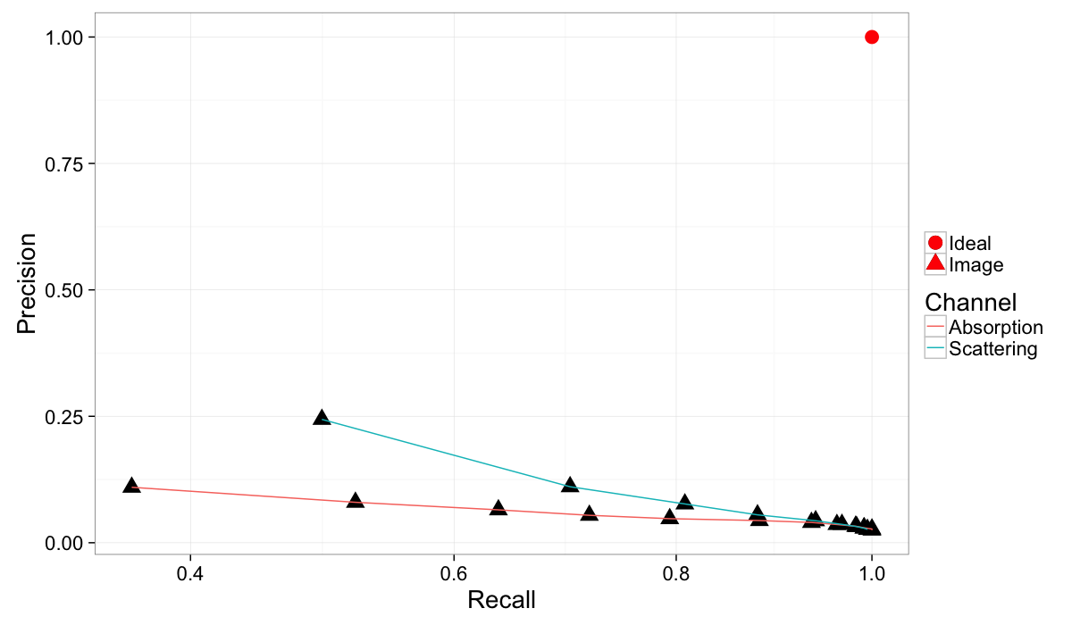
Since our image has two channels we can examine both of them (Recall is not on a linear scale so the differences can more easily be seen). It is clear that scattering provides more useful information than absorption except for very high recall and meaninglessly low precision.
# flip the contrast since the dark values are calcifications
breast.dci.flip<-mutate(breast.dci,val=-1*val)

dci.steps<-step.fcn(breast.dci.flip$val,12)
dci.table<-mk.stat.table(breast.dci.flip,dci.steps)
prec.dci.table<-mutate(dci.table,
                   Recall=TP/(TP+FN),
                  Precision=TP/(TP+FP)
)ggplot(rbind(cbind(prec.table,Channel="Absorption"),
cbind(prec.dci.table,Channel="Scattering")),
aes(x=Recall,y=Precision))+
geom_point(aes(shape="Image"),size=5)+
geom_point(data=data.frame(Recall=1,Precision=1),
aes(shape="Ideal"),size=5,color="red")+
geom_path(aes(group=Channel,color=Channel))+
scale_x_sqrt()+
labs(shape="")+
theme_bw(20)Combining both channels
abs.steps<-step.fcn(breast.img$abs,12)
dci.steps<-step.fcn(breast.img$dci,12)
abs.dci.scan<-ldply(
  abs.steps,function(abs.thresh)
    ldply(dci.steps,function(dci.thresh) {
      mutate(breast.img,
         Segmented = ifelse(
                         (abs>abs.thresh) & (dci
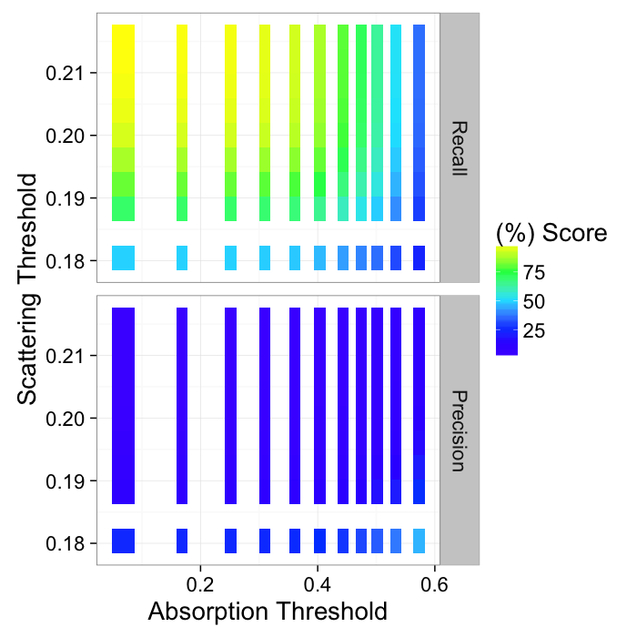
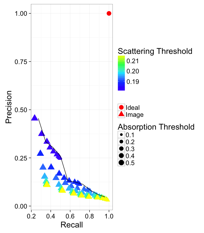
We can get even better results by using a combination of both absorption and scattering to find the calcifications
abs.dci.prec<-mutate(abs.dci.stats,
Recall=TP/(TP+FN),
Precision=TP/(TP+FP)
)
ggplot(melt(abs.dci.prec,measure.vars=c("Recall","Precision")),
aes(x=abs.thresh,y=dci.thresh,fill=100*value))+
geom_tile()+
scale_fill_gradientn(colours=topo.colors(5))+
facet_grid(variable~.)+
labs(x="Absorption Threshold",y="Scattering Threshold",fill="(%) Score")+
theme_bw(20)
This can then be represented as a pseudo-ROC curve by showing all of the points and finding the maximum value.
nice.fit<-ddply.cutcols(abs.dci.prec,.(cut_interval(Recall,10)),function(in.df)
data.frame(Precision=max(in.df$Precision))
)
ggplot(abs.dci.prec,
aes(x=Recall,y=Precision))+
geom_point(aes(shape="Image",color=dci.thresh,size=abs.thresh))+
geom_point(data=data.frame(Recall=1,Precision=1),
aes(shape="Ideal"),size=5,color="red")+
geom_path(data=nice.fit)+
scale_color_gradientn(colours=topo.colors(5))+
labs(color="Scattering Threshold",size="Absorption Threshold",
fill="(%) Score",shape="")+
theme_bw(20)
Learning Objectives
Motivation (Why and How?)
- How do we quantify where and how big our objects are?
- How can we say something about the shape?
- How can we compare objects of different sizes?
- How can we compare two images on the basis of the shape as calculated from the images?
- How can we put objects into an finite element simulation? or make pretty renderings?
Outline
- Motivation (Why and How?)
- Object Characterization
- Volume
- Center and Extents
- Anisotropy
- Shape Tensor
- Principal Component Analysis
- Ellipsoid Representation
- Scale-free metrics
- Anisotropy, Oblateness
- Meshing
- Marching Cubes
- Isosurfaces
- Surface Area
Motivation
We have dramatically simplified our data, but there is still too much.
- We perform an experiment bone to see how big the cells are inside the tissue
↓

2560 x 2560 x 2160 x 32 bit
56GB / sample
- Filtering and Enhancement!
↓
- 56GB of less noisy data
- Segmentation
↓
2560 x 2560 x 2160 x 1 bit
(1.75GB / sample)
- Still an aweful lot of data
What did we want in the first place
Single number:
- volume fraction,
- cell count,
- average cell stretch,
- cell volume variability
Component Labeling
Once we have a clearly segmented image, it is often helpful to identify the sub-components of this image. The easist method for identifying these subcomponents is called component labeling which again uses the neighborhood 𝒩 as a criterion for connectivity, resulting in pixels which are touching being part of the same object.
In general, the approach works well since usually when different regions are touching, they are related. It runs into issues when you have multiple regions which agglomerate together, for example a continuous pore network (1 object) or a cluster of touching cells
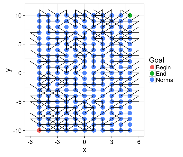
The more general formulation of the problem is for networks (roads, computers, social). Are the points start and finish connected?
nx<-5
ny<-10
cross.im<-expand.grid(x=c(-nx:nx),y=c(-ny:ny))
max.nodes.fn<-function(x,y) 1+round(abs(x+y/2)) # non-homogenous network connectivity
cross.im<-ddply(cross.im,.(x,y), function(in.pt) {
out.df<-data.frame(xv=c(),yv=c())
max.nodes<-max.nodes.fn(in.pt[1,"x"],in.pt[1,"y"])
for(i in 1:round(runif(1,max=max.nodes))) {
c.angle<-runif(1,max=pi)
out.df<-rbind(out.df,data.frame(
xv=round(cos(c.angle)),
yv=round(sin(c.angle))
))
}
out.df
})
id.fn<-function(x,y) (y*100+x)
cross.im$id<-with(cross.im,id.fn(x,y))
cross.lab.im<-cbind(cross.im,label="Normal")
cross.lab.im$label<-as.character(cross.lab.im$label)
cross.lab.im[which(cross.lab.im$id==cross.lab.im[1,]$id),"label"]<-"Begin"
cross.lab.im[which(cross.lab.im$id==cross.lab.im[nrow(cross.lab.im),]$id),"label"]<-"End"
cross.lab.im$label<-as.factor(cross.lab.im$label)
ggplot(cross.lab.im,aes(x=x,y=y,xend=x+xv,yend=y+yv))+
geom_point(aes(color=label),size=5)+geom_segment()+
theme_bw(20)+labs(color="Goal")
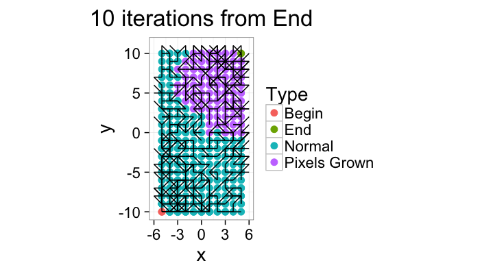
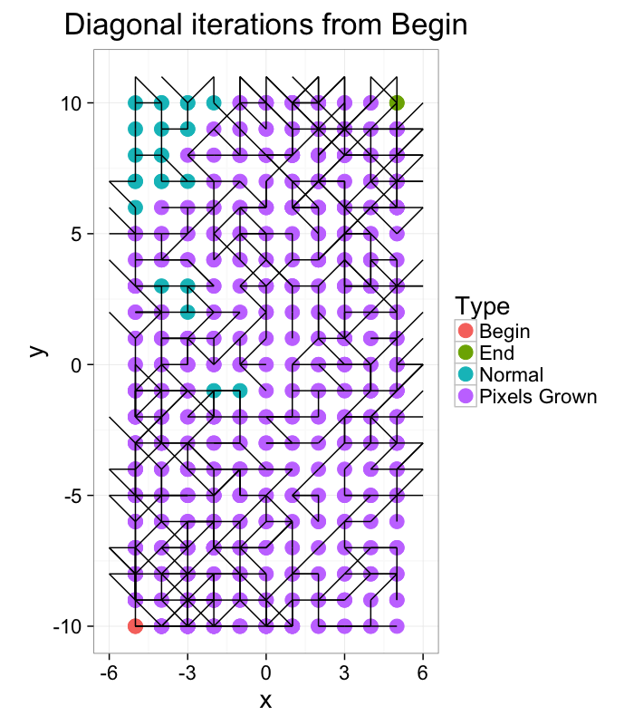
Component Labeling: Algorithm
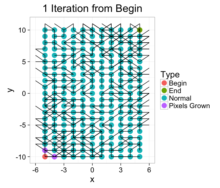
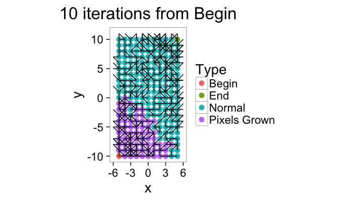
We start out with the network and we grow Begin to its connections. In a brushfire-style algorithm
- For each point (x, y)∈{Begin, Pixels Grown}
- For each point (x′, y′)∈𝒩(x, y)
- Set the label to Pixels Grown
- Repeat until no more labels have been changed
# Network traversing algorithm
iter.grow<-function(ncross.lab.im,iter.cnt=10,source.phase="Begin",target.phase=NA,grow.into.phase="Normal") {
if(is.na(target.phase)) target.phase<-source.phase
for(iters in 1:iter.cnt) {
begin.pts<-subset(ncross.lab.im,label==source.phase | label==target.phase)
begin.ids<-unique(begin.pts$id)
begin.pts.term<-subset(ncross.lab.im,id.fn(x+xv,y+yv) %in% begin.ids)
begin.pts<-rbind(begin.pts,
begin.pts.term
)
ncross.lab.im$label<-as.character(ncross.lab.im$label)
for(i in 1:nrow(begin.pts)) {
cur.pt<-begin.pts[i,]
child.id<-id.fn(cur.pt$x+cur.pt$xv,cur.pt$y+cur.pt$yv)
switch.pixs<-which(ncross.lab.im$id==child.id &
ncross.lab.im$label == grow.into.phase)
if(length(switch.pixs)>1) ncross.lab.im[switch.pixs ,"label"]<-target.phase
}
switch.pixs<-which(ncross.lab.im$id %in% begin.pts.term$id &
ncross.lab.im$label == grow.into.phase)
if(length(switch.pixs)>1) ncross.lab.im[switch.pixs,"label"]<-target.phase
}
ncross.lab.im$label<-as.factor(ncross.lab.im$label)
ncross.lab.im
}
ggplot(iter.grow(cross.lab.im,1,target.phase="Pixels Grown"),aes(x=x,y=y,xend=x+xv,yend=y+yv))+
geom_point(aes(color=label),size=5)+geom_segment()+
theme_bw(20)+labs(color="Type",title="1 Iteration from Begin")
Component Labeling: Algorithm Steps
ggplot(iter.grow(cross.lab.im,10,target.phase="Pixels Grown"),aes(x=x,y=y,xend=x+xv,yend=y+yv))+
geom_point(aes(color=label),size=3)+geom_segment()+coord_equal()+
theme_bw(20)+labs(color="Type",title="10 iterations from Begin")
ggplot(iter.grow(cross.lab.im,10,source.phase="End",target.phase="Pixels Grown"),aes(x=x,y=y,xend=x+xv,yend=y+yv))+
geom_point(aes(color=label),size=3)+geom_segment()+coord_equal()+
theme_bw(20)+labs(color="Type",title="10 iterations from End")
ggplot(iter.grow(cross.lab.im,round(2*sqrt(20^2+10^2)),target.phase="Pixels Grown"),aes(x=x,y=y,xend=x+xv,yend=y+yv))+
geom_point(aes(color=label),size=5)+geom_segment()+coord_equal()+
theme_bw(20)+labs(color="Type",title="Diagonal iterations from Begin")
Component Labeling: Images Algorithm
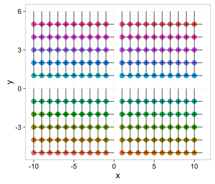
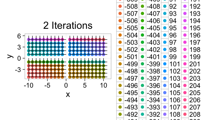
Same as for networks but the neighborhood is defined with a kernel (circular, full, line, etc) and labels must be generate for the image
Assign a unique label to each point in the image
L(x, y)=y * Imwidth + x
- For each point (x, y)
- Check each point (x′, y′)∈𝒩(x, y)
- Set
L(x, y)=min(L(x, y),L(x′, y′))
L(x′, y′)=L(x, y)
Repeat until no more L values are changed
nx<-10
ny<-5
ang.vals<-seq(0,pi/2,length.out=2)
cross.im<-expand.grid(x=c(-nx:nx),y=c(-ny:ny))
cross.im<-ddply(cross.im,.(x,y), function(in.pt) {
out.df<-data.frame(xv=c(),yv=c())
for(i in 1:length(ang.vals)) {
c.angle<-ang.vals[i]
out.df<-rbind(out.df,data.frame(
xv=round(cos(c.angle)),
yv=round(sin(c.angle))
))
}
out.df
})
id.fn<-function(x,y) (y*100+x)
cross.im$id<-with(cross.im,id.fn(x,y))
cross.im<-subset(cross.im,x!=0 & y!=0)
ggplot(cross.im,aes(x=x,y=y,xend=x+xv,yend=y+yv))+
geom_point(aes(color=as.factor(id)),size=5)+geom_segment()+
guides(color = "none")+
theme_bw(20)
Component Labeling: Image Algorithm
# Component labeling algorithm
im.iter.grow<-function(icross.im,iter.cnt=10) {
ncross.im<-icross.im
for(iters in 1:iter.cnt) {
begin.pts<-ncross.im
for(i in 1:nrow(begin.pts)) {
cur.pt<-begin.pts[i,]
child.id<-id.fn(cur.pt$x+cur.pt$xv,cur.pt$y+cur.pt$yv)
# fill into lower points
switch.pixs<-which(icross.im$id==child.id &
icross.im$id > cur.pt$id)
if(length(switch.pixs)>1) ncross.im[switch.pixs ,"id"]<-cur.pt$id
}
icross.im<-ncross.im
}
ncross.im
}
ggplot(im.iter.grow(cross.im,2),aes(x=x,y=y,xend=x+xv,yend=y+yv))+
geom_point(aes(color=as.factor(id)),size=3)+geom_segment()+coord_equal()+
theme_bw(20)+labs(color="Type",title="2 Iterations")
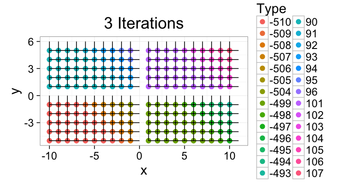
ggplot(im.iter.grow(cross.im,3),aes(x=x,y=y,xend=x+xv,yend=y+yv))+
geom_point(aes(color=as.factor(id)),size=3)+geom_segment()+
coord_equal()+
theme_bw(20)+labs(color="Type",title="3 Iterations")
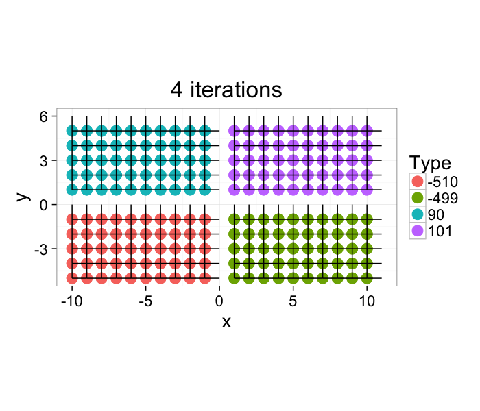
The image very quickly converges and after 4 iterations the task is complete. For larger more complicated images with thousands of components this task can take longer, but there exist much more efficient algorithms for labeling components which alleviate this issue.
ggplot(im.iter.grow(cross.im,4),aes(x=x,y=y,xend=x+xv,yend=y+yv))+
geom_point(aes(color=as.factor(id)),size=5)+geom_segment()+coord_equal()+
theme_bw(20)+labs(color="Type",title="4 iterations")
Component Labeling: Image Algorithm
cell.im<-jpeg::readJPEG("ext-figures/Cell_Colony.jpg")
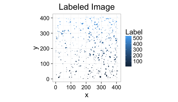
cell.lab.df<-im.to.df(bwlabel(cell.im<.6))
ggplot(subset(cell.lab.df,val>0),aes(x=x,y=y,fill=val))+
geom_raster()+
labs(fill="Label",title="Labeled Image")+
theme_bw(20)+coord_equal()
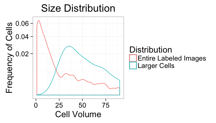
size.histogram<-ddply(subset(cell.lab.df,val>0),.(val),function(c.label) data.frame(count=nrow(c.label)))
keep.vals<-subset(size.histogram,count>25)
ggplot(size.histogram,aes(x=count))+
geom_density(aes(color="Entire Labeled Images"))+
geom_density(data=keep.vals,aes(color="Larger Cells"))+
labs(x="Cell Volume",y="Frequency of Cells",title="Size Distribution",color="Distribution")+
scale_y_sqrt()+
theme_bw(20)
ggplot(subset(cell.lab.df,val %in% keep.vals$val),aes(x=x,y=y,fill=as.factor(val)))+
geom_raster()+
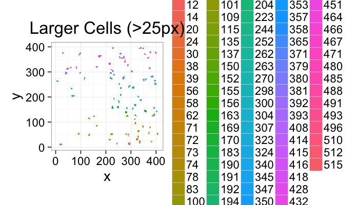
labs(fill="Intensity",title="Larger Cells (>25px)")+
theme_bw(20)+coord_equal()
Component Labeling: Beyond
Now all the voxels which are connected have the same label. We can then perform simple metrics like
- counting the number of voxels in each label to estimate volume.
- looking at the change in volume during erosion or dilation to estimate surface area
From the labels
cell.im<-jpeg::readJPEG("ext-figures/Cell_Colony.jpg")
cell.lab.df<-im.to.df(bwlabel(cell.im<.6))
size.histogram<-ddply(subset(cell.lab.df,val>0),.(val),function(c.label) data.frame(count=nrow(c.label)))
keep.vals<-subset(size.histogram,count>25)
cur.cell.id<-subset(cell.lab.df,val %in% keep.vals$val)$val[1]
cur.cell.df<-subset(cell.lab.df,val==cur.cell.id)
ggplot(subset(cell.lab.df,val %in% keep.vals$val),aes(x=x,y=y,fill=as.numeric(as.factor(val))))+
geom_raster()+
geom_tile(data=cur.cell.df,fill="red",alpha=0.5)+
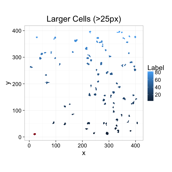
labs(fill="Label",title="Larger Cells (>25px)")+
theme_bw(20)+coord_equal()
What we would like to to do
- Count the cells
- Say something about the cells
- Compare the cells in this image to another image
- But where do we start?
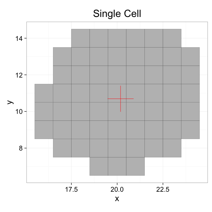
COV: With a single object
$$ I_{id}(x,y) =
\begin{cases}
1, & L(x,y) = id \\
0, & \text{otherwise}
\end{cases}$$
mean.df<-colMeans.df(cur.cell.df[,c("x","y")])
ggplot(cur.cell.df,aes(x=x,y=y))+
geom_tile(color="black",fill="grey")+
geom_point(data=mean.df,color="red",pch=3,size=20)+
labs(title="Single Cell")+
theme_bw(20)+coord_equal()+guides(fill=F)
Define a center
$$ \bar{x} = \frac{1}{N} \sum_{\vec{v}\in I_{id}} \vec{v}\cdot\vec{i} $$
$$ \bar{y} = \frac{1}{N} \sum_{\vec{v}\in I_{id}} \vec{v}\cdot\vec{j} $$
$$ \bar{z} = \frac{1}{N} \sum_{\vec{v}\in I_{id}} \vec{v}\cdot\vec{k} $$
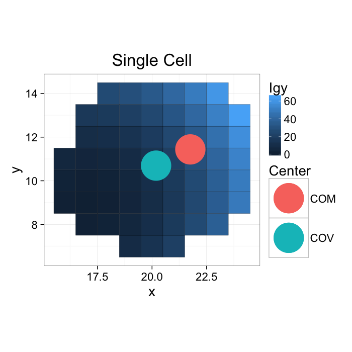
COM: With a single object
If the gray values are kept (or other meaningful ones are used), this can be seen as a weighted center of volume or center of mass (using Igy to distinguish it from the labels)
commean.fun<-function(in.df) {
ddply(in.df,.(val), function(c.cell) {
weight.sum<-sum(c.cell$weight)
data.frame(xv=mean(c.cell$x),
yv=mean(c.cell$y),
xm=with(c.cell,sum(x*weight)/weight.sum),
ym=with(c.cell,sum(y*weight)/weight.sum)
)
})
}
cur.cell.df.weight<-cbind(cur.cell.df,weight=with(cur.cell.df,(x-17)^2+(y-9)^2))
commean.df<-commean.fun(cur.cell.df.weight)
ggplot(cur.cell.df.weight,aes(x=x,y=y))+
geom_tile(aes(fill=weight),color="black")+
geom_point(data=commean.df,aes(x=xv,y=yv,color="COV"),pch=16,size=20)+
geom_point(data=commean.df,aes(x=xm,y=ym,color="COM"),pch=16,size=20)+
labs(title="Single Cell",color="Center",fill="Igy")+
theme_bw(20)+coord_equal()#+guides(fill=T)
Define a center
$$ \Sigma I_{gy} = \frac{1}{N} \sum_{\vec{v}\in I_{id}} I_{gy}(\vec{v}) $$
$$ \bar{x} = \frac{1}{\Sigma I_{gy}} \sum_{\vec{v}\in I_{id}} (\vec{v}\cdot\vec{i}) I_{gy}(\vec{v}) $$
$$ \bar{y} = \frac{1}{\Sigma I_{gy}} \sum_{\vec{v}\in I_{id}} (\vec{v}\cdot\vec{j}) I_{gy}(\vec{v}) $$
$$ \bar{z} = \frac{1}{\Sigma I_{gy}} \sum_{\vec{v}\in I_{id}} (\vec{v}\cdot\vec{k}) I_{gy}(\vec{v}) $$
Extents: With a single object
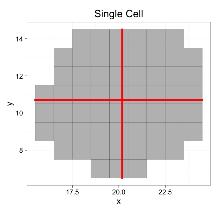
Exents or caliper lenghts are the size of the object in a given direction. Since the coordinates of our image our x and y the extents are calculated in these directions
# since the edge of the pixel is 0.5 away from the middle of the pixel
emin<-function(...) min(...)-0.5
emax<-function(...) max(...)+0.5
extents.fun<-function(in.df) {
ddply(in.df,.(val), function(c.cell) {
c.cell.mean<-colMeans.df(c.cell[,c("x","y")])
out.df<-cbind(c.cell.mean,data.frame(xmin=c(c.cell.mean$x,emin(c.cell$x)),
xmax=c(c.cell.mean$x,emax(c.cell$x)),
ymin=c(emin(c.cell$y),c.cell.mean$y),
ymax=c(emax(c.cell$y),c.cell.mean$y)))
})
}
cell.extents<-extents.fun(cur.cell.df)
ggplot(cur.cell.df,aes(x=x,y=y))+
geom_tile(color="black",fill="grey")+
geom_segment(data=cell.extents,aes(x=xmin,y=ymin, xend=xmax,yend=ymax),color="red",size=2,lineend="square")+
labs(title="Single Cell")+
theme_bw(20)+coord_equal()+guides(fill=F)
Define extents as the minimum and maximum values along the projection of the shape in each direction
$$ \text{Ext}_x = \left\{ \forall \vec{v}\in I_{id}: max(\vec{v}\cdot\vec{i})-min(\vec{v}\cdot\vec{i}) \right\} $$
$$ \text{Ext}_y = \left\{ \forall \vec{v}\in I_{id}: max(\vec{v}\cdot\vec{j})-min(\vec{v}\cdot\vec{j}) \right\} $$
$$ \text{Ext}_z = \left\{ \forall \vec{}\in I_{id}: max(\vec{v}\cdot\vec{k})-min(\vec{v}\cdot\vec{k}) \right\} $$
- Lots of information about each object now
- But, I don’t think a biologist has ever asked “How long is a cell in the x direction? how about y?”
Anisotropy: What is it?
By definition (New Oxford American): varying in magnitude according to the direction of measurement.
- It allows us to define metrics in respect to one another and thereby characterize shape.
- Is it tall and skinny, short and fat, or perfectly round
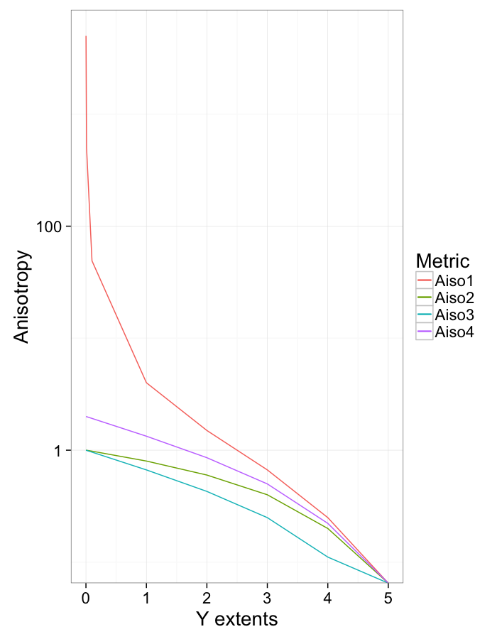
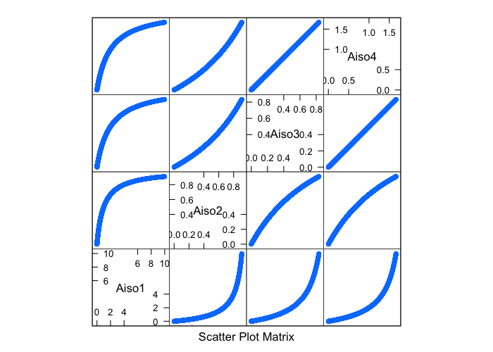
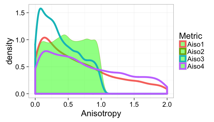
Due to its very vague definition, it can be mathematically characterized in many different very much unequal ways (in all cases 0 represents a sphere)
$$ Aiso1 = \frac{\text{Longest Side}}{\text{Shortest Side}} - 1 $$
$$ Aiso2 = \frac{\text{Longest Side}-\text{Shortest Side}}{\text{Longest Side}} $$
$$ Aiso3 = \frac{\text{Longest Side}}{\text{Average Side Length}} - 1 $$
$$ Aiso4 = \frac{\text{Longest Side}-\text{Shortest Side}}{\text{Average Side Length}} $$
⋯ → ad nauseum
Anisotropy: Which definition makes sense?
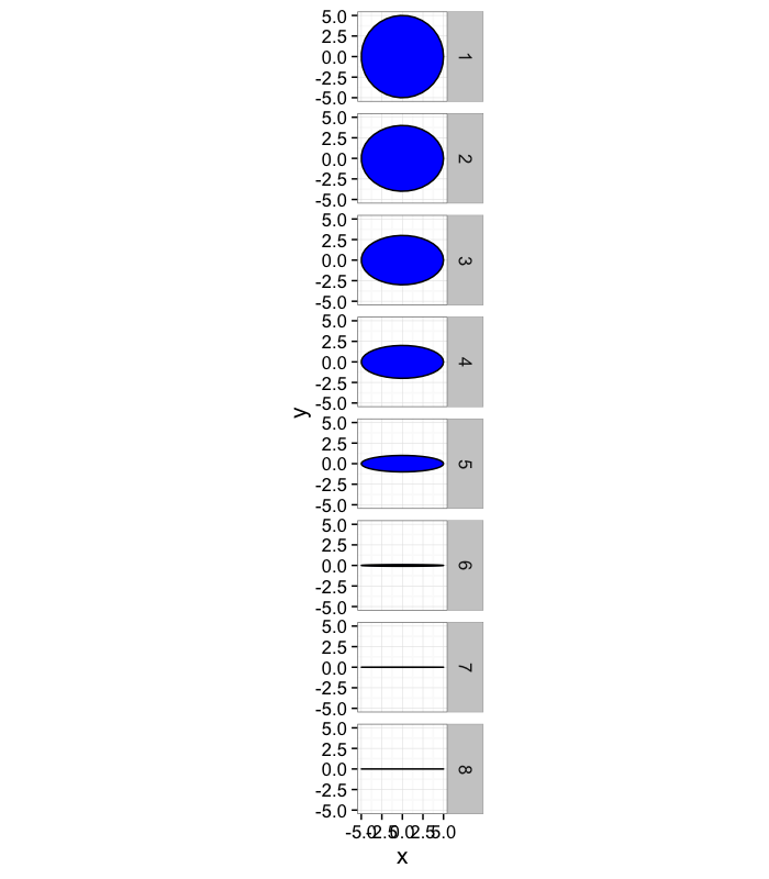
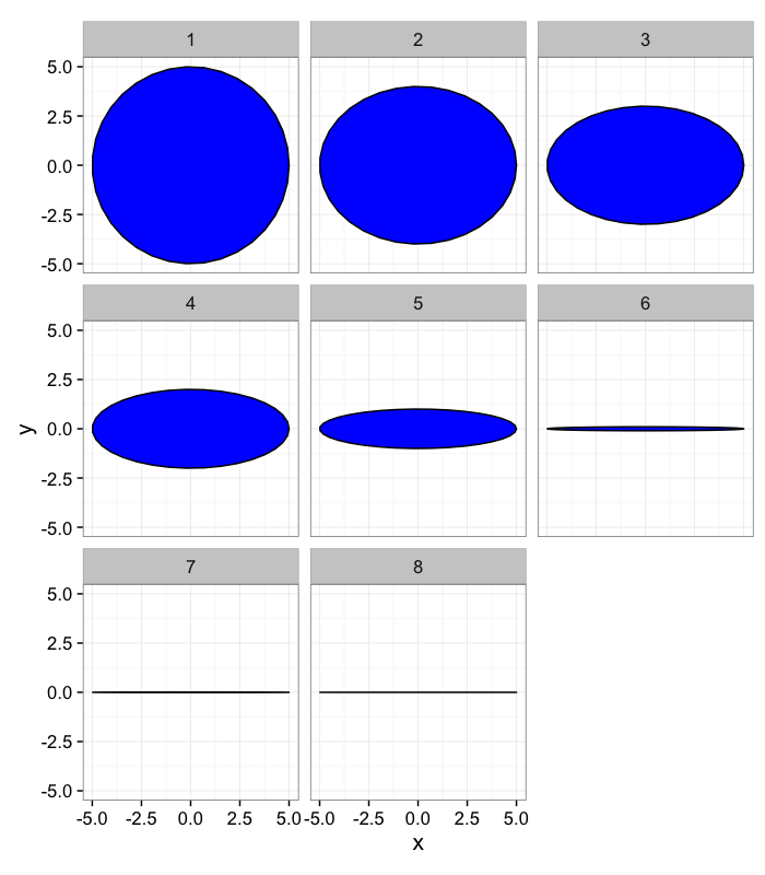
Let’s take some sample objects
# test function for ellipse generation
# ggplot(ldply(seq(-pi,pi,length.out=100),function(th) create.ellipse.points(a=1,b=2,th.off=th,th.val=th)),aes(x=x,y=y))+geom_path()+facet_wrap(~th.val)+coord_equal()
create.ellipse.points<-function(x.off=0,y.off=0,a=1,b=NULL,th.off=0,th.max=2*pi,pts=36,...) {
if (is.null(b)) b<-a
th<-seq(0,th.max,length.out=pts)
data.frame(x=a*cos(th.off)*cos(th)+b*sin(th.off)*sin(th)+x.off,
y=-1*a*sin(th.off)*cos(th)+b*cos(th.off)*sin(th)+y.off,
id=as.factor(paste(x.off,y.off,a,b,th.off,pts,sep=":")),...)
}
deform.ellipse.draw<-function(c.box) {
create.ellipse.points(x.off=c.box$x[1],
y.off=c.box$y[1],
a=c.box$a[1],
b=c.box$b[1],
th.off=c.box$th[1],
col=c.box$col[1])
}
test.objs<-data.frame(x=0,y=0,th.off=0,a=5,b=rev(c(1e-3,1e-2,1e-1,1,2,3,4,5)))
test.objs$col<-1:nrow(test.objs)
test.objs$x.extents<-2*test.objs$a
test.objs$y.extents<-2*test.objs$b
ggplot(ddply(test.objs,.(col),deform.ellipse.draw),
aes(x=x,y=y,group=as.factor(id)))+
geom_polygon(color="black",fill="blue")+coord_equal()+
facet_grid(col~.)+theme_bw(15)
s.aiso<-function(lside,sside) (lside/sside-1)
aiso<-function(lside,sside) ((lside-sside)/lside)
a.aiso<-function(lside,sside) (2*lside/(lside+sside)-1)
as.aiso<-function(lside,sside) (2*(lside-sside)/(lside+sside))
awrap<-function(c.fun) function(in.ell.dim) c.fun(pmax(2*in.ell.dim$a,2*in.ell.dim$b),pmin(2*in.ell.dim$a,2*in.ell.dim$b))
aiso.table.fn<-function(in.objs) {
ddply(in.objs,.(b),function(c.ell) {
data.frame(Aiso1=awrap(s.aiso)(c.ell),
Aiso2=awrap(aiso)(c.ell),
Aiso3=awrap(a.aiso)(c.ell),
Aiso4=awrap(as.aiso)(c.ell))
})
}
aiso.table<-aiso.table.fn(test.objs)
names(aiso.table)[1]<-"Y Extent"
kable(aiso.table,digits=2)
Y Extent
Aiso1
Aiso2
Aiso3
Aiso4
0.00
4999.00
1.00
1.00
2.00
0.01
499.00
1.00
1.00
1.99
0.10
49.00
0.98
0.96
1.92
1.00
4.00
0.80
0.67
1.33
2.00
1.50
0.60
0.43
0.86
3.00
0.67
0.40
0.25
0.50
4.00
0.25
0.20
0.11
0.22
5.00
0.00
0.00
0.00
0.00
Anisotropy: Which definition makes sense?
ggplot(ddply(test.objs,.(col),deform.ellipse.draw),
aes(x=x,y=y,group=as.factor(id)))+
geom_polygon(color="black",fill="blue")+coord_equal()+
facet_wrap(~col)+theme_bw(15)
Anisotropy vs x extents
names(aiso.table)[1]<-"y.extent"
ggplot(aiso.table,aes(x=y.extent))+
geom_line(aes(y=Aiso1,color="Aiso1"))+
geom_line(aes(y=Aiso2,color="Aiso2"))+
geom_line(aes(y=Aiso3,color="Aiso3"))+
geom_line(aes(y=Aiso4,color="Aiso4"))+
scale_y_log10()+
labs(x="Y extents",y="Anisotropy",color="Metric")+
theme_bw(20)
Distributions: Randomly Sized Objects
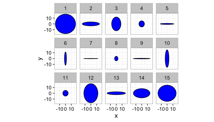
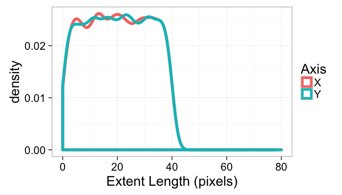
Objects with uniformally distributed, independent x and y extents
m.count<-5000
many.objs<-data.frame(x=0,y=0,th.off=0,a=runif(m.count,0,20),b=runif(m.count,0,20))
many.objs$col<-1:nrow(many.objs)
many.objs$x.extents<-2*many.objs$a
many.objs$y.extents<-2*many.objs$b
maiso.table<-aiso.table.fn(many.objs)
ggplot(ddply(subset(many.objs,col<16),.(col),deform.ellipse.draw),
aes(x=x,y=y,group=as.factor(id)))+
geom_polygon(color="black",fill="blue")+coord_equal()+
facet_wrap(~col,ncol=5)+theme_bw(15)
ggplot(many.objs)+
geom_density(aes(x=x.extents,color="X"),size=2)+
geom_density(aes(x=y.extents,color="Y"),size=2)+
#scale_x_log10()+
labs(x="Extent Length (pixels)",color="Axis")+
guides(fill=F)+
xlim(0,80)+
theme_bw(20)
ggplot(maiso.table)+
geom_density(aes(x=Aiso1,color="Aiso1"),size=2)+
geom_density(aes(x=Aiso2,color="Aiso2"),fill="green",alpha=0.5)+
geom_density(aes(x=Aiso3,color="Aiso3"),size=2)+
geom_density(aes(x=Aiso4,color="Aiso4"),size=2)+
#scale_x_log10()+
labs(x="Anisotropy",color="Metric")+
xlim(0,2)+guides(fill=F)+
theme_bw(20)
Extents: With all objects
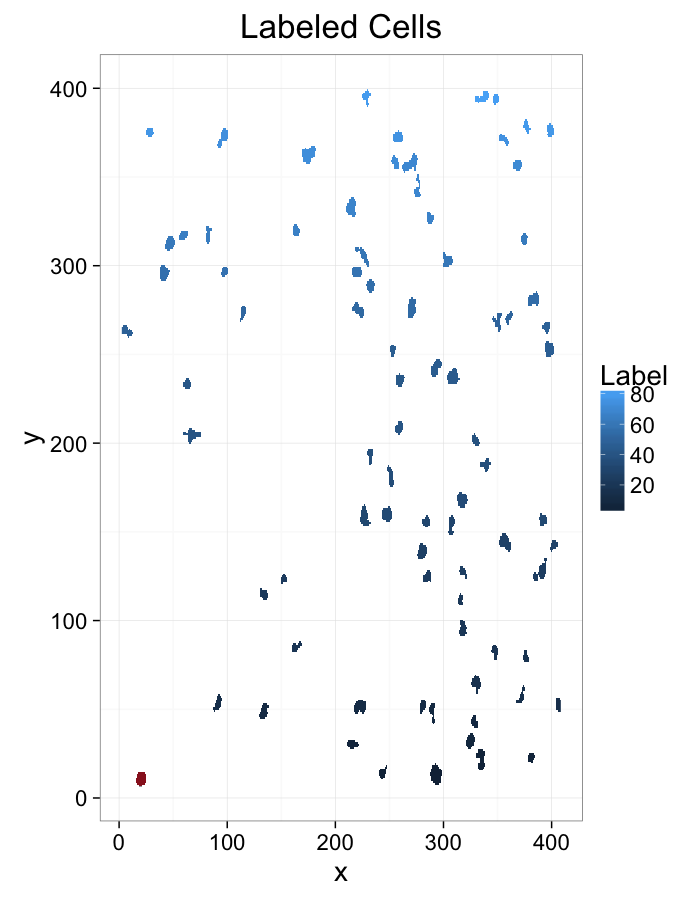
ggplot(subset(cell.lab.df,val %in% keep.vals$val),aes(x=x,y=y,
fill=as.numeric(as.factor(val))))+
geom_raster()+
geom_tile(data=cur.cell.df,fill="red",alpha=0.5)+
labs(fill="Label",title="Labeled Cells")+
theme_bw(20)#+coord_equal()
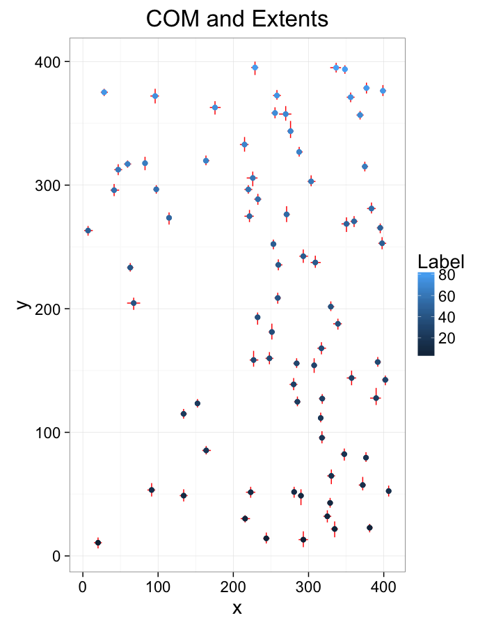
cell.extents.all<-extents.fun(subset(cell.lab.df,val %in% keep.vals$val))
ggplot(cell.extents.all,aes(x=x,y=y))+
geom_segment(aes(x=xmin,y=ymin, xend=xmax,yend=ymax),color="red",lineend="square")+
geom_point(aes(color=as.numeric(as.factor(val))),size=2)+
labs(title="COM and Extents",color="Label")+
theme_bw(20)#+coord_equal()
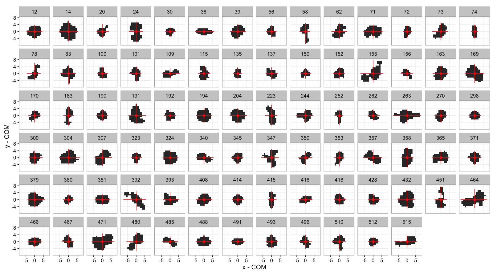
COV and Extents: All Cells
mean.pos.subfun<-function(in.df) {
ddply(in.df,.(val),function(c.cell) {
c.mean<-colMeans.df(c.cell)
data.frame(x=c.cell$x-c.mean$x,y=c.cell$y-c.mean$y)
})
}
mean.sub.df<-mean.pos.subfun(subset(cell.lab.df,val %in% keep.vals$val))
ggplot(cell.extents.all,aes(x=x-x,y=y-y))+
geom_raster(data=mean.sub.df,aes(x=x,y=y))+
geom_segment(aes(x=xmin-x,y=ymin-y, xend=xmax-x,yend=ymax-y),
color="red")+
geom_point(color="red",size=2)+
facet_wrap(~val,ncol=14)+
labs(x="x - COM",y="y - COM")+
theme_bw(15)+coord_equal()
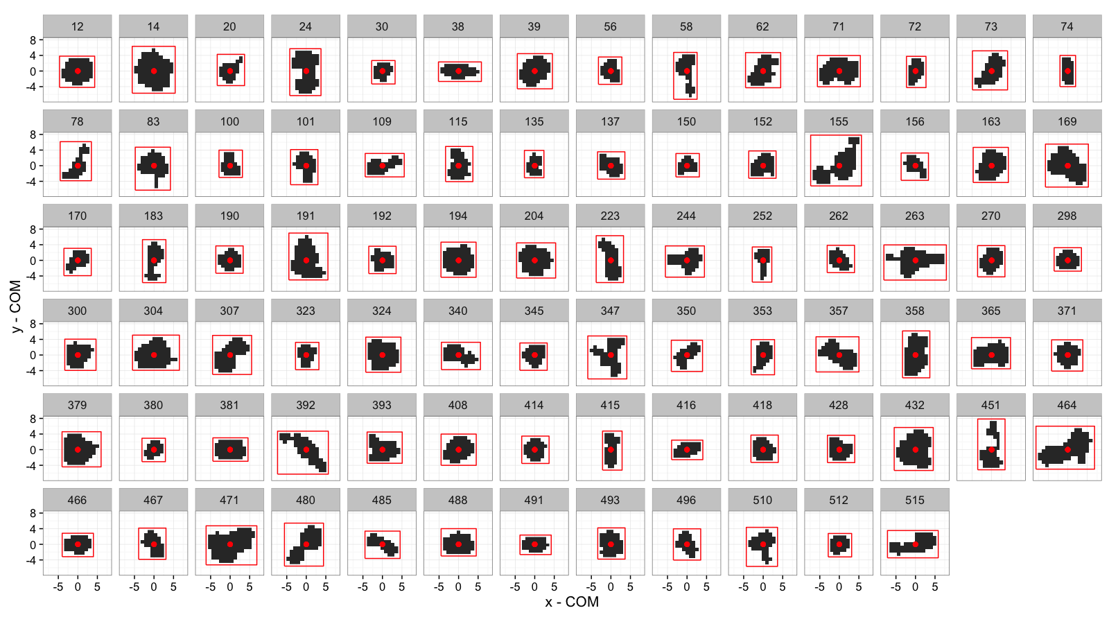
Bounding Box: All Cells
bbox.fun<-function(in.df) {
ddply(in.df,.(val), function(c.cell) {
c.cell.mean<-colMeans.df(c.cell[,c("x","y")])
xmn<-emin(c.cell$x)
xmx<-emax(c.cell$x)
ymn<-emin(c.cell$y)
ymx<-emax(c.cell$y)
out.df<-cbind(c.cell.mean,
data.frame(xi=c(xmn,xmn,xmx,xmx,xmn),
yi=c(ymn,ymx,ymx,ymn,ymn),
xw=xmx-xmn,
yw=ymx-ymn
))
})
}
cell.bbox.all<-bbox.fun(subset(cell.lab.df,val %in% keep.vals$val))
ggplot(cell.bbox.all,aes(x=x-x,y=y-y))+
geom_raster(data=mean.sub.df,aes(x=x,y=y))+
geom_path(aes(x=xi-x,y=yi-y),
color="red")+
geom_point(color="red",size=2)+
facet_wrap(~val,ncol=14)+
labs(x="x - COM",y="y - COM")+
theme_bw(15)+coord_equal()
Sorted by Anisotropy
cell.bbox.all$aiso<-with(cell.bbox.all,(pmax(xw,yw)-pmin(xw,yw))/pmax(xw,yw)+val/1e5)
ggplot(cell.bbox.all,aes(x=x-x,y=y-y))+
#geom_raster(data=mean.sub.df,aes(x=x,y=y))+
geom_path(aes(x=xi-x,y=yi-y,group=val),
color="red")+
geom_point(color="red",size=2)+
facet_wrap(~aiso,ncol=14)+
labs(x="x - COM",y="y - COM")+
theme_bw(15)+coord_equal()
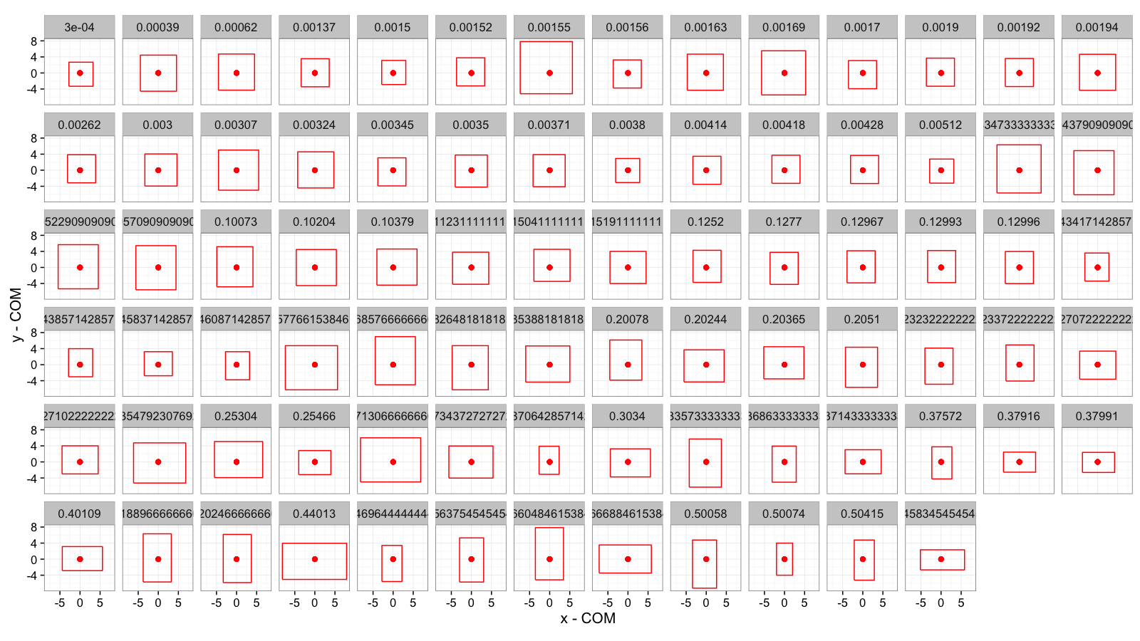
Bounding Box is a Poor Approximation
While easy to calculate, the bounding box / extents approach is a very rough approximation for most of the objects in our image. In particular objects which are not parallel to the XY-axes are misrepresented.
Possible Solutions
- Orient the boxes so there is the least amount of empty space or it best fits the data
- Assume the object is an ellipse and do some sort of curve fitting to find the object
- Don’t worry about height and width and focus instead on more general characteristics like curvature, thickness (next lecture)
Useful Statistical Tools: Principal Component Analysis
While many of the topics covered in Linear Algebra and Statistics courses might not seem very applicable to real problems at first glance, at least a few of them come in handy for dealing distributions of pixels (they will only be briefly covered, for more detailed review look at some of the suggested material)
Principal Component Analysis
Similar to K-Means insofar as we start with a series of points in a vector space and want to condense the information. With PCA instead of searching for distinct groups, we try to find a linear combination of components which best explain the variance in the system.
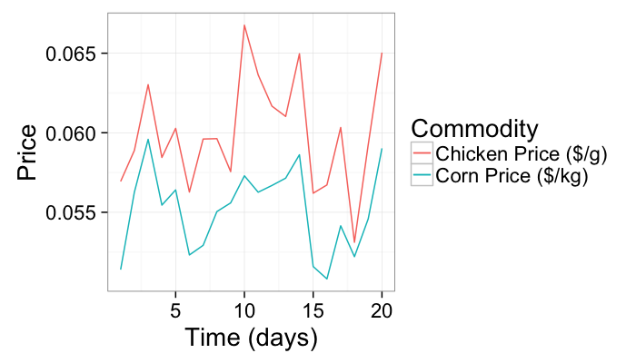
As an example we will use a very simple example of corn and chicken prices vs time
n.pts<-20
test.pca<-data.frame(time=c(1:n.pts),
corn.price=0.01*runif(n.pts)+0.05)
test.pca$chicken.price<-with(test.pca,corn.price+0.01*runif(n.pts))
ggplot(test.pca,aes(x=time))+
geom_line(aes(y=corn.price,color="Corn Price ($/kg)"))+
geom_line(aes(y=chicken.price,color="Chicken Price ($/g)"))+
labs(x="Time (days)",y="Price",color="Commodity")+
theme_bw(20)
test.pca.princomp<-princomp(test.pca[,-1])
test.pca$pca1<-test.pca.princomp$scores[,1]
test.pca$pca2<-test.pca.princomp$scores[,2]
ggplot(test.pca,aes(x=time))+
geom_line(aes(y=pca1,color="Principal Component #1"))+
geom_line(aes(y=pca2,color="Principal Component #2"))+
geom_line(aes(y=corn.price,color="Corn Price ($/kg)"))+
geom_line(aes(y=chicken.price,color="Chicken Price ($/g)"))+
labs(x="Time (days)",y="Price",color="Commodity")+
theme_bw(20)
Useful Statistical Tools: Principal Component Analysis
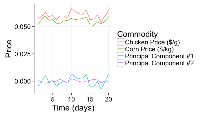
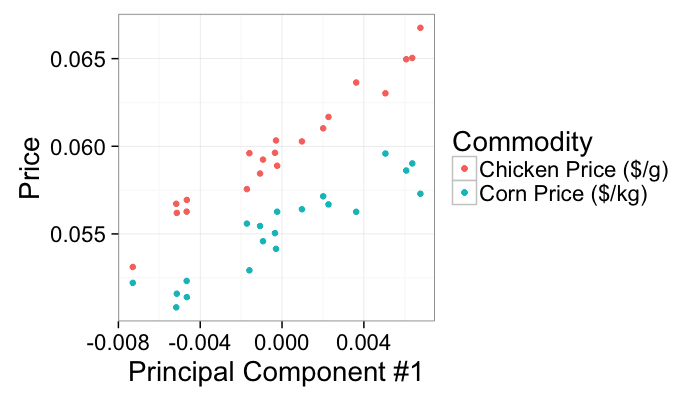
The first principal component condenses the correlated information in both the chicken and corn prices (perhaps the underlying cost of fuel) since it explains the most variance in the final table of corn and chicken prices.
ggplot(test.pca,aes(x=pca1))+
geom_point(aes(y=corn.price,color="Corn Price ($/kg)"))+
geom_point(aes(y=chicken.price,color="Chicken Price ($/g)"))+
labs(x="Principal Component #1",y="Price",color="Commodity")+
theme_bw(20)
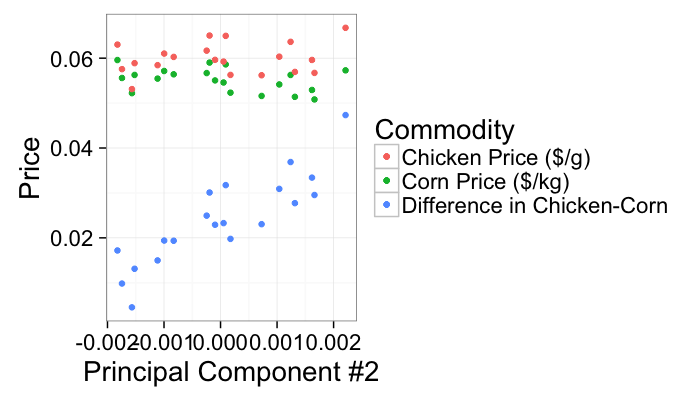
The second principal component is then related to the unique information seperating chicken from corn prices but neither indices directly themselves (maybe the cost of antibiotics)
ggplot(test.pca,aes(x=pca2))+
geom_point(aes(y=corn.price,color="Corn Price ($/kg)"))+
geom_point(aes(y=chicken.price,color="Chicken Price ($/g)"))+
geom_point(aes(y=5*(chicken.price-corn.price),color="Difference in Chicken-Corn"))+
labs(x="Principal Component #2",y="Price",color="Commodity")+
theme_bw(20)
Applied PCA: Shape Tensor
How do these statistical analyses help us?
Going back to a single cell, we have the a distribution of x and y values.
- are not however completely independent
- greatest variance does not normally lie in either x nor y alone.
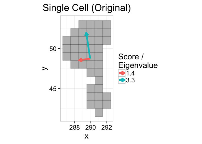
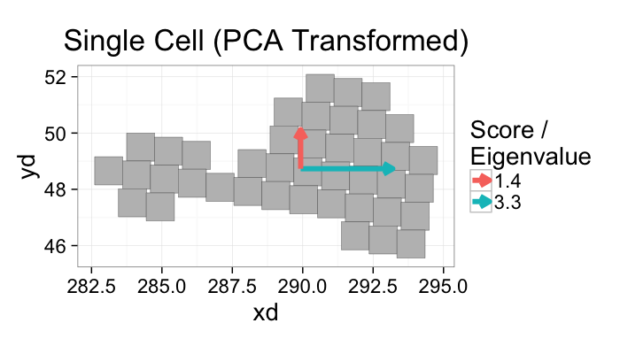
A principal component analysis of the voxel positions, will calculate two new principal components (the components themselves are the relationships between the input variables and the scores are the final values.)
- An optimal rotation of the coordinate system
pca.fun<-function(in.df) {
ddply(in.df,.(val), function(c.cell) {
c.cell.cov<-cov(c.cell[,c("x","y")])
c.cell.eigen<-eigen(c.cell.cov)
c.cell.mean<-colMeans.df(c.cell[,c("x","y")])
out.df<-cbind(c.cell.mean,
data.frame(vx=c.cell.eigen$vectors[1,],
vy=c.cell.eigen$vectors[2,],
vw=sqrt(c.cell.eigen$values),
th.off=atan2(c.cell.eigen$vectors[2,],c.cell.eigen$vectors[1,]))
)
})
}
cur.cell.id<-subset(cell.lab.df,val %in% keep.vals$val)$val[100]
cur.cell.id<-58
cur.cell.df<-subset(cell.lab.df,val==cur.cell.id)
cell.pca<-pca.fun(cur.cell.df)
ggplot(cur.cell.df,aes(x=x,y=y))+
geom_tile(color="black",fill="grey")+
geom_segment(data=cell.pca,aes(x=x,y=y,xend=x+vx*vw,yend=y+vy*vw,
color=as.factor(round(vw*10)/10)),
arrow=arrow(length = unit(0.3,"cm")),size=2)+
labs(title="Single Cell (Original)",color="Score /\nEigenvalue")+
theme_bw(20)+coord_equal()+guides(fill=F)
x1<-cell.pca[1,"x"]
y1<-cell.pca[1,"y"]
vx1<-cell.pca[1,"vx"]
vy1<-cell.pca[1,"vy"]
vx2<-cell.pca[2,"vx"]
vy2<-cell.pca[2,"vy"]
# these functions are evidently not the same
n.cell.df<-plyr::mutate(
cur.cell.df,
xd = vx1*(x-x1)+vy1*(y-y1)+x1,
yd = vx2*(x-x1)+vy2*(y-y1)+y1,
)
cur.cell.df %>% kable
ggplot(n.cell.df,
aes(x=xd,y=yd))+
geom_tile(aes(width=1,height=1),color="black",fill="grey")+
geom_segment(data=mutate(cell.pca,vx=c(1,0),vy=c(0,1)),
aes(x=x,y=y,xend=x+vx*vw,yend=y+vy*vw,
color=as.factor(round(vw*10)/10)),
arrow=arrow(length = unit(0.3,"cm")),size=2)+
labs(title="Single Cell (PCA Transformed)",color="Score /\nEigenvalue")+
theme_bw(20)+coord_equal()+guides(fill=F)
How did we calculate that?
We start off by calculating the covariance matrix from the list of x, y, and z points that make up our object of interest.
$$ COV(I_{id}) = \frac{1}{N} \sum_{\forall\vec{v}\in I_{id}} \begin{bmatrix}
\vec{v}_x\vec{v}_x & \vec{v}_x\vec{v}_y & \vec{v}_x\vec{v}_z\\
\vec{v}_y\vec{v}_x & \vec{v}_y\vec{v}_y & \vec{v}_y\vec{v}_z\\
\vec{v}_z\vec{v}_x & \vec{v}_z\vec{v}_y & \vec{v}_z\vec{v}_z
\end{bmatrix} $$
We then take the eigentransform of this array to obtain the eigenvectors (principal components, $\vec{\Lambda}_{1\cdots 3}$) and eigenvalues (scores, λ1⋯3)
$$ COV(I_{id}) \longrightarrow \underbrace{\begin{bmatrix}
\vec{\Lambda}_{1x} & \vec{\Lambda}_{1y} & \vec{\Lambda}_{1z} \\
\vec{\Lambda}_{2x} & \vec{\Lambda}_{2y} & \vec{\Lambda}_{2z} \\
\vec{\Lambda}_{3x} & \vec{\Lambda}_{3y} & \vec{\Lambda}_{3z}
\end{bmatrix}}_{\textrm{Eigenvectors}} * \underbrace{\begin{bmatrix}
\lambda_1 & 0 & 0 \\
0 & \lambda_2 & 0 \\
0 & 0 & \lambda_3
\end{bmatrix}}_{\textrm{Eigenvalues}} * \underbrace{\begin{bmatrix}
\vec{\Lambda}_{1x} & \vec{\Lambda}_{1y} & \vec{\Lambda}_{1z} \\
\vec{\Lambda}_{2x} & \vec{\Lambda}_{2y} & \vec{\Lambda}_{2z} \\
\vec{\Lambda}_{3x} & \vec{\Lambda}_{3y} & \vec{\Lambda}_{3z}
\end{bmatrix}^{T}}_{\textrm{Eigenvectors}} $$
The principal components tell us about the orientation of the object and the scores tell us about the corresponding magnitude (or length) in that direction.
Principal Component Analysis: Take home message
- We calculate the statistical distribution individually for x, y, and z and the ‘correlations’ between them.
- From these values we can estimate the orientation in the direction of largest variance
- We can also estimate magnitude
- These functions are implemented as
princomp or pca in various languages and scale well to very large datasets.
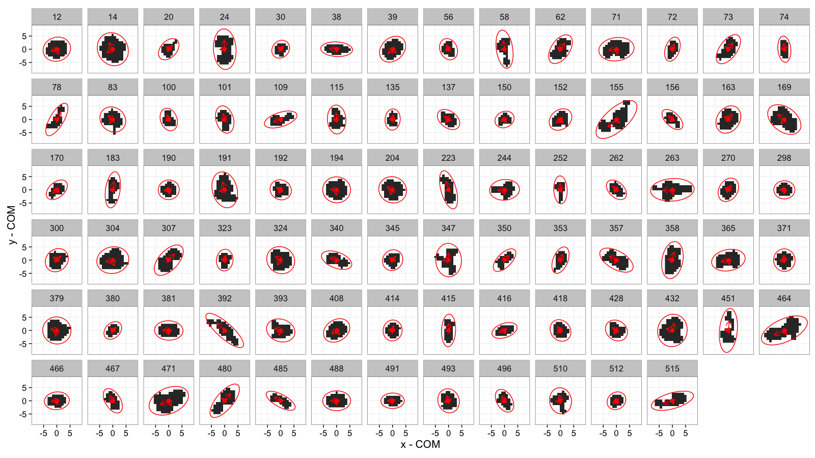
Principal Component Analysis: Elliptical Model
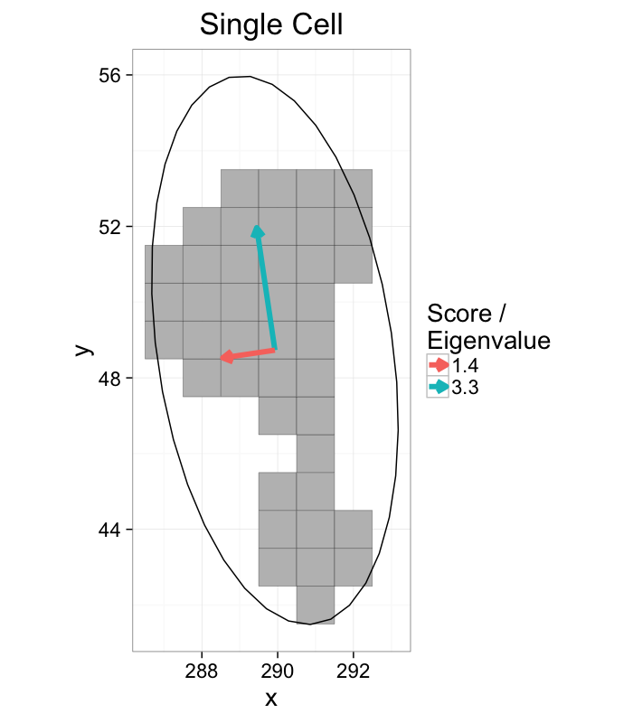
While the eigenvalues and eigenvectors are in their own right useful
- Not obvious how to visually represent these tensor objects
- Ellipsoidal (Ellipse in 2D) representation alleviates this issue
Ellipsoidal Representation
- Center of Volume is calculated normally
- Eigenvectors represent the unit vectors for the semiaxes of the ellipsoid
- $\sqrt{\text{Eigenvalues}}$ is proportional to the length of the semiaxis ($\mathcal{l}=\sqrt{5\lambda_i}$), derivation similar to moment of inertia tensor for ellipsoids.
vec.to.ellipse<-function(pca.df) {
ddply(pca.df,.(val),function(cur.pca) {
# assume there are two vectors now
create.ellipse.points(x.off=cur.pca[1,"x"],y.off=cur.pca[1,"y"],
b=sqrt(5)*cur.pca[1,"vw"],a=sqrt(5)*cur.pca[2,"vw"],
th.off=pi/2-atan2(cur.pca[1,"vy"],cur.pca[1,"vx"]),
x.cent=cur.pca[1,"x"],y.cent=cur.pca[1,"y"])
})
}
cell.ellipse<-vec.to.ellipse(cell.pca)
ggplot(cur.cell.df,aes(x=x,y=y))+
geom_tile(color="black",fill="grey")+
geom_segment(data=cell.pca,aes(x=x,y=y,xend=x+vx*vw,yend=y+vy*vw,
color=as.factor(round(vw*10)/10)),
arrow=arrow(length = unit(0.3,"cm")),size=2)+
geom_path(data=cell.ellipse)+
labs(title="Single Cell",color="Score /\nEigenvalue")+
theme_bw(20)+coord_equal()+guides(fill=F)
Elliptical Model vs Bounding Box
ggplot(cur.cell.df,aes(x=x,y=y))+
geom_tile(color="black",fill="grey")+
geom_path(data=bbox.fun(cur.cell.df),aes(x=xi,y=yi,color="Bounding\nBox"))+
geom_path(data=cell.ellipse,aes(color="Ellipse"))+
labs(title="Single Cell",color="Shape\nAnalysis\nMethod")+
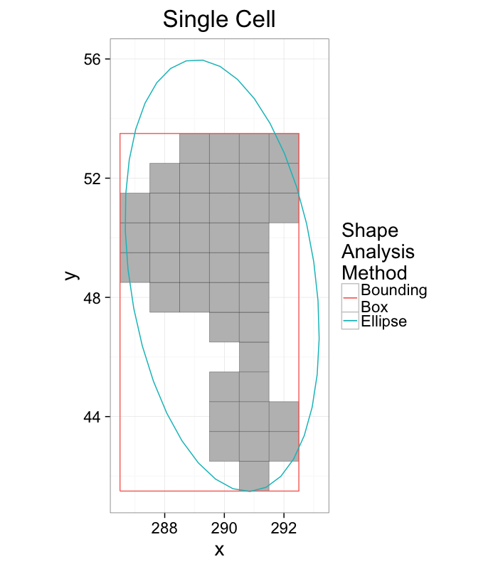
theme_bw(20)+coord_equal()+guides(fill=F)
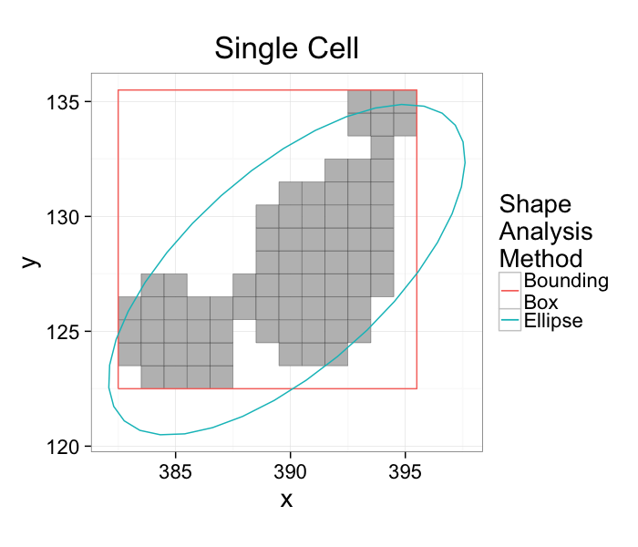
- The bounding box matches boundaries better
- The ellipse captures the dimensions and shape better
- Extents can be calculated from either method
- Anisotropy can also be calculated from either method
Elliptical Model for All Samples
cell.pca.all<-pca.fun(subset(cell.lab.df,val %in% keep.vals$val))
cell.ell.all<-vec.to.ellipse(cell.pca.all)
ggplot(cell.bbox.all,aes(x=x-x,y=y-y))+
geom_raster(data=mean.sub.df,aes(x=x,y=y))+
geom_path(data=cell.ell.all,aes(x=x-x.cent,y=y-y.cent),color="red")+
geom_point(color="red",size=2)+
geom_segment(data=cell.pca.all,aes(xend=vx*vw,yend=vy*vw),
arrow=arrow(length = unit(0.3,"cm")),color="red")+
facet_wrap(~val,ncol=14)+
labs(x="x - COM",y="y - COM")+
theme_bw(15)+coord_equal()
Comparison between Anisotropy for both models
pca.aiso.all<-ddply(cell.pca.all,.(val),function(cur.pca) {
lon.ax<-max(cur.pca$vw)
sho.ax<-min(cur.pca$vw)
data.frame(e.aiso=(lon.ax-sho.ax)/lon.ax)
})
both.aiso<-merge(pca.aiso.all,cell.bbox.all,by="val")
no.aiso.vals<-subset(both.aiso,aiso<0.01 & e.aiso>0.2)$val
ggplot(both.aiso,aes(x=aiso,y=e.aiso))+
geom_point(aes(color=ifelse(aiso<0.01,"lost information","normal")))+
geom_smooth()+
labs(x="Extents / BB Anisotropy",y="Elliptical Anisotropy",color="Points")+
coord_equal()+theme_bw(20)
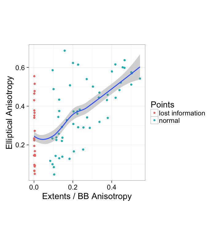
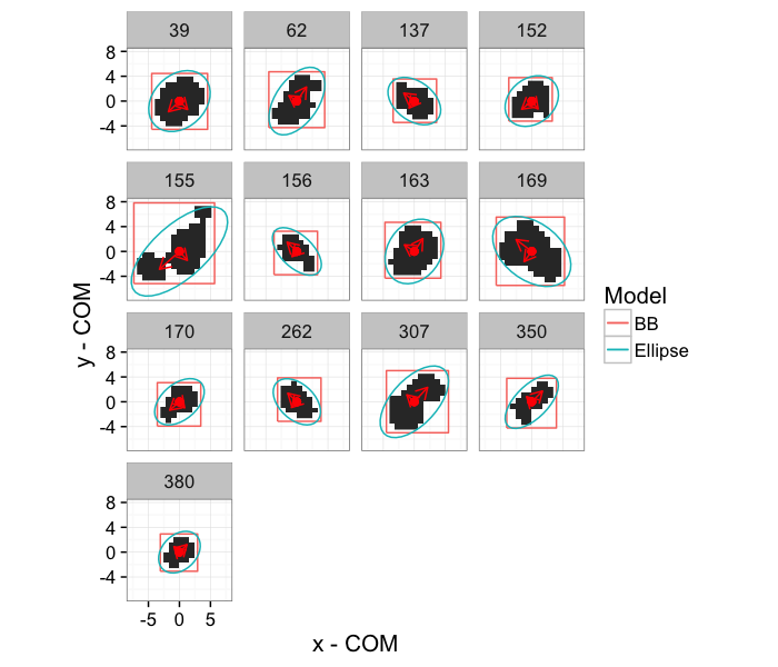
We see that there seems to be a general, albeit weak, correlation between the two measures. The most concerning portion is however the left side where the extents or bounding box method reports 0 anisotropy and the elliptical method reports substancial amounts of it.
ggplot(subset(cell.bbox.all,val %in% no.aiso.vals),aes(x=x-x,y=y-y))+
geom_raster(data=subset(mean.sub.df,val %in% no.aiso.vals),aes(x=x,y=y))+
geom_path(aes(x=xi-x,y=yi-y,color="BB"))+
geom_path(data=subset(cell.ell.all,val %in% no.aiso.vals),
aes(x=x-x.cent,y=y-y.cent,color="Ellipse"))+
geom_point(color="red",size=2)+
geom_segment(data=subset(cell.pca.all,val %in% no.aiso.vals),
aes(xend=vx*vw,yend=vy*vw),
arrow=arrow(length = unit(0.3,"cm")),color="red")+
facet_wrap(~val)+
labs(x="x - COM",y="y - COM",color="Model")+
theme_bw(15)+coord_equal()
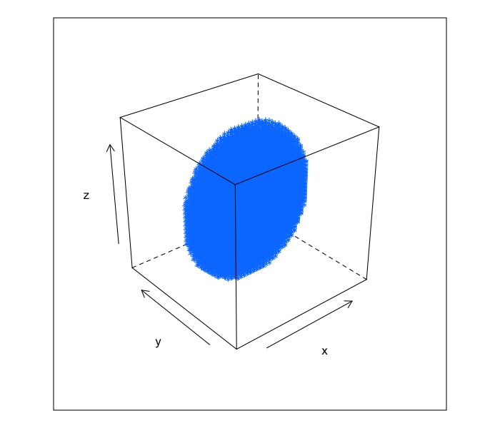
3D Shape Analysis
The models we have done are all applicable to both 2D and 3D images. The primary difference is when looking at 3D images there is an extra dimension to consider.
xg<-seq(-10,10,length.out=41)
make.ellipse.3d<-function(a,b,c,xg) {
ell.3d<-expand.grid(x=xg,y=xg,z=xg)
ell.3d$val<-with(ell.3d,(x/a)^2+(y/b)^2+(z/c)^2 < 1)
ell.3d
}
cloud(z~x*y,data=subset(make.ellipse.3d(9,3,10,xg),val),xlim=c(-10,10),ylim=c(-10,10),zlim=c(-10,10))
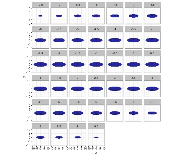
It can also be shown as a series of 2D slices.
ggplot(subset(make.ellipse.3d(9,3,10,xg),val),aes(x=x,y=y))+
geom_tile(color="blue")+
facet_wrap(~z)+
coord_equal()+
xlim(c(-10,10))+ylim(c(-10,10))+
theme_bw(10)
Anisotropy applies to these samples as well but it only gives us information about the shortest and the longest dimensions. Is that enough?
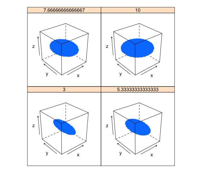
Pancakeness
Each of these images has the exact same anisotropy because the shortest semiaxis length remains
xg<-seq(-10,10,length.out=41)
b.vals<-seq(3,10,length.out=4)
cloud(z~x*y | as.factor(b), data=ldply(b.vals,function(b)
cbind(subset(make.ellipse.3d(b,10,3,xg),val),b=b)),
xlim=c(-10,10),ylim=c(-10,10),zlim=c(-10,10))
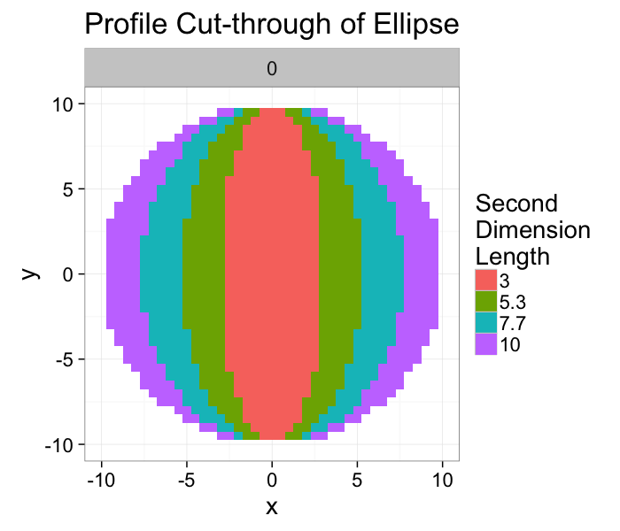
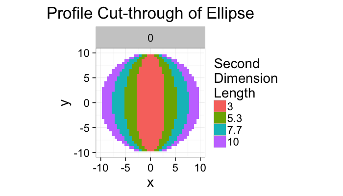
If we take a slice through the image we can image the final shape looking like a very small thin rod in the case where the second dimension is equal to 3 (short in two directions and long in the other) and a pankcake (short in one direction and long in the other two).
ggplot(ldply(rev(b.vals),function(b)
cbind(subset(make.ellipse.3d(b,10,3,xg),val & z==0),b=b)),
aes(x=x,y=y))+
geom_tile(aes(fill=as.factor(round(b*10)/10)),alpha=1)+
facet_wrap(~z)+
coord_equal()+
xlim(c(-10,10))+ylim(c(-10,10))+
labs(title="Profile Cut-through of Ellipse",fill="Second\nDimension\nLength")+
theme_bw(20)
Oblateness
We can thus introduce a new metric for assessing the second-degree anisotropy in the object and this we shall somewhat more formally call Oblateness.
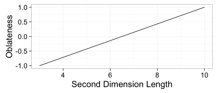
$$ \textrm{Ob} = 2\frac{\lambda_{2}-\lambda_{1}}{\lambda_{3}-\lambda_{1}}-1 $$
The value like in anisotropy is bound between -1 and 1.
- -1 indicates the middle semiaxis is the same length of the shortest semiaxis λ2 = λ1 and thus the structure is rod-like → prolate
- +1 indicates the middle axis is the same length as the longest semiaxis λ2 = λ3 and thus the structure is pancake-like → oblate
ggplot(ldply(rev(b.vals),function(b)
cbind(subset(make.ellipse.3d(b,10,3,xg),val & z==0),b=b)),
aes(x=x,y=y))+
geom_tile(aes(fill=as.factor(round(b*10)/10)),alpha=1)+
facet_wrap(~z)+
coord_equal()+
xlim(c(-10,10))+ylim(c(-10,10))+
labs(title="Profile Cut-through of Ellipse",fill="Second\nDimension\nLength")+
theme_bw(20)
ob.vals<-data.frame(b=b.vals,obl=2*(b.vals-3)/(10-3)-1
)
ggplot(ob.vals,aes(x=b,y=obl))+
geom_line()+
labs(x="Second Dimension Length",y="Oblateness")+
theme_bw(20)
Interfaces / Surfaces
Many physical and chemical processes occur at surfaces and interfaces and consequently these structures are important in material science and biology. For this lecture surface and interface will be used interchangebly and refers to the boundary between two different materials (calcified bone and soft tissue, magma and water, liquid and gas) Through segmentation we have identified the unique phases in the sample under investigation.
- Segmentation identifying volumes (3D) or areas (2D)
- Interfaces are one dimension lower corresponding to surface area (3D) or perimeter (2D)
- Interfaces are important for
- connectivity of cell networks, particularly neurons
- material science processes like coarsening or rheological behavior
- chemical processes (surface-bound diffusion, catalyst action)
Surface Area / Perimeter
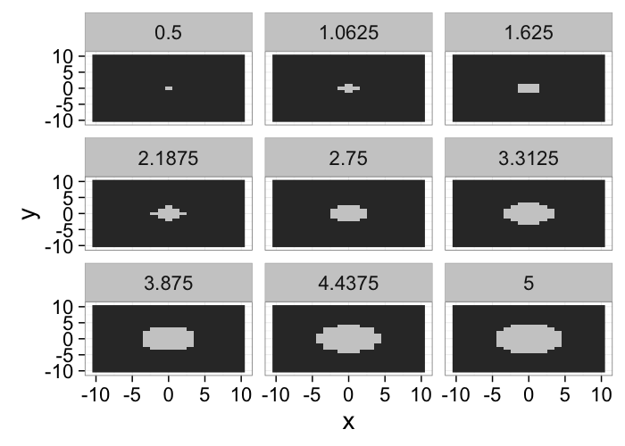
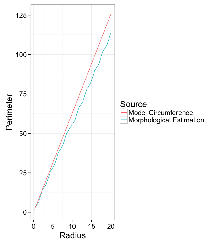
We see that the dilation and erosion affects are strongly related to the surface area of an object: the more surface area the larger the affect of a single dilation or erosion step.
make.circle<-function(nx,r,nscale=1) {
ny<-nx
grad.im<-expand.grid(x=c(-nx:nx)/nscale,y=c(-ny:ny)/nscale)
grad.im$val<-with(grad.im,(x^2+y^2)
calc.eros.cnt<-function(nx,r,nscale=1,im.fun=make.circle) {
in.cir<-im.fun(nx,r,nscale=nscale)
cir.im<-df.to.im(in.cir)
data.frame(nx=nx,r=r,nscale=nscale,
dvolume=sum(dilate(cir.im>0,makeBrush(3,"diamond"))>0),
evolume=sum(erode(cir.im>0,makeBrush(3,"diamond"))>0),
volume=sum(cir.im>0)
)
}
max.rad<-20
r.list<-seq(0.2,max.rad,length.out=20)
r.table<-ldply(r.list,function(r) calc.eros.cnt(max.rad+1,r,1))
r.table$model.perimeter<-with(r.table,2*pi*r)
r.table$estimated.perimeter<-with(r.table,
((dvolume-volume)+(volume-evolume))/2)
ggplot(r.table,aes(x=r))+
geom_line(aes(y=estimated.perimeter,color="Morphological Estimation"))+
geom_line(aes(y=model.perimeter,color="Model Circumference"))+
labs(x="Radius",y="Perimeter",color="Source")+
theme_bw(20)
Meshing
Constructing a mesh for an image provides very different information than the image data itself. Most crucially this comes when looking at physical processes like deformation.
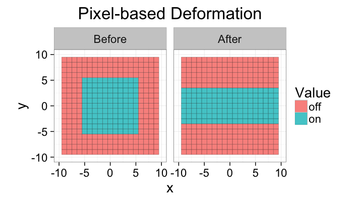
While the images are helpful for visualizing we rarely have models for quantifying how difficult it is to turn a pixel off
base.grid<-expand.grid(x=c(-10:10),y=c(-10:10))
base.shape.undef<-cbind(base.grid,val=with(base.grid,abs(x)<6 & abs(y)<6))
def.grid<-rbind(
cbind(base.shape.undef,type="Before"),
cbind(base.grid,val=with(base.grid,abs(x)<10 & abs(y)<4),type="After")
)
ggplot(def.grid,
aes(x=x,y=y,fill=ifelse(val,"on","off")))+
geom_tile(alpha=0.80,color="black")+
coord_equal()+facet_wrap(~type)+
xlim(c(-10,10))+ylim(c(-10,10))+
labs(title="Pixel-based Deformation",fill="Value")+
theme_bw(20)
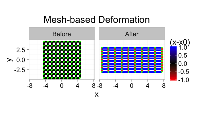
If the image is turned into a mesh we now have a list of vertices and edges. For these vertices and edges we can define forces. For example when looking at stress-strain relationships in mechanics using Hooke’s Model
$$ \vec{F}=k (\vec{x}_0-\vec{x}) $$
the force needed to stretch one of these edges is proportional to how far it is stretched.
df.to.mesh<-function(in.df,d.size.x=0.5,d.size.y=0.5,make.seg=F) {
corner.pts<-expand.grid(dx=c(-d.size.x,d.size.x),dy=c(-d.size.y,d.size.y))
min.x<-min(in.df$x)
max.x<-max(in.df$x)
min.y<-min(in.df$y)
max.y<-max(in.df$y)
mesh.pts<-ddply(in.df,.(x,y),function(cur.df) {
xy.cols<-c("x","y")
pos.data<-cur.df[1,xy.cols]
n.data<-cur.df[,!(names(cur.df) %in% xy.cols)]
ddply(corner.pts,.(dx,dy),function(c.offset) {
cbind(x=pos.data$x+c.offset$dx[1],y=pos.data$y+c.offset$dy[1],n.data)
})
})
if(make.seg) {
grid.pts<-expand.grid(dx=c(-d.size.x,0,d.size.x),dy=c(-d.size.y,0,d.size.y))
grid.pts$seg.len<-with(grid.pts,sqrt(dx^2+dy^2))
subset(
ddply(subset(grid.pts,((abs(dx)==0) + (abs(dy)==0))==1),.(dx,dy,seg.len),
function(c.offset) {
cbind(xend=mesh.pts$x+c.offset$dx[1],yend=mesh.pts$y+c.offset$dy[1],
mesh.pts)
}),
xendmin.x & yendmin.y)
} else {
mesh.pts
}
}
undef.mesh<-df.to.mesh(subset(base.shape.undef,val),make.seg=T)
base.shape.def<-base.shape.undef
base.shape.def$x<-base.shape.def$x*10/6
base.shape.def$y<-base.shape.def$y*4/6
def.mesh<-df.to.mesh(subset(base.shape.def,val),
d.size.x=0.5*10/6,d.size.y=0.5*4/6,make.seg=T)
ggplot(rbind(cbind(undef.mesh,type="Before"),
cbind(def.mesh,type="After")),
aes(x=x,y=y))+
geom_segment(aes(xend=xend,yend=yend,color=sign(seg.len-0.5)),size=2)+
geom_point(size=2,color="green",pch=20)+
coord_equal()+facet_wrap(~type)+
scale_color_gradient2(mid="black",low="red",high="blue",space="Lab")+
#xlim(c(-10,10))+ylim(c(-10,10))+
labs(title="Mesh-based Deformation",color="(x-x0)")+
theme_bw(20)
Meshing
Since we uses voxels to image and identify the volume we can use the voxels themselves as an approimation for the surface of the structure.
- Each ‘exposed’ face of a voxel belongs to the surface
From this we can create a mesh by
- adding each exposed voxel face to a list of surface squares.
- adding connectivity information for the different squares (shared edges and vertices)
A wide variety of methods of which we will only graze the surface (http://en.wikipedia.org/wiki/Image-based_meshing)
Marching Cubes
Why
Voxels are very poor approximations for the surface and are very rough (they are either normal to the x, y, or z axis and nothing between). Because of their inherently orthogonal surface normals, any analysis which utilizes the surface normal to calculate another value (growth, curvature, etc) is going to be very inaccurate at best and very wrong at worst.
How
The image is processed one voxel at a time and the neighborhood (not quite the same is the morphological definition) is checked at every voxel. From this configuration of values, faces are added to the mesh to incorporate the most simple surface which would explain the values.
Marching tetrahedra is for some applications a better suited approach
Next Time on QBI
So while bounding box and ellipse-based models are useful for many object and cells, they do a very poor job with the sample below.
cur.cell.df<-subset(cell.lab.df,val==155)
cell.pca<-pca.fun(cur.cell.df)
cell.ellipse<-vec.to.ellipse(cell.pca)
ggplot(cur.cell.df,aes(x=x,y=y))+
geom_tile(color="black",fill="grey")+
geom_path(data=bbox.fun(cur.cell.df),aes(x=xi,y=yi,color="Bounding\nBox"))+
geom_path(data=cell.ellipse,aes(color="Ellipse"))+
labs(title="Single Cell",color="Shape\nAnalysis\nMethod")+
theme_bw(20)+coord_equal()+guides(fill=F)
Why
- We assume an entity consists of connected pixels (wrong)
- We assume the objects are well modeled by an ellipse (also wrong)
What to do?
- Is it 3 connected objects which should all be analzed seperately?
- If we could divide it, we could then analyze each spart as an ellipse
- Is it one network of objects and we want to know about the constrictions?
- Is it a cell or organelle with docking sites for cell?
- Neither extents nor anisotropy are very meaningful, we need a more specific metric which can characterize
