This document describes requirements for the layout and presentation of text in languages that use the Arabic script when they are used by Web standards and technologies, such as HTML, CSS, Mobile Web, Digital Publications, and Unicode.

This document describes the basic requirements for Arabic script layout and text support on the Web and in eBooks. These requirements provide information for Web technologies such as CSS, HTML and digital publications about how to support users of Arabic scripts. Currently the document focuses on Standard Arabic and Persian.

The editor's draft of this document is being developed by the Arabic Layout Task Force, part of the W3C Internationalization Interest Group. It is published by the Internationalization Working Group. The end target for this document is a Working Group Note.

Sending comments on this document

If you wish to make comments regarding this document, please raise them as github issues . Only send comments by email if you are unable to raise issues on github (see links below). All comments are welcome.

To make it easier to track comments, please raise separate issues or emails for each comment, and point to the section you are commenting on  using a URL for the dated version of the document.

Introduction

About this document

Some text goes here.

Arabic Script Overview

Encoding

Arabic script is encoded in the Unicode standard semantically, meaning that every letter receives only a single Unicode character, no matter how many different contextual shapes it may exhibit.

Unicode also has a partial set of non-semantic encoded characters for the Arabic script, under blocks Arabic Presentation Forms-A and Arabic Presentation Forms-B, which are deprecated and should not be used in general interchange.

Characters

Arabic script uses Arabic alphabet, diacritics, numbers, punctuations and symbols, and control characters. Appendix lists these characters.

The majority of these characters are common among different languages. There are two different set of digits for 0–9 (U+0660U+0669 and U+06F0U+06F9) used by different languages. Most of the alphabetical characters are used by all the languages using Arabic scripts, but there are exceptions, such as the Arabic letter yeh being represented with two different characters, U+064A ARABIC LETTER YEH (ي) and U+06CC ARABIC LETTER FARSI YEH (ی). These differences among the character sets of each language are marked in the appendix tables.

Control characters are used to produce the correct spelling of the words or to ensure correct combination with left-to-right content. Consequently, they should be preserved when storing and displaying texts.

Direction

Arabic script is written from right to left. Numbers, even Arabic numbers, are written from left to right, as is text in a script that is normally left-to-right.

When the main script is Arabic, the layout and structure of pages and documents are also set from right to left.

Unicode Standard Annex #9, Unicode Bidirectional Algorithm details an algorithm for rendering right-to-left text and covers a myriad of situations in mixing different kinds of characters. A simpler explanation of the basics of the algorithm exists in the W3C article Unicode Bidirectional Algorithm basics. You can refer to these documents for more information about Unicode’s bidirectional algorithm.

A brief overview of the bidirectional (bidi for short) algorithm follows, because the direction is an essential part of how Arabic script is used.

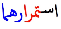
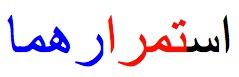
The characters of a text are digitally stored and transferred in the same order that they are typed by a user. This is the order in which the text is read and pronounced by people and held in memory by software applications, as shown in for a sample text.

The order of characters in memory

But the order used when displaying text is different. The purpose of the bidi algorithm is to find display positions for the characters of a text. These positions are solely used for displaying texts. shows the same sample text when prepared for display with the bidi algorithm.

The order of characters when displayed

An initial step of the process involves determining each paragraph’s base direction: whether the paragraph is left-to-right or right-to-left. The base direction is either explicitly set by the author, inherited from the page, or (typically for user-generated content) detected based on the content of the paragraph. The base direction has two important uses later in the process.

The next step is to split the text into directional runs. Each directional run is a sequence of characters with the same direction.

Splitting a text into 3 directional runs

Inside each run, all the characters follow the same order. The runs themselves are ordered for visual representation from left to right or from right to left, depending on the base direction of the paragraph. demonstrates an example of this. This is the first effect of the base direction.

The effect of base direction on the order of runs

Unicode has a bidi category property defined for each character that is used to determine the direction of each character. All the Arabic letters are marked as right-to-left characters, while Latin characters have the left-to-right category.

Some characters, mostly punctuations, are neutral. The direction of these characters is derived from their surrounding characters. If a neutral character is surrounded by characters of the same direction (e.g. an space surrounded by Arabic letters), it gets the direction of its neighbors. Otherwise (e.g. a space between an Arabic and a Latin, or a neutral character appearing at the start or the end of a paragraph), the neutral character gets its direction from the paragraph’s base direction. This is another effect of the base direction in the bidi algorithm.

The above explanation of the bidi algorithm is highly simplified, to convey only the essentials of how Arabic text is transformed for rendering. The actual algorithm deals with many more character types and edge cases. Please refer to Unicode Bidirectional Algorithm basics for more information or Unicode Standard Annex #9, Unicode Bidirectional Algorithm for the official detailed documentation.

Joining

Joining Forms

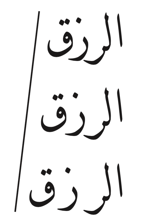
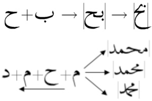
Arabic script is a cursive writing system; i.e, letters can join to their neighboring letters. In this perspective, every Arabic letter has one, two, or four different joining forms, which allow the letter to join to its neighbors, if applicable. These four forms are:

  • Isolated form, used when the letter does not join to any of the surrounding letters;
  • Initial form, used when the letter is joining only to its next (left-hand side) letter;
  • Medial form, used when the letter is joining on both sides, and
  • Final form, used when the letter is joined only to its previous (right-hand side) letter.

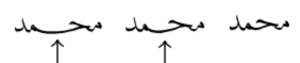
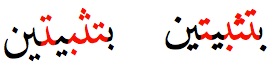
shows samples of all four forms for U+0645 ARABIC LETTER MEEM (م).

Four different shapes for joining to previous or succeeding letters

For each Arabic letter, based on the joining behavior of its neighbors, one of its shapes is used in writing. demonstrates how letters join to form a word.

Joining letters by using their various shapes

There are different categories of characters based on their joining behavior, but most of the Arabic letters are either dual joining or right joining. Dual joining characters can join from both sides. Like the character in image 1, these types of characters have all the four shapes mentioned above. Right joining characters only join to their previous (right-side) character. These characters only have isolated and final shapes, for they don’t join to their next character.

Right-joining letters only have two forms of final and isolated.

Almost all the non-alphabetical characters are non-joining. The few exceptions will be discussed in this document.

Please refer to The Unicode Standard Version 8.0, Section 9.2, for full explanation of Arabic cursive joining.

Joining XXX

Ligatures

Almost all the writing styles of Arabic script use a special shape when letters lam and alef are joined. Most Arabic fonts include mandatory ligatures for this combination. Ignoring this ligature, as shown in , leads to wrong rendering of text.

Correct and wrong ways of rendering letter lam followed by letter alef

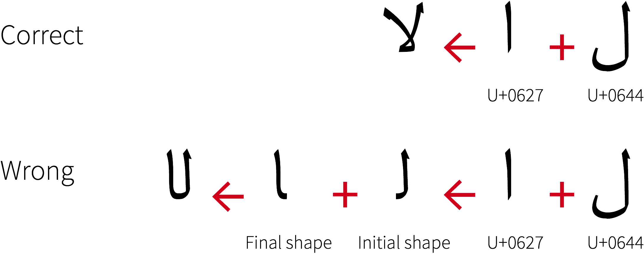
This shape is not limited to the combination of U+0644 ARABIC LETTER LAM (ل) with U+0627 ARABIC LETTER ALEF (ا). Variations of letter alef such as U+0622 ARABIC LETTER ALEF WITH MADDA ABOVE (آ) and U+0623 ARABIC LETTER ALEF WITH HAMZA ABOVE (أ) and also variations of letter lam follow the same rules as well. Combination with diacritics does not affect these ligatures. Each of these ligatures also provides a special shape for joining from its right side (to the preceding letter).
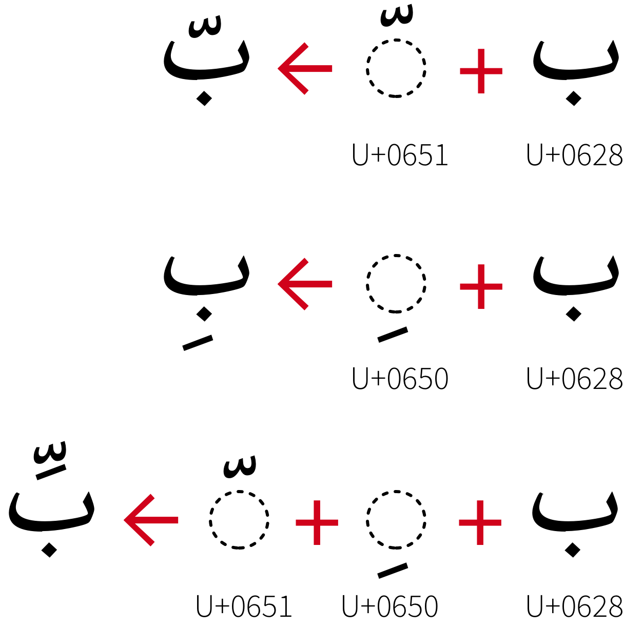
Diacritics

More than one diacritics can appear after a single character subsequently and all of them should be applied over the same character. Font files usually define special shapes or positioning for combination of diacritics. These extra information should be applied in rendering texts.

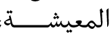
shows an example, where, according to this font’s specification, combining U+0651 ARABIC SHADDA and U+0650 ARABIC KASRA changes their positions. Various font files may require different transformations.

Diacritics could be combined in Arabic script.

Font and Typographical considerations

Arabic Style and Calligraphy

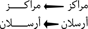
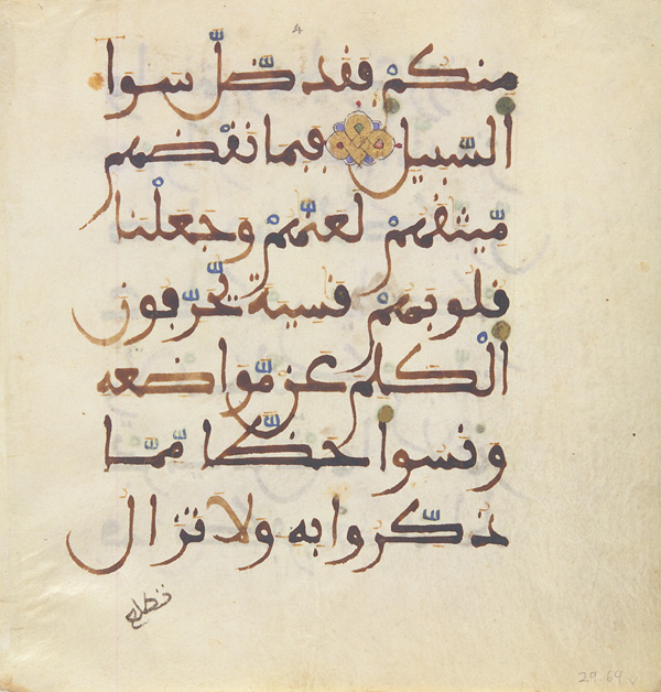
Arabic styling and writing has its origins in Islamic art and civilization, and was widely used to decorate mosques and palaces, as well as to create beautiful manuscripts and books, and especially to copy the Korʼan. Arabic script is cursive, making it viable to support different geometric shapes overlapping and composition. Words can be written in a very condensed form as well as stretched into elongated shapes, and the scribes and artists of Islam labored with passion to take advantage of all these possibilities.

From the beginning of Arabic calligraphy, two tendencies or two types of styles can be seen emerging: writing for the decoration of mosques and sculptures, which was complex and highly decorative, and writing styles reserved for writing the Korʼan, which were easier to use and more readable.

Writing styles then evolved under the influences of cultural diversity, leading to regional calligraphic schools and styles (Kufi in Iraq, Farsi and Taʻlīq in Persia, or Diwani in Turkey). Additional differences arose depending on the purpose of writing, such as the copying and dissemination of the Korʼan.

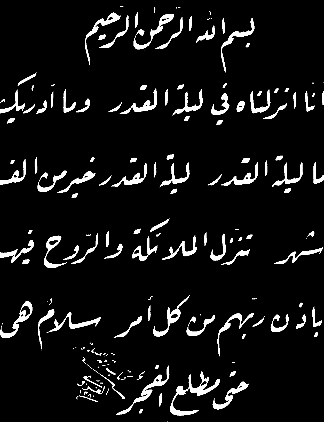
In general we group under the generic term Naskh (copy/inscription) the scripts which are meant for reading at smaller sizes and are suitable for books and texts to be read, e.g. the Korʼan, and as Kufic the highly stylized font styles used for ornamentation and more styled writings. Nevertheless, the rich evolution of the Arabic script led to the distinctive enumeration of a number of additional named styles.
Similarly, two other generic terms are used to classify styles : Mabsut (wa Mustaqīm) is a form of style that is elongated and straight angled, [which dominated the copies of Korʼan in eighth and ninth centuries], and Muqawwar (wa Mudawwar) is a form of style that is curved and rounded.

Different Writing Styles

Basics and principles of Arabic writing were defined by Ibn Moqlah (886-940 Higra), who defined six styles of writing: Kufi, Thuluth, Naskh, Ruqʻa, Taʻlīq and Diwani.

Kufi (كوفي)
Kufi script
Kufi example [Source].

One of the oldest and best known Arabic scripts. It is characterized by its decorative and pronounced geometric forms, well adapted for architectural designs. The style grew with the beginning of Islam to satisfy a need for Muslims to codify the Korʼan.

Thuluth (ثلث)
Thuluth script
Thuluth example [Source].

(The third.) Recognizable by the fact that the letters and words are highly interleaved in its complex form. May be the most difficult style to write (requiring a significant amount of skill), both in terms of its letters and in terms of its structure and composition.

Naskh (نسخ)
Naskh script
Nask example [Source].

One of the clearest styles of all, with clearly distinguished letters which facilitate reading and pronunciation. Can be written at small sizes (traditionally using pens made of reeds and ink), which suits the production of longer texts used for boards and books intended for the general population, especially the Korʼan.

Ruqʻa (رقعة‎)
Ruqʻa script
Ruqʻa example [Source].

A handwritten style still commonly used in Arabic countries, and recognisable by its bold-like letters written above the writing line. Designed to be used for education, for everyday writing and adopted in the offices (Diwan) of the Ottoman Empire. One of it's feature is that calligraphers have kept it and did not derived variations from it.

Taʻlīq (تعليق)
Taʻlīq script
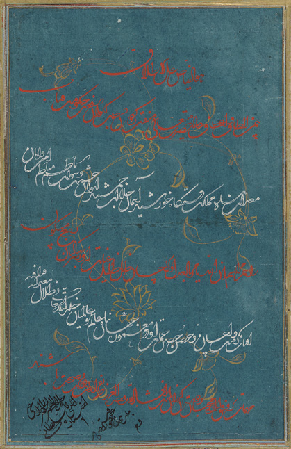
Taʻlīq example [Source].

Taʻlīq (hanging) is a beautiful script characterized by the precision and stretch of its letters, its clarity, and its lack of complexity. Designed for Persian language, until replaced by Nastaʻlīq.

Diwani (ديواني)
Diwani script
Diwani example [Source].

Used by the Ottman court (Diwan) to write official documents. Some variations of it are still in use today (e.g. hand written documents by some religious officials).

We can add other font styles to this list, such as the following :
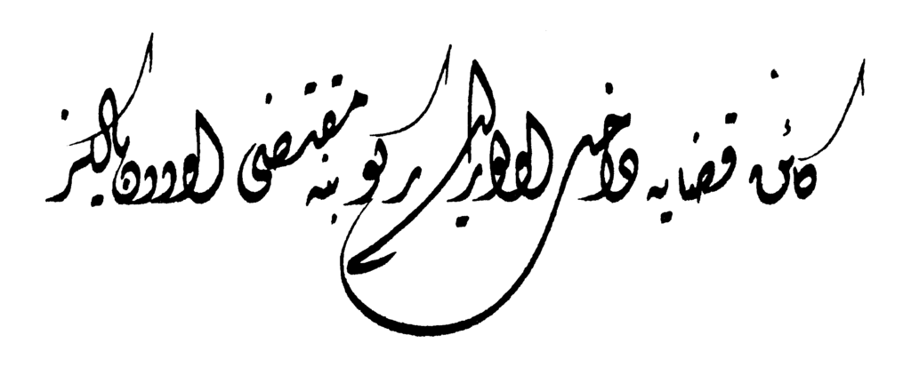
Nastaʻlīq (نستعلیق)
Nastaliq script
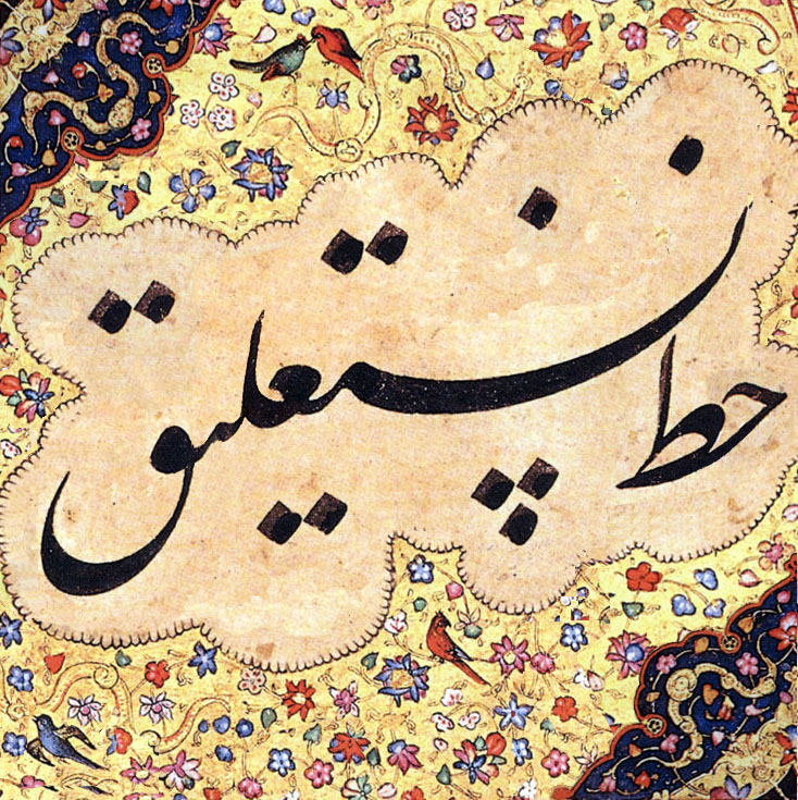
Nastaʻlīq example [Source].

Persian version of Taʻlīq, derived from Naskh and Taʻlīq and developed in the 8th and 9th centuries. It is like a Taʻlīq but easier to write and read. Shekasteh Nastaʻlīq (literally means "broken Nastaʻlīq") is also another derivation of those two, developed in the 15th century.

Maghribi (مغربي)
Maghribi script
Maghribi example [Source].

Used in the past in the western islamic world (Andalusia), and still now in North Africa. Used for writing the Korʼan as well as other scientific, legal and religious manuscripts. Rabat, a mabsut version of it, is widely used in some official printings in Morocco.

Arabic Script and Typography

Arabic script has some characteristics that are challenging for typographers and font designers. Examples bellow show some characteristics worth to be considered carefully. How could typography, which came late to the Arabic world, then follow the tradition of the many authors and artists who manually shaped the Arabic writing over decades? even in it's simplest Naskh style?

  1. Multi-level baselines

    Letters may join through a finely inclined line

    slope baseline

    or two, square-ended lines

    two level baselin
    Multilevel baselines don't occur in all fonts. The above examples use the Arabic Typesetting font. Compare those examples to to more typical fonts:

    normal Font

  2. Multi-context joining

    Rendering of letters depends not only on their place in the word (initial, medial, final) but also on their neighboring letters, i.e. the letter they join with. Each letter has a different appearance in each combination.

    Different initial shape of noon
    Initial letter noon, showing many different forms.

    Fonts don't always comply with or respect this kind of tuning. To do so, fonts need many glyphs in order to adapt to each context. In more modern typefaces some of these connections are implemented by ligatures, but ligatures can't capture or cover all joining behavior.

    In the two left most words, the initial noon differs in that one raises a kind of stroke. This property of raising a stroke is common for a number of letters (beh, teh, noon, theh) which are taller than their connected letters in order to be distinguished in some contexts, such asBeh with stroke before seen vs. Beh without stroke after seen , or to resolve ambiguity. See also the section about teeth letters below.

  3. Words as groups of letters

    A word shape is not (only) a "horizontal" connections of letters, but of groups of letters (syntagmes).

    Example two words in some nice Naskh font.

    Groups of letters are colored blue or red
    Aleph and two groups of letters to form a word
    two other group of letters

    To compare with the same words in more usual font:

    Can't really say letter groups. Rather a "horizontal sequence of letters of almost same width".
    same word in more normal font same word in default font

    Group combinations cannot be covered by general or usual ligatures.

  4. Vertical joining

    Groups of letters may also "join" vertically (top down) instead of right to left. And not all fonts permit this.

    Vertical joining vs. horizontal joing
    Joining happens almost vertical Joining happens horizontal

    Once again, some fonts try standard ligatures, but this is not ligature. This is rather (good) writing practice/style.

    One should note that all this characteristics has not only an aesthetic side, but also play a role in justification. It is at the discretion of (hand writing) authors to chose the best kind of joining to suit the desired line width. Should then be a general rule on that. But to achieve such justification would require sophisticated algorithms.

  5. The so called teeth letters.

    Letters having uniform medial shape, align in a kind of teeth.

    Teeth letters

    Even in the teeth context letter shape may vary. It's not the same letters (in red) which raise the stroke in the two figures.

Fonts

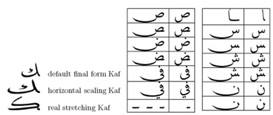
Arabic script counts 26 letters, and mostly 19 basic shapes. Since letters change according to their position in the word, Arabic set of glyph may range to more than one hundred shapes. If one count possible ligatures, and different combination of joining forms (see above), the number of glyph can increase further. Not sure that typeface design can accommodate all needs, even though some present typefaces can run hundred of shapes.

Early typefaces, some still in use today, were designed with some facilities. Designer of those differs in their simplification hypothesis. For example, one of the first approach is to use "type writer style", that is a same glyph for different positions in a word. This is the case for initial and medial shape for most of the letters (example here). It is generally the browser default font for Arabic script. A more unifying approach is the use of a single and detached glyph for each letter without joining (todo example here). Other approach were used resulting in more or less visually practical fonts.

Nowadays, there is a large choice of fonts, and one can choose the font that best suits to one's typographical desire. However, one may also wishes to take into account some non typographical considerations like: (TBD later on)

  • Accessibility (readability and visibility) ...
  • The kind of device with small screen (for example, larger loop and teeth height, small descenders etc...), although fonts actually appear better on smartphones
  • Font style for titles and banners and alike (small number of words), may differ from the style for content text (long text).
  • Shapes and proportions (the size issue) in mixed texts
  • Some fonts might give another opportunity for line justification than the one based on word spacing (See section 4.2.4 Ligatures).
  • etc...

Characters and Words

Punctuation

Issues/questions:

  • List of non-ASCII punctuation and description of usage and frequency.
  • Use and positioning of punctuation marks in the sentence.
  • Use of paired punctuation marks.

Text segmentation

Word, sentence and paragraph boundaries are largely deliminated by spaces and punctuation as in most Latin script text.

However, there are exceptions, such as the "و" conjunction in Arabic orthography, "ل" before a non-Arabic script noun, and the misuse of space in place of ZWNJ in some Arabic script languages.

Issues/questions:

  • Should all ligatures be selectable as a single unit, or as individual parts corresponding to the underlying characters?
  • Expand on the exceptions.

Positioning diacritics relative to base characters

In Arabic script text it is unusual to use diacritics for vowel information and for consonant lengthening. If they are used, however, there are different approaches to their placement relative to the base characters they modify. Some fonts display short vowel diacritics at the same height, while others vary the height according to the base character.

Another potential difference arises when a short i vowel diacritic is used with a shadda. In some cases the vowel diacritic remains below the base letter, whereas in other cases the vowel diacritic appears above the base letter, but under the shadda (so that it can be distinguished from the short a vowel diacritic, which appears above the shadda).

Issues/questions:

  • Some applications allow adjustment of the distance between the diacritics and the base character. Is this a requirement for most text systems?
  • What about adjustment to the horizontal position of the diacritic?
  • Should it be possible to influence whether a font places the kasra below the base character or immediately below the shadda, when combined with the latter?

Letter-spacing

There are situations where Arabic text is stretched for reasons other than justification. Common instances include:

These instances do not correspond to letter-spacing in non-cursive scripts, however. Apart from the fact that the stretching is indicated by stretching the baseline between characters, the stretching is not usually equidistant between all characters in the stretched text.

Issues/questions:

  • Is this really letter-spacing, or is it seen as something different?
  • Can we codify any rules for how the elongation happens? Are they the same rules as for justification? (Probably not, in the case of mimicking voice.)

Special requirements when dealing with cursive glyphs

The cursive nature of the Arabic script requires more attention when applying some visual styles to the texts. It mostly occurs when the implementation assumes letters as separated shapes and does not account for cursive scripts.

Joining and Intra-Word Spaces

The only spaces inside Arabic words are created near characters that are not dual-joining. When adjusing intra-word spaces (i.e. the space inside the words) only these spaces can be adjusted. Moving two joined characters closer to or further from each other creates undesirable results.

Transparency

Arabic fonts achieve joining by overlapping letters. A left-joining letter extends out of its bounding box from the left side and a right-joining letter extends out of its bounding box from the right side. Making each letter transparent can expose these overlapping joinings, which should be avoided. Joining the paths of the joined letter into a single shape can remove the overlappings and create the good results.

Applying transparency to Arabic letters should not expose their joining overlaps.

Text border

When adding text border, simply adding a border to each letter shape fails to produce the proper result for the Arabic script. A joined letter should not be separated from its joined neighbors by adding border. Like transparency, a way to avoid this is to unify glyph paths into a single big path for all the letters that are joined and add border around that path.

Text border should not expose joinings.

Styling individual letters

For educational, technical, or even aesthetic reasons, users might want to apply a specific style to a single letter (or a few letters) in a word. For example, is the logo of the largest telecommunications provider in Oman.

Omantel logo
Colour changes across joining characters in the logo for Omantel.

This should not break the letter’s joining with its neighbors, as shown in .

Applying style to a single letter should not interfere with its joining properties.

Handling oblique and italicised text in Arabic

Describe the problem here.

Issues/questions:

  • Which way should oblique/italic text slant in Arabic?
  • Misuse of generic font styles.

Considerations for mixed-script text

Arabic ascenders and descenders extend much further than those of the Latin script, and care must be taken to correctly align text in the different scripts when they appear together.

Issues/questions:

  • What are the font-size aspects that must be considered in mixed text scenarios?

Arabic numbering

Arabic script uses non-European digits for numbers in certain locales and situations.

Arabic digits are also used for counters (see ).

Issues/questions:

  • Describe the arabic-indic digits, and when they are used, including the distinction between arabic-indic and eastern-arabic-indic digits.
  • Provide resources and guidelines on how to choose the right set of numerals based on the language.

Lines and Paragraphs

Line breaking

When Arabic text doesn't fit within the available line width, the text is wrapped to the next line between words.

In bidirectional text, if a line break occurs between a sequence of words that are progressing in a left-to-right direction the first line will be filled with LTR words that come at the start of the phrase in the order spoken (ie. not the visual order when laid out in a single line). This is because it is never correct to read lines from bottom to top. A similar rearrangement is required when a sequence of right-to-left words is split at the end of a line in an overall LTR context.

Issues/questions:

  • In Urdu words are not necessarily bounded by spaces. What method is used for determining appropriate break points in this case?
  • What other characters besides SPACE constitute break points for automatic line wrapping?
  • What are the rules for hyphenation in Arabic script text?
  • The CSS Text spec says "When shaping scripts such as Arabic are allowed to break within words due to hyphenation, the characters must still be shaped as if the word were not broken." The example shows Uighur text with a hyphen at the end of a line and with shaped characters at line end and start. Is this normal in Arabic and Persian text also?
  • In some styles of CJK typesetting, English words are allowed to break between any two letters, rather than only at spaces or hyphenation points. Are the rules different form Arabic script text?
  • The CSS spec says "When shaping scripts such as Arabic are allowed to break within words due to break-all, the characters must still be shaped as if the word were not broken." Is this true?
  • The CSS hanging-punctuation property allows the arabic comma and arabic full stop to hang in the margin, rather than wrapping them to the next line. Is this appropriate?

Characters that cannot end or start a line

Issues/questions:

  • What are they?
  • Are the rules language specific?
  • What's the usual course of action to avoid incorrect placement?
  • Are the rules applied consistently everywhere?

Hyphenation

Issues/questions:

  • Does Arabic script text use hyphenation? If so, is the use of hyphenation language-specific?
  • What are the rules? Are there any general rules that transcend all languages?

Justification

Notes, Links, …


There are a number of different ways to produce justified text in Arabic. In some cases several of these methods may be combined. In other cases, certain methods are disallowed.

Typical methods include:

  • Expansion or contraction of inter-word spaces.
  • Expansion or contraction of intra-word spaces, ie. the space following a character in the middle of a word that doesn't join with the character that follows it.
  • Use of wider glyph forms for certain characters.
  • Stretching of the joins between characters, known as 'kashida'.
  • Use of ligated forms, to reduce space taken by characters on a line.

Issues/questions:

  • What are the rules for elongation of inter-character baselines, and how do they differ from one font style to another?
  • When is it appropriate to use which method?
  • Is the tatweel character useful?
  • What should happen if an application uses a Ruqʻah font as a fallback, which cannot allow for word elongation? Does the application need to automatically know that it should not stretch words when using this font style?
  • How does an application or person decide which methods to use, and where, to justify text?
  • The CSS Text spec says: that, apart from elongation, applications "must assume that no justification opportunity exists between any pair of typographic letter units in cursive script (regardless of whether they join). " Is this correct? InDesign, for example, allows alterations of gaps in the middle of a word where one character doesn't join with the following character.
  • Should the CSS letter-spacing property have any effect on Arabic script text?

Of the four basic justification methods (flush left, flush right, justified, and centered), justified is the most challenging, as it requires changing the widths of the lines to a pre-defined measure. Measure refers to the width of a column of text. In a justified paragraph the width of all the lines should be the same as the paragraph’s measure (except, of course, the last line).

In Arabic there are six mechanisms for changing the width of a line of text. Each one has its limitations and considerations on when and how it can be applied. Furthermore, different typographers and calligraphers have divergent preferences for these mechanisms.

An important factor in the application of these mechanisms is their success in creating an even color. The color of the text refers to the amount of ink/blackness used to print or show a block of text. Color describes the density of the text against its background. Poorly justifying paragraphs can create uneven distribution of color.

These mechanisms are not exclusive. Quite the contrary, they are commonly used simultaneously to produce better justified paragraphs. Combination of these mechanisms is discussed in Combination of the Mechanisms.

Adjusting Inter-Word Spaces

This is the same mechanism widely used when justifying Latin scripts, where the width of the spaces between the words can be increased or decreased to change the width of the line.

Aligning lines by increasing and decreasing spaces between the words.

A minimum width is defined for how much the space can be shrunk, because putting the words too close to each other creates aesthetic and legibility problems.

Stretching the space too wide is also undesirable, but is utilized as a last resort when it is not possible to use other solutions to make fully justified paragraphs. In some applications a maximum width for the inter-word space is defined as a soft limit (compared to minimum width which is a hard limit). Reaching the maximum width makes the software to try to use other solutions for justification. If no other solution could yield the required result, the software would fall back to inter-word spacing and stretch the space past the maximum width.

Depending solely on this mechanism for aligning lines in a justified paragraph can lead to unpleasant results, such as rivers (multiple stretched spaces appearing vertically close to each other and forming a white gap inside the paragraph) and uneven distribution of color in the paragraph. Hence, typographers generally use other mechanisms as well to minimize the effect of adjusting inter-word spaces.

Adjusting Intra-Word Spaces

This solution alters the space between letters of each word to change the width of the text. Like adjusting inter-word spaces, this is used for Latin scripts as well, but using it for Arabic script involves considerations specific to Arabic. As noted in Joining and Intra-Word Spaces, the principal consideration is that gaps between characters only exist for those letters that join only to the right, such as dal and reh . Adjustment of intra-word space is not relevant where one letter is joined to its neighbors.

Altering intra-word spaces between unjoined letters.

Depending on the writing style and the typeface in use, different amounts of alteration to the intra-word space is acceptable for Arabic. Some writing styles allow more liberal adjustments to the closeness of the letter groups, while others can only accept small adjustments in this regard. In any case, much smaller adjustments can be used for intra-word spacing in comparison for inter-word spacing, which naturally is wider and tolerate bigger adjustments.

Alternative Shapes

In addition to the four joining forms (isolated, initial, medial, and final), each Arabic letter can come with different shapes while preserving its joining form. For instance, a typeface or writing style can offer two or more shapes for the final form of a single letter.

These variant shapes usually have variant widths and hence can be used to adjust the width of the line.

Alternative shapes for changing the width of the text.

An advantage of using alternative letter shapes when justifying paragraphs is that it does not involve modifying default properties of the typeface (width of space or other characters). Instead, it is using shapes that are part of the typeface and are in harmony with other shapes in the lines.

But excessive use of alternative shapes, such as using multiple very wide alternatives close to each other, can create unnatural results.

It is not possible to justify paragraphs using only alternative letter shapes, because these shapes have predefined widths. For example, if a line should get 25 points wider, it is impossible to achieve that by using alternative letter shapes that are, say, 10 or 20 or 30 points wider than the default shapes. But these shapes can make the lines closer to measure, thus reducing the usage of other mechanisms.

Ligatures

Some Arabic fonts, following the writing styles that use special shapes when joining certain letters, provide a rich number of ligatures. These ligatures can be used in paragraph justification, since they usually reduce the widths of the words.

Various ligatures reducing the widths of the words

But existence of the ligatures in a font does not mean that they can be used freely. A font may provide some of its ligatures for creating an artistic style, which would be unsuitable for texts requiring optimum legibility.

For that reason, the user should be able to select which sets of ligatures can be used for justification. Fonts can offer predefined sets of ligatures to simplify this process.

Kashida

Kashida refers to extending the horizontal connection between joined letters.

Two words extended with kashida.

This is a feature deeply related with the cursive nature of Arabic script. Kashida is an interesting tool for paragraph justification. It is more flexible than alternative letter shapes and ligatures, because it is not restricted to a limited number of predefined widths. At the same time, it has relatively less effect on the text color than spacing.

But a proper implementation of kashida involves a number of limitations and considerations.

Excessive use of kashida or applying very long kashidas results in uneven color. Also, horizontal or vertical proximity of numerous kashida creates an unnatural color.

Unpleasant result of excessive use of kashida.

Kashida is not always straight. Some fonts may require curvilinear kashidas, which require more advanced implementations.

Curvilinear kashida
Curvilinear kashida

Typographers can have preferred places for applying kashidas. In other words, instead of applying kashida between every joined pair of letters, they want it at certain joins.

There are multiple joins in this word, but only one is selected for kashida.

Another preference is avoiding multiple kashidas in a single word.

Tatweel

Tatweel is a dual-joining character that can be inserted between two joined letters to widen their connection. In The Unicode Standard, tatweel is represented as U+0640 ARABIC TATWEEL (ـ).

Tatweel
Tatweel

Tatweel extends letter connections in a fashion similar to kashida, but in a much more limited way. It is a character that has to be in the text or inserted like other characters. It has a predefined width, like any other character.

Yet it is much simpler to implement, since it acts like normal Arabic characters and does not require special treatment. For this reason, it can be considered useful specially in constrained implementations like fixed-width environments.

Combination of the Mechanisms

Each of the above six mechanisms have their own limitations and side effects. Utilizing only one of them for justifying paragraphs can create undesirable results. Multiple mechanisms can be used at the same time to work around their limitations and minimize their side effects.

Since Arabic provides various mechanisms that can be used for justification, an advanced implementation that supports all or most of the above features can produce exemplary justifications. More limited applications can combine what is available.

Preferences for each mechanisms can depend on the document and text and the preference of the typographers and users. Implementations can enable users to prioritize and control the mechanisms mentioned above.

Paragraph and line alignment

Lines of Arabic script text are normally right aligned within the page.

Issues/questions:

  • When a list on an Arabic page contains an item that is completely composed of LTR text, should the list item be right- or left-aligned on the page?
  • If a list item is left-sligned on an Arabic page because it contains only LTR text, should the list item counter be to the right or to the left?
  • Is it common to indent the first line of a paragraph? How much?

Tab settings

Issues/questions:

  • What is there to say?

Styling the initial text in a paragraph

Issues/questions:

  • Does this apply? If so, is there an equivalent to first-letter styling or is it word-based?
  • Is the line initial punctuation included?

Counters, lists, etc

Arabic script text may use special counter styles for lists, numbering headings, pages, etc., based on Arabic script characters.

Issues/questions:

Special cases

Issues/questions:

  • poetry, math, vertical text, etc?

Pages

Topic Keywords:

Document

Topic Keywords:

Characters

The following tables list Unicode characters used for Arabic script. Each table has two columns named Ar and Fa which denote which characters are used for Arabic or Persian languages, respectively. The content of these columns is one of these symbols:

Alphabetical characters

Character UCS Name Ar Fa
ء U+0621 ARABIC LETTER HAMZA
آ U+0622 ARABIC LETTER ALEF WITH MADDA ABOVE
أ U+0623 ARABIC LETTER ALEF WITH HAMZA ABOVE
ؤ U+0624 ARABIC LETTER WAW WITH HAMZA ABOVE
إ U+0625 ARABIC LETTER ALEF WITH HAMZA BELOW
ئ U+0626 ARABIC LETTER YEH WITH HAMZA ABOVE
ا U+0627 ARABIC LETTER ALEF
ب U+0628 ARABIC LETTER BEH
ة U+0629 ARABIC LETTER TEH MARBUTA
ت U+062A ARABIC LETTER TEH
ث U+062B ARABIC LETTER THEH
ج U+062C ARABIC LETTER JEEM
ح U+062D ARABIC LETTER HAH
خ U+062E ARABIC LETTER KHAH
د U+062F ARABIC LETTER DAL
ذ U+0630 ARABIC LETTER THAL
ر U+0631 ARABIC LETTER REH
ز U+0632 ARABIC LETTER ZAIN
س U+0633 ARABIC LETTER SEEN
ش U+0634 ARABIC LETTER SHEEN
ص U+0635 ARABIC LETTER SAD
ض U+0636 ARABIC LETTER DAD
ط U+0637 ARABIC LETTER TAH
ظ U+0638 ARABIC LETTER ZAH
ع U+0639 ARABIC LETTER AIN
غ U+063A ARABIC LETTER GHAIN
ف U+0641 ARABIC LETTER FEH
ق U+0642 ARABIC LETTER QAF
ك U+0643 ARABIC LETTER KAF
ل U+0644 ARABIC LETTER LAM
م U+0645 ARABIC LETTER MEEM
ن U+0646 ARABIC LETTER NOON
ه U+0647 ARABIC LETTER HEH
و U+0648 ARABIC LETTER WAW
ى U+0649 ARABIC LETTER ALEF MAKSURA
ي U+064A ARABIC LETTER YEH
ٯ U+066F ARABIC LETTER DOTLESS QAF
ٱ U+0671 ARABIC LETTER ALEF WASLA
پ U+067E ARABIC LETTER PEH
چ U+0686 ARABIC LETTER TCHEH
ژ U+0698 ARABIC LETTER JEH
ڜ U+069C ARABIC LETTER SEEN WITH THREE DOTS BELOW AND THREE DOTS ABOVE
ڢ U+06A2 ARABIC LETTER FEH WITH DOT MOVED BELOW
ڤ U+06A4 ARABIC LETTER VEH
ڥ U+06A5 ARABIC LETTER FEH WITH THREE DOTS BELOW
ڧ U+06A7 ARABIC LETTER QAF WITH DOT ABOVE
ڨ U+06A8 ARABIC LETTER QAF WITH THREE DOTS ABOVE
ک U+06A9 ARABIC LETTER KEHEH
گ U+06AF ARABIC LETTER GAF
ی U+06CC ARABIC LETTER FARSI YEH

Diacritics

Character UCS Name Ar Fa
ARABIC FATHATAN U+064B ARABIC FATHATAN
ARABIC DAMMATAN U+064C ARABIC DAMMATAN
ARABIC KASRATAN U+064D ARABIC KASRATAN
ARABIC FATHA U+064E ARABIC FATHA
ARABIC DAMMA U+064F ARABIC DAMMA
ARABIC KASRA U+0650 ARABIC KASRA
ARABIC SHADDA U+0651 ARABIC SHADDA
ARABIC SUKUN U+0652 ARABIC SUKUN
ARABIC MADDAH ABOVE U+0653 ARABIC MADDAH ABOVE
ARABIC HAMZA ABOVE U+0654 ARABIC HAMZA ABOVE
ARABIC HAMZA BELOW U+0655 ARABIC HAMZA BELOW
ARABIC LETTER SUPERSCRIPT ALEF U+0670 ARABIC LETTER SUPERSCRIPT ALEF

Numeral characters

Character UCS Name Ar Fa
٠ U+0660 ARABIC-INDIC DIGIT ZERO
١ U+0661 ARABIC-INDIC DIGIT ONE
٢ U+0662 ARABIC-INDIC DIGIT TWO
٣ U+0663 ARABIC-INDIC DIGIT THREE
٤ U+0664 ARABIC-INDIC DIGIT FOUR
٥ U+0665 ARABIC-INDIC DIGIT FIVE
٦ U+0666 ARABIC-INDIC DIGIT SIX
٧ U+0667 ARABIC-INDIC DIGIT SEVEN
٨ U+0668 ARABIC-INDIC DIGIT EIGHT
٩ U+0669 ARABIC-INDIC DIGIT NINE
۰ U+06F0 EXTENDED ARABIC-INDIC DIGIT ZERO
۱ U+06F1 EXTENDED ARABIC-INDIC DIGIT ONE
۲ U+06F2 EXTENDED ARABIC-INDIC DIGIT TWO
۳ U+06F3 EXTENDED ARABIC-INDIC DIGIT THREE
۴ U+06F4 EXTENDED ARABIC-INDIC DIGIT FOUR
۵ U+06F5 EXTENDED ARABIC-INDIC DIGIT FIVE
۶ U+06F6 EXTENDED ARABIC-INDIC DIGIT SIX
۷ U+06F7 EXTENDED ARABIC-INDIC DIGIT SEVEN
۸ U+06F8 EXTENDED ARABIC-INDIC DIGIT EIGHT
۹ U+06F9 EXTENDED ARABIC-INDIC DIGIT NINE

Punctuations and symbols

Character UCS Name Ar Fa
SPACE U+0020 SPACE
! U+0021 EXCLAMATION MARK
" U+0022 QUOTATION MARK
' U+0027 APOSTROPHE
( U+0028 LEFT PARENTHESIS
) U+0029 RIGHT PARENTHESIS
* U+002A ASTERISK
+ U+002B PLUS SIGN
, U+002C COMMA
- U+002D HYPHEN-MINUS
. U+002E FULL STOP
/ U+002F SOLIDUS
: U+003A COLON
; U+003B SEMICOLON
< U+003C LESS-THAN SIGN
= U+003D EQUALS SIGN
> U+003E GREATER-THAN SIGN
? U+003F QUESTION MARK
[ U+005B LEFT SQUARE BRACKET

Control characters

Character UCS Name Ar Fa
<control> U+000A <control>
<control> U+000D <control>
ZERO WIDTH NON-JOINER U+200C ZERO WIDTH NON-JOINER
ZERO WIDTH JOINER U+200D ZERO WIDTH JOINER
LEFT-TO-RIGHT MARK U+200E LEFT-TO-RIGHT MARK
RIGHT-TO-LEFT MARK U+200F RIGHT-TO-LEFT MARK
LINE SEPARATOR U+2028 LINE SEPARATOR
PARAGRAPH SEPARATOR U+2029 PARAGRAPH SEPARATOR
LEFT-TO-RIGHT EMBEDDING U+202A LEFT-TO-RIGHT EMBEDDING
RIGHT-TO-LEFT EMBEDDING U+202B RIGHT-TO-LEFT EMBEDDING
POP DIRECTIONAL FORMATTING U+202C POP DIRECTIONAL FORMATTING
LEFT-TO-RIGHT OVERRIDE U+202D LEFT-TO-RIGHT OVERRIDE
RIGHT-TO-LEFT OVERRIDE U+202E RIGHT-TO-LEFT OVERRIDE
WORD JOINER U+2060 WORD JOINER
LEFT-TO-RIGHT ISOLATE U+2066 LEFT-TO-RIGHT ISOLATE
RIGHT-TO-LEFT ISOLATE U+2067 RIGHT-TO-LEFT ISOLATE
FIRST STRONG ISOLATE U+2068 FIRST STRONG ISOLATE
POP DIRECTIONAL ISOLATE U+2069 POP DIRECTIONAL ISOLATE
ZERO WIDTH NO-BREAK SPACE U+FEFF ZERO WIDTH NO-BREAK SPACE

Unicode 6.3 introduced directional isolate characters to replace the more complicated directional embedding characters. These new characters are in the process of being supported in applications and their usage is encouraged over the old embedding characters. U+202A LEFT-TO-RIGHT EMBEDDING, U+202B RIGHT-TO-LEFT EMBEDDING, U+202C POP DIRECTIONAL FORMATTING, U+202D LEFT-TO-RIGHT OVERRIDE, U+202E RIGHT-TO-LEFT OVERRIDE are the old embedding characters and U+2066 LEFT‑TO‑RIGHT ISOLATE, U+2067 RIGHT‑TO‑LEFT ISOLATE, U+2068 FIRST STRONG ISOLATE, and U+2069 POP DIRECTIONAL ISOLATE are the new isolate characters.

Also, character U+FEFF ZERO WIDTH NO-BREAK SPACE is deprecated and should be replaced with U+2060 WORD JOINER.

Glossary

Term Arabic Transliterated Arabic Persian Transliterated Persian Definition
alignment مُحَاذَاةْ، تَرصِيف muḥādhāt, tarṣīf هم‌ترازی hmtrāzi
alphanumeric أَبجَدِي عَدَدِي abjadī ʻadadī الفبایی عددی ālfbāiy addi
appendix مُلحَق mulḥaq ضمیمه zmimh
arabic numerals أَرْقَامْ عَرَبِيَّة، أَرْقَامْ أُورُوبِيَّة arqām ʻarabīyah, arqām ūrūbīyah ارقام عربی ārqām arbi Refer to "European numerals". Use "European numerals" or "ASCII numerals" to avoid confusion.
ascender جُزْءُ الحَرْفِ العُلْوِي، الصَّاعِدْ juz’u al-ḥarfi al-ʻulwī, al-ṣṣāʻid خط صعود، کرسی بالا xt s’ud, krsi bālā
asterisk نَجْمَة najmah ستاره stārh
auto spacing تَبَاعُدْ ذَاتِي، فَرَاغْ آلِي tabāʻud dhātī, farāgh ālī فاصله‌گذاری خودکار fāslhɡzāri xudkār
back margin الهَامِشْ الخَلْفِي al-hāmish al-khalfī حاشیهٔ داخلی hāšihٔ dāxli
back matter بَيَانَاتْ نِهَايَةْ الكِتَابْ bayānāt nihāyat al-kitāb واحدهای پس از متن uāhdhāy ps aoez mtn Appendices, supplements, glossary of terms, index and/or bibliography, and so on, appended at the end of a book.
bad break قَطْعْ سَيِّئْ qaṭʻ sayyi’ شکستن بد، سطرشکنی بد škstn bd, strškni bd
baseline سَطْرُ الأَسَاسْ، خَطْ الاِرْتِكَازْ satru al-’asās, khaṭ al-irtikāz خط کرسی xt krsi A virtual line on which almost all glyphs in Western fonts are designed to be aligned.
bibliography المَرَاجِعْ al-marājiʻ کتابنامه ktābnāmh A list of works and papers related to the subjects in the text.
blank page صَفْحَة فَارِغَة ṣafḥah fārighah صفحهٔ خالی sfhhٔ xāli An empty page.
bleed خَارِجْ إِطَارْ الصَّفْحَة khārij iṭār al-ṣafḥah تصویرْ تا بُرِش tsuyrْ tā boreš To print a picture or a tint to run off the edge of a trimmed page.
block direction اِتِّجَاهْ المَقْطَعْ، اِتِّجَاهْ الكُتْلَة ittijāh al-maqṭaʻ, ittijāh al-kutlah جهت نوشتار jht nuštār The progression direction of lines, one after the other.
block quotation كُتْلَة اِقْتِبَاسْ، مُرَبَّعْ اِقْتِبَاسْ kutlat iqtibās, murabbaʻ iqtibās نقل‌قول پاراگرافی nqlqul pārāɡrāfi
body type الخَطْ الرَّئِيسِي al-khaṭ al-rra’īsī حروف بدنه hruf bdnh
bold غَلِيظْ ghalīẓ حرف سیاه hrf siāh A kind of font style. Similar to bold in Western typograpy.
boldface خَطْ غَلِيظْ khaṭ ghalīẓ حرف سیاه hrf siāh
bound on the left-hand side مُلْزِمَة عَلَى الجَانِبْ الأَيْسَرْ mulzimah ʻalá al-jānib al-’aysar صحافی چپ‌به‌راست shāfi čpbhrāst Binding of a book to be opened from the left.
bound on the right-hand side مُلْزِمَة عَلَى الجَانِبْ الأَيْمَنْ mulzimah ʻalá al-jānib al-’ayman صحافی راست‌به‌چپ shāfi rāstbhčp Binding of a book to be opened from the right.
bounding box المُرَبَّعْ المُحِيطْ al-murabbaʻ al-muḥīṭ کادر محیطی kādr mhiti
box مُرَبَّعْ murabbaʻ کادر، جعبه kādr, j’bh
braces قَوْسَيْنْ qawsayn آکولاد ākulād { and }
brackets قوسين قَوْسَيْنْ مُرَبَّعَيْنْ qawsayn murabbaʻayn کروشه krušh [ and ]
break (a line) فَصْلْ السَّطْرْ، قَطْعْ (سَطْرْ) faṣl al-saṭr, qaṭʻ (saṭr) شکستن (خط)، سطرشکنی škstn (xt), strškni To place the first of two adjacent characters at the end of a line and the second at the head of a new line.
broadside وَرَقَة عَلَى صَفْحَة عَرِيضَة waraqah ʻalá ṣafḥah ʻarīḍah یک‌رو ikru In book typography, a sheet of paper printed as one page.
bullet رَمْزْ نَقْطِي ramz naqṭī centered dot
calligraphy فَنُّ الخَطِّ، الخَطُّ (فَنْ الخَطْ، الخَطْ) fannu al-khaṭṭi, al-khaṭṭu (fan al-khaṭ, al-khaṭ) خوشنویسی xušnuysi
caption تَسْمِيَة، عُنْوَانْ tasmīah, ʻunwān عنوان، شرح ’nuān, šrh A title or a short description accompanying a picture, an illustration, or a table.
cell خَلِيَة khalīah سلول slul Each element area of tables, cell.
cell contents مُحْتَوَى الخَلِيَة muḥtawá al-khalīah محتوای سلول mhtuāy slul The content of each cell in tables.
cell padding حَشْوْ الخَلِيَة ḥashw al-khalīah Spaces between line and cell in tables.
centered alignment تَوْسِيطْ tawsīṭ ترازبندی وسط‌چین trāzbndi vstčin
centered dot نُقْطَة مُوَسَّطَة nuqṭah mūassaṭah
centering تَوْسِيطْ tawsīṭ وسط‌چین کردن ustčin krdn To align the center of a run of text that is shorter than a given line length to the center of a line.
chapter فَصْلْ، بَابْ faṣl, bāb فصل fsl
character حَرْفْ ḥarf حرف hrf
character count عَدَدْ الحُرُوفْ ʻadad al-ḥurūf تعداد حروف t’dād hruf
character frame إِطَارْ الحَرْفْ iṭār al-ḥarf Rectangular area occupied by a character when it is set solid.
character set مَجْمُوعَةْ حُرُوفْ majmūʻat ḥurūf مجموعهٔ حروف mjmu’hٔ hruf
character shape شَكْلُ الحَرْفْ shaklu al-ḥarf شکل حرف škl hrf Incarnation of a character by handwriting, printing or rendering to a computer screen.
character size حَجْمُ الحَرْفْ ḥajmu al-ḥarf اندازهٔ حرف āndāzhٔ hrf Dimensions of a character. Unless otherwise noted, it refers to the size of a character frame in the block direction.
closing bracket قَوْسْ إِغْلَاقْ qaws ighlāq کروشه بسته kruše bsth
code point نُقْطة تَرْمِيزْ nuqṭat tarmīz
colon نُقْطَتَيْنْ nuqṭatayn دونقطه dunqth
column عَمُودْ ʻamūd ستون stun A partition on a page in multi-column format.
column gap تَبَاعُدْ الأَعْمِدَة tabāʻud al-’aʻmidah فاصلهٔ ستون fāslhٔ stun Amount of space between columns on a page.
column spanning عَبْرُ الأَعْمدَة ʻabr al-’aʻmidah A setting style of illustrations, tables, etc., over hanging to multiple columns.
column spanning heading رَأْسْ عَبْرْ الأَعْمدَة ra’s ʻabr al-’aʻmidah Headings using multiple columns.
comma فَاصِلَة fāṣilah ویرگول uyrɡul
composition تَرْكِيبْ tarkīb حروفچینی و صفحه‌بندی hrufčini v sfhhbndi Process of arrangement of text, figures and/or pictures, etc on a page in a desired layout (design) in preparation for printing.
compound word كَلِمَة مُرَكَّبَة kalimah murakkabah کلمهٔ مرکب klmhٔ mrkb
continuous pagination تَرْقِيمْ الصَّفَحَاتْ المُسْتَمِرْ tarqīm al-ṣṣafaḥāt al-mustamir صفحه‌شماری پیوسته sfhhšmāri pivsth a) To number the pages of a book continuously across all those in the front matter, the text and the back matter. b) To number the pages continuously across those of all books, such as a series published in separate volumes. Also to number the pages continuously across those of all issues of a periodical published in a year, aside from pagination per issue.
control characters حُرُوفْ تَحَكُّمْ ḥurūf taḥakkum حروف کنترلی hruf kntrli
copy نُسْخَة nuskhah نسخه nsxh
cover غِلَافْ ghilāf جلد jld
cut-in heading A style of headings. Headings do not occupy the full lines, but share lines area with following main text lines.
dash وَاصِلَة wāṣilah
dedication إِهْدَاءْ ihdā’ اهدائیه āhdā’ih
descender line مَا تَحْتَ السَّطْرْ mā taḥta al-ssaṭr A descender is the part of a letter extending below the base line, as in 'g', 'j', 'p', 'q', or 'y'. A descender line is a virtual line drawn at the bottom of descender parallel to base line.
diacritical marks علامات التشكيل ʻalāmāt al-ttashkīl اِعراب، نشانه‌های حروف āe’rāb, nšānhhāy hruf
diagonal fraction جُزْءْ قُطْرِي juz’ quṭrī
diagram رَسْمْ بَيَانِي، رَسْمْ تَخْطِيطِي rasm bayānī, rasm takhṭīṭī نمودار nmudār
discretionary hyphen وَاصِلَة لَيِّنَة wāṣilah layyinah See "soft hyphen".
display عَرْضْ ʻarḍ نمایش nmāyš
display type نَوْعْ العَرْضْ nawʻ al-ʻarḍ
document وَثِيقَة، مُسْتَنَدْ wathīqah, mustanad سند snd
dpi نُقْطَة فِي البُوصَة nuqṭah fī al-būṣah نقطه در اینچ nqte dr ieynč Dots per inch (DPI, or dpi) is a measure of spatial printing.
eastern arabic numerals الأَرقَامْ العَرَبِيَّة المَشْرِقِيَّة al-’arqām al-ʻarabīyah al-mashriqīyah ٠ ١ ٢ ٣ ٤ ٥ ٦ ٧ ٨ ٩
ellipsis عَلَامَة القَطْع، القَطْعْ ʻalāmat al-qaṭʻ, al-qaṭʻ سه‌نقطه shnqth
EM (وَحَدَةْ قِيَاسْ) إِمْ، وَحَدَةْ قِيَاسْ النُقْطَة (waḥadah qīās) im, waḥadat qīās al-nuqṭah اِم، ضربه āem, zrbh Unit in the field of typography, equal to the currently specified point size. A reference to the width of the capital "M"
em dash خَطْ فاصِلْ مِنْ حَجْمْ اِمْ، وَصْلَة طَوِيلَة khaṭ fṣil min ḥajm im, waṣlah ṭawīlah خط xt A wide dash, usually of size EM
em space فَرَاغْ مِنْ حَجْمْ اِمْ، فَرَاغْ طَوِيلْ farāgh min ḥajm im, farāgh ṭawīl فاصلهٔ اِم fāslhٔ em A wide space, usually of size EM
EN نصف وحدة قياس النقطة niṣf waḥadat qīās al-nuqṭah اِن āen ???
en dash وَصْلَة مُتَوَسِّطَة waṣlah mutawassiṭah خط اِن xt en A not-so-wide dash, usually of size EN
en space مَسَافَة مُتَوَسِّطَة masāfah mutawassiṭah فاصلهٔ اِن fāslhٔ en A not-so-wide space, usually of size EN
encoding تَرْمِيزْ tarmīz کدنگاری kdnɡāri
endnote التَّعْلِيقْ الخِتَامِي، حَاشِيَة al-ttaʻlīq al-khitāmī, ḥāshīah A set of notes placed at the end of a part, chapter, section, paragraph and so on, or at the end of a book.
epigraph اِقْتِبَاسْ، مَقُولَة قَصِيرَة iqtibās, maqūlah qaṣīrah سرلوحه srluhh
European numerals أَرْقَامْ أُورُوبِيَّة arqām ūrūbīyah ارقام اروپایی ārqām aoerupāiy Any of the symbols in [0-9] used to represent numbers. Sometimes called Arabic numerals or ASCII numerals.
exception dictionary قَامُوسْ الإِسْتِثْنَاءَاتْ qāmūs al-’istithnā’āt
exclamation marks عَلَامَاتْ التَّعَجُّبْ ʻalāmāt al-ttaʻajjub علامت تعجب ’lāmt t’jb
figure شَكْلْ shakl تصویر tsuyr
first-line indent مَسَافَة السَّطْرْ الأَوَّلْ masāfat al-ssaṭr al-’awwal تورفتگی خط اول turftɡi xt uowl
fixed-width ثَابِتْ العَرْضْ thābit al-ʻarḍ A characteristic of a font where the same character advance is assigned for all glyphs.
flush left alignment مُحَاذَاة إِلَى اليَمِينْ muḥādhāt ilá al-yamīn
flush right alignment مُحَاذَاة إِلَى اليَسَارْ muḥādhāt ilá al-yasār
folio وَرَقَة، صَفْحَة waraqah, ṣafḥah شمارهٔ صفحه šmārhٔ sfhh
font الخَطْ al-khaṭ فونت، قلم funt, qlm A set of character glyphs of a given typeface.
font family/typeface family أُسْرَة مِحْرَفْ، أُسْرَة خُطُوطْ usrat miḥraf, usrat khuṭūṭ خانوادهٔ فونت xānuādhٔ funt
font metrics مَقَايِيسْ الخَطْ maqāyīs al-khaṭ
foot تَذْيِيلْ tadhyīl پایه pāyh a) The bottom part of a book or a page. b) The bottom margin between the edge of a trimmed page and the hanmen (text area)
foot/bottom margin الهاَمِشْ الأَسْفَلْ al-hamish al-’asfal حاشیهٔ پایینی hāšihٔ pāiyni
footnote حَاشِيَة سَفْلِيَة ḥāshīah saflīyah پانویس pānuys A note in a smaller face than that of main text, placed at the bottom of a page.
fore-edge الحَافة العَمودِيَّة الخَارِجِيَّة al-ḥāfh al-ʻamwdīyah al-khārijīyah حاشیهٔ بیرونی hāšihٔ biruni a) The three front trimmed edges of pages in a book. b) The opposite sides of the gutter in a book.
format تنْسِيقْ، هَيْئَة tansīq, hay’ah شکل‌بندی، شکل šklbndi, škl
fraction كَسْرْ Kasr
front matter المَادَّة الأَمَامِيَّة al-māddah al-’amāmīyah واحدهای پیش از متن uāhdhāy piš aoez mtn The first part of a book followed by the text, usually consisting of a forward, preface, table of contents, list of illustrations, acknowledgement and so on.
full-width تَامْ العَرْضْ tām al-ʻarḍ a) Relative index for the length which is equal to a given character size. b) Character frame which character advance is equal to the amount referred to as a). A full-width character frame is square in shape by definition.
glyph صُورَةْ الرَّمْزْ ṣūrah al-rramz
golden rectangle مستطیل طلایی msttil tlāiy
golden section بخش طلایی bxš tlāiy
Greek letters حُرُوفْ يُونَانِيَّة ḥurūf yūnānīyah حروف یونانی hruf yvnāni
grid alignment هم‌ترازی شطرنجی hmtrāzi štrnji
gutter حَاشِیَة ḥāshīah حاشیه hāših a) The binding side of a spread of a book. b) the margin between the binding edge of a book and the hanmen (text area). c) The part of a book where all pages are bound together to the book spine.
half em نِصْفْ اِمْ niṣf im نیم اِم nim em Half of the full-width size.
half em space فَرَاغْ نِصْفْ اِمْ farāgh niṣf im فاصلهٔ نیم اِم fāslhٔ nim em Amount of space that is half size of em space.
hang line سَطْرْ مُعَلَّقْ saṭr muʻallaq
hanging indentation تعليق المسافة البادئة
hanging punctuation تعليق علامات الترقيم
head رَأْسْ ra’s سَر sar a) The top part of a book or a page. b) The top margin between the top edge of a trimmed page and the hanmen (text area)
head/top margin هَامِشْ عُلْوِي hāmish ʻulwī حاشیهٔ بالا hāšihٔ bālā
header رَأْسْ ra’s سرصفحه srsfhh
heading عُنْوَانْ ʻunwān عنوان ’nuān a) A title of a paper or an article. b) A title for each section of a book, paper or article.
headline عُنْوَانْ رَئِيسِي ʻunwān ra’īsī
headnote تَقْدِمَة taqdimah A kind of notes in vertical writing style, head area in kihon-hanmen is kept beforehand, and notes are set with smaller size font than main text.
hierarchy تسلسل هرمي، ترتيب هرمي سلسله‌مراتب slslhmrātb
horizontal writing mode صِيغَة الكِتَابَة الأُفُقِيَّة ṣīghat al-kitābah al-’ufuqīyah حالت نوشتار افقی hālt nuštār aoefqi The process or the result of arranging characters on a line from left to right, of lines on a page from top to bottom, and/or of columns on a page from left to right.
hyphen وَاصِلَة wāṣilah نیمخط nimxt
hyphenation اِسْتِخْدَامْ الوَاصِلَة istikhdām al-wāṣilah A method of breaking a line by dividing a Western word at the end of a line and adding a hyphen at the end of the first half of the syllable.
hyphenation and justification الوَاصِلَة وَالمُحَاذَاةْ al-wāṣilah wālmuḥādhāt Also abbreviated as H&J
hyphenation routine إِجْرَاءْ الوَاصِلَة ijrā’ al-wāṣilah
illustrations رَسْمْ تَوْضِيحِي، صُورَة إِيضَاحِيَّة rasm tawḍīḥī, ṣūrahīḍāḥīyah تصویر tsuyr A general term referring to a diagram, chart, cut, figure, picture and the like, to be used for printed materials.
indentation إِزَاحَة، مَسَافَة بَادِئَة izāḥah, masāfah bādi’ah فاصلهٔ سرِ سطر، تورفتگی سرِ سطر fāslhٔ sre str, turftɡi sre str
independent pagination تَرْقِيمْ الصَّفَحَاتْ مُسْتَقِلْ tarqīm al-ṣṣafaḥāt mustaqil صفحه‌بندی مستقل sfhhbndi mstql To number the pages of the front matter, the text and the back matter independently.
index فَهْرَسْ fahras فهرست راهنما fhrst rāhnmā A list of terms or subjects with page numbers for where they are referred to in a single or multiple volumes of a book.
initial أَوَّلِي awwalī آغازین āqāzin
inline direction الاِتِّجَاهْ السَّطْرِي al-ittijāh al-ssaṭrī Text direction in a line.
input إِدْخَالْ idkhāl ورودی urudi
inseparable characters rule قَاعِدَة مَحَارِفْ لَا تَنْفَصِلْ qāʻidat maḥārif lā tanfaṣil A line adjustment rule that prohibits inserting any space between specific combinations of characters.
interpunct
italics مَائِلْ mā’il ایتالیک āytālik
itemization وَضْعْ بُنُودْ، تَبْوِيبْ، عَنَاصِرْ waḍʻ bunūd, tabwīb, ʻanāṣir To list ordered or unordered items one under the other.
justified alignment مُحَاذَاةْ مَضْبُوطَة muḥādhāt maḍbūṭah هم‌ترازی میزان hmtrāzi mizān
kashida الْكَشِيدَة، التَّطْوِيلْ al-kashīdah, al-ttaṭwīl کشیده kšidh
label name اِسْمْ بِطَاقَةْ العَنْوَنَة ism biṭāqat al-ʻanwanah Text following or followed by numbers for illustrations, tables, headings and running headings.
Latin letters حُرُوف لَاتِينِيَّة ḥurūf lātīnīyah حروف لاتین hruf lātin
layout نَسْقْ، تَصْمِيمْ nasq, taṣmīm قالب‌بندی qālbbndi
leading قِيَادِي qīādī
letter face صُورَةْ الحَرْفْ ṣūrat al-ḥarf Area in which glyph is drawn.
lettering تَرْقِينْ، كِتَابَة tarqīn, kitābah طراحی حروف trāhi hruf
letterpress printing طِبَاعَةْ الحُرُوفْ ṭibāʻat al-ḥurūf چاپ برجسته čāp brjsth The traditional printing method using movable type.
letterspacing تَبَاعُدْ الحُرُوفْ tabāʻud al-ḥurūf فاصلهٔ حروف fāslhٔ hruf
ligature رَبْطْ بَيْنَ الحُرُوفْ rabṭ bayna al-ḥurūf
line سَطْرْ saṭr خط xt
line adjustment مُحَاذَاةْ السَّطْرْ muḥādhāt al-ssaṭr تنظیم خط tnzim xt A method of aligning both edges of all lines to be the same given length by removing or adding adjustable spaces.
line adjustment by hanging punctuation مُحَاذَاة السَّطْرْ بِتَعْلِيقْ عَلَامَاتْ التَّرْقِيمْ muḥādhāt al-ssaṭr bitaʻlīq ʻalāmāt al-ttarqīm A line breaking rule to avoid commas or full stops at a line head (which is prohibited in Japanese typography) by taking them back to the end of the previous line beyond the specified line length.
line adjustment by inter-character space expansion مُحَاذَاة السَّطْرْ بِتَوسِيع الفَرَاغْ بَيْنَ المَحَارِفْ muḥādhāt al-ssaṭr bitawsīʻ al-farāgh bayna al-maḥārif A line breaking rule that aligns both edges of a line by expanding inter-character spaces. .
line breaking rules قَوَاعِد كَسْرْ السَّطْرْ qawāʻid kasr al-ssaṭr A set of rules to avoid prohibited layout in Japanese typography, such as "line-start prohibition rule", "line-end prohibition rule", inseparable or unbreakable character sequences and so on.
line end نِهَايَة السَّطْرْ nihāyat al-ssaṭr انتهای خط ānthāy xt The position at which a line ends.
line end alignment مُحَاذَاة نِهَايَة السَّطْرْ muḥādhāt nihāyat al-ssaṭr هم‌ترازی انتهای خط hmtrāzi aoenthāy xt To align a run of text to the line end.
line end indent مَسَافَة بَدْئْ نِهَايَة السَّطْرْ masāfat bad’ nihāyat al-ssaṭr تورفتگی انتهای خط turftɡi aoenthāy xt To reserve a certain amount of space before the default position of a line end.
line feed تَغْذِيَة السَّطْرْ taghdhīat al-ssaṭr The distance between two adjacent lines measured by their reference points.
line gap فَجْوَة السَّطْرْ fajwat al-ssaṭr فاصلهٔ بین خطوط fāslhٔ bin xtut The smallest amount of space between adjacent lines.
line head رَأْسْ السَّطْرْ ra’s al-ssaṭr سرِ سطر sre str The position at which a line starts.
line head alignment مُحَاذَاة رَأْسْ السَّطْرْ muḥādhāt ra’s al-ssaṭr هم‌ترازیِ سر سطر hmtrāzie sr str To align a run of text to the line head.
line head indent مَسَافَة بَدْئْ رَأْسْ السَّطْرْ masāfat bad’ ra’s al-ssaṭr فاصلهٔ سر سطر، تو رفتگی سر سطر fāslhٔ sr str, tu rftɡi sr str To reserve a certain amount of space after the default position of a line head.
line height اِرْتِفَاعْ الخَطْ irtifāʻ al-khaṭ ارتفاع خط ārtfā’ xt
line length طُولُ السَطْرْ ṭūlu al-saṭr طول خط tul xt Length of a line with a pre-defined number of characters. When the line is indented at the line head or the line end, it is length of the line from the specified amount of line head indent to the specified amount of line end indent.
line spacing تَبَاعُدْ الأَسْطُرْ tabāʻud al-’asṭur
line-end prohibition rule قَاعِدَة حَظْرْ نِهَايَة السَّطْرْ qāʻidat ḥaẓr nihāyat al-ssaṭr A line breaking rule that prohibits specific characters at a line end.
line-start prohibition rule قَاعِدَة حَظْرْ بِدَايَة السَّطْرْ qāʻidat ḥaẓr bidāyat al-ssaṭr A line breaking rule that prohibits specific characters at a line head.
list قَائِمَة، لَائِحَة qā’imah, lā’iḥah فهرست fhrst
long dash شَرْطَة طَوِيلَة sharṭah ṭawīlah
main text نَصْ رَئِيسِي naṣ ra’īsī متن اصلی mtn aoesli a) The principal part of a book, usually preceded by the front matter, followed by the back matter. b) The principal part of an article excluding figures, tables, heading, notes, leads and so on. c) The content of a page excluding running heads and page numbers. d) The net contents of a book excluding covers, end papers, insets and so on.
margin هَامِشْ hāmish حاشیه hāših
measure قِيَاسْ qīās مقیاس، اندازه mqiās, aoendāzh
measurement قِيَاسْ qīās اندازه‌گیری āndāzhɡiri
mixed text composition تَرْكِيبَة النَّصْ المُخْتَلِطْ tarkībah al-nnaṣ al-mukhtaliṭ a) To interleave Japanese text with Western text in a line (Japanese and Western mixed text composition). b) To compose text with different sizes of characters (mixed size composition). c) To compose text with different typefaces (mixed typeface composition).
mixing typefaces خَلْطْ أنْمَاطْ الخُطُوطْ khalṭ anmāṭ al-khuṭūṭ ترکیب قلم‌ها trkib qlmhā
modular grid شَبَكَة وَحَدَاتْ، شَبَكَة مُرَكَّبَة مِنْ وَحَدَاتْ shabakah waḥadāt, shabakah murakkabat min waḥadāt شطرنجی مُدولی štrnji moduli
multi-column format تَنْسِيقْ مُتَعَدِّدْ الأَعْمِدَة tansīq mutaʻaddid al-’aʻmidah شکل‌بندی چندستونی šklbndi čndstuni A format of text on a page where text is divided into two or more sections (columns) in the inline direction and each column is separated by a certain amount of space (column space).
multi-column grid شَبَكَة مُتَعَدِّدَة الأَعْمِدَة shabakah mutaʻaddidat al-’aʻmidah شطرنجی چندستونی štrnji čndstuni
multivolume work عَمَلْ مُتَعَدِّدْ الأَجْزاءْ ʻamal mutaʻaddid al-’ajz’ اثر چند جلدی āsr čnd jldi A set of work published in two or more volumes, as in the complete work or the first/last half volumes.
new column عَمُودْ جَدِيدْ ʻamūd jadīd ستون جدید stun jdid In multi-column setting, to change to new column before the end of current column.
new recto صَفْحَة يُمْنَى جَدِيدَة ṣafḥah yumná jadīdah آغاز در صفحهٔ فرد āqāz dr sfhhٔ frd To start a new heading or something on a odd page.
no-break text عَدَمْ تَفَكُّكْ النَّصْ، نَصْ دُونَ اِنْفِكَاكْ ʻadam tafakkuk al-nnaṣ, naṣ dūna infikāk
nonbreaking hyphen وَاصِلَة غَيْرْ قَاسِمَة wāṣilah ghayr qāsimah
nonbreaking word space فَضَاءْ كَلِمَة غَيْرْ قَاسِمْ faḍā’ kalimah ghayr qāsim
note مُلَاحَظَة mulāḥaẓah یادداشت iāddāšt Explanatory information added to terms, figures or tables.
number of characters per line عَدَدْ الأَحْرُف فِي كُلِّ سَطْرْ ʻadad al-’aḥruf fī kulli saṭr تعداد حروف در خط t’dād hruf dr xt Number of characters in a line to specify the length of lines.
number of columns عَدَدْ الأَعْمِدَة ʻadad al-’aʻmidah تعداد ستون‌ها t’dād stunhā Number of columns on a page.
numerals الأَعْدَادْ، الأَرْقَامْ al-’aʻdād, al-’arqām اعداد ā’dād
one em space مَسَافَة اِمْ وَاحِدَة masāfat im wāḥidah فاصلهٔ اِم fāslhٔ em Amount of space that is full-width size.
one third em ثُلُثْ اِمْ thuluth im یک‌سوم اِم iksum em One third of the full-width size.
one third em space مَسَافَة ثُلُثْ اِمْ masāfat thuluth im فاصلهٔ یک‌سوم اِم fāslhٔ yksum em Amount of space that is one third size of em space.
opening brackets فَتْحْ قَوْسَيْنْ fatḥ qawsayn کروشه باز kruše bāz
optical size حَجْمْ بَصَرِي ḥajm baṣarī
optical spacing تَبَاعُدْ بَصَرِي tabāʻud baṣarī
orientation تَوَجُّهْ tawajjuh جهت jht
ornament زَخْرَفَة zakhrafah تزئینی tz’ini
outdent إِلْغَاءْ التَّأخِيرْ، إِلْغَاءْ الإِزَاحَة ilghā’ al-tta’khīr, ilghā’ al-’izāḥah
overhang عبء ʻib’
overrun تَجَاوُزْ، اِجْتِيَاحْ tajāwuz, ijtīāḥ
page صَفْحَة ṣafḥah صفحه sfhh A side of a sheet of paper in a written work such as a book.
page break فَاصِلْ صَفْحَة fāṣil ṣafḥah To end a page even if it is not full and to start a new page with the next paragraph, a new heading and so on.
page format شَكْلْ الصَّفْحَة shakl al-ṣṣafḥah شکل‌بندی صفحه šklbndi sfhh The layout and presentation of a page with text, graphics and other elements for a publication such as a book.
page number رَقْمْ الصَّفْحَة raqm al-ṣṣafḥah شمارهٔ صفحه šmārhٔ sfhh A sequential number to indicate the order of pages in a publication.
pagination تَرْقِيمْ الصَّفَحَاتْ tarqīm al-ṣṣafaḥāt صفحه‌شماری sfhhšmāri
paragraph فَقْرَة faqrah پاراگراف pārāɡrāf A group of sentences to be processed for line composition. A paragraph consists of one or more lines.
paragraph break اِنْقِطَاعْ الفَقْرَة، كَسْرْ الفَقْرَة inqiṭāʻ al-faqrah, kasr al-faqrah شکستن پاراگراف škstn pārāɡrāf To start a new line to indicate a new paragraph.
paragraph format تَنْسِيقْ الفَقْرَة tansīq al-faqrah شکل‌بندی پاراگراف šklbndi pārāɡrāf A format of a paragraph, as in line head indent or line end indent.
paragraph indent هَامِشْ الفَقْرَة، المَسَافَة البَادِئَة لِلْفَقْرَة hāmish al-faqrah, al-masāfah al-bādi’ah lilfaqrah تورفتگی پاراگراف turftɡi pārāɡrāf
parenthesis أَقْوَاسْ aqwās پرانتز prāntz
period نُقْطَة nuqṭah نقطه nqth
pixel بكسل، بيكسل biksl, bīksil پیکسل piksl
point نُقْطَة nuqṭah نقطه nqth A measurement unit of character size. 1 point is equal to 0.3514mm (see JIS Z 8305). There is another unit to measure character sizes called Q, where 1Q is equivalent to 0.25mm.
polyglot مُتَعَدِّدْ اللُغَاتْ mutaʻaddid al-lughāt
printing types أَنْوَاعْ الطِّبَاعَة anwāʻ al-ṭṭibāʻah Movable type used for letterpress printing.
proportional مُتَنَاسِبٌ mutanāsibun A characteristic of a font where character advance is different per glyph.
proportional fonts الخُطُوطْ المُتَنَاسِبَة al-khuṭūṭ al-mutanāsibah
punctuation marks عَلَامَاتْ التَّرْقِيمْ ʻalāmāt al-ttarqīm A general term referring to the symbols used in text composition to help make the meaning of text clearer, as in commas, full stops, question marks, brackets, diereses and so on.
quad رُبَاعِيَّة rubāʻīyah
quarter em رُبْعْ اِمْ rubʻ im رُبع اِم rob’ em Quarter size of full-width.
quarter em space مَسَافَة رُبْعْ اِمْ masāfat rubʻ im فاصلهٔ رُبع اِم fāslhٔ rob’ em Amount of space that is a quarter of an em space in size.
quarter em width عُرْضْ رُبْعْ اِمْ ʻurḍ rubʻ im پهنای رُبع اِم phnāy rob’ em Character frame which has a character advance of a quarter em.
question mark عَلَامَة اِسْتِفْهَامْ ʻalāmat istifhām علامت سوال ’lāmt suāl
quotation اِقْتِبَاسْ iqtibās Excerps from other published works.
rag خَرَقَة؟ kharaqah
reference marks العَلَامَاتْ المَرْجِعِيَّة al-ʻalāmāt al-marjiʻīyah A symbol or short run of text attached to a specific part of text, to which notes are provided followed by the corresponding marks.
reference number الرَّقْمْ المَرْجِعِي al-rraqm al-marjiʻī
reverse pagination تَرْقِيمْ الصَّفَحَاتْ عَكْسِي tarqīm al-ṣṣafaḥāt ʻaksī Numbering pages of a book backwards.
reversed type نَوْعٌ عَكْسْ nawʻun ʻaks
river نَهْرْ nahr Optical path of white space that sometimes occurs when word spaces in successive lines of type occur immediately below each other and continue for several lines.
river of white
Roman numerals الأَرْقَامْ الرُّومَانِيَّة al-’arqām al-rrūmānīyah اعداد رومی ā’dād rumi Numerals represented by upper case or lower case of Latin letters.
romanization الكِتَابَة بِالحُرُوفِ اللَاتِينِيَّة al-kitābah bilḥurūfi al-lātīnīyah لاتین‌نویسی lātinnuysi
rule قَاعِدَة qāʻidah
run back تشغيل مرة أخرى
title mark عَلَامَةْ عُنْوَانْ ʻalāmat ʻunwān
run down الخُطوُطْ العَرِيضَة لِلْمُحْتَوَيَاتْ al-khuṭwuṭ al-ʻarīḍah lilmuḥtawayāt In video production, an outline of the contents of a program,
run in فِي نَفْسِ الخَطْ fī nafsi al-khaṭ In typography, any copy—specifically a head—designed to be set in the same line as the text.
run-in heading عُنْوَانْ بِدُونِ اِنْقِطَاعْ ʻunwān bidūni inqiṭāʻ A kind of heading style to continue main text just after the heading without line break.
runaround فَرَاغْ نَائِبْ عَنْ صُورَة إِيضَاحِيَّة farāgh nā’ib ʻan ṣūrah īḍāḥīyah In typography, copy typeset so that it will create a "hole" on the page to fit an illustration
running feet عُنْوَانْ فِي الجُزْءِ السَّفْلِي مِنْ صَفَحَاتْ مُتَتَالِيَّة ʻunwān fī al-juz’i al-ssaflī min ṣafaḥāt mutatālīyah A "heading"—such as a book title, chapter title, or author—that is located at the bottom of consecutive page
running heads عُنْوَانْ فِي الجُزْءِ العُلْوِي مِنْ صَفَحَاتْ مُتَتَالِيَّة ʻunwān fī al-juz’i al-ʻulwī min ṣafaḥāt mutatālīyah A heading—such as a book title, chapter title, or author—that is located at the top of consecutive pages,
runover تَشْغِيلْ أَكْثَرْ tashghīlakthar
scale مِقْيَاسْ، نِطَاقْ miqyās, niṭāq
script النَّصْ، الكِتَابَة al-nnaṣ, al-kitābah
second indenetation المَسَافَة البَادِئَة الثَّانِيَّة al-masāfah al-bādi’ah al-ththānīyah
second level heading عُنْوَانْ المُسْتَوَى الثَّانِي ʻunwān al-mustawá al-ththānī Second level and middle size heading between first level heading and third level heading.
semicolon فَاصِلَة مَنْقُوطَة fāṣilah manqūṭah نقطه‌ویرگول nqthuyrɡul
sentence جُمْلَة jumlah جمله jmlh
sideheads رُؤُوسْ الجَانِبْ ru’ūs al-jānib
single line alignment method طَرِيقَة المُحَاذَاة لِسَطْرٍ وَاحِدْ ṭarīqat al-muḥādhāt lisaṭrin wāḥid To align a run of text that is shorter than a given line length to designated positions.
single running head method طَرِيقَة الرَأْسْ بِتَشْغِيلْ وَاحِدْ ṭarīqat al-ra’s bitashghīl wāḥid A method that puts running heads only on odd pages.
sinkage فَرَاغْ عَمُودِي إضَافِي farāgh ʻamūdī iḍāfī
soft hyphen وَاصِلَة لَيِّنَة wāṣilah layyinah
solidus العَلَامَة المَائِلَة al-ʻalāmah al-mā’ilah
sorting التَّرْتِيبْ al-ttartīb ترتیب trtib
space فَرَاغْ farāgh فاصله fāslh Amount of space between adjacent characters or lines. It also refers to the blank area between the edges of a hanmen or an illustration and text or other hanmen elements.
spacing التَّبَاعُدْ al-ttabāʻud فاصله‌گذاری fāslhɡzāri
spine العَمُودْ al-ʻamūd
spread اِنْتِشَارْ Any two facing pages when opening a book and the like.
stem جذع
style أسلوب، النمط intishār شیوه šivh
style guide دَلِيلْ النَّمَطْ dalīl al-nnamaṭ شیوه‌نامه šivhnāmh
subheads العَنَاوِينْ الفَرْعِيَّة al-ʻanāwīn al-farʻīyah
subscript (inferior) نَصْ مُنْخَفِضْ (أَسْفَلْ) naṣṣ munkhafiḍ (’asfal) Smaller face of characters, attached to the lower right or the lower left of a normal size character.
subtitle عُنْوَانْ فَرْعِي ʻunwān farʻī زیرنویس zirnuys Secondary title for headings, subtile.
superior numeral الرَّقْمْ العُلْوِي al-rraqm al-ʻulwī
superscript (superior) نَصْ مُرْتَفِعْ (أَعْلَى) naṣṣ murtafiʻ (’aʻlá) Smaller face of characters, attached to the upper right or the upper left of a normal size character.
symbol رَمْزْ ramz
tab عَلَامَة التَّبْوِيبْ ʻalāmat al-ttabwīb
tab setting وَضْعْ عَلَامَة التَّبْوِيبْ waḍʻ ʻalāmat al-ttabwīb A method of line composition to align one or more runs of text to designated positions on a line.
table جَدْوَلْ jadwal جدول jdul Formatted data consisting of characters or numbers, arranged in cells and sometimes divided by lines, in order to present the data in a way that is easier to understand.
table of contents جَدْوَلْ المُحْتَوَيَاتْ، الفِهْرِسْ jadwal al-muḥtawayāt, al-fihris فهرست مطالب fhrst mtālb A list of headings of contents of a book in page order or arranged by subjects, with page numbers on which each section begins.
tail margin الهاَمِشْ الأَسْفَلْ al-hamish al-’asfal
text نَصْ naṣṣ متن
text direction اِتِّجَاهْ النَّصْ ittijāh al-nnaṣ جهت متن jht mtn Horizontal setting or vertical setting.
thin space فَرَاغْ رَقِيقْ farāgh raqīq
third level heading عُنْوَانْ المُسْتَوَى الثَّالِثْ ʻunwān al-mustawá al-ththālith Headings for smallest or minimum unit of main text in books.
top level heading عُنْوَانْ المُسْتَوَى الأَعْلَى ʻunwān al-mustawá al-’aʻlá Headings for largest or muximum unit of main text in books.
tracking ضَبْطْ تَبَاعُدْ الحُرُوفْ ḍabṭ tabāʻud al-ḥurūf
transliteration التَّرْجَمَة الصَّوْتِيَّة al-ttarjamah al-ṣṣawtīyah حرف‌نویسی hrfnuysi
trim size حَجْمْ التَّقْلِيمْ، حَجْمْ القَصْ ḥajm al-ttaqlīm, ḥajm al-qaṣṣi Dimensions of a full page in a publication, including margins.
type page جُزْءُ الصَّفْحَة الخَاصْ بِالكِتَابَة juz’u al-ṣṣafḥah al-khāṣ bilkitābah The portion of a page within the prescribed margins where type, graphics, and other page elements can be added
type size حَجْمْ الحَرْفْ بِالنُّقْطَة ḥajm al-ḥarf bilnnuqṭahu
type styles أنماط الكتابة The measure of the height of the characters of a font, measured in points.
type-picking نوع قطف انتخاب فونت āntxāb funt To select metal type for characters needed to print a manuscript. (Metal type is stored in a type case, but because the number of Japanese characters is very large, an extra operation was invented that involves collecting type in a so-called 'bunsen box' before typesetting a manuscript using a composing stick.)
typeface مِحْرَفْ miḥraf فونت، قلم funt, qlm A set of letters or symbols, which are designed to have coherent patterns to be used for printing or rendering to a computer screen.
typesetting تَنْضِيدْ، تَنْضِيدْ الحُرُوفْ الْمَطْبَعِيَّة tanḍīd, tanḍīd al-ḥurūf al-maṭbaʻīyah حروفچینی hrufčini
typography طِبَاعَة الحُرُوفْ، أُسْلُوبْ الطِّبَاعَة ṭibāʻat al-ḥurūf,uslūb al-ṭṭibāʻah تایپوگرافی tāypuɡrāfi
unbreakable characters rule قَاعِدَة أَحْرُفْ غَيْرْ قَابِلَة لِلْكسْرْ qāʻidat aḥruf ghayr qābilah lilksr A line breaking rule that prohibits breaking a line between consecutive dashes or leaders, or between other specific combinations of characters.
underline تَسْطِيرْ مِنْ تَحْتْ tasṭīr min taḥt A line drawn under a character or a run of text in horizontal writing mode.
unicameral أُحَادِى المَجْلِسْ uḥādī al-majlis
Unicode يُونِيكُودْ yūnīkūd یونی‌کُد ivnikod
vertical writing mode وَضْعْ الكِتَابَة العَمُودِي waḍʻ al-kitābah al-ʻamūdī حالت نوشتار عمودی hālt nuštār amudi The process or the result of arranging characters on a line from top to bottom, of lines on a page from right to left, and/or of columns on a page from top to bottom.
volume حَجْمْ ḥajm جلد jld
weight ثِقَلْ thiqal A measurement of the thickness of fonts.
Western alphabet الأَبَجَدِيَّة الغَرْبِيَّة al-’abajadīyah al-gharbīyah
Western languages اللُغَاتْ الغَرْبِيَّة al-lughāt al-gharbīyah
widow أَرْمَلَة armalah The term in Western text layout to describe that the last line of a paragraph with only a few words appears at the top of a new page or a column.
widow adjustment تَعْدِيلْ أَرْمَلَة taʻdīl armalah A method of line composition to adjust lines in a paragraph so that the last line consists of more than a given number of characters.
word division قِسْمْ كَلِمَة qism kalimah
word space فَرَاغْ بَيْنَ الكَلِمَاتْ farāgh bayna al-kalimāt
x-height اِرْتِفَاعْ الحَرْفْ إِكْسْ irtifāʻ al-ḥarf iks

Acknowledgements

Special thanks to the following people who contributed to this document (contributors' names listed in in alphabetic order).

Khaled Hosny, Azzeddine Lazrek

Please find the latest info of the contributors at the GitHub contributors list.