Secrets of a happy graphing life
Load gapminder and the tidyverse
library(gapminder)
library(tidyverse)
#> Loading tidyverse: ggplot2
#> Loading tidyverse: tibble
#> Loading tidyverse: tidyr
#> Loading tidyverse: readr
#> Loading tidyverse: purrr
#> Loading tidyverse: dplyr
#> Conflicts with tidy packages ----------------------------------------------
#> filter(): dplyr, stats
#> lag(): dplyr, statsKeep stuff in data frames
I see a fair amount of student code where variables are copied out of a data frame, to exist as stand-alone objects in the workspace.
life_exp <- gapminder$lifeExp
year <- gapminder$year
Problem is, ggplot2 has an incredibly strong preference for variables in data frames; it is virtually a requirement for the main data frame underpinning a plot.
ggplot(aes(x = year, y = life_exp)) + geom_jitter()
#> Error: ggplot2 doesn't know how to deal with data of class uneval
Just leave the variables in place and pass the associated data frame! This advice applies to base and lattice graphics as well. It is not specific to ggplot2.
ggplot(data = gapminder, aes(x = year, y = life_exp)) + geom_jitter()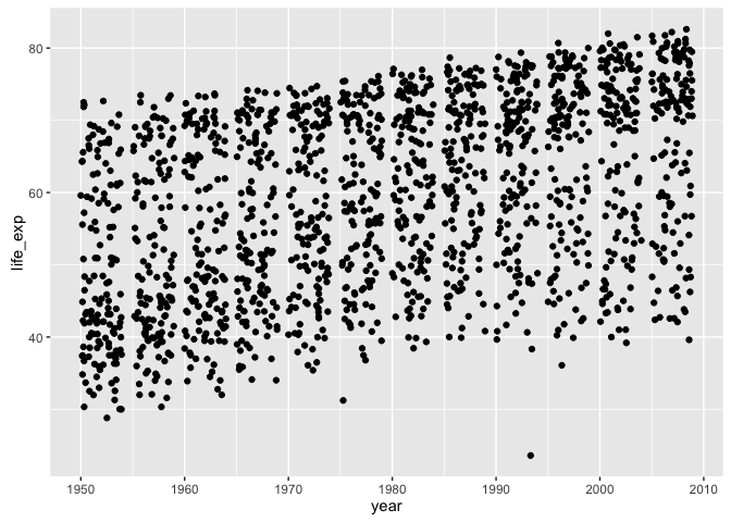
What if we wanted to filter the data by country, continent, or year? This is much easier to do safely if all affected variables live together in a data frame, not as individual objects that can get “out of sync.”
Don’t write-off ggplot2 as a highly opinionated outlier! In fact, keeping data in data frames and computing and visualizing it in situ are widely regarded as best practices. The option to pass a data frame via data = is a common feature of many high-use R functions, e.g. lm(), aggregate(), plot(), and t.test(), so make this your default modus operandi.
Explicit data frame creation via tibble::tibble() and tribble()
If your data is already lying around and it’s not in a data frame, ask yourself “why not?”. Did you create those variables? Maybe you should have created them in a data frame in the first place! The tibble() function is an improved version of the built-in data.frame(), which makes it possible to define one variable in terms of another and which won’t turn character data into factor. If constructing tiny tibbles “by hand”, tribble() can be an even handier function, in which your code will be laid out like the table you are creating. These functions should remove the most common excuses for data frame procrastination and avoidance.
my_dat <-
  tibble(x = 1:5,
         y = x ^ 2,
         text = c("alpha", "beta", "gamma", "delta", "epsilon"))
## if you're truly "hand coding", tribble() is an alternative
my_dat <- tribble(
  ~ x, ~ y,    ~ text,
    1,   1,   "alpha",
    2,   4,    "beta",
    3,   9,   "gamma",
    4,  16,   "delta",
    5,  25, "epsilon"
)
str(my_dat)
#> Classes 'tbl_df', 'tbl' and 'data.frame':    5 obs. of  3 variables:
#>  $ x   : num  1 2 3 4 5
#>  $ y   : num  1 4 9 16 25
#>  $ text: chr  "alpha" "beta" "gamma" "delta" ...
ggplot(my_dat, aes(x, y)) + geom_line() + geom_text(aes(label = text))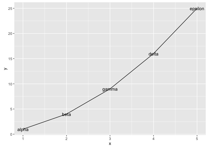
Together with dplyr::mutate(), which adds new variables to a data frame, this gives you the tools to work within data frames whenever you’re handling related variables of the same length.
Worked example
Inspired by this question from a student when we first started using ggplot2: How can I focus in on country, Japan for example, and plot all the quantitative variables against year?
Your first instinct might be to filter the Gapminder data for Japan and then loop over the variables, creating separate plots which need to be glued together. And, indeed, this can be done. But in my opinion, the data reshaping route is more “R native” given our current ecosystem, than the loop way.
Reshape your data
We filter the Gapminder data and keep only Japan. Then we gather up the variables pop, lifeExp, and gdpPercap into a single value variable, with a companion variable key.
japan_dat <- gapminder %>%
  filter(country == "Japan")
japan_tidy <- japan_dat %>%
  gather(key = var, value = value, pop, lifeExp, gdpPercap)
dim(japan_dat)
#> [1] 12  6
dim(japan_tidy)
#> [1] 36  5
The filtered japan_dat has 12 rows. Since we are gathering or stacking three variables in japan_tidy, it makes sense to see three times as many rows, namely 36 in the reshaped result.
Iterate over the variables via facetting
Now that we have the data we need in a tidy data frame, with a proper factor representing the variables we want to “iterate” over, we just have to facet.
p <- ggplot(japan_tidy, aes(x = year, y = value)) +
  facet_wrap(~ var, scales="free_y")
p + geom_point() + geom_line() +
  scale_x_continuous(breaks = seq(1950, 2011, 15))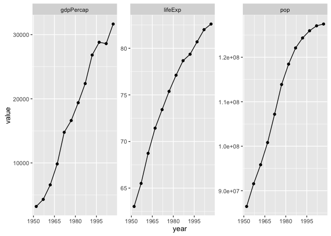
Recap
Here’s the minimal code to produce our Japan example.
japan_tidy <- gapminder %>%
  filter(country == "Japan") %>%
  gather(key = var, value = value, pop, lifeExp, gdpPercap)
ggplot(japan_tidy, aes(x = year, y = value)) +
  facet_wrap(~ var, scales="free_y") +
  geom_point() + geom_line() +
  scale_x_continuous(breaks = seq(1950, 2011, 15))
This snippet demonstrates the payoffs from the rules we laid out at the start:
- We isolate the Japan data into its own data frame.
- We reshape the data. We gather three columns into one, because we want to depict them via position along the y-axis in the plot.
- We use a factor to distinguish the observations that belong in each mini-plot, which then becomes a simple application of facetting.
- This is an example of expedient data reshaping. I don’t actually believe that
gdpPercap,lifeExp, andpopnaturally belong together in one variable. But gathering them was by far the easiest way to get this plot.