Design Process:
After reading the requirements of this assignment, I summarized functional and non-functional requirements for my project.
Functional Requirements:
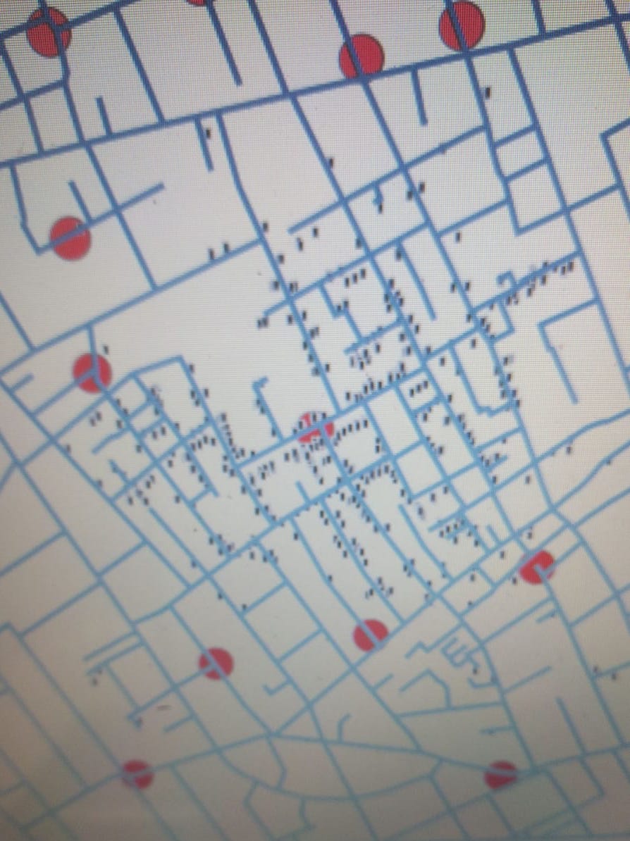
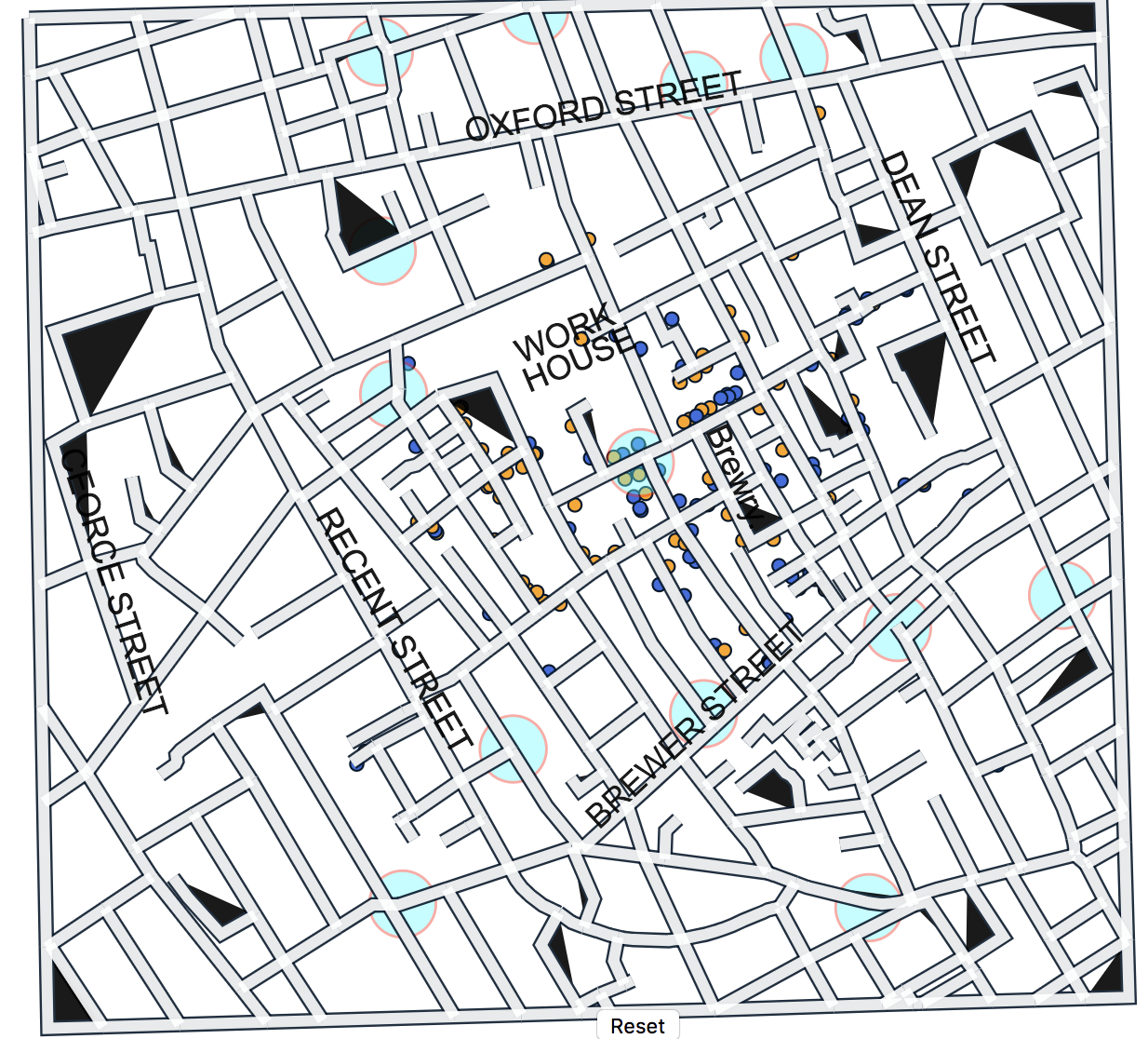
1. A map drawn with the area (streets and pumps) including the locations of the deaths.
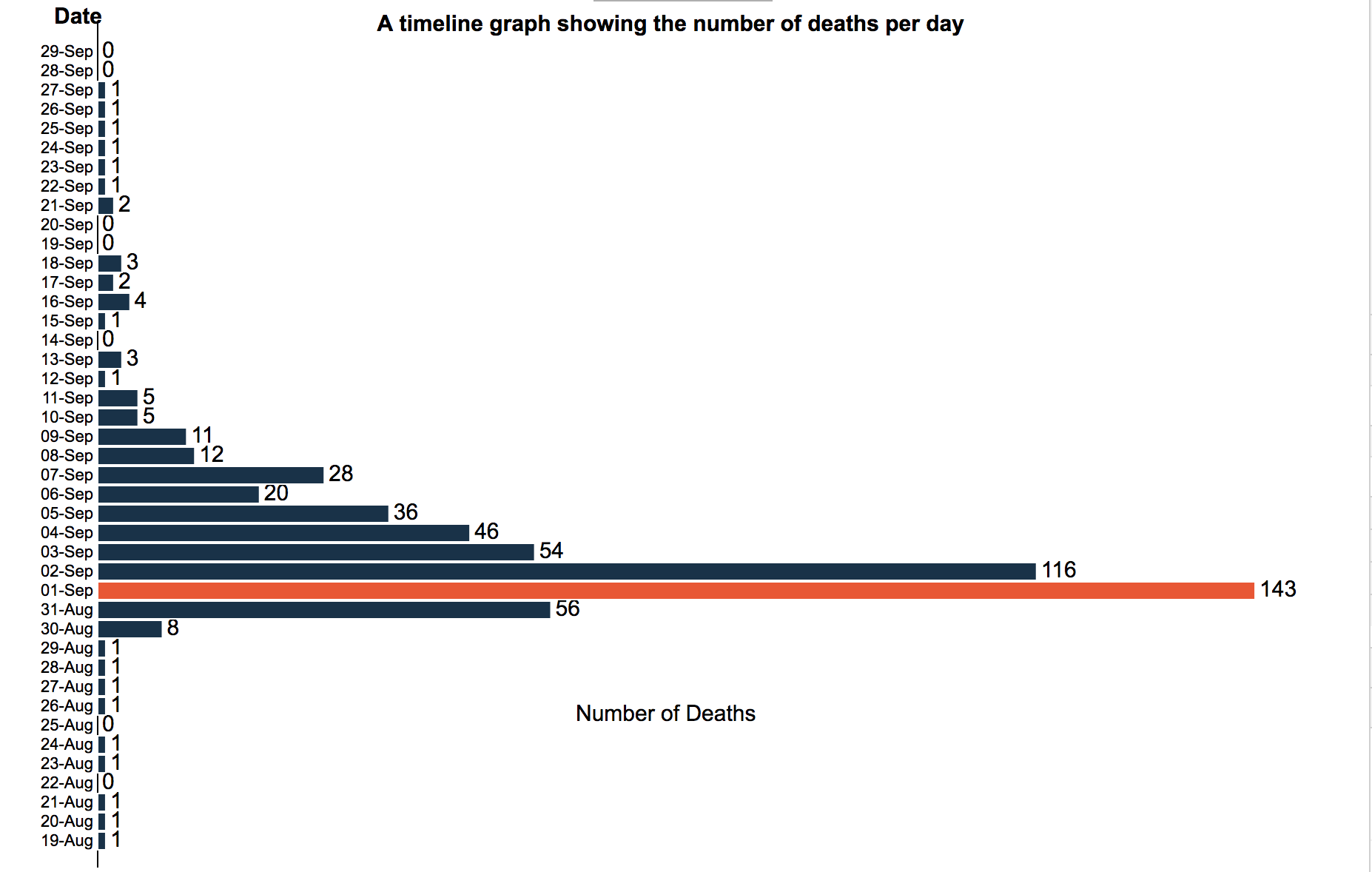
2. A timeline graph showing the number of deaths per day.
3. Ability to move the mouse over the timeline graph to choose which day to visualize.
4. Details on who wrote the project, where the data came from, etc.
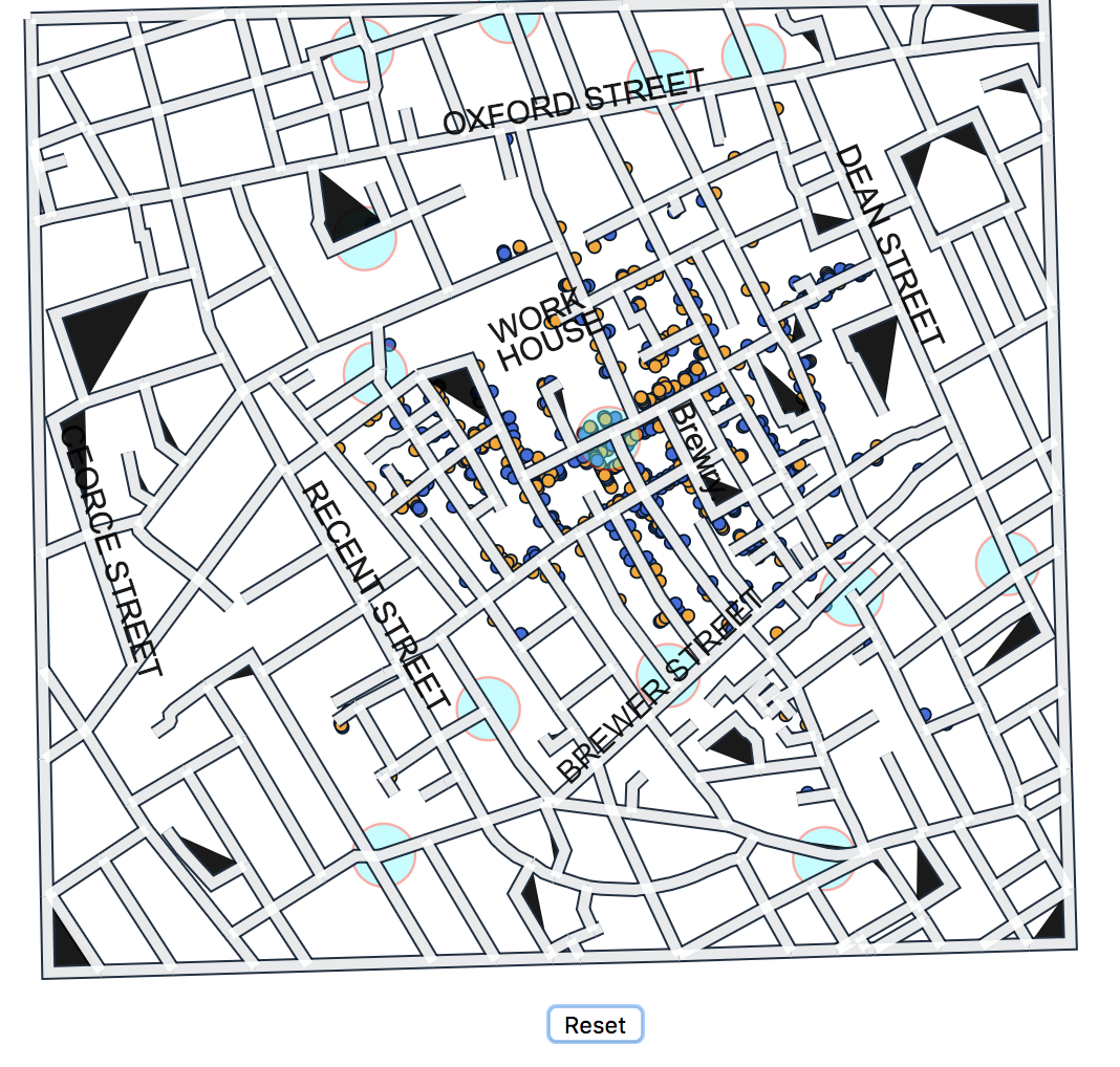
5. Label major street names and the location of the brewery and the work house.
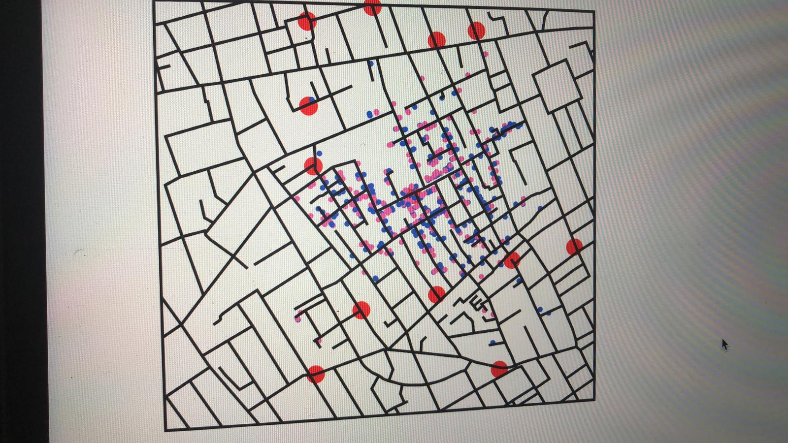
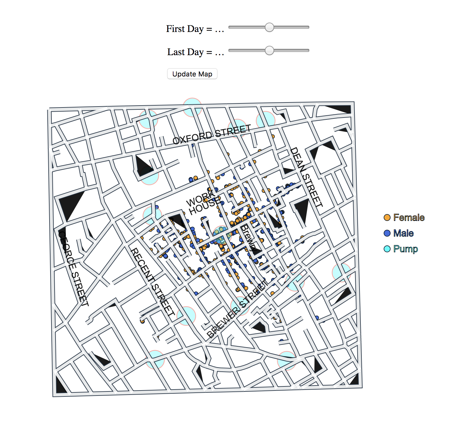
6. Show on the map whether each victim was male or female.
7. Show on the map the age of each victim.
8. A graph shows the distribution of deaths by gender and age overall.
9. Ability to visualize the overall graph (including gender and age) with the change of date.
10. Zoom in/out and pan around the map.
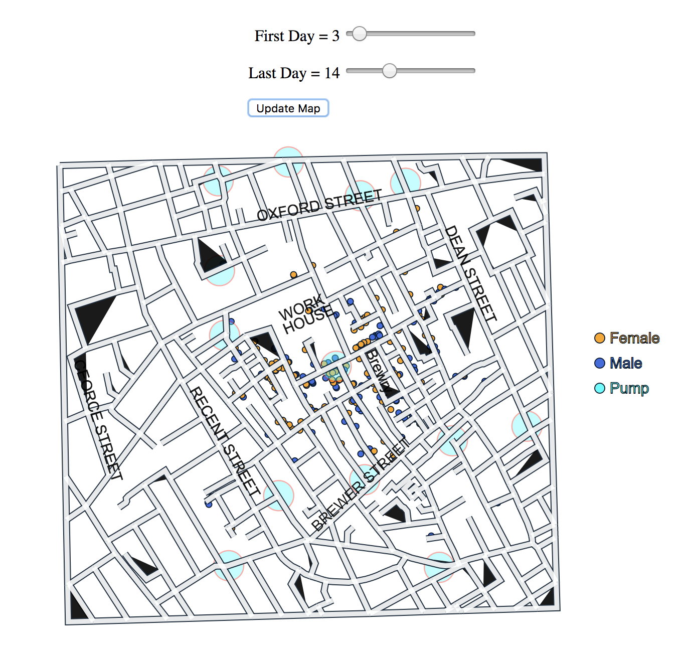
11. Ability to show data from a window of days on the timeline graph
Non-Functional Requirements:
1. Stable graph and map.
2. Well labeled graph and map.
3. Friendly to people with color blindness.
4. Update quickly when the user interacts.
5. Gender and age for each victim should be seen easily.
6. Show data clearly.
7. Do not confuse the user.
According to those requirements, I processed to design my project. Initially, I just came up with the sketch of the map without adding colors. With the project going on, I draw 2 sketches to help me modify the design.


First, I wanted to make block for each graph(the left photo), however, when I finished drawing the map, I found that it cannot be possible to place in all three maps in one block, so I rearranged the structure into the sketch on the right side. Finally when I implemented the visualization, the layout is slightly different from this one.
Design Choices :
When I began to choose which color to use, first I used basic colors to record some initial thinking. But they are just the first thought came into my mind, and the color shown on screen is quite different from that on the paper.
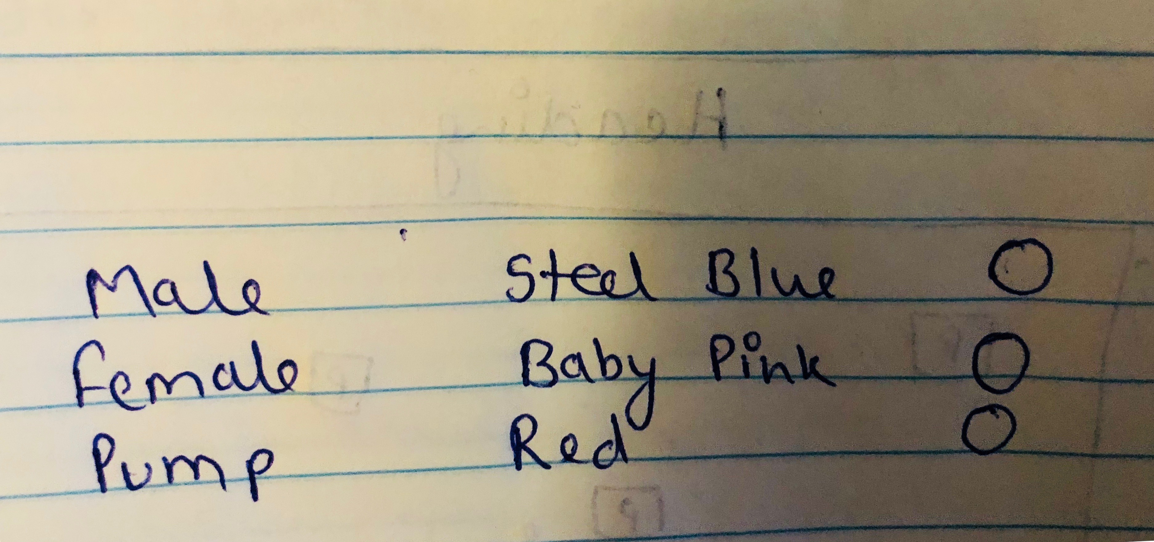

I began to choose color at the same time when I began coding and checked them on color blindness tool, and found red and pink colors are not suitable,So I tried different plans on my page(right).
First, I choose to fill the circles white with black stokes because when they enter the page, there is no color shows the gender or age of the victim. The combination of black and white looks like a graffiti board indicates there are colors needed to be filled in.
I tried different ways to show the gender during the process of the project, but the combination of colors (steel blue and orange) did not change because they can be distinguished easily. and by comparing them I choose the one that shows the clearest data (not the below ones).
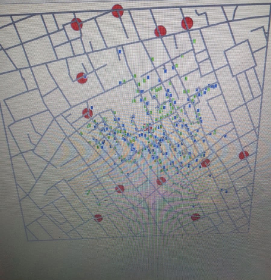
After this, I tried to create this map to give a look of streets, Then I reduced the opacity of pump's red color so that its dark color could not hide the death locations of victim. Also I used zoom and pan functions on this map. To show the age and gender clearly on the map,I used the mouse tool tip. Demonstrated below :
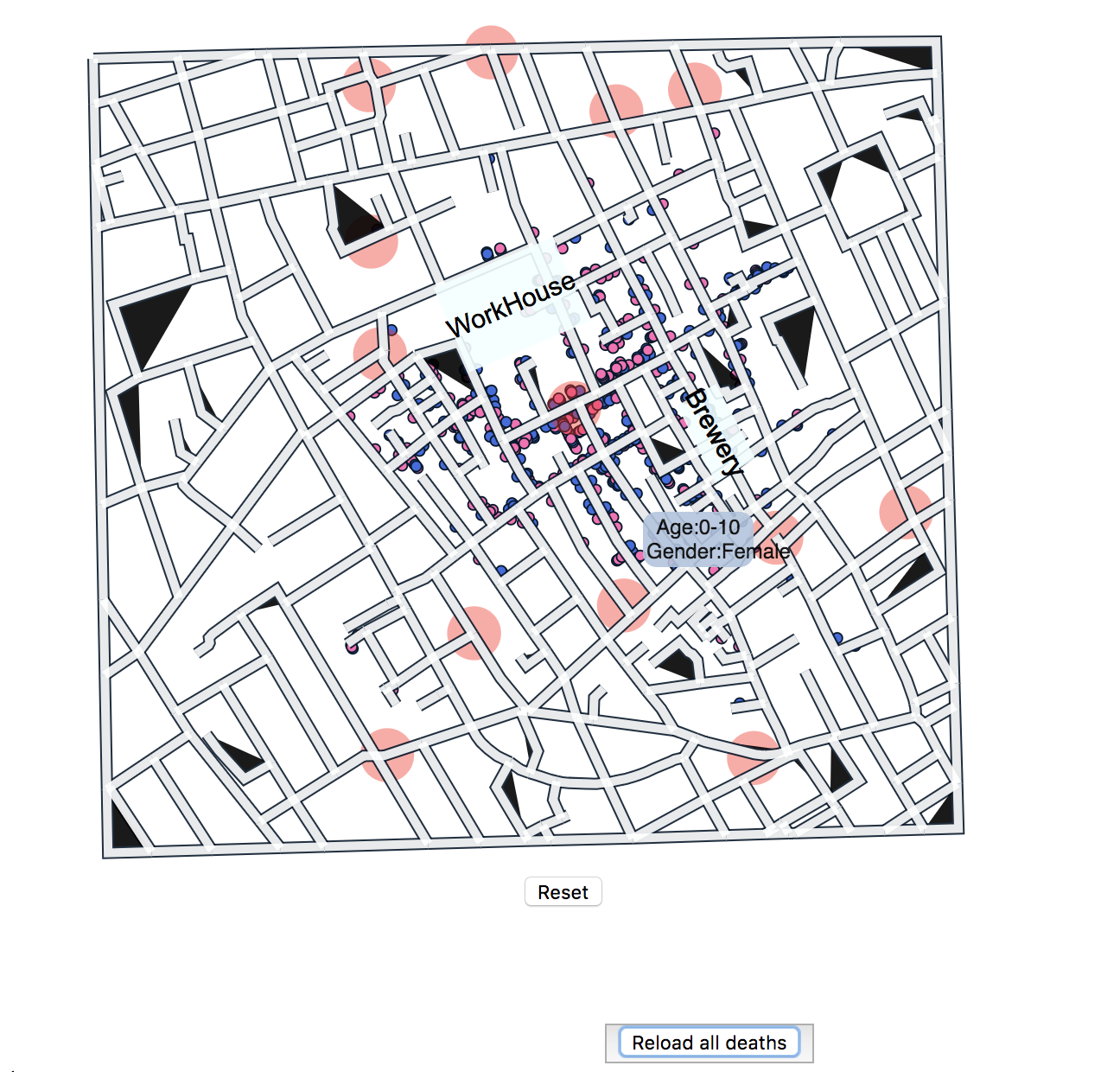
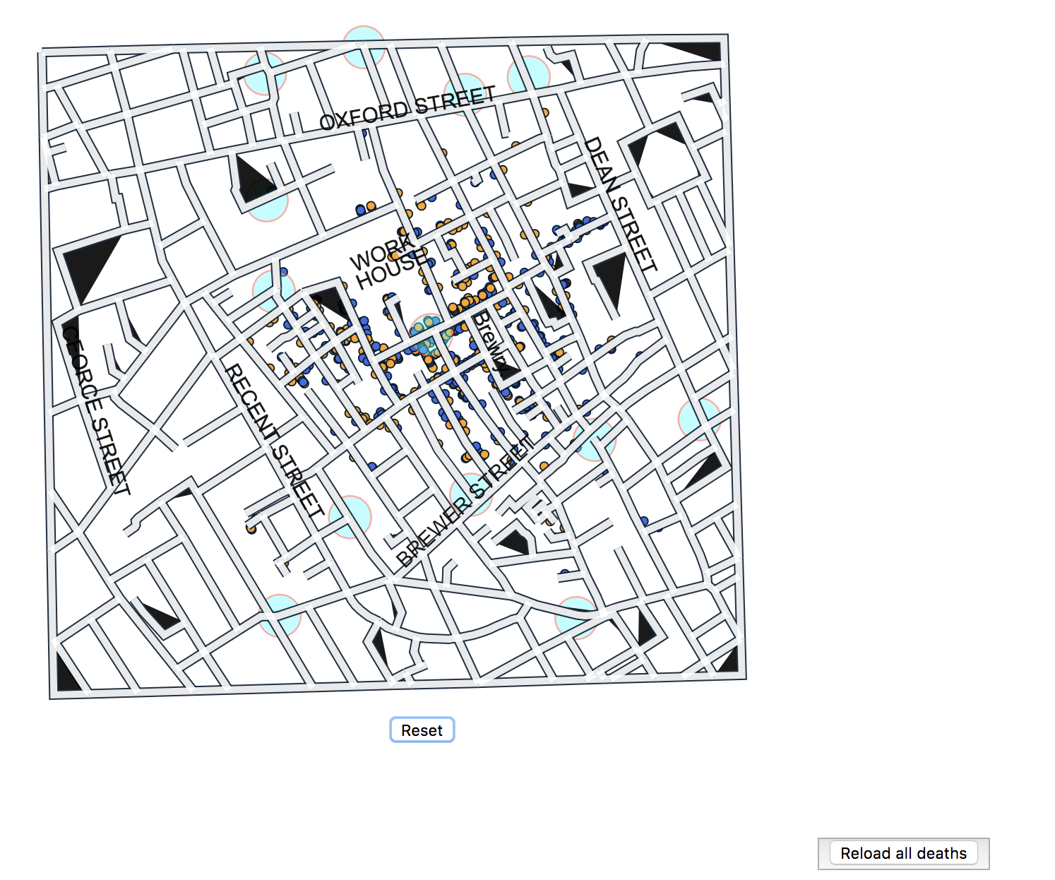
I made a reset button below the map. which will help user to reset the map after Panning or zooming the map. Also visualized the major street name and locations of brewery & work-house. Changed the color of pumps(cyan) and male-female death locations(blue-orange) as previous ones were not easily distinguishable while using color blindness tool.

Created a time line bar chart, which demonstrate the total number of deaths happend on each date.From the timeline we can see that the peak is on September 1st, and the epidemic outbreaked during August 31st to September 10th. Actually the number of deaths increaces for only 2 days. If some measures were used to control this epidemic, it is quite efficient.
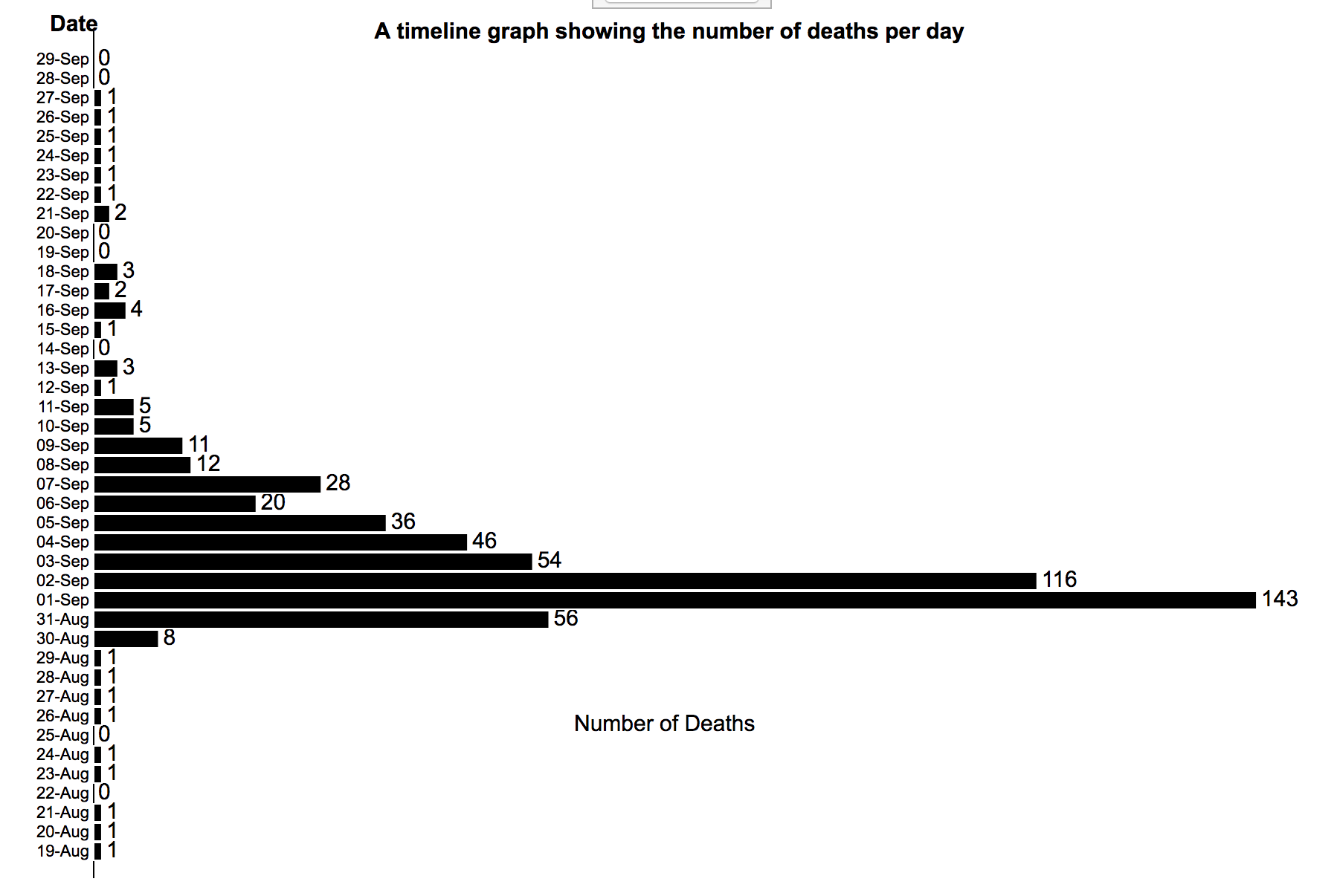
1.On this time line bar chart, If we select a date,it will update the map and show only those deaths which happend on that particular date.
2.There is a button on the top of the timeline bar chart,"Reload all Deaths", which can be used to reset the map for all dates after using the interactive time line
bar chart for one particular date.
Created two slider, which take first day and last day window of days from the user, then after clicking "update Map" button it plots the total deaths happend in that window-days on the map.
Discovered facts:
1. According to US census data from 1850, percentage of people in each age group in general during that time were 0-10: 28%, 11-20: 25%, 21-40: 30%, 41-60: 13%, 61-80: 4%, > 80: 1%. We assume the same breakdown for London. But during this cholera epidemic, the largest number of victims are from the age group: >80. So, this epidemic may be harmful for olds and they have the lowest survival rate.
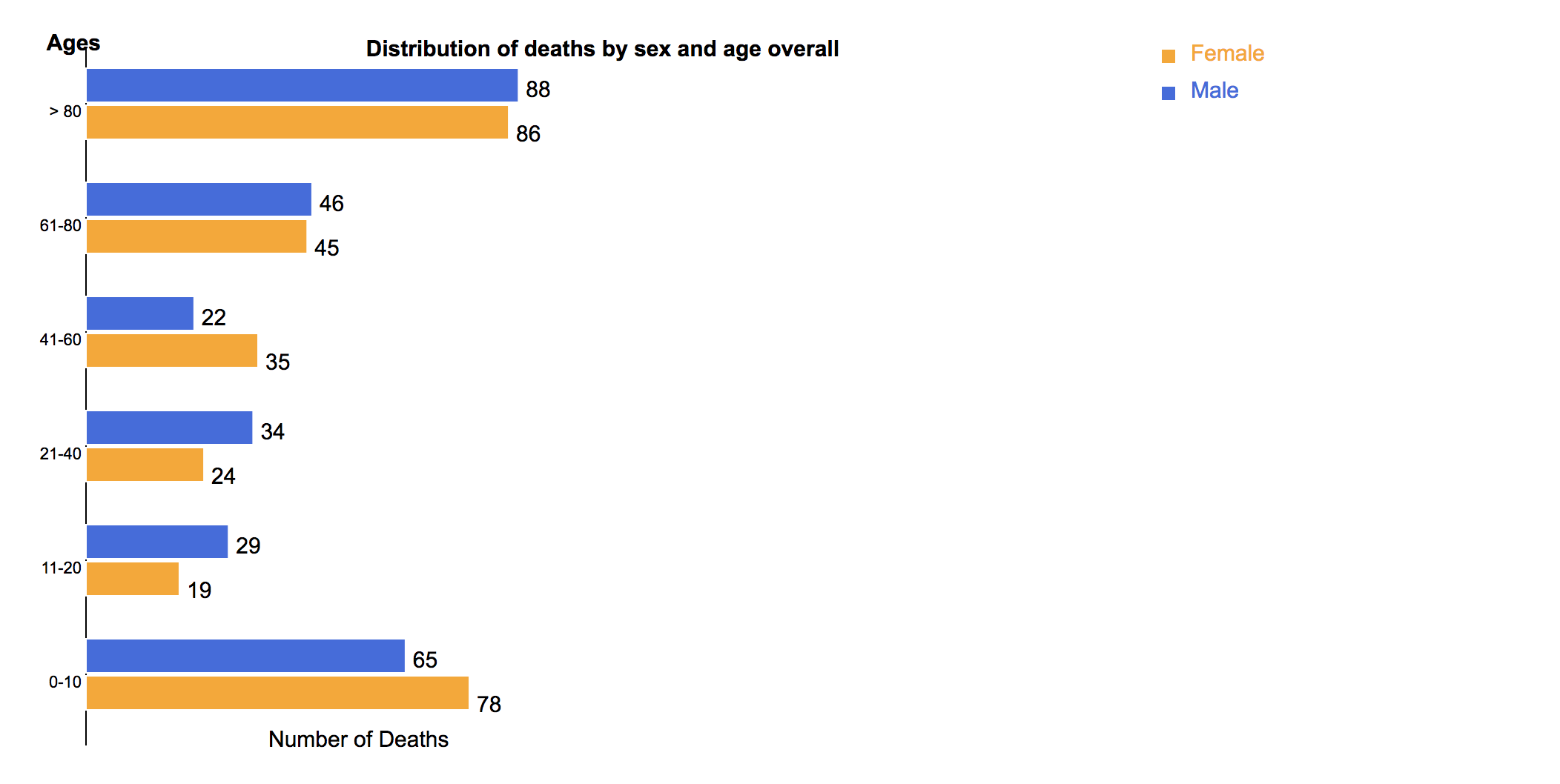
2. Also, there is not large difference among the percentages of people in age 0-10, 11-20 and 21-40, however, in age 0-10, the number of victims is nearly twice as much as those in the other two groups, so kids are easier to suffer in this disease. 3. There are not so many differences between number of victims of males and that of females, so the disease may not related to gender.
4. From the timeline we can see that the peak is on September 1st, and the epidemic outbreaked during August 31st to September 10th. Actually the number of deaths increaces for only 2 days. If some measures were used to control this epidemic, it is quite efficient.
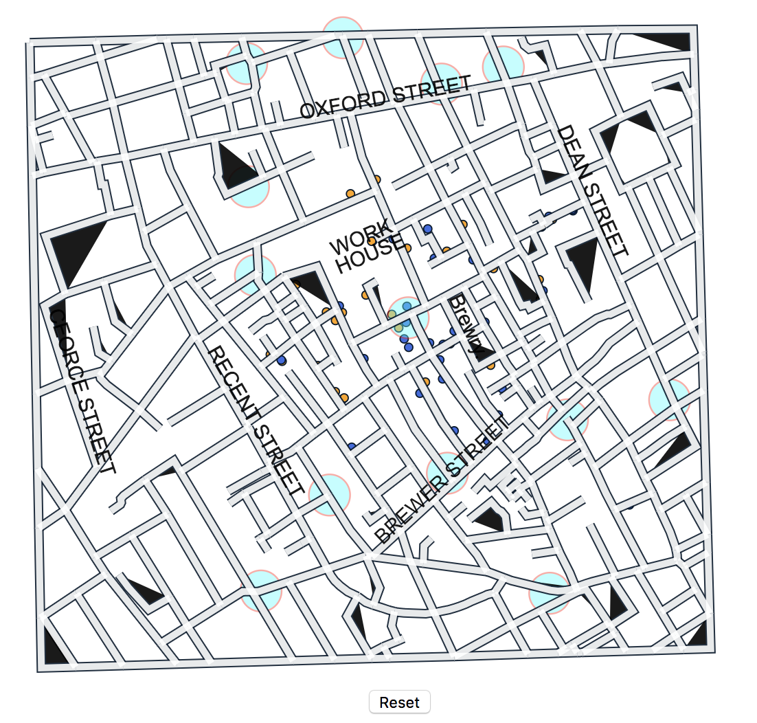
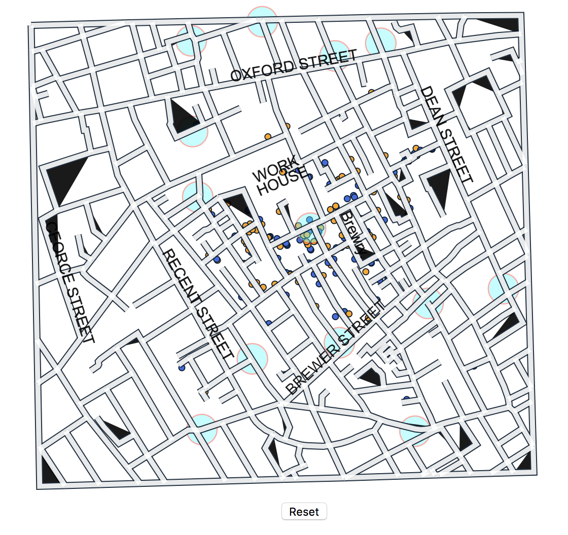
The left graph above is the locations of deaths by August 27th, and the right one is by 3rd September. We can see that new deaths happened around the original deaths. And pumps may also be the way for spreading of the epidemic. This disease may spread through water and the contaction with the infected person.