Introduction
Anscombe dataset


Exploratory data analysis
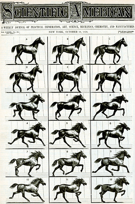
The greatest value of a picture is when it forces us to notice what we never expected to see.
Visual presentation
Interactive presentation
John Hunter (1968 - 2012)
Patterns over time
Backends
| TkAgg | Qt4Agg | WebAgg |
|
|

|
Antigrain geometry
| Raster (PNG) | Vector (SVG) |
|

|
pyplot interface
import matplotlib.pyplot as plt
plt.figure()
plt.subplot(...)
plt.plot(...)
plt.show()
pyplot is a stateful interface that handles much of the boilerplate for creating figures and axes and connecting them to the backend of your choice, and maintains module-level internal data structures representing the current figure and axes to which to direct plotting commands.
Recap
            plt.plot

            plt.show
            plt.xlabel
            plt.ylabel
            plt.xlim
            plt.gca
            plt.text
            xaxis.set_minor_locator
            yaxis.set_major_locator
            YearsLocator
            MonthLocator
Proportions
Artists


Design points
Signal-to-noise ratio
Recap
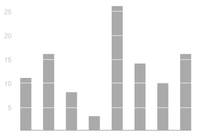
            plt.bar

            plt.xticks(pos, labels)

            Spine.set_visible

            Axis.set_ticks_position

            Axes.set_axis_bgcolor

            plt.grid

            plt.title
Distributions
Stem-and-leaf plot
1.1 2.2 2.8 3.2 3.4 3.4 3.5 4.1 4.9 5.5 5.7
| 1. | 1 | |||
|---|---|---|---|---|
| 2. | 2 | 8 | ||
| 3. | 2 | 4 | 4 | 5 |
| 4. | 1 | 9 | ||
| 5. | 5 | 7 |
Boxplots

Transforms
Recap
            plt.hist

            plt.boxplot

            plt.legend

            plt.text

            plt.setp

            plt.vlines

            Axes.transAxes

            Axes.transData

            blended_transform_factory
Correlations
Small multiplies
Use of color

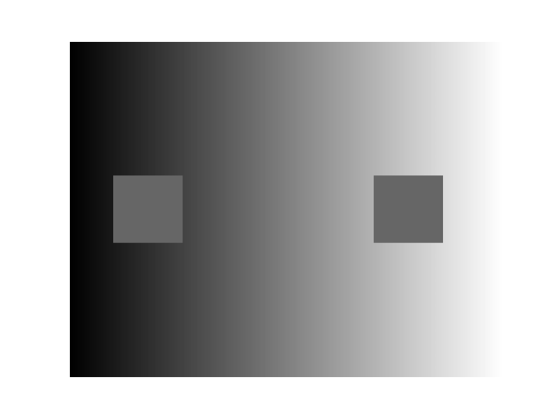
Visual illusion
Matplotlib colormaps

Recap
            plt.subplots

            Axes.set_axis_off

            plt.imshow

            rcParams
Finding patterns
Principal component analysis

K-means clustering

Visual encoding channels

Recap
            plt.scatter
            mcolors.Normalize
            cm.get_cmap
Making maps
Map projections

Choropleth map
Recap
matplotlib
plt.contourf
cartopy
            cartopy.crs
            cartopy.io
            ax.coastlines
            ax.add_feature
            ax.set_extent
            ax.add_image
            ax.add_geometries